Six loose emeralds, including emerald cut emerald, estimated weight 1.63 carats, another similar, estimated weight 1.65 carats, a octagonal cut, 0.95 carats and three oval cuts All gemstone have light chips to surfaceOne emerald cut measuring approximately 9.6 x 6.3 x 3.6mmOther emerald cut measuring approximately 7.4 x 5.8 x 5.1mmOctagonal cut emerald 6.3 x 6.s x 3.2 mmOne oval cut measures approximately 8 x 6.9 x 38mm, estimated weight 1.21 caratssecond oval cut measures approximately 8.5 x 6.4 x 4.3mm, estimate weight 1.34 caratsThird oval cut measures approximately 81 x 5.6 x 3.4mm, estimated weight 0.88 carats
534325 Preisdatenbank Los(e) gefunden, die Ihrer Suche entsprechen
534325 Lose gefunden, die zu Ihrer Suche passen. Abonnieren Sie die Preisdatenbank, um sofortigen Zugriff auf alle Dienstleistungen der Preisdatenbank zu haben.
Preisdatenbank abonnieren- Liste
- Galerie
-
534325 Los(e)/Seite
Single stone synthetic corundum ring, oval cut synthetic corundum measuring an estimated 22.5 x 16.4 x 9.6mm, in a four claw setting, signed A.Kat, ring size K, mount stamped 18 ct, Gross weight approximately 10.67 gramssynthetic corundum is set securely, a few very very small chips to girdle and light scratches to gemstones surface
Russian Poljot International Red October gentleman's wristwatch, special edition number 612, stainless steel case, black face, baton hour markers with Arabic numerals at 3, 6, 9 and 12, date aperture between 4 and 5 o'clock, automatic movement, on black leather strap with spare Poljot stainless steel bracelet strap, with box and papers (1) Red seconds hand sweeping at time of inspection. Not tested for time keeping.Unable to turn crown. Light scratches to case. Scratch to glass above 12 o'clock position.Signs of wear commensurate with ageEwbank's do not guarantee the working order or accuracy of any lots sold
Asymmetric opal and diamond pendant, set with an oval cabochon cut opal, 11.3 x 5.6mm and round cut diamond, pendant measuring 2.9 x 1.5cm, on a flat curb link chain, 37.5cm in length, both in 9 ct 9 ct gross weight 5.5 gramsOverall good condition a few light scratches to the side of the opalclasp opening and closing securely
A pair of mother of pearl cufflinks, stamped 9 ct, a set of nautical mother of pearl buttons, white enamel lighter pendant, along with other cufflinks and buttons and a single gold plated earrings 9 ct gross weight 4.94 gramsMother of pearl cufflinks - light scratches to surface and small chips to edges. One button/cufflink face is complete with thread, the other 3 are missing some gold thread. Discolouration to gold on back of cufflinks
Omega, a Gentleman’s gold dress watch, the signed white enamel dial with Roman numeral hour markers and gold hands, fitted with a calibre 1377 quartz movement no. 47890484, snap on case back, marked inside for 18 ct and numbered 191746 QZ, mounted on a link bracelet with fold over clasp, marked for 18 ct Requires battery replacement, Crystal glass is loose. Light scratches when viewed under 10 x loupe to case back and sides.Ewbank's do not guarantee the working order or accuracy of any lots sold.
Late Art Deco sapphire and diamond floral spray brooch, central old European cut diamond weighing an estimated 0.85 carat, surrounded by seven round and oval cut sapphires, weighing an estimated total of 2.30 carats, with old and rose cut diamond set petals, stem and leaves, estimated total diamond weight of 5.80 carats, mounted in tested platinum, pin and roll catch fitting, 7.4 x 3.5cm, in an original Antrobus, Old Bond St box. Gross weight approximately 23.36 gramsThe brooch is in overall good condition for age, the diamonds appear secure in settingsome small diamonds are chipped, there is a variation of old European cut diamonds, old mine cut diamonds, rose cut diamonds and single cut diamonds throughout. Estimated colour ranges from H-KEstimated clarity ranges from SI-I The sapphires are in good condition, light surface wear and abrasions, one sapphire has chip to top surfaceMetal shows light wear
Modern blue topaz and diamond necklace, comprising three octagonal cut blue topaz in rub over settings, each suspended from a fixed diamond set solid bale, on rope chain marked for 18 ct, 42.5cm in length, estimated total blue topaz weight 5.40 carats Gross weight 11.7 gramstwo of the blue topaz stone have light scratches to top surfaceall stones are set securelylobster claw clasp opening and closing securely
Omega, a gentleman's De Ville, wristwatch with circular white enamel signed dial, Roman numeral hour markers, fitted with a quartz movement, with a stainless steel De Ville embossed case back numbered 55117466 with box and papers and a similar Longines gentleman's gold plated case watch, signed white enamel dial with Roman numeral hour markers, date at three, quartz movement, with box and original sales receipt and a Rotary gentleman's quartz watch, brushed gold coloured dial, date at three, mounted on a black leather strap, boxed with guarantee papers All require battery replacement,Signs of light scratching commensurate with age when viewed under 10 x loupeEwbank's do not guarantee the working order or accuracy of any lots sold.
Two quartz cocktail rings, one set with rectangular step cut citrine, estimated weight 17.91 carats, and a similar amethyst ring, estimated weight 13.73 carats, both ring size P 1/2 and mounts testing as 14 ct Gross weight 14.8 gramscitrine measures approximately 16.8 x 14.5 x10.2mm, very light scratches to top of citrineEvidence of resizing to shank on both ringsAmethyst measures approximately 17.6 x 13.7 x 7.9mm,very light scratches to top of amethyst
Art Deco drop earrings, set with two oval cut sapphires, in articulated setting, estimated total sapphire weight 4.42 carats, surrounded by round brilliant cut diamond set frame, estimated total diamond weight 1.23 carats, post and butterfly fitting, mounted in 18 ct white gold, 4.9 x 1.5cm 18 ct gross weight 10.4 gramsDiamond colour: ranges from H to MDiamond clarity: SI/IChips to some diamondsSapphires are a dark blue colour, translucent with natural inclusions. Light scratches to metal
Star sapphire and diamond ring, central oval cabochon cut star sapphire, with a six ray star, weighing an estimated 31.54 carats, with five round brilliant cut diamonds and two marquise cut diamonds set each side, estimated total diamond weight 0.85 carat, with split shoulder, mount testing as 14 ct, ring size approximately L Gross weight 13.32 gramsstones appear securesapphire has two chips to one side of stonethree claws on the marquise cut diamonds are very worn, metal shows light surface abrasions and tarnishing, signs of re-sizingshank is oval in shape
Tiffany & Co. open heart pendant with diamonds, designed by Elsa Peretti, 18 ct gold open heart pendant is set with five graduated round brilliant cut diamonds, signed Tiffany & Co, Elsa Peretti, and hallmarked London 2007, measures 1.6cm wide, on a 40.5cm Tiffany & Co. gold chain, with pouch and box Gross weight approximately 4.15 gramsOverall excellent condition, light surface scratches consistent with use. No notable damage or repairclasp opening and closing securely
Ladies late Victorian half hunter pocket watch, enamel dial with Roman numerals, subsidiary dial and minute track, mechanical movement No.993506, signed J W Benson 25 Old Bond Street London, case stamped 18 ct, front of case has red enamel detail surrounding the glass, inside case is engraved 'Mabel with her father and mothers best love on her 21st Birthday June 3.1899', back of the case bear entwined engraved initials Gross weight 37.8 gramsPocket watch is currently working but has not been tested for time keepingcrack in dial enamel at five o'clock, light chips to outer red enamels surfaceEwbank's do not guarantee the working order or accuracy of any lots
Mela Muter (Maria Melania Mutermilch)Stadt in der Provence Öl auf Leinwand 73 x 92 cm Gerahmt. Unten rechts blau signiert 'Muter'. - In guter, farbfrischer Erhaltung.Das Werk ist im Foto-Archiv der Galerie Bargera dokumentiert, dort betitelt "Town in Provence"ProvenienzGalerie Bargera, Köln; Privatsammlung RheinlandIm Laufe ihrer Schaffenszeit in Frankreich malte Mela Muter zahlreiche Landschaftsdarstellungen und Stadtansichten aus der Provence, meist aus dem Umkreis von Avignon. Die Faszination, die die Farb- und Formenvielfalt dieses Landstriches auf die Künstlerin ausübte, wird in dem hier angebotenen großformatigen Panorama eines provenzalischen Städtchens in besonderem Maße spürbar. Von einem erhöhten Standpunkt aus eröffnet sich ein Blick weit über die bergige Landschaft, Gassen mit kubischen, verschachtelten Häuserformationen fallen steil nach hinten zu einem Fluss hin ab, vielleicht der Rhône. Ein Kirchturm und Festungstürme sind noch sichtbar, die genaue Ausdehnung der Stadtlandschaft bleibt jedoch im Ungewissen. Jenseits des Flusses schmiegen sich weitere Gebäude in eine Senke, dahinter erhebt sich in vielen felsigen Verwerfungen ein von einer Festung gekrönter Bergrücken.Das intensive Licht des Südens durchdringt alles Dargestellte, es reflektiert von den weißen Hauswänden, gibt der Wasseroberfläche des Flusses ein strahlendes Kobaltblau und verleiht selbst den rotbraunen Töne von Dachflächen und Erde, die das Kolorit des Bildes bestimmen, strahlende Nuancierungen in Rosé und Orange. Mela Muter (Maria Melania Mutermilch)Stadt in der Provence Oil on canvas 73 x 92 cm Framed. Signed 'Muter' in blue lower right. - In fine condition with fresh colours.The work is documented in the photo archive of Galerie Bargera and titled there "Town in Provence"Over the course of the period she spent working in France, Mela Muter painted numerous images of landscapes and views of towns in Provence, mostly from the area around Avignon. The fascination that this region's diversity of colours and forms exercised over the artist is particularly palpable in the large-format panorama of a little Provençal town offered here. From an elevated vantage point, an extensive view opens up above the mountainous landscape; lanes with cubic, interlocking formations of houses drop steeply down and away towards a river, perhaps the Rhône. A church tower and the towers of a fortress are also visible, although the precise extent of the townscape remains uncertain. Beyond the river, additional buildings are nestled within a low-lying area, behind which a mountain ridge crowned by a fortress rises up along the numerous thrusting rock formations.The intense light of the south permeates everything depicted here: it is reflected by the white walls of the houses, provides the surface of the river with its radiant cobalt blue and even invests the reddish-brown tones of the rooftops and the earth that define the tonality of the picture with radiant nuances in pink and orange.
Bernd und Hilla BecherHilla BecherBernd BecherIndustriebauten Portfolio mit 10 Vintages, Gelatinesilberabzügen hochglänzend Jeweils 19,5 x 15,5 cm, Hoch- und Querformate. Einzeln freiliegend unter Passepartout und unter Glas gerahmt. Jeweils rückseitig mit Copyrightstempel der Photographen. Aus einer Auflage von 55 Exemplaren. Edition des Städtischen Museums, Mönchengladbach. - Die originale Portfoliobox und das Textblatt mit Nummerierung sind nicht erhalten.ProvenienzEhemals Sammlung Sal. Openheim, KölnLiteraturBernd und Hilla Becher, Anonyme Skulpturen. Eine Typologie technischer Bauten, Düsseldorf 1970, mit Abbn.Motive:1. Kalköfen, ca. 1920, bei Manbenge, Nordfrankreich, 19632. Fördertum, ca. 1910, "Blaenserchan" Colliery, Pontypool, Südwales, 19663. Wasserturm, Liège, 19684. Kühlturm, ca. 1950, Zeche "Victoria Mathias", Essen, Ruhrgebiet, 19635. Silo und Mischanlage einer Baustelle, Essen, Ruhrgebiet 19656. Raffinerie, Lothringen, 19677. Gasbehälter, ca. 1880, London-Finchley, 19668. Gasbehälter, 1959, Wuppertal, 19639. Silo für Kokskohle, ca. 1920, Kokerei "Eschweiler Reserve", bei Aachen, 196510. Förderturm, 1920, Fosse "Dutemple", Valenciennes, Nordfrankreich, 1967Bei den zehn Aufnahmen von Industriebauten handelt es sich um jene Edition, die das Städtische Museum Mönchengladbach 1968 anlässlich der Ausstellung "industriebauten, eine fotografische dokumentation von b. u. h. becher" herausgegeben hat. Damals konnte das Museum noch nicht ahnen, welche Bedeutung das Künstlerpaar für die Entwicklung der Photographie und deren Etablierung als feste Größe im internationalen Kunstbetrieb nehmen würden. Mit ihrem typologischen Ansatz waren die Bechers nicht nur Begründer der ‚Düsseldorfer Photoschule' sondern auch Vorbild für eine ganze Generationen internationaler, konzeptionell arbeitender Künstler und Photographen. Die mit einer Plattenkamera im Format 13 x 18 cm aufgenommen Photographien weisen den für die Bechers charakteristischen, sachlich-dokumentarischen Blick auf das Objekt auf. Mit der Wahl eines erhöhten, distanzierten Standortes, der das photographische Erfassen der Gesamtheit des Bauwerks und dessen Zentrierung im Bild erlaubt, liegt den Aufnahmen eine einheitliche formale Struktur zugrunde. Dennoch kommen, bei aller Entsubjektivierung der Objekte, aufgrund der Präzision der Bilderfassung immer auch kleine Besonderheiten und Details zum Vorschein, die jede Photographie zu einem individuellen Portrait des gezeigten Bauwerkes werden lassen. Beim Blick auf die Gesamtheit der hier vorliegenden Photographien entsteht der Eindruck einer Art Familienzusammengehörigkeit, der nicht nur dadurch zustande kommt, dass die Gebäude ihre Zugehörigkeit zu einer im Niedergang begriffenen Industriekultur eint, er ist auch Ergebnis der handwerklichen Meisterschaft Bernd und Hilla Bechers als Photographen vor Ort und in der Dunkelkammer. Nach Auskunft von Hilla Becher wurde die damals geplante Auflage von 55 Exemplaren nicht vollständig realisiert.Wie danken Gabriele Conrath-Scholl (Die Photographische Sammlung/SK-Stiftung Kultur, Köln) für hilfreiche Informationen. Bernd and Hilla BecherHilla BecherBernd BecherIndustriebauten Portfolio containing 10 vintage ferrotyped gelatin silver prints Each 19.5 x 15.5 cm, portrait and landscape formats. Each matted and framed under glass. Each with photographer's copyright stamp on the verso. From an edition of 55. Städtisches Museum edition, Mönchengladbach. - The original portfolio box and the text sheet with edition number is not extant.ProvenanceFormerly Sal. Oppenheim collection, CologneLiteratureBernd und Hilla Becher, Anonyme Skulpturen. Eine Typologie technischer Bauten, Dusseldorf 1970, with ill.Subjects:1. Lime kiln, c. 1920, near Manbenge, Northern France, 19632. Winding tower, c. 1910, "Blaenserchan" Colliery, Pontypool, South Wales, 19663. Water tower, Liège, 19684. Cooling tower, c. 1950, "Victoria Mathias" colliery, Essen, Ruhr area, 19635. Silo and mixing plant of a construction site, Essen, Ruhr area 19656. Refinery, Lorraine, 19677. Gas container, c. 1880, London-Finchley, 19668. Gas container, 1959, Wuppertal, 19639. Container for charcoal, c. 1920, coking plant "Eschweiler Reserve", near Aachen, 196510. Winding tower, 1920, Fosse "Dutemple", Valenciennes, Northern France, 1967The ten photographs showing industrial buildings are from the edition published by the Städtische Museum Mönchengladbach on the occasion of the exhibition 'industriebauten, eine fotografische dokumentation von b. u. h. becher' [industrial buildings, a photographic documentary by b. u. h. becher] in 1968. At that time, the museum had no idea of the significance the artist couple would have for the development of photography and its establishment as a constant in the international art world. With their typological approach, the Bechers were not only founders of the 'Düsseldorfer Photoschule' [Düsseldorf School of Photography), but also role models for an entire generation of international artists and photographers working conceptionally.The photographs, taken with a 13 x 18 cm plate-back camera, show the Bechers' characteristic, objective, documentary view of the object. By choosing a raised, distanced location, allowing the entire building to be captured photographically and centred in the image, the photographs are based on a uniform formal structure. Nevertheless, despite any de-subjectification of the objects, the precision of the image capture always brings to light small peculiarities and details that make each photograph an individual portrait of the building shown. When considering the entirety of the photographs presented here, the impression of a certain shared family identity is created, which is not only due to the fact that the buildings share the fate of industrial culture in decline, but is also the result of Bernd and Hilla Becher's craftsmanship as photographers on location and in the darkroom.According to Hilla Becher the originally planned edition of 55 was not entirely realised at the time.We would like to thank Gabriele Conrath-Scholl (Die Photographische Sammlung/SK-Stiftung Kultur, Cologne) for helpful information.
Alfred KubinAschermittwoch Aquarell und Tuschfederzeichnung auf Bütten (Rückseite einer Katasterkarte) 39,5 x 31,6 cm Unter Glas gerahmt. Unten rechts mit Tusche signiert 'Kubin', unten links mit Bleistift betitelt 'Aschermittwoch'. - Im Rand gebräunt und mit vereinzelten Stockflecken.Hoberg Mappe V/II/2 und Raabe 168 (die nach dieser Zeichnung entstandene Lithographie)ProvenienzPrivatsammlung, WestfalenWie kaum einem Künstler der Moderne gelingt es Alfred Kubin die sozialen Realitäten des Alltags mit den unterschiedlichsten Fiktionen und Traumbildern organisch ineinander übergehen zu lassen. In einem Brief an seinen Künstlerfreund Fritz von Herzmanovsky-Orlando bezeichnet sich Kubin 1908 selbst als „Organisator des Ungewissen, Zwitterhaften, Dämmerigen, Traumartigen“ und tatsächlich offenbaren sich seine Werke dem Betrachter als abgründiges Amalgam von Gesehenem und Unsichtbarem (Brief vom 9. Januar 1908, in: Fritz von Herzmanovsky-Orlando, Sämtliche Werke Bd. VII. Der Briefwechsel mit Alfred Kubin. 1903 bis 1952, Salzburg/Wien 1983, S. 10). Zwischen Apokalypse und Karneval präsentiert sich der Aschermittwoch in unserer prachtvoll aquarellierten Tuschezeichnung als Limbus für Mensch und Kreatur. Auf der Schwelle von Rausch und Affekt, Buße und Erlösung ist der Karneval ein in vielfacher Hinsicht naheliegendes Thema für den Künstler, steht das Fest doch sinnbildlich für die Verwandlung und liefert als irdischer (Alb-)Traum par excellence eine ideale Folie für Kubins Inszenierung unterschiedlicher Wirklichkeitsebenen. Auffällig ist nicht nur der für Kubin so typische Detailreichtum, der die einzelnen Bildelemente und dargestellten Wesen in einer Fülle phantastischer Erzählungen aufgehen zu lassen vermag, sondern auch die zeichnerische Dichte. Meisterhaft setzt Kubin Hell- und Dunkeltöne und untereicht die obsessive Drastik des Sujets mit jedem einzelnen Strich auch auf formaler Ebene. In dieser Qualität und Größe präsentiert sich das vorliegende Blatt, nach der auch eine Lithographie für die Mappe „Traumland II“ (Hrsg. von Fritz Gurlitt, Berlin 1922) erschien, als bildgewaltiges Meisterwerk eines der bedeutenden Zeichner des 20. Jahrhunderts. Alfred KubinAschermittwoch Watercolour and pen and ink drawing on laid paper (reverse side of a cadastral map) 39.5 x 31.6 cm Framed under glass. Signed 'Kubin' in India ink lower right, titled 'Aschermittwoch' lower left. - Marginal browning and with few foxmarks.Hoberg Mappe V/II/2, and Raabe 168 (lithograph after this drawing)ProvenancePrivate collection, WestphaliaThere is scarcely another artist of the modernist period who succeeds like Alfred Kubin in organically merging the social realities of everyday life with the most varied fictions and dream images. In a 1908 letter to his friend and fellow artist Fritz von Herzmanovsky-Orlando, Kubin refers to himself as “organiser of the uncertain, ambiguous, shadowy, dream-like” (Letter of 9 January 1908, in: Fritz von Herzmanovsky-Orlando, Sämtliche Werke vol. VII. Der Briefwechsel mit Alfred Kubin. 1903 bis 1952, Salzburg/Vienna 1983, p. 10) and his works do in fact reveal themselves to their viewers as an enigmatic amalgamation of the seen and the invisible. In our ink drawing magnificently toned with watercolours, Ash Wednesday presents itself as something between the Apocalypse and Carnival, as a limbo for human beings and creatures. On the threshold between intoxication and passion, penance and salvation, Carnival is an obvious theme for the artist in many respects: after all, the festival serves as a symbol of transformation and, as the earthly dream (or nightmare) par excellence, it provides an ideal foil for Kubin to stage different levels of reality. What is striking is not just Kubin's very typical wealth of detail, which is able to make the individual elements of the picture and the depicted creatures culminate in an abundance of fantastic narratives, but also the graphic density. Kubin has masterfully placed his light and dark tones and used every single stroke to also underscore the obsessive explicitness of his subject on a formal level. In this quality and grandeur, this sheet - which also provided the source for a lithograph for the portfolio “Traumland II” (publ. by Fritz Gurlitt, Berlin 1922) - presents itself as a visually overpowering masterwork by one of the 20th century's most important draughtsmen.
Julian StanczakSway in warm light 3-teilige Arbeit: je Acryl auf Leinwand Jeweils 122 x 62 cm. Gesamtmaß 122 x 186 cm. Zusammen gerahmt. Rückseitig auf der Leinwand signiert und datiert 'Stanczak 98'. Rückseitig auf dem Keilrahmen signiert, datiert und betitelt 'JULIAN STANCZAK "SWAY IN WARM LIGHT" 1998'. - Mit geringfügigen Altersspuren.ProvenienzSelker Fine Art, Rancho Santa Fe/Kalifornien; Privatsammlung, PolenDer 1928 in Polen geborene Julian Stanczak gelangt nach Deportation und Flucht als Jugendlicher nach Uganda. Die Farbenvielfalt und Lichtintensität, die er in Afrika erlebt, beeindrucken ihn zutiefst. Sie legen den Grundstein für seine künstlerische Entwicklung und seine lebenslange Beschäftigung mit der Farbe. 1950 emigriert Stanczak in die USA, in Yale wird Josef Albers sein Lehrer. Angeregt durch Albers' Vorbild wendet er sich Ende der 1950er Jahre einer abstrakten Bildsprache zu, die durch dicht gesetzte verschiedenfarbige Formen optische Wechselwirkungen hervorruft. Damit wird Stanczak einer der ersten Vertreter der Op Art, ebenso wie sein Kommilitone Richard Anuszkiewicz. Konsequent führt Stanczak in den kommenden Jahrzehnten den eingeschlagenen Weg fort und experimentiert mit Streifen-, Quadrat- und Wellenrastern in leuchtenden Farbtönen. Anders als anderen Vertretern der Op Art geht es Stanczak nicht um grellfarbige Effekte oder die bewusste optische Herausforderung des Betrachters, sondern um die Visualisierung von flüchtigen, subtilen Eindrücken. „Er sucht nach einer universalen Formgebung für die unscheinbarsten, aber lebenswichtigen Kostbarkeiten des Alltags, die uns mit dem „Jetzt“ verbinden, mit dem lebendigen Augenblick, der sich nicht festhalten lässt […] eine Veränderung des Lichts, eine Bewegung, verursacht von unbeachteten kleinen Geschehen, die man nur aus dem Augenwinkel miterlebt.“ (Elizabeth McClelland, in: Ausst.Kat. Julian Stanczak, A Retrospective, Youngstown/Ohio u.a. 1998, S. 155) Julian StanczakSway in warm light 3- part work: each acrylic on canvas Each 122 x 62 cm. Overall dimensions 122 x 186 cm. Framed together. Signed and dated 'Stanczak 98' verso on canvas. Signed, dated and titled 'JULIAN STANCZAK "SWAY IN WARM LIGHT" 1998' verso on stretcher. - Minor traces of age.ProvenanceSelker Fine Art, Rancho Santa Fe/California; private collection, PolandBorn in Poland in 1928, Julian Stanczak fled to Uganda as a teenager following deportation. In Africa, he experienced a diversity of colour and intensity of light that made a great impression on him. These laid the foundation of his artistic development and his life-long preoccupation with colour. In 1950, Stanczak emigrated to the USA; at Yale his teacher was Josef Albers. In 1950 - inspired by Albers - he applied himself to an abstract visual language which evoked visual interaction by means of densely arranged variegated shapes. Stanczak thus became one of first representatives of Op Art, just as his fellow student Richard Anuszkiewicz. Stanczak followed this path consistently in subsequent years, experimenting with grid patterns of stripes, squares and waves in vibrant colours. In contrast to other representatives of Op Art, Stanczak was not primarily interested in flamboyant effects or in optically challenging the viewer, but in the visualisation of fleeting, subtle impressions. “Er sucht nach einer universalen Formgebung für die unscheinbarsten, aber lebenswichtigen Kostbarkeiten des Alltags, die uns mit dem „Jetzt“ verbinden, mit dem lebendigen Augenblick, der sich nicht festhalten lässt […] eine Veränderung des Lichts, eine Bewegung, verursacht von unbeachteten kleinen Geschehen, die man nur aus dem Augenwinkel miterlebt.“ (Elizabeth McClelland, in: (Elizabeth McClelland: exhib.cat. Julian Stanczak, A Retrospective, Youngstown/Ohio i.a. 1998, p.155)
Lyonel FeiningerDesign for Mural "SS Constitution". Verso: Segelschiffe und Kreuzer. Aquarell und Tuschfeder, bzw. schwarze Kreide- und Tuschfederzeichnung auf elfenbeinfarbenem Büttenpapier 23,6 x 63,5 cm Unter Glas gerahmt. Unten links mit Tuschfeder signiert und datiert 'Feininger 1949' und am Unterrand bezeichnet 'Design for mural, "SS.Constitution", not carried out.' - Die untere linke Ecke rückseitig mit dem ovalförmigen Stempel "Feininger Estate" versehen und mit Bleistift "103" nummeriert. - Mit schmalem sehr schwachen Lichtrand.Mit einer Expertise von Achim Moeller, The Lyonel Feininger Project LLC, New York, vom 1. November 2011. Die Arbeit ist im Archiv der Zeichnungen und Aquarelle Lyonel Feiningers unter der Nr. 1066-11-01-11 aufgenommen.ProvenienzMarlborough International Fine Art, London (Rahmenetikett); Privatsammlung Norddeutschland„Ich lebe von der Erinnerung und der Sehnsucht - sie bilden wohl die Triebkraft zu allen tiefen Werken der Kunst; aber das berauschende Erleben von Neuem und Congenialem schafft den Boden für eine große Erneuerung und Vision [...]“ schreibt Lyonel Feininger 1930 an seine Frau Julia (Brief vom 9. August 1930, zit. nach Ausst. Kat. Feininger. Frühe Werke und Freunde, Wuppertal 2006, S. 67).Als Künstler begeisterte sich Feininger zeitlebens für maritime Themen, und so verwundert es nicht, dass er sich 1949 mit großem Elan dem Auftrag eines großformatigen Wandbildes für die im Bau befindliche SS Constitution widmet. Konzipiert als klassischer Ocean-Liner sollte der Dampfer noch im selben Jahr in Massachusetts vom Stapel laufen. Für die Reederei American Export Lines fuhr die Constitution ab 1951 zunächst im Liniendienst auf der Route New York-Genua-Neapel-Gibraltar und später auch als Kreuzfahrtschiff. Von Feininger sind eine Reihe von Entwürfen für dieses Projekt überliefert, die an Bord jedoch nicht zur Ausführung kamen. Umso wichtiger erscheinen somit heute die panoramaartigen Aquarelle des Künstlers, in denen Feininger seine atmosphärischen marinen Szenen noch einmal in ein ganz besonderes Format bringt. In unseren Entwürfen greift Feininger nicht auf Dampfer wie die Constitution zurück, sondern auf geisterhaft wirkende Großsegler. Wie als Botschafter eines vergangenen Zeitalters nähern sie sich dem Betrachter prachtvoll geschmückt mit phantastischen Flaggen aus dem Nebel. Lyonel FeiningerDesign for Mural "SS Constitution". Verso: Segelschiffe und Kreuzer. Watercolour and pen and ink, resp. black chalk and pen and ink drawing on ivory-coloured laid paper 24 x 63.5 cm Framed under glass. Signed and dated 'Feininger 1949' in pen and ink lower left and inscribed 'Design for mural, "SS.Constitution", not carried out.' lower margin. - Oval stamp "Feininger Estate" verso lower left corner and numbered "103" in pencil. - Very weak narrow light-stain.With an expert report by Achim Moeller, The Lyonel Feininger Project LLC, New York, dated 1 November 2011. The work is registered in the archive of drawings and watercolours by Lyonel Feininger under no. 1066-11-01-11.ProvenanceMarlborough International Fine Art, London (Rahmenetikett); Privatsammlung Norddeutschland“I live on memory and yearning - they surely form the driving force behind all deep works of art; however, the intoxicating experience of the new and congenial provides the soil for a great renewal and vision,” wrote Lyonel Feininger to his wife Julia in 1930 (Letter of 9 August 1930, cited in exhib. cat. Feininger. Frühe Werke und Freunde, Wuppertal 2006, p. 67).Throughout his life, maritime subjects captivated Feininger as an artist, and so it is no surprise that, in 1950, he enthusiastically devoted his attention to a commission to create a large-format wall painting for the SS Constitution, which was being built at that time. Conceived as a classic ocean liner, the steamer was to be launched later that year in Massachusetts. From 1951 the Constitution served the line New York-Genoa-Naples-Gibraltar for the company American Export Lines and later also served as a cruise liner. A number of Feininger's design sketches for this project are preserved, although they were never carried out on-board. The artist's panorama-like watercolours thus seem all the more important today: in them, Feininger once again introduces his atmospheric maritime scenes into a very distinctive format. In our designs, Feininger makes use not of steamers like the Constitution but spectral tall ships. Like emissaries from a bygone era they emerge out of the fog, splendidly adorned with fantastic flags, to present themselves to their viewers.
Bruno GollerBallspielende Mädchen Öl auf Leinwand 50,5 x 100,8 cm Gerahmt (wohl Originalrahmung des Künstlers). Unten rechts hellbraun signiert 'Bruno Goller'. - Oberflächlich zum Teil minimalst verschmutzt.Wir danken Ricarda Dick, Literatur- und Kunstinstitut Hombroich/Sammlung Kahmen, für freundliche bestätigende Auskünfte.ProvenienzSammlung Matthias T. Engels, Linnich; seitdem in FamilienbesitzDas Oeuvre Bruno Gollers wird bestimmt von rätselhaften, scheinbar aus der Zeit gefallenen Sujets in zurückhaltender Farbigkeit, die dem Betrachter vielfältige Assoziationsmöglichkeiten bieten. Seine „Ballspielenden Mädchen“ lassen an einen Fries aus einer mittelalterlichen Buchmalerei oder ein antikes Fresko denken. Das extreme Querformat ist durch die angedeutete Darstellung farbiger Zeltplanen und hölzerner Rahmenkonstruktionen in vier Felder eingeteilt, vor denen vier Mädchen in altertümlichen Gewändern einen Ball werfen oder in den Händen halten. Hintereinander aufgereiht agieren die Spielerinnen nicht miteinander, sondern voneinander isoliert, jede in einem individuellen Bewegungsmoment eingefangen. Die Segmentierung des Bildraumes ist ebenso wie die Verwendung erdiger Farbtöne charakteristisch für Gollers Schaffen um 1950.Das Gemälde stammt aus dem persönlichen Besitz von Matthias T. Engels, der ab 1948 als Ministerialrat des noch jungen Bundeslandes Nordrhein-Westfalen begann, Werke von regionalen Künstlern anzukaufen, um sowohl junge Talente als auch unter dem NS-Regime verfemte Künstler zu unterstützen. Die durch sein Kultusministerium getätigten Ankäufe mündeten in der Sammlung „Kunst aus Nordrhein-Westfalen“, die seit Mitte der 1970er Jahre in der ehemaligen Reichsabtei Kornelimünster ihren Platz hat. Bruno GollerBallspielende Mädchen Oil on canvas 50.5 x 100.8 cm Framed (presumably original artist's frame). Signed 'Bruno Goller' in light brown lower right. - Partially with very minimal surface soiling.We would like to thank Ricarda Dick, Literatur- und Kunstinstitut Hombroich/Sammlung Kahmen, for kind confirmatory information.ProvenanceMatthias T. Engels, Linnich; in family possession sinceBruno Goller's oeuvre is defined by enigmatic subjects which seem like relics from another time, featuring muted colour schemes and offering viewers diverse possibilities for associations. His “Ballspielende Mädchen” call to mind a frieze from a medieval illuminated manuscript or an ancient fresco. The extreme horizontal format is divided into four fields through the suggested depiction of coloured tent coverings and their wooden framework: in front of them, four girls in archaic robes throw a ball or hold it in their hands. Lined up one after the other, the players do not interact with each other; instead, they are isolated from one another, each captured in an individual moment of movement. Like the use of earthy tones of colour, the pictorial space's segmentation is characteristic of Goller's work from around 1950.The painting is from the personal collection of Matthias T. Engels, a senior principal in what was then the new federal state of North Rhine-Westphalia who began purchasing works by regional artists in order to support young talents as well as artists persecuted under the Nazi regime. The purchases made by his Ministry of Culture culminated in the collection “Kunst aus Nordrhein-Westfalen”, which has been housed in the former imperial abbey of Kornelimünster since the mid-1970s.
Gerhard Richter13. Nov. 2000 Öl auf Farbphotographie 15 x 10,1 cm. Auf Unterlagenkarton montiert. Unter Glas gerahmt. Auf dem Unterlagenkarton signiert, datiert und betitelt '13. Nov. 2000 Richter'. Auf der Rahmenrückwand signiert, datiert und betitelt '13. Nov. 2000 Richter'.Gerhard Richter Online-Werkverzeichnis, Overpainted Photographs, Winter, 13.Nov.2000ProvenienzGalerie Fred Jahn, München; Privatsammlung, DeutschlandAusstellungenMadrid 2009 (Fundación Telefónica), Photo España 2009, Gerhard Richter, Overpainted PhotographsLeverkusen 2008/2009 (Museum Morsbroich), Genf 2009 (Centre de la photographié Genève), Gerhard Richter, Übermalte Fotografien, Ausst.Kat., o.S. mit Farbabb.„Gerhard Richters Geschichte, Fotografien auf die eine oder andere Art zu benutzen oder sich auf sie zu beziehen, ist lang und komplex, doch was er auch mit einem wirklichen Foto oder der Idee eines Fotos macht, es wirkt immer neu erfunden. Beim Betrachten dieser übermalten kleinen Bilder in der Größe von Schnappschüssen, die ich wie Karten durchmischen könnte, wenn ich sie je in die Hand bekäme, dachte ich: Sie sind so schön. Was Schönheit ist, kann man nur vermuten; sie ist eine Reaktion auf das, was wir sehen, ein Teil scheint ein genetisch programmiertes Angezogensein von Symmetrien, von Licht und Farbe zu sein, der Rest ist wohl erlernt. Ich war jedenfalls entzückt von den Farben der Übermalung und des Bildes darunter, und als ich mit der Betrachtung fortfuhr, wurde ich wehmütig, traurig, amüsiert, verwirrt, erstaunt, und manchmal überkam mich ein Gefühl eines schmerzlichen Verlusts. Einige Male habe ich laut gelacht. Ich war die ganze Zeit fasziniert.“ (Siri Hustvedt, Wahrheit und Richtigkeit, in: Markus Heinzelmann, Gerhard Richter, Übermalte Fotografien, Ausst.Kat. Museum Morsbroich u.a., Ostfildern 2009, S.73/74) Gerhard Richter13. Nov 2000 Oil on colour photograph 15 x 10.1 cm. Mounted on support card. Framed under glass. Signed, dated and titled '13. Nov. 2000 Richter' on support card. Signed, dated and titled '13. Nov. 2000 Richter' verso on frame backing.Gerhard Richter online-catalogue raisonné, Overpainted Photographs, Winter, 13.Nov.2000ProvenanceGalerie Fred Jahn, Munich; private collection, GermanyExhibitionsMadrid 2009 (Fundación Telefónica), Photo España 2009, Gerhard Richter, Overpainted PhotographsLeverkusen 2008/2009 (Museum Morsbroich), Geneva 2009 (Centre de la photographié Genève), Gerhard Richter, Übermalte Fotografien, exhib.cat., n.pag. with colour illus.“Gerhard Richter's history of using or referencing photographs in one way or another is long and complex, but whatever he does with an actual photograph or the idea of a photograph always seems to be reinvented. On viewing these overpainted small pictures, the size of snapshots, which I could shuffle like cards if I ever got them in my hand, I thought: they are so beautiful. One can only speculate what beauty is; it is a reaction to that what we see - one part appears to be a genetically programmed attraction of symmetries, of light and colour; the rest is probably learnt. I was, in any case, charmed by the colours of the overpainting and the picture underneath, and as I continued to look, I became melancholy, sad, amused, confused, amazed, and I was sometimes overcome by a feeling of painful loss. I laughed a few times. I was fascinated the whole time.” (Siri Hustvedt, Wahrheit und Richtigkeit, in: Markus Heinzelmann, Gerhard Richter, Übermalte Fotografien, exhib.cat. Museum Morsbroich i.a., Ostfildern 2009, p.73/74)
August MackeSpaziergänger im Park (Spaziergänger mit Kind im Park) Tuschpinselzeichnung, im Rand mit Bleistift, auf glattem Papier, auf Unterlagekarton (30 x 29,4 cm) montiert 20 x 20 cm (Blattmaß 23,2 x 22,3 cm) Unter Glas gerahmt. Der Karton rückseitig mit Tuschfeder betitelt und datiert "Spaziergänger mit Kind im Park 1913" sowie mit dem ovalen Nachlass-Stempel (Lugt 1775 b), darin bezeichnet "C 40"; am Unterrand zusätzlich mit Bleistift beschriftet "August Macke/ Rückseitig dat. 1914/Tuschezeichnnung". - Papier und Unterlagekarton vorderseitig jeweils unten rechts mit dem kleinen schwarzen Sammlerstempel "Blome" (Lugt 4043). - Das Papier gebräunt mit schmalem Lichtrand.Heiderich Zeichnungen 1245 ("Spaziergänger im Park", datiert 1912)ProvenienzArnold Blome, Bremen (mit zweifachem Sammlerstempel); Graphisches Kabinett, Kunsthandel Wolfgang Werner, Bremen (mit Etikett auf dem Rahmungskarton); ehemals Sammlung Richard König, Duisburg; seitdem Familienbesitz, RheinlandUrsula Heiderich datiert die vorliegende Tuschezeichnung zusammen mit zwei größeren Tuschpinselzeichnungen, dem Studienblatt "Leute auf der Straße" und "Leute an der Gartenmauer" (vgl. Heiderich Zeichnungen 1243, 1244) auf 1912, nachdem es enge stilistische Bezüge gibt zu zwei Skizzenbüchern Mackes, die in Bonn im Frühjahr und Sommer des Jahres entstanden. Sie führt aus: "Einige Tuschpinselzeichnungen sind in einem charakteristischen Gestus vorgetragen, der in den Skizzenbüchern breiteren Raum einnimmt. In den Skizzenbüchern Nr. 41 und 44, die sich auf das Frühjahr 1912 datieren lassen, wurden ähnliche Motive in diesem Stil gestaltet. Vehement gesetzte Pinselzüge mit offenen Begrenzungen verbinden das graphische Material mit dem tragenden Grund zur optischen Wechselwirkung. Hier werden Anregungen durch die fernöstliche Kalligraphie wirksam, die bereits die Zeichenweise von Emile Bernard oder Albert Marquet zu ähnlichen Resultaten geführt hatten. Auch das Kunstmittel des Arbeitens mit dem angetrockneten Pinsel, dessen Spitze sich beim Abstreifen zu gespaltenen Verläufen öffnet, läßt sich mit Zeichnungen dieser Künstler verbinden. Es ist möglich, daß August Macke Zeichnungen der Fauves in diesem Stile kannte. Jedoch erreicht er in seinen Tuschblättern von 1912 einen ganz eigenen, eigentümlichen, 'freigeschriebenen' graphischen Stil. August Mackes Kunst ist zu jeder Zeit mehr als nur Summe bestimmter Eindrücke." (U. Heiderich, August Macke Zeichnungen, Werkverzeichnis, Stuttgart 1993, S. 44).Die beschriebene Pinseltechnik erzeugt auch in diesem sehr reizvollen Motiv quadratischen Formates quasi malerische Valeurs durch die unterschiedliche monochrome Farbdichte. Die Illusion von Räumlichkeit stellt sich ein wie die abgestuften Werte von sattem Schwarz zu Grau eine raffinierte Wirkung von sommerlichem Schattenspiel entfalten. August MackeSpaziergänger im Park (Spaziergänger mit Kind im Park) Brush and India ink drawing, the margins in pencil, on smooth paper, mounted on supporting card (30 x 29.4 cm) 20 x 20 cm (sheet dimensions: 23.2 x 22.3 cm) Framed under glass. Titled and dated verso on supporting card "Spaziergänger mit Kind im Park 1913" in brush and India ink and inscribed "August Macke Rückseitig dat. 1914 Tuschzeichnung" in pencil and with the oval estate stamp (Lugt 1775b), therein inscribed "C 40" in pencil. - Paper and supporting card each with black collector's stamp "Blome" (Lugt 4043) recto lower right corner. - The paper browned with narrow light-stain.Heiderich Zeichnungen 1245 ("Spaziergänger im Park", dated 1912)ProvenanceArnold Blome, Bremen (collector's stamp twice); Graphisches Kabinett, Kunsthandel Wolfgang Werner, Bremen (label verso on frame card); formerly Collection Richard König, Duisburg; in family possession since, RhinelandUrsula Heiderich has dated the present ink drawing - together with two larger brush-and-ink drawings, the sheet of studies “Leute auf der Straße” and “Leute an der Gartenmauer" (see Heiderich Zeichnungen 1243, 1244) to 1912 on the basis of close stylistic links to two of Macke's sketchbooks created in Bonn in the spring and summer of that year. She explains in detail: “Several brush-and-ink drawings are carried out with a characteristic gesture that occupies a sizeable amount of space in the sketchbooks. In sketchbooks nos. 41 and 44, which can be dated to the spring of 1912, similar motifs are composed in this style. Emphatically executed brushstrokes with open boundaries connect the graphic material with the underlying support to form an optical interplay. Here inspirations stemming from Far Eastern calligraphy become active - inspirations that had already led to similar results in Emile Bernard's or Albert Marquet's manner of drawing. The artistic technique of working with a dried brush, whose tip opens up into separate paths as it is dragged along the paper, can be linked with drawings by these artists. It is possible that August Macke was familiar with drawings of the Fauves in this style. He nonetheless achieves an entirely personal, distinctive, 'freehand' graphic style in his sheets in ink from 1912. At every moment, August Macke's art is more than just the sum of particular impressions.” (U. Heiderich, August Macke Zeichnungen, Werkverzeichnis, Stuttgart 1993, p. 44).The brush technique described here also generates virtually painterly values through the varying density of the monochrome colour in this very appealing motif in a square format. The illusion of space emerges, just as the gradated values from deep black to grey unfold a nuanced effect suggesting a summery play of shadow.
Emil NoldeTosendes Meer Aquarell auf Japanpapier 33,5 x 45,5 cm Unter Glas gerahmt. Unten rechts mit Feder und schwarzer Tusche signiert 'Nolde'. - In sehr schöner, farbfrischer Erhaltung.Mit einer Foto-Expertise von Manfred Reuther, Klockries, vom 12. Oktober 2020.Das Werk ist in seinem Archiv unter der Nummer "Nolde A - 184/2020" registriert und dokumentiert.Wir danken Christian Ring, Stiftung Seebüll Ada und Emil Nolde, für ergänzende Informationen.ProvenienzJolanthe Nolde, geb. Erdmann (1921-2010), Nachlass; seitdem in FamilienbesitzAusstellungenHeidelberg 1958 (Kunstverein), Emil Nolde. Gemälde - Aquarelle - Graphik. Eine Privat-Sammlung, Kat. Nr. 35 ("Tosendes Meer")LiteraturVgl. Emil Nolde, Am Westmeer 1930, in: Emil Nolde. Mein Leben, Köln 1976, S. 376-379 sowie Martin Urban, Nachwort, ebenda S. 418Die Farb- und Formgewalt von Noldes Aquarell „Tosendes Meer“ erinnert daran, welchen künstlerisch hohen Stellenwert die Meeresbilder in seinem Oeuvre einnehmen. Die Ölbilder entstehen - rauschhaft und wie in Extase gemalt - z.T. hintereinander in großen gemalten Folgen, insbesondere 1930 anlässlich des Aufenthaltes auf Sylt (vgl. „Meer“ A - F, Urban 1100-1105; davon nur 4 Bilder heute erhalten, darunter „Meer B“ in der Tate Gallery, „Meer E“ in der Nolde-Stiftung). Nach dem Krieg 1947 folgen vergleichbare Formate, von denen eines Jolanthe Nolde gehörte und im Heidelberger Kunstverein 1958 zusammen mit dem vorliegenden Aquarell ausgestellt war (vgl. Urban 1290 sowie Urban 1291-1292, „Meer“ I-III). Noldes ausdrucksstarke Papierarbeiten begleiteten die Gemälde, das Medium des Aquarells schien dazu wie geschaffen.Wie sehr den Künstler das Thema als Erlebnis fesselte, zeigen seine stakkatoartigen Ausführungen „Am Westmeer“ von seinem Sylter Aufenthalt im Sommer und Herbst 1930: „Es war, als ob die freie Luft, der salzige Geschmack, die tosenden Wogen mich spornten und beglückten. […] Die Wogen, ihr Grollen, die Wolken vor und über mir, der Strand, die Dünen, das graue Gras, es alles war mein. […] Wie ein Trunkener lief ich stundenlang den Strand entlang oder durch den flüssigen Sand der Dünen, meine Gesänge schreiend, wo es einsam war, schreiend mit den Möwen, die auch so schreien. […] Ich begriff alles kaum und nahm es hin, gelassen bewegt, wie auch meine Farben es waren, ob ich die graugrünen Dünen malte, das tosende Meer oder die Menschen.“ (Emil Nolde, Mein Leben, op.cit., S. 377). Seine Naturerfahrung ist eine mit allen Sinnen wahrgenommene und dieses sensorische, auch akustische Moment findet sich mit aller Meisterschaft in seinem Werk umgesetzt.In der vorliegenden Komposition ist die Intensität und Farbfrische des Mediums in selten schöner Erhaltung besonders beglückend: die Farben glühen und fluoreszieren, man erlebt die Bewegung untergründiger Tiefenströmungen in starken wie rhythmischen Hell-Dunkel-Kontrasten und transparenten Farblagen, die Wogen mit ihrer explosiv aufschäumenden Gischt als ein moduliertes, blendendes Weiß, wobei der Malgrund, ein faseriges Japanbütten, einbezogen wird. Die Expressivität des Blattes resultiert nicht zuletzt aus der Sicherheit und Freiheit, mit der Nolde instinkthaft das Motiv quasi à rebours entwickelt, denn die flüssige malerische Bewegung unterstreicht die Urgewalt der von rechts nach links heranlaufenden, unruhigen Wassermassen, die sich zu einem schimmernden zentralen Brecher aufsteilen. Emil NoldeTosendes Meer Watercolour on Japan paper 33.5 x 45.5 cm Framed under glass. Signed 'Nolde' in pen and black ink lower right. - In very fine condition with fresh colours.With a photo-certificate by Manfred Reuther, Klockries, dated 12 October 2020.The work is registered and documented in his archive under number "Nolde A - 184/2020".We would like to thank Christian Ring, Stiftung Seebüll Ada und Emil Nolde, for additional information.ProvenanceJolanthe Nolde, geb. Erdmann (1921-2010), estate; since then in family possessionExhibitionsHeidelberg 1958 (Kunstverein), Emil Nolde. Gemälde - Aquarelle - Graphik. Eine Privat-Sammlung, cat. no. 35 ("Tosendes Meer")LiteratureCf. Emil Nolde, Am Westmeer 1930, in: Emil Nolde. Mein Leben, Cologne 1976, p. 376-379, and Martin Urban, Nachwort, ibid. p. 418The chromatic and formal force of Nolde's watercolour “Tosendes Meer” reminds us of the high artistic status that seascapes possessed within his oeuvre. The pictures done in oils - painted in exhilaration, as if in ecstasy - were sometimes created one after the other in large painted series, particularly in 1930, on the occasion of his stay on Sylt (see “Meer” A - F, Urban 1100-1105; of which only 4 pictures are preserved today, including “Meer B” in the Tate Gallery and “Meer E” in the Nolde-Stiftung). After the war, in 1947, paintings of comparable formats followed, one of which belonged to Jolanthe Nolde and was exhibited at the Heidelberger Kunstverein in 1958, together with the present watercolour (see Urban 1290 and Urban 1291-1292, “Meer” I-III). Nolde's highly expressive works on paper accompanied his paintings; the medium of the watercolour seemed particularly adequate for this purpose.The extent to which this theme captivated the artist as an experience is shown by the staccato-like observations “Am Westmeer”, from his stay on Sylt in the summer and autumn of 1930: “It was as if the open air, the salty taste, the roaring waves spurred me on and delighted me. […] The waves, their rumbling, the clouds before and above me, the beach, the dunes, the grey grass: it was all mine. […] Like a drunk I walked along the beach for hours or through the liquid sand of the dunes, screaming my songs where it was secluded, screaming with the seagulls, which also scream like that. […] I barely understood everything and accepted it, calmly moved - like my colours were, too - whether I was painting the greyish green dunes, the roaring sea or the people.” (Emil Nolde, Mein Leben, Cologne, 1976, p. 377). His experience of nature is one perceived with all the senses and this sensory, also acoustic, aspect finds itself realised with complete mastery in his work.The intensity and fresh colours of the medium are unusually finely preserved and are particularly pleasing in the present composition: the colours smoulder and glow, we experience the movement of deep, submerged currents in stark and rhythmic contrasts of light and dark as well as transparent layers of colour, and we experience the waves, with their explosively foaming spray, as a modulated, dazzling white that also incorporates the painting's support - a fibrous, laid Japan paper. The sheet's expressivity is not least the result of the confidence and freedom with which Nolde has instinctively developed the motif, so to speak, “à rebours”: the fluid painterly movement underscores the primal force of the troubled masses of water flowing towards us from right to left, rising up steeply into a shimmering, central breaker.
Donald JuddHalf Solid Tube Piece Sperrholz, rot gefasst, und Aluminium 50 x 115 x 77 cm. - Mit geringfügigen Altersspuren.Mit beiliegender Bestätigung der Authentizität der vorliegenden Arbeit von Rolf Ricke, Köln, vom 12.04.1997.ProvenienzGalerie Rolf Ricke, Köln; Privatsammlung, Nordrhein-WestfalenAusstellungenKöln 1991 (Galerie Rolf Ricke), Donald JuddDie Arbeit mit großen kastenförmigen Objekten aus Sperrholz beginnt Donald Judd Anfang der 1960er Jahre. Durch die Platzierung direkt auf dem Boden besitzen sie einen unmittelbaren Bezug zu dem umgebenden Raum und werden durch einen halbröhrenförmigen Einschnitt an der Oberseite in ihrer Blockhaftigkeit aufgebrochen. Sie sind vollständig in kadmiumroter Farbe gestrichen - ein Farbton, dem der Künstler eine besondere Bedeutung beimisst. Das helle, leuchtende Rot ist nach seiner Ansicht nach die einzige Farbe, die die realen Dimensionen und die scharfkantigen Konturen der kubischen Objekte präzise sichtbar macht.Für Judd, der seine künstlerische Laufbahn als Maler beginnt, markieren diese hölzernen Kastenobjekte einen entscheidenden Schritt von der Zwei- zur Dreidimensionalität. „Als Judd zu der Überzeugung gelangte, dass acht Ecken eines Werks auf dem Boden bedeutender waren als vier an der Wand und dass rote Farbe auf einem Objekt interessanter sei als ein Kontrast aus drei Tönen, war der Schritt in Richtung des ganzen Raums getan. Die Box eröffnete ihm, wie er fand, eine so große Zahl neuer Möglichkeiten, dass er von nun an keine wöchentliche Krise mehr zu meistern hatte“, beschreibt Thomas Kellein diese völlig neue Ausrichtung. „Das Werk blieb immer forsch und direkt, eine Aufgabe für den Betrachter, an jedem Ding die sprichwörtlichen zwei Seiten zu suchen.“ (Thomas Kellein, in: Ausst.Kat. Donald Judd, Das Frühwerk, Bielefeld/Houston 2002/03, S. 40).In den 1980er und 1990er Jahren nimmt Judd die Arbeit an den Kastenobjekten wieder auf und kombiniert sie mit Röhren aus Metall, einem seiner bevorzugten Werkstoffe. Die vorhergehende Öffnung des Kubus' wird durch die unlackierten Röhren nun deutlich sichtbar verschlossen oder sogar nach oben in den Raum aufgewölbt, was durch die Gegensätzlichkeit der Materialien ganz neue Bezüge herstellt. Donald JuddHalf Solid Tube Piece Plywood, painted red, and aluminium 50 x 115 x 77 cm. - Minor traces of age.With accompanying confirmation of the authenticity of the present work by Rolf Ricke, Cologne, dated 12.04.1997ProvenanceGalerie Rolf Ricke, Cologne; private collection, North Rhine-WestphaliaExhibitionsCologne 1991 (Galerie Rolf Ricke), Donald JuddDonald Judd began working with large box-shaped objects made of plywood at the beginning of the 1960s. By being placed directly on the ground, they formed a direct connection to the surrounding space, their block-like character broken open by a half pipe-shaped opening on the top. They are painted entirely with cadmium red - a colour tone to which the artist attributed particular importance. According to the artist, the light, bright red is the only colour which makes the real dimensions and the sharp-edged contours of the cubic objects precisely visible. Having begun his artistic career as a painter, these wooden box-objects mark a deciding step from two to three-dimensionality. “When Judd came to the conclusion that eight corners of a work on the floor were more important than four on the wall, and that red colour on an object is more interesting as a contrast of three tones, the step in the direction of the whole room was taken. He found that the Box opened up many new possibilities, so that he no longer had to master a weekly crisis”, Thomas Kellein described the completely new orientation. “The work always remains brisk and direct, a task for the viewer to look for the proverbial two sides to everything.” (Thomas Kellein, in: Exhib.cat. Donald Judd, Das Frühwerk, Bielefeld/Houston 2002/03, p. 40).Judd resumed work on the box objects in the 1980s and 1990s, combining them with metal tubes, one of his preferred work materials. The previous opening in the cuboid was now visibly closed or even vaulted upwards in the space by unpainted tubes, creating completely new references through the dichotomy of the materials.
Maurice UtrilloMoulin de la Galette à Montmartre Öl auf Leinwand 33 x 41 cm Gerahmt. Unten rechts blau signiert 'Maurice, Utrillo, V,' und darunter rot datiert '1936,' sowie unten links rot betitelt 'Moulin de La Galette, à Montmartre,'. - In schönem, farbfrischen ErhaltungszustandMit einer Foto-Expertise von Gilbert Pétrides, Paris, vom 6. Oktober 1988ProvenienzGalerie Aktuaryus, Zürich; Sammlung Dr. S. Hurwitz, Zürich; Galerie Kornfeld, Bern, Kunst des 19. und 20. Jahrhunderts, Teil I, Auktion 21.6.2002, Los 172; Privatsammlung, WestfalenMaurice Utrillo war ein Kind des Montmartre. Es ist der Ort, der sein Schaffen zeitlebens prägen und zu dem es ihn immer wieder zurückziehen sollte. Als Maler nahm sich Utrillo die impressionistische Kunst der Zeit zum Vorbild, insbesondere die lichtdurchflutete Malerei Alfred Sisleys beeindruckte ihn nachhaltig. Bei aller Virtuosität im Umgang mit der Farbe blieb Utrillo im Unterschied zu vielen Zeitgenossen jedoch Porträtist der Landschaft und vor allem von Paris. Es sind seine Ansichten des Pariser Nordens und insbesondere des Montmartre, die den Sohn von Suzanne Valadon weltberühmt machten.Sein Interesse an Landschaft und Stadt behält der Maler über alle Schaffensphasen hinweg bei und variiert vor allem in der Farbe: Nachdem im Frühwerk noch dunklere Töne vorherrschten, entdeckt Maurice Utrillo in der Bretagne das Licht. Gleißend hell, beinahe überbelichtet scheinen die leuchtend weißen Arbeiten um 1910, in die dann ab etwa 1915 die Farbe zurückkehrt. Das vorliegende Gemälde ist ein eindrucksvolles Beispiel für die farbkräftige Palette im Spätwerk des Künstlers. Die Darstellung der Moulin de la Galette überzeugt hier in spezifischer Lebendigkeit des Pinselstrichs und komplex differenzierter, luftiger Farbigkeit. Mit großer Leichtigkeit und Souveränität gelingt Utrillo hier ein ausgesprochen atmosphärischer Eindruck dieser ikonischen Montmartre-Ansicht. Maurice UtrilloMoulin de la Galette à Montmartre Oil on canvas 33 x 41 cm Framed. Signed 'Maurice, Utrillo, V,' in blue lower right and dated '1936,' in red below as well as titled 'Moulin de La Galette, à Montmartre,' in red lower left. - In fine condition with vibrant colours.With a photo-certificate by Gilbert Pétrides, Paris, dated 6 October 1988ProvenanceGalerie Aktuaryus, Zurich; Collection Dr. S. Hurwitz, Zurich; Galerie Kornfeld, Bern, Kunst des 19. und 20. Jahrhunderts, Teil I, auction 21 June 2002, lot 172; Private collection, WestphaliaMaurice Utrillo was a child of Montmartre. This place shaped his work throughout his life and would repeatedly draw him back to itself. As a painter Utrillo took the Impressionist art of his time as his model; the light-filled painting of Alfred Sisley made a particularly lasting impression on him. Despite his being a virtuoso in the handling of colour, Utrillo - in contrast to many of his contemporaries - nonetheless remained a portraitist of the landscape and, particularly, of Paris. His views of northern Paris and especially of Montmartre are what made the son of Suzanne Valadon world-famous.The painter maintained his interest in the landscape and city throughout every phase of his oeuvre, varying colour more than anything else: after his early work, in which darker tones had still been dominant, Maurice Utrillo discovered light in Brittany. The luminously white works from around 1910 appear glaringly bright, almost overexposed; then, from around 1915, colour returns back to them. The present painting is an impressive example of the bold colours of the artist's palette in his late work. Here, the depiction of the Moulin de la Galette convinces us with the distinctive vitality of the brushwork and the complex nuances of its airy tonality. With great ease and mastery, Utrillo has succeeded in creating an emphatically atmospheric impression of this iconic view of Montmartre.
Adolf HölzelFenster "Lesende" Bleiverglastes Glasfenster, teils mit Schwarzlot bemalt 107 x 33 cm Gerahmt (jüngere Bleirahmung 109 x 36 cm), mit Aufhängevorrichtung. Unten rechts datiert und bezeichnet: "Ausgeführt W. v. [Werkstatt von ] A. SAILE STGT. 1926" - Stellenweise mit einigen kleinen fachmännischen Restaurierungen.Venzner G III 1.1 (dort irrtümlich "1929" datiert, "offenbar nicht erhalten")ProvenienzDr. Willi Fulda, Lauta-Werk, Lausitz; 1947 durch Erbschaft an den Vorbesitzer; Lempertz Auktion Moderne Kunst 684, 21.11.1992, Los 193; Privatsammlung Nordrhein-Westfalen; seitdem in FamilienbesitzLiteraturWolfgang Venzmer, Die Glasfenster für Stuttgart und zeitgleiche Pastelle, in: Adolf Hölzel, Leben und Werk, Stuttgart 1982, S. 164-166 mit Anm. 317 S. 210, Abb. S. 273; vgl. Annika Plank, "Farben - Kinder des Lichts", Zu Adolf Hölzels Glasfenstern, in: Kaleidoskop Hoelzel in der Avantgarde, Auss. Kat. Kunstmuseum Stuttgart/ Kunstforum Ostdeutsche Galerie, Regensburg, Heidelberg 2009, S. 90 ff., insbesondere S. 92 f.Wie Katharina Erling hervorhob, stammt das seinerzeit verschollen geglaubte Fenster - wie auch der dazugehörige angebotene Entwurf (siehe Los 191) - für das Bibliothekszimmer von Dr. Willi Fulda im Lauta-Werk, Lauta/Lausitz, aus Hölzels wichtiger und letzten Schaffensperiode. In zahlreichen Pastellen beschäftigte der Künstler sich damals bekanntlich mit den Gesetzmäßigkeiten und Wirkungen von Farben und Formen im Licht, erscheinen sie doch wie leuchtende abstrakte Entwürfe für imaginäre Glasfenster. Die Gestaltung mit transparentem Glas krönte seine künstlerischen Bestrebungen. „Denn wenn Hölzel eine absolute Malerei, in Analogie zur Musik ganz aus den Mitteln heraus entwickelt, oder, um einen anderen Terminus zu gebrauchen, eine ‚musikalische Malerei' vorgeschwebt hat: Hier haben seine Intentionen die reinste Verwirklichung gefunden, konnten Beabsichtigtes und Erreichtes zu weitgehender Deckung kommen“ (Wolfgang Venzmer, Adolf Hölzel, op. cit S. 127). 1973 hatte Adolf Saile von der Werkstatt Saile in Stuttgart den Verfasser des Werkverzeichnisses auf das Fenster im Bibliothekszimmer in Lauta, dem damaligen Aluminiumwerk „Albert Zimmermann“, aufmerksam gemacht. Es war nur in einem Schwarz-Weiß-Foto dokumentiert. Wie K. Erling hervorhob, ist das vorliegende, 1926 datierte Werk nach dem frühen Auftrag von 1918 für die Glasfenster-Gestaltung im Festsaal der Firma Bahlsen in Hannover „das erste in der traditionellen Art der Bleiverglasung ausgeführte Glasfenster von Adolf Hölzel. Wie der Forschung bisher unbekannt geblieben ist, leitet dieses Fenster Mitte der 20er Jahre eine erneute Auseinandersetzung Hölzels mit dem Medium Farbglas ein. (…) Kurz nach Fertigstellung des Fensters war es in Stuttgart ausgestellt.“ (zit. nach dem Kat. Moderne Kunst, Lempertz Auktion 21. 11. 1992, S. 46/47). Die zeitgenössische Kritik zeigte sich von der Wirkung des kristallinen Werkes mit seiner rhythmisierten, wie metaphysischen Farblandschaft förmlich bezaubert. Hölzel gewichtete die pyramidale Komposition sowohl durch die Farbverteilung wie durch eine verschmelzende Integration von motivisch-figurativen und kosmisch-landschaftlichen Elementen. Das Stuttgarter Tagblatt vom 26. Oktober 1926 kommentierte: „Im Ausstellungsraum der Glasmalerei-Werkstätte von V. Saile, Neckarstraße, ist zur Zeit ein Glasfenster von Hölzel ausgestellt. Es ist herrlich. Hölzel hat seinerzeit mit seinen großen, in der Prachtentfaltung der Farbe ganz aus eigenen Kompositionsprinzipien geschaffenen Glasfenstern für Hannover viel Aufsehen erregt. Nun verwendet er in kleinerem Rahmen seine vielfach neuen und verfeinerten Erfahrungen über das Leben und Wirken der Farbe. (…) Als echte Kinder des Lichtes nehmen diese Farben jeden Strahl der Sonne auf und steigern ihn zu märchenhaftem Glanz. In Stufungen von warmem und kaltem Grün, vollem Rot und kühlem Rosa, dunkelglühenden Tönen und scharfem, hellem Gelb. Das ganze aber bekommt durch blaue Scheiben, die in größeren ovalen Formen mit sicherster Ökonomie verteilt sind, die bestimmende Note, die dieses Glitzern und Funkeln, Leuchten und symphonische Rauschen, schön und beruhigt zusammenfaßt. Es ist meisterlich.“ (Lempertz op.cit., S. 47) Adolf HölzelFenster "Lesende" Leaded glass window, partly painted with black solder 107 x 33 cm Framed (recent lead frame 109 x 36 cm), with hanging device. Dated and inscribed lower right: "Ausgeführt W. v. [Werkstatt von ] A. SAILE STGT. 1926" - Partially with a few minor professional restorations.Venzner G III 1.1 (there erroneously dated "1929", "offenbar nicht erhalten")ProvenanceDr. Willi Fulda, Lauta-Werk, Lausitz; 1947 by inheritance to the previous owner; Lempertz Auktion Moderne Kunst 684, 21 Nov. 1992, Lot 193; Private collection North-Rhine Westphalia; since then in family possessionLiteratureWolfgang Venzmer, Die Glasfenster für Stuttgart und zeitgleiche Pastelle, in: Adolf Hölzel, Leben und Werk, Stuttgart 1982, p. 164-166 with annot. 317 p. 210, illus. p. 273; cfl. Annika Plank, "Farben - Kinder des Lichts", Zu Adolf Hölzels Glasfenstern, in: Kaleidoskop Hoelzel in der Avantgarde, exhib. cat. Kunstmuseum Stuttgart/ Kunstforum Ostdeutsche Galerie, Regensburg, Heidelberg 2009, p. 90 ff., especially p. 92 f.As Katharina Erling has emphasised, Hölzel's window - once believed to be lost - for Dr Willi Fulda's library room at the Lauta factory in the Lusatian town of Lauta is from the important final period of the artist's work, just as the corresponding design also on offer (see lot 191). It is well-known that, at that time, the artist was examining the laws and the effects of colours and forms in light by means of numerous pastels, which actually look like luminous abstract designs for imaginary stained glass windows. His compositions using transparent glass crowned his efforts as an artist. “Because if Hölzel developed an absolute painting entirely out of its own means - in analogy to music - or if, to utilise a different term, he was envisioning a 'musical painting': here his intentions found their purest realisation, here intentions and achievements could become largely congruent” (Wolfgang Venzmer, Adolf Hölzel, op. cit., p. 127). In 1973 Adolf Saile from the Saile workshop in Stuttgart drew the author of the catalogue raisonné's attention to the window in the library room in Lauta, at what was then known as the “Albert Zimmermann” aluminium factory. It was documented only in a black-and-white photo. As K. Erling pointed out, the present work dated to 1926 was - after the early commission of 1918 to design the stained glass in the reception hall of the Bahlsen company in Hanover - “the first stained glass window by Adolf Hölzel carried out in the traditional manner of leaded windows. Scholars have previously remained unaware that this window initiated Hölzel's renewed occupation with the medium of coloured glass in the mid-1920s. […] Shortly after the window's completion, it was exhibited in Stuttgart.” (cited from Kat. Moderne Kunst, Lempertz Auktion 21 Nov. 1992, pp. 46/47).Contemporary critics proved veritably enchanted with the effect of the crystalline work, with its rhythmic, quasi-metaphysical chromatic landscape. Hölzel weighted the pyramidal composition through the distribution of colour as well as an integrative merging of theFull description on lot-tissimo.com
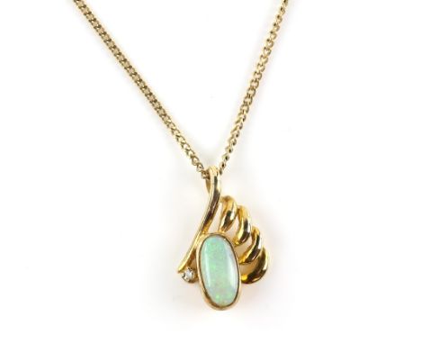
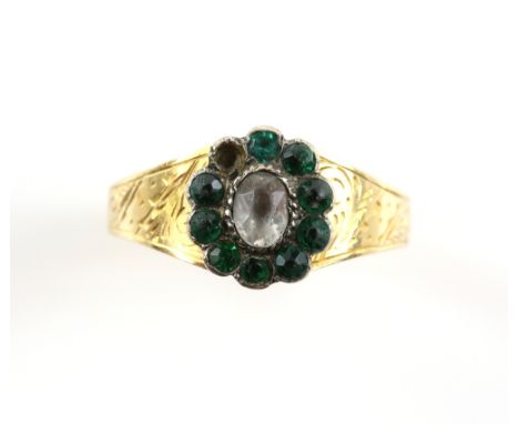
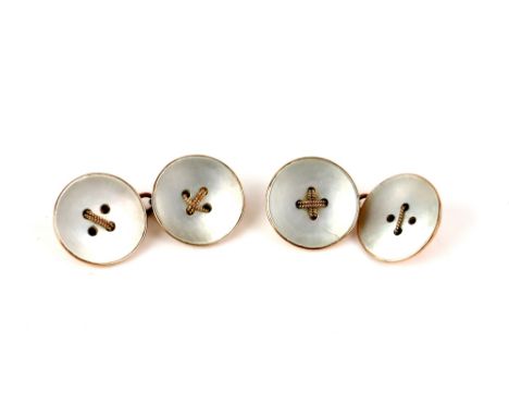
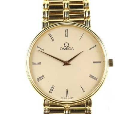
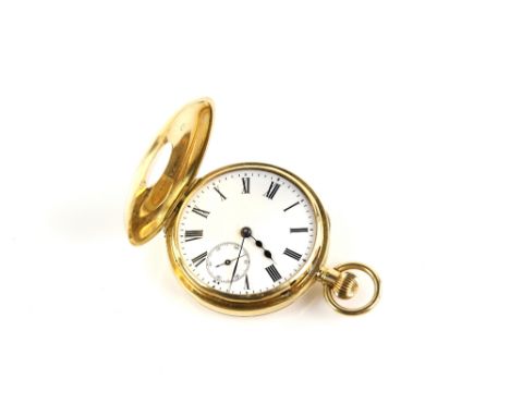
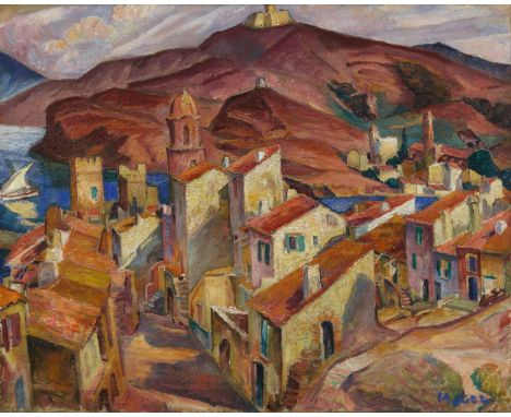
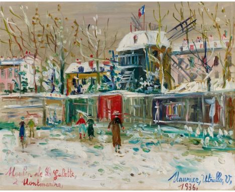
Eglon van der NeerLaute spielende junge Frau Öl auf Holz. 33,5 x 25,5 cm.Signiert oben rechts: E. van der Neer fe.ProvenienzGerard Hoet II. (1698-1760). - Auktion seiner Sammlung, Den Haag, 25.8.1760, Lot 65. - Möglicherweise Sammlung Blankensee, Berlin, 1856 (nach Parthey). - Francis Palmer, Paris (verso auf der Tafel Klebezettel mit dessen Wappen). - Max Flersheim (1849-1922), Paris. - Emil Glückstadt (1875-1923), Kopenhagen. - Auktion seiner Sammlung, Winkel, Magnussen, Kopenhagen, 2.6.1924, Lot 680. - Galerie M. & G. Segal, Basel, 1989. - Galerie Edel, Köln, 1990 (ausgestellt auf der TEFAF, Maastricht, 1990). - Dort erworben.AusstellungenKöln, Wallraf-Richartz-Museum (Leihgabe von ca. 1993-2002).LiteraturWohl Pieter Terwesten: Catalogus of naamlyst van schilderyen […], Den Haag 1770, S. 226. - Möglicherweise Gustav Parthey: Deutscher Bildersaal. Verzeichniss der in Deutschland vorhandenen Oelbilder verstorbener Maler, Bd. II, Berlin 1864, S. 186. - Wohl Cornelis Hofstede de Groot: Beschreibendes und kritisches Verzeichnis der Werke der hervorragendsten holländischen Maler des XVII Jahrhunderts, 10 Bde., Esslingen und Paris, 1910-28, Bd. 5, Esslingen und Paris 1912, S. 526, Nr. 75a oder S. 527, Nr. 81a. - Corinna Klein, in: Ekkehard Mai (ed.): Das Kabinett des Sammlers, Köln 1993, S. 193, Nr. 77, mit Abb. - Everhard Korthals Altes: Philip van Dijk, een achttiende-eeuwse Haagse schilder-kunsthandelaar met een lokale en internationale clientèle, in: Oud Holland 116, 2003, S. 172. - Eddy Schavemaker: Eglon van der Neer (1635/36-1703). Zijn leven en werk (=Diss. Utrecht), Utrecht 2009, S. 437, Nr. 109, Abb. S. 436. - Eddy Schavemaker: Eglon van der Neer (1635/36-1703). His Life and Work (=Aetas aurea 22), Doornspijk 2010, S. 497, Nr. 104, Farbtafel XXXVI.Eglon van der Neer schuf zahlreiche Darstellungen eleganter junger Frauen, die zumeist in einem vornehmen Interieur des gehobenen Bürgertums einer alltäglichen Beschäftigung nachgehen. Ein vom Künstler bevorzugtes und im Verlauf seiner Karriere immer wieder aufgegriffenes Motiv ist die Lautenspielerin. In unserem mit feinmalerischer Präzision ausgeführten Gemälde sitzt eine musizierende Frau annähernd frontal zum Betrachter gewandt, wobei die Beine leicht nach links gerichtet sind und der Oberkörper ein wenig nach rechts gewandt ist. Mit graziösen Bewegungen zupft sie die Seiten der Laute und greift die Bünde am Steg des Instruments, während der leicht geöffnete Mund vermuten lässt, dass sich die Musikerin mit der Laute selber beim Gesang begleitet. Am rechten Bildrand dürften die entsprechenden Notenblätter auf einem mit einer roten Samtdecke bedeckten Tisch stehen.Das von links einfallende Licht modelliert die Figur der jungen Dame und lässt den Schatten des Instrumentenhalses auf ihren linken Unterarm fallen. Das Licht sorgt zudem für das virtuos wiedergegebene Schimmern der kostbaren, apricotfarbenen Seide beim Rock der Lautenspielerin. Eglon van der Neer konkurrierte bei der effektvollen Wiedergabe der stofflichen Textur von Seide und anderen pretiösen Stoffen mit Gerard ter Borch. Zum schimmernden Seidenrock trägt die junge Frau eine weiße, mit weitgebauschten Ärmeln versehene Leinenbluse, die jedoch schon leicht lasziv von der Schulter gerutscht ist. Neben dem strahlenden Weiß der Bluse und dem hellen Inkarnat wird das Kolorit unseres Gemäldes von einem delikaten Farbakkord bestimmt, der aus dem Apricot des Rocks, dem tiefdunklen Rot der samtenen Tischdecke und dem warmen Braun des Lautenkörpers gebildet wird.Eddy Schavemaker hat unser Gemälde auf die erste Hälfte der 1680er Jahre datiert, als Eglon van der Neer in Brüssel lebte. Geboren wurde der Künstler in Amsterdam als Sohn des Landschaftsmalers Aert van der Neer. Nach seiner Ausbildung arbeitet er zunächst von 1654 bis 1659 im südfranzösischen Orange, danach abwechselnd in Rotterdam und Amsterdam, bevor er 1679 nach Brüssel übersiedelt, wo er bis 1695 lebt. 1687 wird van der Neer zum Hofmaler des spanischen Königs Karl II. ernannt, elf Jahre später zum Hofmaler des Pfälzer Kurfürsten, in dessen Residenzstadt Düsseldorf er 1703 gestorben ist. Neben eleganten Genredarstellungen wie dem vorliegenden Gemälde führte van der Neer Portraitaufträge aus und schuf darüber hinaus einige religiöse und mythologische Gemälde sowie in seinen späteren Lebensjahren vermehrt Landschaftsansichten. Zusammen mit Adriaen van der Werff, seinem bedeutendsten Schüler, und Godefridus Schalcken gilt Eglon van der Neer als einer der Vollender der Leidener Feinmalerei. Eglon van der NeerA young woman, playing the lute Oil on panel. 33.5 x 25.5 cm.Signed upper right: E. van der Neer. fe.ProvenanceGerard Hoet II. (1698-1760);His sale, The Hague, 25 August 1760, lot 65;Possibly Blankensee collection, Berlin, 1856 (according to Parthey);Francis Palmer, Paris (label on the reverse with his coat-of-arms);Max Flersheim (1849-1922), Paris;Emil Glückstadt (1875-1923), Copenhagen;His sale, Copenhagen, Winkel, Magnussen, 2.6.1924, lot 680;M. & G. Segal, Basel, 1989;Klaus Edel, Cologne, 1990.ExhibitionsCologne, Wallraf-Richartz-Museum (on loan ca. 1993-2002).LiteraturePossibly Pieter Terwesten: Catalogus of naamlyst van schilderyen […], The Hague 1770, p. 226;Possibly Gustav Parthey: Deutscher Bildersaal. Verzeichniss der in Deutschland vorhandenen Oelbilder verstorbener Maler, vol. 2, Berlin 1864, p. 186;Possibly Cornelis Hofstede de Groot: Beschreibendes und kritisches Verzeichnis der Werke der hervorragendsten holländischen Maler des XVII. Jahrhunderts, Esslingen and Paris 1912, vol. 5, p. 526, no. 75a or p. 527, no. 81a;Corinna Klein, in: Ekkehard Mai (ed.): Das Kabinett des Sammlers, Cologne 1993, p. 193, no. 77, ill. p. 194;Everhard Korthals Altes: Philip van Dijk, een achttiende-eeuwse Haagse schilder-kunsthandelaar met een lokale en internationale clientèle, in: Oud Holland, CXVI (2003), p. 172;Eddy Schavemaker: Eglon van der Neer (1635/36-1703). Zijn leven en werk (=Diss. Utrecht), Utrecht 2009, p. 437, no. 109, ill. p. 436;Eddy Schavemaker: Eglon van der Neer (1635/36-1703). His Life and Work (=Aetas aurea 22), Doornspijk 2010, p. 497, no. 104, colour plate XXXVI.Eglon van der Neer created several depictions of elegant young ladies, most of whom pursue an everyday activity in a distinguished interior of the haute bourgeoisie. One of the artist's preferred motifs, taken up time and again throughout his career, is the lute player. In our painting, executed with fine painterly precision, a lady playing music is seated almost directly facing the viewer with her legs pointing slightly to the left and her upper body turned slightly to the right. She plucks at the lute with graceful movements and grasps the frets on the bridge of the instrument, while her slightly open mouth suggests that the musician is accompanying her with the lute while singing. The likely corresponding sheets of music can be seen on a table covered with a red velvet cloth on the right edge of the picture. The light coming from the left models the figure of the young lady so the shadow of the neck of the instrument falls on her left forearm. The light also generates the virtuoso shimmer of the precious, apricot-coloured silk on the lute player's skirt. Eglon van der Neer competed witFull description on lot-tissimo.com
Cornelis KickStillleben mit Römerglas, Orange und Zitronen Öl auf Holz. 43 x 31,5 cm.Signiert Mitte rechts: Corn. Kick.ProvenienzAuktion Sotheby-Mak van Waay, Amsterdam, 30.11.1981, Lot 54.AusstellungenHolländische Malerei aus Berliner Privatbesitz, Berlin, Gemäldegalerie Staatliche Museen Preußischer Kulturbesitz, 1984, Nr. 31.LiteraturJan Kelch: Ausst.-Kat. „Holländische Malerei aus Berliner Privatbesitz“, Berlin 1984, S. 66-67, Nr. 31, mit Abb. – Susanne Rütten, in Ekkehard Mai (Hg.): Das Kabinett des Sammlers, Köln 1993, S. 144-145, Nr. 56, mit Abb.Vor tiefdunklem Hintergrund präsentiert uns der Amsterdamer Stilllebenmaler Cornelis Kick genau sieben Objekte, eng aneinander und nahe an den Rand einer Steinplatte gerückt: ein mit Weißwein halb gefülltes Römerglas, eine Orange, eine Zitrone, ein aufgeschnittenes Zitronenachtel, eine dünne Zitronenscheibe, ein kleiner Zitronenkern und ein Messer, dessen elfenbeinerner Griff leicht über die Tischkante hervorragt. Mit diesen wenigen Gegenständen - hinzu kommen noch einige Wassertropfen - schafft Cornelis Kick eine spannungsreich leicht aus der Mittelachse gerückte Komposition, die insbesondere durch den starken Kontrast der strahlend hell wiedergegebenen Früchte zur dunklen Steinplatte und zum tiefdunklen Hintergrund die Aufmerksamkeit des Betrachters auf sich zieht. Das prachtvolle Römerglas hebt sich vom dunklen Hintergrund vor allem durch die meisterhaft gesetzten Lichtreflexe und -spiegelungen ab: Die obere Hälfte des Kelchs wird lediglich durch linienförmige Lichtreflexe am Rand sowie eine flächige Spiegelung an der Wandung wahrnehmbar, im unteren Teil des Kelchs sind es gelbliche Reflexe, die den Eindruck von Weißwein evozieren, und am Schaft wiederum unzählige winzige, punktförmige Lichtreflexe, die die Darstellung der himbeerförmigen Verzierungen erzeugen.Schon Arnold Houbraken rühmte in seiner 1718/19 erschienenen „De groote schouburgh“ die detaillierte Wiedergabe der Objekte in den Stillleben Kicks. Dennoch gibt der Künstler bis heute Rätsel auf: So wird schon sein Geburtsdatum in der Literatur unterschiedlich mit 1634 oder 1635 angegeben. Neben seiner Tätigkeit als Maler hat Kick möglicherweise einen Laden geführt, sicher erscheint nur, dass er zeitlebens in bzw. vor den Toren der Stadt Amsterdam lebte und zu seinen Schülern die bedeutenden Stilllebenmaler Jacob van Walscapelle und Elias van den Broeck gehörten. Houbraken berichtete in seiner „groote schouburgh“ auch von Portraitdarstellungen des Cornelis Kick („Hy zelf schilderde ook Beelden en Pourtretten“), allerdings sind Bildnisse aus seiner Hand heute nicht mehr nachweisbar. So sind es nunmehr ausschließlich Stillleben, insbesondere Blumenstücke, für die der Künstler bekannt ist, und die wegen ihrer genauen Naturbeobachtung und der brillanten Wiedergabe der Oberflächentexturen und Lichtreflexe geschätzt werden. Insgesamt sind Werke des Künstlers ausgesprochen rar - noch rarer sind seine Stillleben mit Früchten oder kostbaren Gegenständen wie unser vorliegendes Gemälde, das sowohl durch die Monumentalisierung alltäglicher Gegenstände als auch die Atmosphäre der Stille bis heute fasziniert. Cornelis KickStill life with a Roemer, an Orange and Lemons Oil on panel. 43 x 31.5 cm.Signed centre right: Corn. Kick.ProvenanceAnonymous sale, Sotheby-Mak van Waay, Amsterdam, 30 November 1981, lot 54.ExhibitionsHolländische Malerei aus Berliner Privatbesitz, Berlin, Gemäldegalerie, 1984, no. 31.LiteratureJan Kelch: Holländische Malerei aus Berliner Privatbesitz, Berlin 1984, exhib. cat., pp. 66-7, no. 31, reproduced;Susanne Rütten, in Ekkehard Mai (ed.): Das Kabinett des Sammlers, Cologne 1993, pp. 144-145, no. 56, reproduced.The Amsterdam still life painter Cornelis Kick presents exactly seven objects in front of a dark background, placed close together and towards the edge of a stone slab: a Roemer glass half filled with white wine, an orange, lemon, a lemon wedge, a thin slice of lemon, a small lemon pip and a knife with its ivory handle protruding slightly over the edge of the table. With these few objects, as well as a few drops of water, Cornelis Kick creates an exciting composition that is slightly off-centre, and attracts the observer especially through the strong contrast of the bright fruits against the dark stone slab and the deep dark background. The splendid Roemer glass stands out against the dark background particularly through the masterfully placed light reflections and mirroring: The upper half of the goblet is only noticeable by the linear light reflections on its edge as well as a flat mirroring on its side. In the lower part of the goblet, yellow reflections evoke the impression of white wine and countless tiny, dot-shaped points of light on the stem evoke the raspberry-shaped decorations. Arnold Houbraken had already praised the detailed reproduction of the objects in Kick's still life in his De groote schouburgh published in 1718/19. The artist nevertheless poses riddles to this day: His date of birth is listed in the literature as 1634 or 1635; aside his activity as a painter, Kick may have had a shop. The only thing that seems certain is that he lived all his life in or just outside the city of Amsterdam and that his students included the important still life painter Jacob van Walscapelle and Elias van den Broeck. In his De groote schouburgh, Houbraken also reported on Cornelis Kick's portraits (Hy zelf schilderde ook Beelden en Pourtretten), although none are identifiable as by him today. It is therefore exclusively still lifes, especially flowers, for which the artist is known, and which are appreciated for their precise observation of nature and the brilliant reproduction of surface textures and light reflections. On the whole, works by the artist are extremely rare - rarer still are his still lifes with fruits or precious objects such as the present painting which continue to fascinate today through the monumentalising of everyday items and the atmosphere of stillness.
A SILVER 'AMOEBA' NECKLACE, BY HENNING KOPPEL FOR GEORG JENSEN, CIRCA 1947 Composed of a series of openwork amoebic-shaped links, with maker's mark for Georg Jensen since 1945, stamped 'Sterling Denmark', numbered '89', length 43.5cm The bracelet of same design is illustrated page 98 from 'Simply Danish, Silver Jewellery 20th Century' by Jorg Schwandt For similar example of this necklace, see page 154 from 'Georg Jensen, A Tradition Of Splendid Silver' by Janet Drucker Henning Koppel (1918-1981) was a Danish designer and artist well-known as an early pioneer of 20th century functionalism. He studied sculpture at the Royal Danish Academy and then later at the Academie Ranson in Paris. As a result of his Jewish background Koppel sought refuge in Sweden during the Second World War. Koppel was one of the more prominent designers to feature with Jensen. His stint began in 1945, prior to this he was mentored by Harald Nielsen On returning to Denmark after the war, he secured a contract working with Georg Jensen, a collaboration that launched his career as a jewellery designer. Amongst his early creations - a series of necklaces and bracelets resembling whale vertebrae and microscopic organisms - were miniature masterpieces of highly original modelling. These designs were unlike anything that had been produced in the Jensen workshop in the previous 40 years and he became one of the most iconic designers for the company. Koppel specialised in abstract forms that were both startling and beautiful. His work, similar to Jensen's has a sculptural element to it. Koppel was mindful of the jewellery he was creating and how it would interact with natural light - Jensen also considered this. Koppel created tactile works, that evoke a wanting to touch them. In the place of jewels, he would use enamels. Koppel created an astonishing range of work throughout his career from one off signature designs to everyday objects. Both were defined by their elegant but functional qualities, in flowing organic forms. Koppel was a master draughtsman who executed precise drawings for his works which allowed him to understand the design's three dimensionality. He won many awards including three Gold Medals at the Milan Triennial, the International Design Award of the American Institute of Designers and the Lunning Prize. Koppel's works are represented in numerous museums worldwide.
A SILVER NECKLACE, BY HENNING KOPPEL FOR GEORG JENSEN, CIRCA 1950 Composed of a series of fancy-shaped links with a round-shaped cabochon lapis lazuli clasp, with maker's mark for Georg Jensen since 1945, stamped '925 Sterling Denmark', numbered '130B', length 43cm Henning Koppel (1918-1981) was a Danish designer and artist well-known as an early pioneer of 20th century functionalism. He studied sculpture at the Royal Danish Academy and then later at the Academie Ranson in Paris. As a result of his Jewish background Koppel sought refuge in Sweden during the Second World War. Koppel was one of the more prominent designers to feature with Jensen. His stint began in 1945, prior to this he was mentored by Harald Nielsen On returning to Denmark after the war, he secured a contract working with Georg Jensen, a collaboration that launched his career as a jewellery designer. Amongst his early creations - a series of necklaces and bracelets resembling whale vertebrae and microscopic organisms - were miniature masterpieces of highly original modelling. These designs were unlike anything that had been produced in the Jensen workshop in the previous 40 years and he became one of the most iconic designers for the company. Koppel specialised in abstract forms that were both startling and beautiful. His work, similar to Jensen's has a sculptural element to it. Koppel was mindful of the jewellery he was creating and how it would interact with natural light - Jensen also considered this. Koppel created tactile works, that evoke a wanting to touch them. In the place of jewels, he would use enamels. Koppel created an astonishing range of work throughout his career from one off signature designs to everyday objects. Both were defined by their elegant but functional qualities, in flowing organic forms. Koppel was a master draughtsman who executed precise drawings for his works which allowed him to understand the design's three dimensionality. He won many awards including three Gold Medals at the Milan Triennial, the International Design Award of the American Institute of Designers and the Lunning Prize. Koppel's works are represented in numerous museums worldwide.
A FINE GEM-SET AND DIAMOND BRACELET, BY FRED PARIS, CIRCA 1970 - 1980 Of articulated design, composed of four large openwork bombé links set with alternating sapphire, ruby and emerald cabochons highlighted with brilliant-cut diamonds throughout with textured gold detail, mounted in 18K gold, diamonds approximately 10.00cts, signed Fred Paris, with maker's mark 'AV' for André Vassort, French assay marks, with maker's case, length 17cm Fred Samuel (1908-2006) established his jewellery brand in 1936 in Paris, where he spent much of his professional life. Originally from Buenos Aires, born into a family that dealt in precious stones, it was no surprise he conceived a passion for cultured pearls and won recognition as a leading expert in the field. Fred imbued his designs with the energy of South America, saying his creations were inspired by the life, the light, the movement, the energy of the continent. This passion is expressed through the use of coloured gemstones and playful motifs. During World War II, Fred Samuel fled Paris and became an interpreter for the Allies. After the war, the brand changed its name to from Fred Samuel to 'Fred' due to anti-Jewish sentiment in post-war Germany. Describing himself in 1936 as a 'Contemporary Creative Jeweller', he proved this through his striking modern designs, with rounded, curvaceous lines. Fred became famous for jewels designed by Jean Cocteau and for its famous clients, such as Marlène Dietrich and the royal family of Monaco, including princess Grace. In 1966 Fred Paris was the inventor of cable jewellery 'Force 10' (made of stainless steel) and this feature is still very prominent today in ring, bracelet, pendant and necklace designs. As the brand grew, new stores were opened across the world; 1976 Monte Carlo, 1981 Cannes, 2001 Tokyo and 2007 Beijing, Dubai and Bogotá. The company became the property of LVMH in 1996 and Fred collaborated with Kate Moss for the design of an exclusive collection in 2012. Fred Paris designed the iconic 23 heart-shaped ruby necklace interlaced with diamonds, which was gifted to Julia Roberts by Richard Gere in the film Pretty Woman. The last major film for which Fred Paris provided jewellery was Casino Royale starring Daniel Craig, featuring the star collection pendant and earrings. This magnificent bracelet is a unique creation of Fred. n 1995 FRED joined the Moet Hennessy Louis Vuitton LVMH group. In the secluded streets of Paris, shadowed by the celebrity of the great jewellery maisons of France, work the craftsmen whose talents satisfy the constant appetite for glamour. In December 1955, at 34 rue Sainte Anne, André Vassort registered his atelier and soon became one of the most sought-after jewellers in France. He was quickly employed by names such as Boucheron, Van Cleef and Arpels, Mauboussin and FRED. His work adorned their most discerning clients and he became a favourite in carrying out special commissions. Of particular note was the crown that he created under Van Cleef and Arpels for Empress Farah of Iran. Taking six months to complete, the magnificent piece is iridescent with diamonds, emeralds, rubies and pearls, mounted in white gold and set against a backdrop of forest-green velvet. Vassort specialised in working with gold, drawn to the warmth and texture that could be coaxed from the metal, however, he did not shy away from other materials. His understanding of gemstones allowed him to create bold and colourful pieces, exemplified in this lot. Working anonymously for larger houses, a large portion of Vassort's work is unsigned, but, here, we are gifted with his maker's mark 'AV'. When André Vassort closed his workshop in the early 1990s, his name and work were revered within the jewellery industry and his pieces had become synonymous with enduring quality.
A FINE GEM-SET AND DIAMOND PENDANT/BROOCH, BY FRED PARIS, CIRCA 1975 -1980 Designed as a stylised present bow, centring a ruby cabochon within a surround of brilliant-cut diamonds, the ribbons of openwork decorated with alternating sapphire, emerald and ruby cabochons with brilliant-cut diamond highlights throughout, mounted in 18K gold, diamonds approximately 6.00cts total, signed Fred Paris, with maker's marks for André Vassort (partially rubbed), French assay marks, with brooch and pendant fitting, length 6.4cm Fred Samuel (1908-2006) established his jewellery brand in 1936 in Paris, where he spent much of his professional life. Originally from Buenos Aires, born into a family that dealt in precious stones, it was no surprise he conceived a passion for cultured pearls and won recognition as a leading expert in the field. Fred imbued his designs with the energy of South America, saying his creations were inspired by the life, the light, the movement, the energy of the continent. This passion is expressed through the use of coloured gemstones and playful motifs. During World War II, Fred Samuel fled Paris and became an interpreter for the Allies. After the war, the brand changed its name to from Fred Samuel to 'Fred' due to anti-Jewish sentiment in post-war Germany. Describing himself in 1936 as a 'Contemporary Creative Jeweller', he proved this through his striking modern designs, with rounded, curvaceous lines. Fred became famous for jewels designed by Jean Cocteau and for its famous clients, such as Marlène Dietrich and the royal family of Monaco, including princess Grace. In 1966 Fred Paris was the inventor of cable jewellery 'Force 10' (made of stainless steel) and this feature is still very prominent today in ring, bracelet, pendant and necklace designs. As the brand grew, new stores were opened across the world; 1976 Monte Carlo, 1981 Cannes, 2001 Tokyo and 2007 Beijing, Dubai and Bogotá. The company became the property of LVMH in 1996 and Fred collaborated with Kate Moss for the design of an exclusive collection in 2012. Fred Paris designed the iconic 23 heart-shaped ruby necklace interlaced with diamonds, which was gifted to Julia Roberts by Richard Gere in the film Pretty Woman. The last major film for which Fred Paris provided jewellery was Casino Royale starring Daniel Craig, featuring the star collection pendant and earrings. This magnificent bracelet is a unique creation of Fred. n 1995 FRED joined the Moet Hennessy Louis Vuitton LVMH group. In the secluded streets of Paris, shadowed by the celebrity of the great jewellery maisons of France, work the craftsmen whose talents feed the ever-hungry mouths of glamour. In December 1955, at 34 rue Sainte Anne, André Vassort registered his atelier and soon became one of the most sought-after jewellers in France. He was quickly employed by names such as Boucheron, Van Cleef and Arpels, Mauboussin and FRED. His work adorned their most discerning clients and he became a favourite in carrying out special commissions. Of particular note was the crown that he created under Van Cleef and Arpels for Empress Farah of Iran. Taking six months to complete, the magnificent piece is iridescent with diamonds, emeralds, rubies and pearls, mounted in white gold and set against a backdrop of forest-green velvet. Vassort specialised in working with gold, drawn to the warmth and texture that could be coaxed from the metal, however, he did not shy away from other materials. His understanding of gemstones allowed him to create bold and colourful pieces, such as the current lot. Working anonymously for larger houses, a large portion of Vassort's work is unsigned, but, here, we are gifted with his maker's mark 'AV'. When André Vassort closed his workshop in the early 1990s, his name and work were revered within the jewellery industry and his pieces had become synonymous with enduring quality.
A SILVER BROOCH, DESIGNED BY HENNING KOPPEL FOR GEORG JENSEN, CIRCA 1950 Designed as an abstract sail boat, with maker's mark for 'Georg Jensen' since 1945, numbered '375', stamped '925 S Denmark', width 7cm Henning Koppel (1918-1981) was a Danish designer and artist well-known as an early pioneer of 20th century functionalism. He studied sculpture at the Royal Danish Academy and then later at the Academie Ranson in Paris. As a result of his Jewish background Koppel sought refuge in Sweden during the Second World War. Koppel was one of the more prominent designers to feature with Jensen. His stint began in 1945, prior to this he was mentored by Harald Nielsen On returning to Denmark after the war, he secured a contract working with Georg Jensen, a collaboration that launched his career as a jewellery designer. Amongst his early creations - a series of necklaces and bracelets resembling whale vertebrae and microscopic organisms - were miniature masterpieces of highly original modelling. These designs were unlike anything that had been produced in the Jensen workshop in the previous 40 years and he became one of the most iconic designers for the company. Koppel specialised in abstract forms that were both startling and beautiful. His work, similar to Jensen's has a sculptural element to it. Koppel was mindful of the jewellery he was creating and how it would interact with natural light - Jensen also considered this. Koppel created tactile works, that evoke a wanting to touch them. In the place of jewels, he would use enamels. Koppel created an astonishing range of work throughout his career from one off signature designs to everyday objects. Both were defined by their elegant but functional qualities, in flowing organic forms. Koppel was a master draughtsman who executed precise drawings for his works which allowed him to understand the design's three dimensionality. He won many awards including three Gold Medals at the Milan Triennial, the International Design Award of the American Institute of Designers and the Lunning Prize. Koppel's works are represented in numerous museums worldwide.
MARAT, Jean-Paul (1743-93). Recherches Physiques sur l' Electricité. Paris: De l' Imprimerie de Clousier, 1782. 8vo (202 x 122mm). Half title ("Oeuvres de M. Marat"), 5 folding engraved plates, one-page of errata on verso of final text leaf (many dark spots occasionally touching letters, I3 torn without loss, some light mainly marginal spotting and staining). Contemporary marbled calf, spine gilt with red morocco lettering-piece (spine and edges of boards quite heavily rubbed, extremities rubbed). Provenance: old annotation to p.29. FIRST EDITION. Blake 287; Ekelöf Cat. 557; Mottelay p.269; Ronalds p.322; Wheeler Gift 509; not in Brunet.
HOBBES, Thomas (1588-1679). Opera Philosophica, Quae Latinè scripsit, Omnia. Antè quidem per partes, nunc autem, post cognitas omnium objectiones, conjunctim & accuratiùs edita. Amsterdam: Apud Joannem Blaeu, 1668. Parts I - IV (only, of 8) bound in one volume, 4to (198 x 150mm). Woodcut printer's device on title, folding engraved portrait of Thomas Hobbes by W. Faithorne, initials, ornaments, 24 engraved plates [?only, see footnote], 6 of which folding, 7 engraved diagrams, woodcut diagrams, tables (occasional light spotting and staining, a few darker spots, a few leaves lightly browned, minor printing flaw on Qq9v). Contemporary vellum, yapp edges, traces of title in old manuscript on spine (lightly stained). THE FIRST PART OF THE FIRST COLLECTED EDITION OF HOBBES' WORKS. This work has a notoriously problematic collation. The present copy has the following sections: Problemata physica ([A] - F2, pp. 1 - 44, 2 engraved plates [unnumbered]); Examinatio et emendatio mathematicae hodiernae ([A1] - T1, pp. 1 - 146, 2 engraved plates numbered "fig. 2" and "fig. 3"); Elementorum philosophiae sectio prima de corpore ([Aaa1] - Llll3, p. 1 - 261, 12 engraved plates numbered XIV, XVI, XVII, XVIII, XIX, XXI, XXII, XXIII, XXIIII, XXVI, XXVII and a single plate numbered "XXVIII et XXX"); Elementorum philosophiae sectio secunda de homine[Aa1] - LL3 ("Finis"), pp. 1 - 86, followed by 2 [?later] blanks, 8 engraved plates numbered Ad cap. II, III, IIII, V, VI, VII, VIII and IX). Brunet II, 598: "Collection recherchée et devenue rare" [1842]; Lowndes II, 1078; Macdonald & Hargreaves 104. Sold not subject to return.
SECCHI, Angelo (1818-78). Le Soleil ... Deuxième Edition, revue et augmentée. Paris: Gauthier-Villars, 1875. 3 volumes including "Atlas" vol., large 8vo (235 x 155mm), "Atlas" (237 x 210mm). Half titles, illustrations and diagrams, 3 plates in the text vol., of which 2 coloured, 6 double-page plates in the "Atlas" vol. (some light spotting and staining). Contemporary red half morocco gilt, gilt edges (rubbed). The author, an Italian Catholic priest, was a pioneer in astronomical spectroscopy and was one of the first scientists to state authoritatively that the Sun is a star. (3)
ROZIER, François (1734-93). Observations sur la Physique, sur l' Histoire Naturelle et sur les Arts. Paris: Au Bureau du Journal de Physique, January- June 1789. Volume XXXIV [only], 4to (254 x 190mm). Head-piece, 11 engraved plates, one of which folding (repair to blank margin of C[1], a few leaves browned, occasional light spotting, a few darker spots). Contemporary half calf and speckled boards "Society de Gand" stamped in gilt on covers (some worming to upper joints, rubbed and scuffed).
LE CLERC, Sébastien (1637-1714). Traité de Geometrie Theorique et Pratique, a l' Usage des Artistes. Paris: Chez Ch. Ant. Jombert, 1744. 8vo (193 x 120mm). Title and text within double rule border, title with etched vignette by Cochin, etched illustration above the first chapter and at end of chapter VIII and IX, 44 folding engraved plates (?only, of 45 [see footnote], strip torn away from title with slight loss, some holes at gutter towards the beginning, title and first few leaves with large but light waterstain, variable mostly marginal spotting, staining and browning). Contemporary calf (some repairs to spine and corners, rubbed and scuffed). Provenance: "Ce livre se vend à Mons, chez Henri Bottin, Libraire, & Imprimeur, Ruë de la Chef" (printed label on front pastedown); old inscription on title, partly excised; old illegible stamp. FIRST EDITION. Plate counts vary for this work, with most copies recorded as having 45; the present copy has complete numbered sequences of plates in each chapter, and so is apparently complete with just 44. Cohen-de Ricci 611-612; Fowler 174; not in Brunet. Sold not subject to return.
BAUR, Johann Wilhelm (1607-40). Iconographia complectens in se, passionem, miracula, vitam Christi universam, nec non, prospectus rarissimorum portuum palatorium, hortorum, historiarum, aliarumq rerum, quae, per italiam, spectatu sunt dignae, proprio aere aeri incisae, et venales expositae. "Augustae Vindelicorum" [i.e. Augsburg]: A Melchiore Kysell Augustano, 1670-71. 4 parts in one volume, oblong 4to (282 x 330mm). Engraved title and 146 engraved plates by Melchior Keysell after Johann Wilhelm Baur, plate numbers on small squares of card laid down at plate margins (a few marginal tears, some marginal holes, some light mainly marginal spotting and staining). Contemporary vellum (a few stains, some worming). Brunet I, 268; Graesse I, 312.
STURM, Johann Christoph (1635-1703). Collegium experimentale sive curiosum in quo primaria seculi superioris inventa & experimenta physico-mathematica, spetiatim campanae urinatorie, camerae obscura, tubi Torricelliani, seu baroscopii, antliae pneumaticae, thermometrorum, hygroscopiorum, telescopiorum, microscopiorum & c. phaenomena & effecta. Nuremberg: Sumptibus Wolfgangi Mauritii Endteri, 1701 [third and fourth parts dated 1685; fifth part dated 1699]. 5 parts bound in one volume, 4to (195 x 155mm). Half title, 8 folding engraved plates including 4 mounted on stubs at the end [?extracted from another work], engraved illustrations and diagrams, some full-page, woodcut initials and ornaments, tables (some light browning, a few dark spots and small rustholes occasionally touching letters). Contemporary panelled calf, spine with tan morocco lettering-piece (rubbed, some minor erosion to foot of spine). A flying machine is illustrated on p. 64 of the first part and a diving bell on p. 4 of the second part. Graesse VI, 517 (citing the first edition of 1676); not in Brunet. Sold not subject to return.
SPORTING BOOKS - Thomas SMITH (dates unknown). Sporting Incidents in the Life of Another Tom Smith. London: Chapman and Hall, 1867. 8vo (198 x 125mm). Half title, lithographed frontispiece and 12 plates printed on blue paper (some light mainly marginal spotting and staining). Attractively bound in later red half morocco gilt by Riviere & Son, spine gilt in compartments, top edges gilt, others uncut (upper cover detached, extremities rubbed). Provenance: Jonathan E. Backhouse (bookplate). FIRST EDITION. The half title is inscribed, "from the author." With 13 other books of sporting interest, including Surtees' Hillingdon Hall or The Cockney Squire (London, 1888, hand-coloured plates) and seven by H. H. Dixon, all attractively bound in leather. (14)
CHEVALLIER, Alphonse (1793-1879) & Etienne Ossian HENRY (1798-1873). Mémoire sur le Lait. Sa Composition, ses Modifications, ses Altérations ... (Extrait du Journal de Chimie Médicale, de Pharmacie et de Toxicologie.[)] Paris: Felix Locquin et Compagnie, 1839. 8vo (225 x 150mm). Wood-engraved plate, partly hand-coloured, tables (some light staining). 19th-century plain blue wrappers, stitched, unopened. Provenance: old library label pasted onto upper wrapper. [?]First separately-published edition.
SANTORIO, Santorius (1561-1636). De statica medicina aphorismorum sectiones septem: Accedunt in hoc opus commentarii Martini Lister et Georgii Baglivi. Padua: Typis Jo. Baptistae Conzatti, 1710. 12mo (131 x 76mm). Engraved frontispiece, woodcut ornament on title (lower corner of title torn away without loss [?to remove an old signature], margin of *7 repaired affecting a few letters, some mainly marginal staining to a few leaves at the front, occasional light spotting and staining). Contemporary half calf and marbled boards (rubbed). The intriguing frontispiece portrays the author, engaged in one of his experiments on the metabolism, dining at a table while seated in a weighing chair suspended from a pulley. The work was first published in 1642. Bib. Osleriana 3914.
BONNET, Charles (1720-93). Traité d' Insectologie; ou Observations sur les Pucerons. Paris: Chez Durand, 1745. 2 volumes, 8vo (163 x 98mm). Half titles, typographical ornament on titles, 8 folding engraved plates, tables, one folding (lacking one folding table, some very light mainly marginal spotting and staining). Contemporary mottled calf, spines gilt with red and tan morocco lettering-pieces (extremities rubbed). Provenance: L. [?]Minne (old signatures on front free endpapers). FIRST EDITION of this work on insects and aphids by an influential forerunner of evolutionary thought. Garrison & Morton 308: "This pioneering work on experimental entomology incorporates Bonnet's most important discovery - parthenogenetic reproduction - based on his study of aphids. Bonnet used the result of this and other discoveries as a basis for speculation about life on earth. This work presents in tabular form his version of the 'great chain of being'. Bonnet's concept of the essential continuity of life, a consequence of his discovery and pre-formationist interpretation of parthenogenesis, was a major force in the shaping of later evolutionary opinion ..." Nissen ZBI 462; not in Brunet. (2)
MARTIN, Ferdinand (1795-1866). Mémoire sur l' Etiologie du Pied-Bot ... Atlas. Paris: chez l' Auteur, 1839. Oblong 4to (223 x 308mm). 6 lithographed plates by Thierry Frères (some light mainly marginal staining and spotting). Original green printed upper wrapper (lacking lower wrapper, the whole inserted onto tabs into modern cloth-backed paper boards. FIRST EDITION of this rare work on the etiology of the "club-foot."
BINDING - John RUSKIN (1819-1900). The Seven Lamps of Architecture ... Second edition. London: Smith, Elder, and Co., 1855. Large 8vo (251 x 172mm). 14 engraved plates, 2-pages of publisher's advertisements at the end (lacks half title, some light mainly marginal spotting and staining). VERY FINELY BOUND in later half crushed burgundy morocco gilt by Riviere, spine gilt in compartments, gilt edges (joints and corners lightly rubbed). Wise 5.
GOETHE, Johann Wolfgang von (1749-1832). Goethe's Theory of Colours; Translated from the German: with Notes by Charles Lock Eastlake. London: John Murray, 1840. 8vo (212 x 140mm). 4 engraved plates, 3 of which hand-coloured ([?]lacks half title, first few leaves detached or loose, occasional light mainly marginal spotting and staining). Contemporary panelled diced calf (neatly rebacked in old-style, a few leaves detached or detaching at the front). First English edition.
[BRONTË, Charlotte (1816-55), Emily (1818-48) & Anne (1820-49)]. Poems by Currer, Ellis, and Acton Bell. London: Smith, Elder and Co., 1846 [but 1848]. 8vo (169 x 110mm). Errata slip, one-page of publisher's advertisements at the end. Original green cloth with a lyre stamped in blind on the covers, blind-stamped foliate borders, spine lettered in gilt, yellow endpapers (upper joints split, some erosion to foot of spine, some light staining to covers, spine a little faded, corners bumped). FIRST EDITION, second issue. RARE. In 1846, Aylott and Jones of London published the three Brontë sisters' collection of poems under the pseudonyms Currer (Charlotte), Ellis (Emily) and Acton (Anne) Bell. This being their first appearance in print, the authors were completely unknown and the book sold very poorly, with estimates of the number of copies sold of the 1,000 printed ranging from just two to a still paltry thirty-nine. In 1847, Charlotte, still using her pseudonym, published Jane Eyre, and the book was a huge critical and commercial success. On the strength of this, her new publishers, Smith, Elder and Co., bought up the remaindered copies of Poems and published them, in 1848, with a new, or cancel, title page bearing their imprint but with the retrospective date of 1846. By this time, Charlotte's sisters had also had some success with their own novels and the publisher's advertisement at the end of Poems lists, in addition to Charlotte's Jane Eyre, Emily's Wuthering Heights and Anne's The Tenant of Wildfell Hall, whilst still using their Currer, Ellis and Acton Bell pseudonyms. Smith The Brontë Sisters 1.
PRONY, Gaspard Clair François Marie Riche de (1755-1839). Nouvelle Architecture Hydraulique ... Seconde partie, Contenant la Description Détaillée des Machines a Feu. Paris: Chez Firmin Didot, 1796. Second part only (of 2), 4to (313 x 235mm). Wood-engraved ornament on title, tables, 36 fine folding engraved plates, plate 42 mis-numbered as 47, with 2 further folding engraved plates extracted from the "Journal de l' Ecole Polytechnique" at the end (lacks all before title [i.e. blanks], occasional light spotting and staining). Old cloth-backed paper boards (rather worn). Provenance: later library stamp on title. FIRST EDITION. The first volume, not present here, was published in 1790. Brunet III, 846; Poggendorff II, 534.
Histoire de Marie, Alphabet pour les Jeunes Demoiselles [Title on front cover:] Histoire de Marie. Petit Syllabaire de l' Enfance. Metz: Typographie de Gangel, [c. 1840]. 12mo (137 x 98mm). Woodcut device on title, 15 hand-coloured woodcut illustrations ([?]lacking frontispiece or preliminary blank, some light spotting, staining and browning). Original blue boards lettered and decorated in gilt (very faded, lightly stained, extremities rubbed). Provenance: "... Williams, 30 Green Lawn" (old juvenile inscription on front endpaper). RARE. With Our Holiday 1891 ([?]London, c.1891, original photograph inserted, lithographed throughout, original boards gilt, rubbed). (2)
MUSSCHENBROEK, Johann van (1660-1707). Beschreibung der doppelten und einfachen Luftpumpe nebst einer Sammlung von verschiedenen nuzlichen und lehrreichen Versuchen, welche man mit der Luftpumpe machen kan[sic]. Augsburg: Eberhard Klett, 1765. 8vo (170 x 102mm). Woodcut headpiece and ornament, typographical ornament at end of text, 6 folding engraved plates of scientific instruments (small marginal repair to title, some light browning). Modern marbled wrappers over boards. First German edition. Poggendorff II, 247.

-
534325 Los(e)/Seite