Metal finish with embossed design and lettering. First fob front side: Caterpillar; reverse side: Compliments of Arthur J. Gottier Co. - Tolland, Conn. Second fob front view: Caterpillar; reverse side: blank. Third fob front view: CAT; reverse side: blank. Fourth fob front view: Caterpillar Reg. US PAT. Off.; reverse side: Dean Machinery Co. Approximate dimensions for the longest fob: 1.75"L x 1.5"H. Approximate dimensions for the tallest fob: 1.5"L x 2"H. Issued: 20th centuryDimensions: See DescriptionCondition: Age related wear.
We found 596780 price guide item(s) matching your search
There are 596780 lots that match your search criteria. Subscribe now to get instant access to the full price guide service.
Click here to subscribe- List
- Grid
-
596780 item(s)/page
Metal finish with embossed design and lettering. First fob, black and orange enamel over a silver-colored finish, front view: Member 1972 Northwest International Watch Fob Association Inc.; reverse side: 241 Member Stephen R. Curtis IWFAI 1972. Second fob, brass-colored finish, front view: Northwest, depicts a crane on a side of a mountain; reverse side: Presented To Samuel Curtis By Davidson Equip Inc. - Nashville, Tenn. Third fob, pewter-colored finish, front view: Northwest, depicts a crane machinery with clouds in the background; reverse side: Cyril J. Burke Inc. - Detroit, Mich. Approximate dimensions for the largest fob: 2"L x 1.75"H. Issued: 20th centuryDimensions: See DescriptionCondition: Age related wear.
Metal finish with embossed design and lettering. First fob, pentagon shaped, front side: Insley; reverse side: bubble texture finish. Second fob, rectangular shaped, Insley; reverse side: There's An Insley Working Near You. - Indianapolis, Ind. Third fob front side: Hyster; reverse side: blank. Approximate dimensions for the largest fob: 1.25"L x 2"H. Issued: 20th centuryDimensions: See DescriptionCondition: Age related wear.
Metal finish with embossed design and lettering. First fob, octagon shaped, front side: Manitowoc - Shovel, Cranes, Draglines; reverse side: Manitowoc Engineering Corp. - Manitowoc, Wis. Second fob, long rectangular shape, front side: Manitowoc - Shovel, Cranes, Draglines; reverse side: brand impressed marks. Third fob, tall rectangular shape, front side: Manitowoc; reverse side: blank. Approximate dimensions for the largest fob: 1.5"L x 1.75"H. Issued: 20th centuryDimensions: See DescriptionCondition: Age related wear.
Metal finish with embossed design and lettering. 3 Construction Machinery Division - Benton Harbor, Michigan. First fob front side: Michigan Excavator Cranes; reverse side: Tyler Equipment Corp. - Plantsville, Conn. Second fob front side: Michigan Excavator Cranes; reverse side: Michigan Tractor Shovels. The third fob front side: Michigan Tractor Shovels; reverse side: Tyler Equipment Corp. - Wallingford, Conn. Approximate dimensions for a fob: 1.5"L x 1.5"H. Issued: 20th centuryDimensions: See DescriptionCondition: Age related wear.
Metal finish with embossed design and lettering. First fob front view: CAT Track-Type Tractor; reverse side: blank. Second fob front view: Caterpillar; reverse side: Dean-Hanes Machinery Co. Third fob front view: Caterpillar Reg. US PAT Off.; reverse side: Michigan Tractor & Mach. Co. - Novi-Grand Rapids. Fourth fob front view: International Watch Fob Association Inc. Caterpillar; 241 Member Stephen R. Curtis IWFAI 1970. Approximate dimensions for the largest fob: 2"L x 1.75"H. Issued: 20th centuryDimensions: See DescriptionCondition: Age related wear.
Metal finish with embossed design and lettering. Four of the five fobs are colored enameled. First fob front view: Construction Equipment, Eaton Yale & Towne Inc.; reverse side: blank. Second fob front view: Furlow-Laughlin FL Logo; reverse side: Furlow-Laughlin Equipment, Inc. - Baton Rouge, New Orleans. Third fob front view: Columbus Equipment Company; reverse side: By Geo! - Mtta, O. Fourth fob front view: Huber Warco; reverse side: Huber-Warco Company, Motor Graders, Road Rollers, Maintainers - Marion, Ohio, USA. Fifth fob front view: Newington Construction Company; reverse side: blank. Approximate dimensions for the largest fob: 1.75"L x 1.75"H. Issued: 20th centuryDimensions: See DescriptionCondition: Age related wear.
Metal finish with embossed design and lettering. First fob front view: Drott; reverse side: Groff Tractor & Eqt. - Mechanicsburg, PA. Second fob front view: Highway Equipment Co. - Pittsburg-Erie-Dubois; reverse side: American Advertising Specialties Co, Inc. - Pittsburg, PA. Third fob front view: depicts five panels of construction; reverse side: By Geo! Mtta. O. Fourth fob front view: White Construction Equipment; reverse side: dimpled texture finish. Approximate dimensions for the largest fob: 1.75"L x 1.75"H. Issued: 20th centuryDimensions: See DescriptionCondition: Age related wear.
Metal finish with embossed design and lettering. First fob front side: BLH Austin-Western, Graders-Rollers, Sweepers-Cranes; reverse side: Austin-Western Works - Aurora, Ill, and R.W. Bleiler Equipment Co. - W. Hartford, Conn. Second fob front side: BLH Austin-Western; reverse side: Austin-Western Div. - Aurora, Ill. Third fob front side: BLH, colored in red, Austin-Western; reverse side: a manufacturing brand impressed mark. Fourth fob front side: IB Brownhoist; reverse side: Metal Arts Co. - Roch. NY. Approximate dimensions for the longest fob: 2"L x 1.5"H. Approximate dimensions for the tallest fob: 1.75"L x 1.75"H. Issued: 20th centuryDimensions: See DescriptionCondition: Age related wear.
Metal finish with embossed design and lettering. First fob front view: Blue Brute Hand Held Rock Drills; reverse side: Blue Brute, Worthington Corporation - Holyoke, Mass. Second fob front view: Atlas Copco; reverse side: Atlas Copco Inc. - Hackensack, NJ. Third fob front view: IR Ingersoll Rand, depicts a man using a rock drill; reverse side: Carset Jackbits Ingersoll Rand - New York City. Fourth fob front view: shaped as a hand held rock drill; reverse side: GD Gardner-Denver Co. Approximate dimensions for the longest fob: 1.75"L x 1.75"H. Approximate dimensions for the tallest fob: 1.5"L x 2"H. Issued: 20th centuryDimensions: See DescriptionCondition: Age related wear.
Metal finish with embossed design and lettering. First fob front side: Michigan; reverse side: blank. Second fob front side: The Michigan Line, Clark Equipment, Construction Machinery Division - Benton Harbor, Michigan; reverse side: Tyler Equipment Corp. - Wallingford, Conn. Third fob front side: The Michigan Line, Clark Equipment, Tractor Shovel; reverse side: Davidson Equip. Inc. - Nashville, Tenn. Fourth fob front side: Handcock, Clark Equipment, Elevating Scraper; reverses side: blank. Approximate dimensions for the longest fob: 2"L x 1.5"H. Approximate dimensions for the tallest fob: 1.75"L x 1.75"H. Issued: 20th centuryDimensions: See DescriptionCondition: Age related wear.
Metal finish with colored embossed design and lettering. First fob front view: 4th National Watch Fob Show - Norwalk, Ohio. Lima 101.; reverse side: 4th National Watch Fob Show - Norwalk, Ohio, March 30-31, 1968. Second fob front view: 5th National Watch Fob Show - Norwalk, Ohio.; reverse side: International Watch Fob Association Inc. March 29 and 30, 1969. Third fob front side: 8th National Watch Fob Show - Norwalk, Ohio. Jaeger.; reverse side: International Watch Fob Association Inc. March 24,-25,26, 1972. Fifth fob front view: 10th National Watch Fob Show - Strongsville, Ohio. Model 28 - One Man And A Marion Can Move The Earth.; reverse side: International Watch Fob Association Inc. April 5, 6, 7, 1974. Approximate dimensions for the largest fob: 1.75"L x 2"H. Issued: 20th centuryDimensions: See DescriptionCondition: Age related wear.
Metal finish with embossed design and lettering. First fob front view: car-shaped in a light golden-color, with Autocar as the license plate; reverse side: blank. Second fob front view: car grill-shaped, copper-colored, marked Autocar; reverse side: Autocar A Division Of The White Motor Co. - Exton, Pa. Third fob front view: car-shaped in a silvery-color, with Autocar as the license plate; reverse side: blank. Approximate dimensions for the largest fob: 1.25"L x 1.75"H. Issued: 20th centuryDimensions: See DescriptionCondition: Age related wear.
Metal finish with embossed design and lettering. First fob front view: Etnyre; reverse side: blank. Second fob front view: Wellesley Trucking Inc. CE-5-5592; reverse side: blank. Third fob front view: Diamond Reo Trucks; reverse side: Diamond Reo, World's Most Experienced Heavy Duty Truck Builder. Approximate dimensions for the largest fob: 1.5"L x 1.75"H. Issued: 20th centuryDimensions: See DescriptionCondition: Age related wear.
Metal finish with embossed design and lettering. First fob, copper-colored finish, front view: the front side of an Autocar; reverse side: blank. Second fob, brass-colored finish, front view: The Heer Four Wheel Drive; reverse side: Fob Of The Month 5, The Heer Engine Co. - Portsmouth, Ohio. Approximate dimensions for the largest fob: 2"L x 1.75"H. Issued: 20th centuryDimensions: See DescriptionCondition: Age related wear.
Metal finish with embossed design and lettering. First fob front and reverse view: ESCO in red enamel, Earthmoving Equipment. Second fob front view: Scoopmobile LD Series, 4-Wheel Drive; reverse side: Metal Arts Co. - Roch. NY. Third fob front view: Hensley; reverse side: Metal Arts Co. - Roch. NY. Approximate dimensions for the largest fob: 1.5"L x 1.5"H. Issued: 20th centuryDimensions: See DescriptionCondition: Age related wear.
Metal finish with embossed design and lettering. First fob front side: CAT; reverse side: Michigan Tractor & Mach. Co. - Novi-Grand Rapids. Second fob front view: CAT Track-Type Tractor; reverse side: Dean Machinery Co. Third fob front side: Caterpillar Reg. US PAT. Off.; reverse side: Caterpillar Tractor Co. - Peoria, Ill. Fourth fob front view: Caterpillar; reverse side: NH Nagle-Hart, Your Caterpillar Dealer - Madison, Milwaukee, Eau Claire. Approximate dimensions for the largest fob: 1.7"L x 2"H. Issued: 20th centuryDimensions: See DescriptionCondition: Age related wear.
Metal finish with embossed design and lettering. First fob front view: Caterpillar Track-Type Tractor; reverse side: Tractors & Equipment LTD. Fredericton, New Brunswick. Second fob front view: Caterpillar Six tractor; reverse side: Caterpillar Tractor Co. - San Leandro, Cal. Third fob front view: Caterpillar; reverse side: blank. Fourth fob front view: CAT; reverse side: blank. Approximate dimensions for the largest fob: 1.5"L x 2"H. Issued: 20th centuryDimensions: See DescriptionCondition: Age related wear.
Metal finish with embossed design and lettering. First fob front side: Pettie Bone Truck Krane; reverse side: blank. Second fob front side: Lima Cranes; reverse side: Baldwin-Lima Hamilton Corp. - Lima, Ohio. Third fob front side: Grove; reverse side: blank. Approximate dimensions for the largest fob: 2"L x 1.75"H. Issued: 20th centuryDimensions: See DescriptionCondition: Age related wear.
Metal finish with embossed design and lettering. First fob front view: features embossed outline of a dump truck with license plate marked M.T.I.; reverse side: Mitchell Trucking Inc. - South Windsor Conn. Second fob front side: Oshkosh; reverse side: blank. Third fob, colored in red enamel, front side: Member International Watch Fob Assn. Inc.; reverse side: 241 Member Stephen R. Curtis IWFAI 1971. Approximate dimensions for the largest fob: 1.75"L x 1.75"H. Issued: 20th centuryDimensions: See DescriptionCondition: Age related wear.
Metal finish with embossed design and lettering. First and second fob front side: an emboss image of an Allis Chalmers tractor; reverse side: Holmes-Talcotto Co. - Hartford, Conn. Third fob front side: Allis Chalmers Tractors and Road Machinery; reverse side: Allis Chalmer, Tractor Division - Milwaukee, U.S.A. Fourth fob front side: Penn Culvert DA28750 - Malden 48, Massachusetts; reverse side: blank. Fifth fob front side: The W.W. Williams embossed logo; reverse side: Metal Arts Co. - Roch., NY. Approximate dimensions for the largest fob: 2"L x 1.5"H. Issued: 20th centuryDimensions: See DescriptionCondition: Age related wear.
Metal finish with embossed design and lettering. First fob front view: Euclid, depicting a dozer; reverse side: Euclid TC-12. Second fob front view: Euclid, depicting a dump truck; reverse side: Euclid, with a scraper tractor. Third fob front view: Euclid Earth Moving Equipment, with a dump truck; reverse side: Euclid Earth Moving Equipment, with a scraper tractor. Fourth fob front view: Euclid Earth Moving Equipment, The Euclid Road Machinery Co. - Cleveland, O.; reverse side: Metal Arts Co. - Roch. NY.; Fifth fob front view: Euclid, depicting a dump truck; reverse side: L.B. Smith, Inc. - New York States Operations. Approximate dimensions for the longest fob: 2"L x 1.5"H. Approximate dimensions for the tallest fob: 1.75"L x 2.25"HIssued: 20th centuryDimensions: See DescriptionCondition: Age related wear.
Metal finish with embossed design and lettering. First fob front view: shaped as a bulldozer with the John Deere logo on the front; reverse side: Made In U.S.A. Second fob front view: shaped as a John Deere JD570 tractor; reverse side: JD570 Motor Grader John Deere. Third fob, with green enamel border, front view: Jon Deere Type-E 1.5-3-6 H.P.; reverse side: Fob Of The Month 6, John Deere Tractor Co. Waterloo, Iowa. Approximate dimensions for the longest fob: 2"L x 1.5"H. Approximate dimensions for the tallest fob: 1.5"L x 1.75"H. Issued: 20th centuryDimensions: See DescriptionCondition: Age related wear.
Metal finish with embossed design and lettering. First fob, pewter-colored finish, front view: Diamond Reo Trucks; reverse side: Diamond Reo, World's Most Experienced Heavy Duty Truck Builder. Second fob, brass-colored finish, front view: FWD America's Foremost Heavy-Duty Truck; reverse side: FWD, The Four Wheel Drive Auto Co. - Clintonville, Wisconsin. Third fob, white and green enamel over silvery-metal, front view: The Overland Transportation Co. - Charlotte N.C.; reverse side: By Geo! Mtta, O. Approximate dimensions for the largest fob: 1.5"L x 1.75"H. Issued: 20th centuryDimensions: See DescriptionCondition: Age related wear.
Metal finish with embossed design and lettering. First fob, brass-color finish, front view: depicts in an embossed image of two firefighters on the back of a firetruck, a firehose encircles them and an eagle perched on top; reverse side: blank. Second fob, silvery-color finish, front view: an embossed image of an antique mobile fire engine, marked AHRENS-FOX on the front plate; reverse side: By Geo! Matta, O. First fob is approximately: 1.25"L x 2"W x Second fob is approximately: 1.5"L x 1.75"H. Issued: 20th centuryDimensions: See DescriptionCondition: Age related wear.
Metal finish with embossed design and lettering. First fob front side: Komatsu; reverse side: Komatsu Manufacturing Co. Ltd. - Tokyo, Japan. Second fob, bright yellow enameled, front side: PayDozer PayLoader - The Frank G. Hough Co.; reverse side: The Frank G. Hough Co. - Libertyville, Ill. Approximate dimensions for the largest fob: 2"L x 1.75"H. Issued: 20th centuryDimensions: See DescriptionCondition: Age related wear.
Metal finish with embossed design and lettering. First fob front view: GM General Motors Diesel Power; reverse side: The Sign Of Modern Power, Diesel Service, Inc. - West Haven, Hartford. Second fob front view: Terex GM; reverse side: Earthmoving Equipment Division - Hudson, Ohio. Approximate dimensions for the longest fob: 1.75"L x 1.75"H. Approximate dimensions for the tallest fob: 1.25"L x 2"H. Issued: 20th centuryDimensions: See DescriptionCondition: Age related wear.
Metal finish with embossed design and lettering. First fob front side: Massey Ferguson logo; reverse side: blank. Second fob front side and reverse side: Yuan Manufacturing Company. Third fob front side: Disston Keystone Saw, Tool - Steel & File Works; reverse side: Disston Inc. - Philadelphia. Fourth, fifth and sixth fobs front side features mining equipment, and the reverse side is blank. Approximate dimensions for the largest fob: 1.5"L x 1.75"H. Issued: 20th centuryDimensions: See DescriptionCondition: Age related wear.
Metal finish with embossed design and lettering. First fob front view: McCullough Tool Co. Oil Well Tools, Gun Perforators, Houston and Los Angeles; reverse side: Metal Arts Co. - Roch. NY. Second fob front view: Tex-LA Tool & Supply Co., Beaumont Liberty; reverse side: Metal Arts Co. - Roch. NY. Third fob front view: Shull Perforator, Cut-Away View Of Long Knife Perforator; reverse side: Metal Arts Co. - Roch. NY. Approximate dimensions for the largest fob: 1.5"L x 1.75"H. Issued: 20th centuryDimensions: See DescriptionCondition: Age related wear.
DAVID JONES C.H., C.B.E. (BRITISH 1895-1974) ON THE TOW PATH, 1926 signed and dated 26 in pencil (lower right), pencil and watercolour on paper 36cm x 50cm (14 1/8in x 19 ¾in) Private Collection, U.K. David Jones is regarded as one of the most significant modernist writers of his generation. He served with the Royal Welch Fusiliers on the Frontline between 1915-1918 and his magnum opus, In Parenthesis - regarded by peers including T. S. Eliot and W. H. Auden as a masterpiece - is now recognised as one of the most important texts inspired by the First World War. Jones, however, primarily regarded himself as an artist. Having studied at Camberwell Art School and the Westminster School of Art, he became an active participant in exhibition societies including the Seven and Five Group alongside the likes of Ben and Winifred Nicholson, Ivon Hitchens and Frances Hodgkins. Jones’s work is largely figurative in technique, and the chosen medium of watercolour a symbolic decision on the artist’s part, being fluid, mutable and evocative of a long English tradition, from contemporaries including Bawden through Blake and reaching back to medieval illuminations. His works evoke a sense of gentle poetry and depth of meaning. Complex in their apparent simplicity, his oeuvre is perhaps best described in the artist’s own words from 1935:“I should like to speak of a quality which I rather associate with the folk tales of Wales or Celtic derivation, a quality congenial and significant to me which in some oblique way has some connection with what I want to do in painting. I find it impossible to define, but it has to do with a certain affection for the intimate creatureliness of things – a care for, and appreciation of the particular genius of places, men, trees, animals, and yet withal a pervading sense of metamorphosis and mutability.”
ARCHIZOOM ASSOCIATI 'SUPERONDA' SOFA, DESIGNED 1967 comprising two sections in undulating form, upholstered in black vinyl 108cm high, 233cm wide, 34cm deep (42 ½in high, 91 ¾in wide, 13 ¼in deep) Private Collection, London. Designed by the Radical Florentine group Archizoom, this was one of the first sofas conceived without a conventional frame structure. The modular structure allowed it be used as sofa, bed or chaise longue and challenged the bourgeois conventional image of contemporary furniture design.
STUDIO DRIFT (LONNEKE GORDJIN & RALPH NAUTA) FOR CARPENTERS WORKSHOP GALLERY FRAGILE FUTURE 3.8, 2010 edition number 6/8, from an edition of 8 plus 4 Artist's Proofs, dandelion seed, phosphorus bronze, LED and Perspex, in fitted wooden case 21cm high, 21cm long, 21.6cm wide Carpenters Workshop Gallery, London;Property of a Private Aficionado. This work is sold together with a certificate of authenticity from the Carpenters Workshop Gallery.Dutch artists Lonneke Gordijn and Ralph Nauta founded studio DRIFT in 2007 after graduating from the Design Academy in Eindhoven. The first time the pair collaborated was on the project Fragile Future, which formed part of Gordijn’s graduation project, for which they were awarded the first prize Stichting ArtiParti award. The piece consists of numerous ball-shaped LED lamps with real dandelion seeds attached to them, giving the bulbs a flower-like appearance, and the present work is part of this Fragile Future series from 2010.Now working with a multidisciplinary team of 65, studio DRIFT work on experiential sculptures, installations and performances. With both depth and simplicity, DRIFT’s work illuminates the parallels between man-made and natural structures through deconstructive, interactive and innovative processes. The studio’s work manifests the phenomena and hidden properties of nature with the use of technology to learn from the Earth’s underlying mechanisms, and to re-establish our connection to it. DRIFT have exhibited worldwide and have won numerous awards such as the Dezeen Designer of the Year award in 2017, and their work is held in numerous important institutions such as the V&A; in London, LACMA in Los Angeles, and the Stedelijk Museum in Amsterdam.
STEVEN OTTEWILL (BRITISH 1968-) SET OF 9 INTERLOCKING CANDLE HOLDERS, 1990 stamped maker's marks, hallmarked for London 1990, silver, in fitted case each 4cm high, 14cm wide (1 ½in high, 5 ½in wide) (9) Acquired directly from the maker at The New Designers Competition in 1990;Property of a Private Aficionado. Born out of a design brief for the Goldsmiths’ Craftsmanship and Design Awards, Steven Ottewill created the interlocking style. This led to his first ever commission as a young Silversmith at the age of 20 years when he created this set of nine candleholders. So popular was the organic shape, a range developed and now incorporates smaller tea-light holders, napkin rings and salt and pepper. The flowing nature of the design is intended to sit beautifully on any table and to be a delight to arrange.
DIETZ EDZARD (GERMAN 1893-1963) FOR PUHL WAGNER FLAGELLATION, 1925 signed and dated (lower left) and AUSF. PUHL U. WAGNER / GOTTFRIED HEINERSDORFF BERLIN (lower right), stained and leaded glass 166.5cm high, 156cm wide, 8cm deep (65 ½in high, 61 ¼in wide, 3in deep) Private Collection, London. Exhibited:Monza Biennale, German Section, 1925, room 128. The 1925 Biennale aimed to encourage the development of Italian craftmanship. The exhibition program favoured heterogeneity in themes and sections from sacred to graphic arts, and from construction to public art. The German pavilion by the Deutscher Werkbund particularly stood out in 1925.The current work reflects the early influence of the German Expressionists on Edzard's work in the angular human bodies and use of Christian iconography. Before the First World War Edzard studied in Berlin under Max Beckmann, and he was surround by the exciting avant-garde notions of Die Brucke. Following the traumatic war years having been in active military duty for the whole war his work took on a melancholic and reflective tone in the years immediately following the conflict, and it is reflective in his design for this unique stained glass work. The design for the stained glass window gives the impression that it is a particularly personal work, and it has been suggested that it includes a self-portrait of the artist, and that the figure on the right hand side of the image is a portrait of his tutor and artist Max Beckmann.
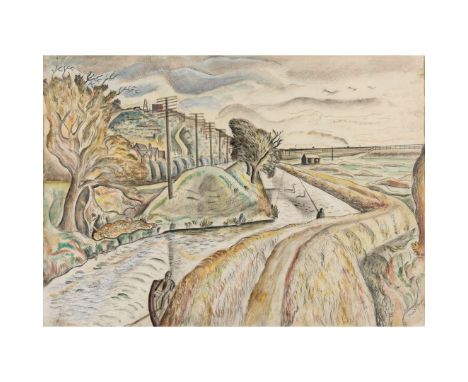
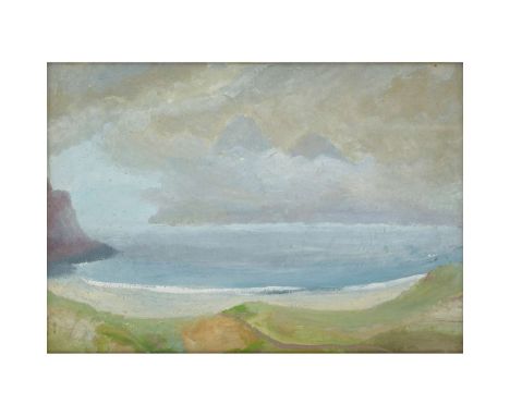
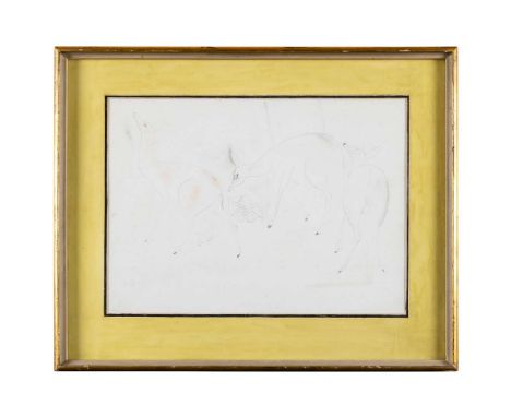
WINIFRED NICHOLSON (BRITISH 1893-1981) SOUND OF RUM FROM BAY OF LAIG, ISLE OF EIGG (THE SINGING SANDS), EARLY 1950s oil on board 58cm x 83.5cm (22 ¾in x 32 7/8in) Acquired from the Artist by her elder son, the late Jake (Jacob) Nicholson (1927-2003) and thence by descent to the present owner Exhibited: Scottish National Gallery of Modern Art, Edinburgh, Winifred Nicholson in Scotland, 10 July - 7 September 2003 and touring to Duff House, Banff, 8 November 2003 – 18 January 2004 and An Tuireann, Skye, 24 January – 20 March 2004;Pier Arts Centre, Stromness, on long-loan 2019 - 2024.Literature: Rhododendrons, Eigg (Pink Rhododendrons) and Sound of Rum from Bay of Laig, Isle of Eigg (The Singing Sands) epitomise Winifred Nicholson’s love for Scotland and in particular the Hebridean island of Eigg. They were acquired from the artist by her son, the designer Jake (Jacob) Nicholson (1927-2003), who cherished them for the rest of his life.Nicholson worked in Scotland repeatedly in the late 1940s and early 1950s, often accompanied by her friend, the poet Kathleen Raine (1908-2003). They stayed on the islands of Eigg and Canna and also in Sandaig on the mainland; there they rented Gavin Maxwell’s cottage, which he immortalised as Camusfèarna in his Ring of Bright Water trilogy.Eigg is just five miles long by five miles wide and is situated twelve miles from Mallaig on the mainland, just south of Skye. Some three decades passed between Nicholson’s first trip there, in the summer of 1950 with Raine and her last, in the Spring of 1980, with her daughter, the artist Kate Nicholson (1929-2019). Raine had idyllic memories of her and Nicholson’s first experience of the island, later recalling: ‘The Factor [of Eigg] was previously employed by Winifred’s father...and he allowed us to camp during the day in an uninhabited cottage where Winifred painted and I wrote, or walked off gathering flowers, many of which Winifred painted…We boiled water and made ourselves cups of tea from time to time and enjoyed the illusion of living there…On our first visit to Eigg I remember it was sultry summer weather and we walked to the top of the island.’ (Quoted in Alice Strang, Winifred Nicholson in Scotland, National Galleries of Scotland, Edinburgh, 2003, p.47)In her turn, whilst there Nicholson wrote to Jake exclaiming ‘Kathleen has written some magical poems. I’ve done about 16 pictures here, how good I don’t know until I get back to look at them against other things.’ (quoted in Strang, op.cit., p.48).Sound of Rum from Bay of Laig, Isle of Eigg reveals Nicholson’s deep connection with the Scottish sea- and landscape and her sensitivity to the gentle, shimmering light unique to the area. The bay, on Eigg’s west coast, commands fine views over the sea to Rum, whose Cuillin peaks are seen emerging from diaphanous clouds. There is a sense of island remoteness and purity. This painting is also known as The Singing Sands after the nearby beach of Camas Sgiotaig, where in certain conditions the sand makes noises when walked upon. This magical natural phenomenon has been explained by Geoffrey Grigson thus:‘Dry blown sand around the coast may emit an unexpected sound, slight or pronounced, when you walk over it or drag a stick across it. Off the dunes and below the high-tide mark, water is drawn in and held between the grains of sand by capillary action. The grains do not touch. Without this watev r cushion dry grains rub together when they are moved, and if they are of the same shape and size they jerk against or across each other as they do so, vibrating and “singing”.’ (Geoffrey Grigson, The Shell Country Alphabet, from Apple Trees to Stone Circles, How to Understand the British Countryside, Particular Books, London, 2009, p.344)When creating the work, Nicholson positioned herself behind and above the white foreshore in order to embrace the curve of the bay. Undulating ground, cliff and hill combine to create an awareness of natural rhythm, heightened by the edge of the wave at the boundary between water and beach. The sky holds muted sunshine as well as a suggestion of something more powerful. The delicate palette, based on blue, green and grey, carries an atmosphere of peace, beauty and a sense of wonder. Nicholson and Kate spent two weeks on Eigg in May 1980, accompanied at first by the artist Donald Wilkinson (b.1937) and his family and secondly by the artists Valerie Thornton (1931-91) and Michael Chase (1915-2001). This time she stayed in the Gamekeeper’s Cottage. As Alice Strang has explained:‘The Gamekeeper’s Cottage is the highest house on the island, with panoramic views across the sea to the mainland. Due to the atmospheric conditions in the area, rainbows occur there with unusual frequency. From an early age Winifred had been fascinated by them, as they were a natural display of the splitting of light into the colour spectrum.’ (Strang, op.cit., p.50) This phenomenon is celebrated in Rhododendrons, Eigg. A painting infused with colour and joy, it was created with the aid of a prism that Nicholson had recently acquired. Her series of prismatic paintings, of which Rhododendrons, Eigg is one of the finest, were extremely important to the artist. Her grandson, Jovan Nicholson has explained, quoting her:‘The way Winifred used a prism is straightforward: when you look through a prism the objects you see are rimmed with rainbow colours. “[My] prism is in a back pocket in my purse. I can put my hand into my pocket and pull it out whenever I want to see a rainbow. For the prism shows us rainbows everywhere.” She valued her prism as “a very little pot of gold”, for she “found out what flowers know, how to divide the colours as prisms do, onto longer and shorter wavelengths, and in so doing giving the luminosity and brilliance of pure colours…in the ordered sequence of the octave of colour.”’ (Jovan Nicholson, Winifred Nicholson: Liberation of Colour, Philip Wilson Publishers, London, 2016, p 32)Moreover, Nicholson was drawn to paint flowers for much of her career, partly as a way to explore her theory that ‘colour is not just a coat over objects – it lies on the rim of objects between one form and the neighbouring form or space.’ (quoted in Judith Collins, Winifred Nicholson, The Tate Gallery, London, 1987, p.31). She sensed that flowers:‘…create colours out of the light of the sun, refracted by the rainbow prism…The flowers are sparks of light, built of and thrown out into the air as rainbows are thrown, in an arc…My paint brush always gives a tremor of pleasure when I let it paint a flower…to me they are the secret of the cosmos.’ (quoted in ed. Andrew Nicholson, Winifred Nicholson: Unknown Colour, Faber & Faber, London, 1987, pp. 239 & 216)The rainbows that shimmer amidst the titular flowers in Rhododendrons, Eigg heighten the viewer’s awareness of their delicate beauty, as well as that of the patterned cloth on which they are presented and the expanse of their natural surroundings. These are more sensed and glimpsed than simply seen, in an image in which an element of spirituality is combined with heartfelt optimism. We are grateful to Jovan Nicholson for his help in researching these paintings.
GERALD SUMMERS (BRITISH 1899-1967) FOR MAKERS OF SIMPLE FURNITURE ARMCHAIR, DESIGNED 1934 birch plywood 75cm high, 59.5cm wide (29 ½in high, 23 3/8in wide) Private Collection, London. English designer Gerald Summers and his partner Marjorie Butcher opened their London shop, Makers of Simple Furniture, in 1931. The firm’s proprietors saw themselves as outsiders, with a mission to create simple and functional furniture responsive to the requirements of the modern home. Confidently employing Summers’ rational approach to design with an emphasis on function, materials, and methods of manufacture, he produced more than 200 designs during its short tenure, before it closed in 1940. Conceived, in Gerald’s words, as “furniture for the concrete age,” these pieces helped shape the notion of the modern interior in Britain.Makers of Simple Furniture’s products found an enthusiastic audience among forward-thinking members of the British public. Department stores and furnishing shops in London, such as Heal’s, carried many of the firm’s stock designs, and pieces were placed in progressive design exhibitions. Today, as more of his designs come to light, we, too, can experience firsthand the rare combination of simplicity, utility, and beauty that distinguishes Gerald’s work in its entirety and makes his furniture as compelling to us in the twenty-first century as it was to the avant-garde in the 1930s.
DAVID JONES C.H., C.B.E. (BRITISH 1895-1974) SUMMER'S DAY, 1925 signed and dated in pencil (lower left), pencil and watercolour on paper 37cm x 52cm (14 ½in x 20 ½in) The Redfern Gallery, London, 1950;Private Collection, U.K. David Jones is regarded as one of the most significant modernist writers of his generation. He served with the Royal Welch Fusiliers on the Frontline between 1915-1918 and his magnum opus, In Parenthesis - regarded by peers including T. S. Eliot and W. H. Auden as a masterpiece - is now recognised as one of the most important texts inspired by the First World War. Jones, however, primarily regarded himself as an artist. Having studied at Camberwell Art School and the Westminster School of Art, he became an active participant in exhibition societies including the Seven and Five Group alongside the likes of Ben and Winifred Nicholson, Ivon Hitchens and Frances Hodgkins. Jones’s work is largely figurative in technique, and the chosen medium of watercolour a symbolic decision on the artist’s part, being fluid, mutable and evocative of a long English tradition, from contemporaries including Bawden through Blake and reaching back to medieval illuminations. His works evoke a sense of gentle poetry and depth of meaning. Complex in their apparent simplicity, his oeuvre is perhaps best described in the artist’s own words from 1935:“I should like to speak of a quality which I rather associate with the folk tales of Wales or Celtic derivation, a quality congenial and significant to me which in some oblique way has some connection with what I want to do in painting. I find it impossible to define, but it has to do with a certain affection for the intimate creatureliness of things – a care for, and appreciation of the particular genius of places, men, trees, animals, and yet withal a pervading sense of metamorphosis and mutability.”
IVON HITCHENS (BRITISH 1893-1979) BLUE RIVER, 1932 signed and dated 32 (lower left), oil on canvas 50.8cm x 76.2cm (20in x 30in) with Leicester Galleries, London;Crane Kalman Gallery, London, from whom acquired by Dorothy and Louis Bohm;The Estate of Dorothy Bohm. Blue River perfectly encapsulates Ivon Hitchens’ work of the early 1930s, his stylish, unique take on modernism that saw him elected to the prestigious Seven & Five Society. Yet this painting also presages the developments in his painting that were to come at the end of the decade, when his vision of the English landscape became increasingly abstracted, the scene before him dissolving into patterns of form and colour which then unfold across the canvas, creating an effect that Hitchens himself described as ‘a visual music’. Hitchens had followed movements in European art very closely, ever since Roger Fry had enraged the British art establishment (and delighted British art students like Hitchens) with his ground-breaking exhibitions of French Post-Impressionism in 1910 and 1912. And in many ways, Hitchens’ work of the 1920s and early 30s is a synthesis of Cézanne, Braque and Matisse, albeit replacing the calme, luxe et volupté of Provence and the Côte d’Azur with a distinctly English palette of leaden blues, pinky greys and restrained greens in every shade. In Blue River we can see these influences clearly: the black outlines on the hills and rocks evoking Matisse, whilst the flat application of blocks of paint – such as the division of the river into a checkerboard of blues – allude to Cubism’s play on perspective, constantly pulling our sense of this being a ‘view’ back to the surface of the canvas, to the making of the painting itself. Yet there are also motifs that are unique to Hitchens. On the left-hand edge, he has stacked forms - a large rock, swathe of meadow and then a stand of trees - to create a solid visual hold, from which the rest of the composition can unfurl. Then there is the exquisite balance between abstraction and figuration, with neither dominant, the sense of flatness and artifice held in tension with a very real sense of light and air. We can see too his variation of brushstrokes, from the broad to the spidery, and the subtle changes in the weighting of paint, between brushes dripping in pigment (which still seems wet, some 90 years later) to ones almost dry. All of this is most notable in the sky, in which broad brushes dipped in four shades of blue and one white dance across the surface of the canvas. Whilst this clearly has a (literal) atmospheric effect, if one views this section in isolation, it is remarkably free and abstract for the period. Indeed, it has something of Helen Frankenthaler or Joan Mitchell about it, the way the brushmarks seem to hang off the surface of the canvas. It’s no wonder, perhaps, that Patrick Heron, the man who effectively interpreted American Abstract Expressionism to an unwitting British audience in the early 1950s, was also the author of the first full monograph on Hitchens in 1952, a book in which Heron often described Hitchens’ work in terms that Clement Greenberg, the great apologist of Abstract Expressionism, would have enjoyed.There is a famous photograph, taken in 1931, the year before Blue River was painted, of Hitchens on the beach at Happisburgh in Norfolk, where he stands alongside Henry and Irina Moore, who in turn are next to Barbara Hepworth and Ben Nicholson (at the start of their affair). Moore and Nicholson are stripped to the waist, Hepworth is tying her hair up, cigarette in mouth, her muscular sculptor’s arms exposed by the top half of a swimming costume. Hitchens, on the other hand, is fully dressed, in shirt, tie, pullover, his tweed jacket fully buttoned up, raincoat slung over his arm, his black beret the only possible nod to la vie bohème. At first glance, he seems like a fish out of water amongst these pioneers of British Modernism. Yet this is to miss the point: he is absolutely one of them. At this point in time, all of these bright young things of the British avant garde are still wedded to some sort of figuration, albeit one transformed thorough the lens of ‘modernist primitivism’ and Cubism. A painting such as Blue River, if looked at closely, is as modernist as anything else coming out of the Mall Studios, Herbert Read’s ‘nest of gentle artists’ shared by Moore, Hepworth and Nicholson, just down the road from Hitchens’ studio in Hampstead. As these Mall Studio artists moved towards abstraction – Hepworth and Nicholson in particular – Hitchens might well have remained wedded to depicting the landscape, but not because he couldn’t let go of the figurative. It was more that those values of simplicity, order and harmony that his contemporaries felt could only be uncovered in the realm of the abstract, were, for him, to be found everywhere in the landscape, out in the open, and all the more fascinating for being impermanent and accidental.
DAVID JONES C.H., C.B.E. (BRITISH 1895-1974) DEER, 1928 signed and dated 28 (lower left), pencil and coloured pencil on prepared paper 39cm x 53.5cm (15 ¼in x 21 1/8in) The Redfern Gallery, London (as Deer in Movement), 1948;Private Collection, U.K. Exhibited:Tate Gallery, London, David Jones, 21 July - 6 September 1981, no. 50, not illustrated in catalogue. David Jones is regarded as one of the most significant modernist writers of his generation. He served with the Royal Welch Fusiliers on the Frontline between 1915-1918 and his magnum opus, In Parenthesis - regarded by peers including T. S. Eliot and W. H. Auden as a masterpiece - is now recognised as one of the most important texts inspired by the First World War. Jones, however, primarily regarded himself as an artist. Having studied at Camberwell Art School and the Westminster School of Art, he became an active participant in exhibition societies including the Seven and Five Group alongside the likes of Ben and Winifred Nicholson, Ivon Hitchens and Frances Hodgkins. Jones’s work is largely figurative in technique, and the chosen medium of watercolour a symbolic decision on the artist’s part, being fluid, mutable and evocative of a long English tradition, from contemporaries including Bawden through Blake and reaching back to medieval illuminations. His works evoke a sense of gentle poetry and depth of meaning. Complex in their apparent simplicity, his oeuvre is perhaps best described in the artist’s own words from 1935:“I should like to speak of a quality which I rather associate with the folk tales of Wales or Celtic derivation, a quality congenial and significant to me which in some oblique way has some connection with what I want to do in painting. I find it impossible to define, but it has to do with a certain affection for the intimate creatureliness of things – a care for, and appreciation of the particular genius of places, men, trees, animals, and yet withal a pervading sense of metamorphosis and mutability.”
GERALD SUMMERS (BRITISH 1899-1967) FOR MAKERS OF SIMPLE FURNITURE OCCASIONAL TABLE, DESIGNED 1933-4 birch plywood 40.5cm high, 73cm diameter (16in high, 28 ¾in diameter) Private Collection, London. English designer Gerald Summers and his partner Marjorie Butcher opened their London shop, Makers of Simple Furniture, in 1931. The firm’s proprietors saw themselves as outsiders, with a mission to create simple and functional furniture responsive to the requirements of the modern home. Confidently employing Summers’ rational approach to design with an emphasis on function, materials, and methods of manufacture, he produced more than 200 designs during its short tenure, before it closed in 1940. Conceived, in Gerald’s words, as “furniture for the concrete age,” these pieces helped shape the notion of the modern interior in Britain.Makers of Simple Furniture’s products found an enthusiastic audience among forward-thinking members of the British public. Department stores and furnishing shops in London, such as Heal’s, carried many of the firm’s stock designs, and pieces were placed in progressive design exhibitions. Today, as more of his designs come to light, we, too, can experience firsthand the rare combination of simplicity, utility, and beauty that distinguishes Gerald’s work in its entirety and makes his furniture as compelling to us in the twenty-first century as it was to the avant-garde in the 1930s.
ALAN CHARLTON (BRITISH 1948-) TEAM PAINTING (IN TWELVE PARTS), 1988 first canvas signed and dated in pen (to reverse), the succeeding canvases numbered in sequence, acrylic on canvas each 36cm x 36cm x 4.5cm (14 1/8in x 14 1/8in x 1 ¾in), each spaced 4.5cm (1 ¾in) apart “I want my paintings to be abstract, direct, urban, basic, modest, pure, simple, silent, honest, absolute”– Alan Charlton
Lot includes 2 comic books about the crimson-skinned , winged vampire goddess. Purgatori: Goddess Rising, August 1999, #2 of 4, and Purgatori: Empire #1, May 2000, first printing. Both are in plastic and measure 6.75"L x 10.25"W. Issued: 1999-2000Dimensions: See DescriptionManufacturer: Chaos ComicsCondition: Age related wear.
First mask is laser cut metal filigreed handheld black mask adorned with rhinestones and tassels (7.5"W x 14.5"H ). The second mask is colored in black and silver felt lined vinyl adorned with spikes (7"W x 3.75"H). Unmarked. Largest piece 7.5"W x 14.5"H. Issued: 21st centuryDimensions: See DescriptionCondition: Age related wear. Silver mask missing a spike.
A original handwritten letter from Horatio Nelson to Captain Sutton of HMS Victory.Written in London and dated May 12th 1803, and notable for its black border denoting Nelson’s mourning of his friend, Sir William Hamilton, and husband of his mistress Lady Emma Hamilton.The letter also mentions the first and last ship that Nelson served aboard, with him referring to ‘the damned pilots have run the Raisonable aground’.Nelson also takes great interest in Captain Sutton’s acquisition of alcohol for Victory, where he states ‘an application must be made to the Treasury for the quantity of wine and spirits for you as Captain of the Victory: for they are very particular about the allowing it to be brought over’.Signed Nelson Bronte.Framed and glazed, with the letter measuring 23cm x 18.5cm, frame size 30.3cm x 24.2cm.Transcription of the letter affixed to reverse.Condition: good.Some overall browning to the paper, and some small areas of foxing.The letter is held within a sealed frame, hence we have not been able to inspect the reverse.The frame is in good condition.
An oak framed and glazed original late 18th century Times Newpaper, celebrating Nelsons victory at Rosetta. A double sided broadsheet, dated Wednesday October 3rd 1798 (issue number 4298). Ingeniously framed to allow the observer to read both sides of the newspaper as it’s still affixed to a wall. Priced at six pence, the front side of the newspaper tells of a ‘Grand Gala in honour of Lord Nelson’s glorious victory over the French at the mouth of the Nile (Rosetta / Alexandria). There also many advertisements, and stories, ranging from the theft of mail by a lone highwayman, to promoting ‘surgical lectures’ and the sale of horses. The reverse side of the paper goes into more detail of Nelson’s exploits, featuring the lines of battle, and naming the French ships taken, burnt, or those that escaped, plus the casualties of the day, and on which ship they were serving. The frame will likely date to first quarter of the 20th century. Approximate newspaper size 62cm x 47.5cm, frame size 75.5cm x 57.5cm. Condition: age related wear to the newspaper. The newspaper would likely be quite fragile should it be removed from the frame, and displays the normal foxing and small holes along the creases. The oak frame is in good order, with the hinged section working as it should. There are apparently some smears to the underside of the glazing, but it may be possible to carefully clean these if desired.
A rare late 18th century silver Davison’s Nile Medal, awarded to Lt William Stewart esq (c.1775-1814) and other associated rare original period documents and portraits to include: The Davison Nile Medal, minted in silver, the grade used for officers below the rank of Captain, the medal is glazed to both sides, and enclosed in a circlet of gold, onto which there is a suspension ring affixed, around the circumference is the usual motto ‘FROM ALEXR, ESQR. ST JAMES’ SQUARE A TRIBUTE OF REGARD. According to contemporary documents, only 150 silver versions of this medal were ordered from the manufacturer, Matthew Boulton, but 154 were actually supplied in 1799. Also: William Stewart’s original Captain’s commission document, dated 1812, which gives him command of HMS Stately. Lt William Stewart’s journal, documenting the 1806 Court Martial of Captain John Oakes Hardy, which discuss the charges (alleged by Lieutenant William Stewart, who was Hardy’s Second Lieutenant) of drunkenness, tyranny, and oppression. A period miniature portrait of Captain Stewart, likely painted circa 1812, in commemoration of his command of Stately (which may be seen over his shoulder), plus another similar portrait of William’s father, The Reverend Thomas Stewart (1739-1803). There are also original early 19th century accounts of Captain Stewarts deceased estate, and a hand written settlement relating to his marriage to Caroline Witty Clubley. Notes: William Stewart was born circa 1775/76, in Donegal, Ireland, son of Rev. Thomas Stewart of Templecrone, Co Donegal and Elizabeth Stewart (nee Spence). He joined the Royal Navy in March 1791 as an Able Seaman on HMS Argo, William served on numerous ships, through the 1790’s, such as Drake, Duke, Scorpion, Vesuvius, Theseus, and apparently on Victory in 1797. He rose through the ranks, becoming a Masters Mate, Midshipman, and in late March 1797, he took his Lieutenants exam. He received his Lieutenants commission in May 1797, and was posted to HMS Alexander. He took part in the Battle of the Nile, with his rank being a 5th Lieutenant, and was invalided to England on the recommendation of the Ships Surgeon. A letter dated September 26th 1798, from a Captain Ball to Lord Nelson, requested the Lt Stewart be given a leave of absence, rather than be invalided, in order that he could return to service to HMS Alexander when he was sufficiently fit and well. William took command of HMS Experiment from August 1805-December 1805, and later HMS Spider up until February 1806. During 1806 Lt Stewart applied for a Court Martial against Captain John Oakes Hardy, the transcript of which is written in William’s journal. Captain Hardy was tried on charges of drunkenness, tyranny, and oppression, with the first charge being upheld by the court. The guilt verdict inevitably led to Captain Hardy’s dismissal from the Royal Navy, but he was reinstated to Post Rank in June 1807. Lt Stewart received his commission as Captain of HMS Stately in July 1812, while the ship was anchored of the coast of Cadiz. William saw further action while serving as Flag Captain on HMS San Josef off the coast of Toulon in 1813 and 1814, and later died while aboard the same vessel in July 1814 (of natural causes). Condition: some wear to all the items commensurate with age and use. The glazed medal has a fracture to the glass on one side, but the medal enclosed within appears to be very good on both sides. The gold mount is also in good condition. The Court Martial journal is in good order, with the pages being most legible. Both portraits are unsecured in their frames, and need to be tacked into place on the reverse, both the image areas are nevertheless in good condition. The other items of paper ephemera show normal levels of browning and foxing in relation to their age.
A CAPTAIN MAITLAND'S HOLY BIBLE Pocket Edition, Coldstream printed by Robert Kerr 1845, in foliate tooled original leather binding, now within a blue silk protective cover. Signed ‘Capt Maitland’ to the first page. Approximately 15cm by 9.5cm. Provenance: Maitland family This bible has been kept by the Maitland family together with material relating to Admiral Sir Frederick Lewis Maitland; who, as Captain of the Bellerophon, took Napoleon’s surrender in 1815. The date of publication stands against it belonging to that Captain Maitland. Many of the Maitland family served as naval officers. However, the preservation of this bible in conjunction with objects belonging to Admiral Sir Frederick Lewis Maitland suggests that it may have been the property of his last flag captain: Thomas Maitland, 11th Earl of Lauderdale (1803 – 1878). Thomas Maitland was appointed to command HMS Wellesley in June 1837, the ship from which his kinsman, F L Maitland flew his flag as Commander-in-Chief of the East Indies and China Station. The Wellesley was a fine 3rd rate ship of the line, built of teak, in Bombay. F L Maitland had served aboard her in the Mediterranean in the late 1820s. The Wellesley was to be his last flagship. He died aboard her, off Bombay in 1839. Thomas Maitland was born in 1803, the only son of General the Hon William Maitland. He joined the Navy – young as they did in those days - in 1816. The year after Frederick Lewis had taken Napoleon’s surrender. That was not a propitious time. The Navy was shrinking, leaving many officers and few ships. Victory over France had secured Britain’s supremacy at sea, limiting opportunity for promotion through action. Despite this, Thomas pursued a remarkably active career. As a lieutenant in the Euryalus he was engaged supporting fighters for Greek independence. He saw more action when, in 1828, a naval brigade was landed to support the Emperor of Brazil against a revolt. Thomas participated in the Battle of Luchana in the First Carlist War. Extensive service in the First Opium War included command of a naval battalion in the storming of heights near Canton. Thomas Maitland was promoted Rear Admiral in 1857. In 1859 he gave evidence to the Royal Commission on the Defences of the United Kingdom, looking at proposals to modernise coastal defences. Maitland saw little need for this. Arguing that the money, “might be more profitably laid out in building ships; because,” he said, “if you can ensure being masters of the Channel, I do not see any absolute necessity, as far as security goes, for fortifying Spithead.”1 His advice was not taken and the resulting extensive, and expensive, fortifications which resulted became known – after the Prime Minister who pushed for them – as “Palmerstone’s Follies.” As Commander in Chief of the Pacific Station Thomas Maitland flew his flag from HMS Bacchante. She was a brand-new screw frigate, fitted with a steam engine capable of pushing her through the water at 12 knots: a mark of how far naval technology had advanced in Maitland’s years of service. He was promoted to full Admiral in 1868 and to Admiral of the Fleet in retirement. In 1862, on the death of his cousin, the tenth Earl of Lauderdale, Thomas succeeded to the title. He died at his seat, Thirlestane Castle, Lauder, Berwickshire in 1878.2 The linkage of this bible with Thomas Maitland is by association only. Many other members of the family served at sea. CONDITION: Condition: generally good. Some normal age related wear and tear, and some minor staining to the first title page.
THREE EARLY 20TH CENTURY NAPOLEONIC WAR RELATED PUBLICATIONS To include: The Surrender of Napoleon by Rear-Admiral Sir Frederick Maitland K.C.B., published in 1904, and detailing the surrender of Buonaparte and his residence on board H.M.S. Bellerophon. Inscribed in pencil to the first page is the name ‘Allan Maitland from AFT 1952’, and an older inscription which reads ‘Mary A. Maitland Feb 1905’. also Bellerophon: The Bravest of the Brave by Edward Fraser, published in 1909 Ink inscribed to the inside cover ‘Hugh Miller’ from his wife M.G.M (Mary A.Miller, formerly Maitland), Christmas 1909. And, a modern copy of Billy Ruffian by David Cordingly, a biography of a ship of the line 1782-1836. Provenance: The Maitland Family CONDITION: Condition: some foxing and wear to the older publications.
THE SKULL OF THE BELLEROPHON SHIP'S GOAT WHICH SUPPLIED MILK FOR NAPOLEON AND HIS SUITE 28.5 cm wide across horns18.5 cm long Preserved and passed through generations of the Maitland family as belonging to the goat that supplied Captain Maitland and the Emperor Napoleon with milk during their passage to England in 1815. The skull can be seen, balanced on a table incorporating a plank from the gangway on which Napoleon surrendered in a photograph, taken, “By special permission of Mr F Lewis-Maitland of Lindores, Fifeshire Photograph by W. Keay Latimer” 18cm x 20cm.William Keay Latimer (1878-1923) was operating in Kirkcaldy by 1908, close to the ancestral home of the Maitland family. The photo from which this is made must have been taken in or before 1909 when it appeared in Edward Fraser’s book, “Bellerophon, the Bravest of the Brave”. Provenance: Rear-Admiral Sir Frederick Lewis Maitland KCB (1777-1839) and thence by descent Dining With Napoleon The Emperor’s Meals feature in many of the accounts of his voyage on the Bellerophon. He was in the habit of inviting two of the ship’s officers to dine with him each evening. Sitting at table with the man who had dominated Europe must have been quite an experience for these, mostly young men. Lieutenant Bowerbank recalled a rather disappointing dinner on 18th July 1815: “At a quarter past six dinner was sent up, to which I was invited. Napoleon took his seat in the middle of the table with Captain Maitland on his right hand. The whole dinner was dressed in the French style and served upon silver. Nothing was carved upon the table, the servants removed each dish for the purpose. Napoleon was very melancholy. He merely inquired (addressing himself to Captain Maitland and me) if the beef was good in England, and whether we had there plenty of vegetables? He, however, made a very hearty dinner. On the removal of the dishes a cup of very strong coffee was served to each. It was poured out by a servant of Napoleon's. Whilst filling his master's cup the poor fellow's hand slipped, and part of the coffee was spilt upon Buonaparte. He said nothing, but gave such a look full in the man's face as not only conveyed the wish, but really seemed to annihilate him. For he immediately resigned his office and quitted the cabin.” The Emperor, especially in his first few days aboard Bellerophon went out of his way to make himself agreeable. Just as Captain Maitland did all he could to make things as comfortable as they could be made for his guests. Meals were the few causes of discord. On his first morning aboard Napoleon and Maitland sat down at 9 for what the latter called an English-style breakfast of tea, coffee and cold meats. Napoleon ate little and looked unhappy. Asking why, Maitland found that a hot breakfast was the norm in France. Thereafter they ate in the French manner. Goats at Sea At first glance a goat serving on one of His Majesty’s ships might look incongruous. But Captain Maitland’s goat stood in a long naval tradition.There are two broad reasons why she was there: Endurance Unlike the steam-powered ships that replaced them, the sailing warships of Captain Maitland’s time had essentially unlimited endurance. Steam ships needed to come in to port to coal. Sailing ships didn’t. Their time at sea was limited only by what their sailors could stand; and so by the quantity and quality of food and drinking water they could store. The long sea time of which these ships were capable facilitated a particular form of warfare, at which Britain’s Royal Navy excelled: blockade. The safety of the British Isles and of British merchant ships at sea was secured not primarily by stationing warships off British ports or by escorting merchant vessels but by stationing fleets off enemy ports. Enemy ships were penned in harbour or engaged once they put to sea. His commerce could be stanched at source. This is the blockade that Captain Maitland and the Bellerophon were maintaining off Rochefort. Blockade duty of this kind could involve months at sea. Sailors were generally given a plentiful, but monotonous diet. Food that wasn’t salted, pickled or dried would quickly perish. So anything fresh (goat’s milk in our case) was appreciated. Health Britain’s sailing navy conducted voyages of exploration, thousands of miles in duration. Captains saw how these torein to their men’s health. They linked this to the monotonous diet. Though science was not ready to guide them, they instinctively knew that variety made for good health. Here is the story (told by Samuel Johnson, no less) of a goat that circumnavigated the globe:The Well-Travelled Goat - Untold lives blog. Floating Farmyards In consequence, ships could resemble floating menageries. Not just goats but sheep, cattle, pigs, hens and geese went to sea with the Royal Navy. In October 1760 HMS Somerset, a ship smaller than the Bellerophon, left Messina with 60 oxen. In January 1761 HMS Elizabeth sailed the Indian Ocean with 71 head of cattle aboard. These herds would likely have been distributed amongst other ships of their squadron when they arrived on station. But Admiral Hawke thought it reasonable that a ship of the line in winter should carry some 40 sheep and a dozen oxen for its own consumption. Officers, Men & Goats It is commonly thought that while officers enjoyed fresh meat and milk their men subsisted on a narrow diet. This wasn’t entirely the case. Life at sea in the 1800s reflected the strong class divisions ashore. But fresh beef (when available) formed part of the diet of all. Ours was the captain’s goat, but most captains allowed sailors of all ranks to bring their own livestock aboard. They made a mess and could be a nuisance at sea, but their health-giving benefits were widely understood. Enlightened officers preferred their men spending their money this way than on the likely alternative – drink. A Goat’s Position at Sea Most livestock spent their time at sea in a pen or coup. Goats, by tradition, roamed free. Steadiness of foot suited them to life on a rolling deck. This did not altogether contribute to their popularity. Their tendency to eat whatever they found being the cause of much complaint. Wider Service Goats have not limited their service to Britain’s Royal Navy. The Prestigious US Naval Academy has one for its mascot: Why does the U.S. Naval Academy have a goat as its mascot? (navytimes.com) . Ashore, a goat (usually selected from a Royal herd) is the mascot of the Royal Welsh Regiment. By tradition, a military goat leads the Welsh Rugby team onto the field in Cardiff
An 1844 edition of William Siborne’s ‘Plates to History of the War in France & Belgium in 1815’. Featuring 11 battle map plates and a map featuring a part of France. Half calf binding, with gilt lettering to the spine, and marbled boards back and front. The map plates show several battles from the era, including Waterloo, with the battle lines shown at different times during the day. Inscription to first page for ‘Mary De Winton Maesllwch(?) Breconshire’, who was part of the well known De Winton family of Maesllwch Castle. Approximately 44.2cm x 32.3cm. Condition: signs of use age, plus shelf wear. As small tear to the calf leather spine near the top, plus overall fading to the edge. The marbled boards show some scuff marks, and surface scoring, but would appear to be complete. Some foxing to the pages, and an old repair to the edge of the plate featuring the Field of Ligny.
Two orders signed by Napoleon, as General in Chief of the Army of Italy. Comprising of a single sheet, mounted on a card backing board, written by Napoleon’s private secretary. Both were written at the headquarters of the General-en-chief of the Army of Italy at the Villa Crivelli, Mombello, Italy. Written on July 8th 1797 (20 messidor year 5), the first order, Napoleon dictates his decision regarding the design and cost of the uniforms for the couriers of the Army of Italy. This is signed ‘Nap’ directly below. The second order authorises the reimbursement of expenses incurred by Martin-Roch-Xavier Estève, who was Napoleon’s Paymaster General (Payeur Central) and later Treasurer General under the First Empire. Estève had incurred expenses while following Napoleon in Austria, and subsequent return to Milan after the signing of the Preliminaries of Peace between the Emperor of Austria and the French Republic. The second order is signed ‘Bonaparte’. Approximate document size 17.8cm x 12.3cm, and 23.2cm x 15.3cm including the backing board. Condition: generally good. Some darkening / smudging to the paper in places, plus a little age related foxing, but the written text is still clear.
Très rare groupe en porcelaine de Meissen représentant deux Arlequins se battant, circa 1740A very rare Meissen group of fighting Harlequins, circa 1740Modelled by J.J. Kaendler, in the round, one standing over the other with slapstick raised while the latter, poking his tongue out, reaches between his legs, the first wearing a gilt-edged green hat with purple rosette, a gilt-edged white ruff collar, yellow tunic with gilt stripes and gilt and purple frogging, blue trousers with gilt stripes and chamois shoes with purple rosettes, the second wearing a gilt-edged ruff collar and iron-red jacket, black trousers with gilt stripes and chamois shoes with purple rosettes, the base applied with leaves and flowers, 17cm high, crossed swords mark in underglaze-blue (slapstick restored, minor chips to flowers and leaves and very minor restoration)Footnotes:Literature:Siemen, Wilhelm (ed.), Von den Ursprüngen des europäischen Porzellans bis zum Art Déco, 2010, p. 103, cat. 63Provenance:The Property of a Lady, resident in France, sold at Sotheby's London, 12 June 1984, lot 142;Purchased in the above saleExhibited:Paris, Musée National de Céramique à Sèvres, Chefs d'oeuvres céramiques de collections privées allemandes, 30 June-20 July 1996, no. B1;Selb and Hohenberg a.d. Eger, Porzellanikon - Staatliches Museum für Porzellan, Königstraum und Massenware. 300 Jahr europäisches Porzellan, 24 April to 2 November 2010.Hohenberg an der Eger, Porzellanikon - Staatliches Museum für Porzellan, 2018-2023It has been suggested that this group may depict Antonio Bertoldi, the leader of the ten-strong Italian Comedy troupe that Augustus III brought from Venice to Dresden in 1738, and the Dresden court jester, Johann Christoph Kirsch, the latter holding the slapstick. The gesture being made with his right hand by the seated Harlequin (perhaps Bertoldi) somewhat resembles the gesture 'ironiam infligo' (though here erroneously with the forefinger rather than the middle finger), which at the time would have been well-understood as a gesture of derision and scorn (Ulrich Pietsch and Claudia Banz, Triumph der blauen Schwerter, 2010, p. 319, cat. 354).Only six other examples of this group are recorded, of which four are in museum collections:1) Metropolitan Museum of Art, New York (Untermyer Collection) inv. 64.101.95 (illustrated in Y. Hackenbroch, Meissen and other Continental Porcelain, 1956, pls. 38 and 39, fig. 72)2) Kunstgewerbe Museum, Berlin (Feist Collection) inv. HF 196 (illustrated in G. von Pechmann, 'Die Italienische Komödie in Porzellan', Der Kunstbrief, 39 (1947); Rainer Rückert, Meissener Porzellan 1710-1810, 1966, no. 889; Stefan Bursche, Meissen. Steinzeug und Porzellan des 18. Jahrhunderts, Kunstgewerbemuseum Berlin, 1980, no. 315; Reinhard Jansen (ed.), Commedia dell'Arte: Fest der Komodianten, 2001, no. 17; Stefan Bursch, 'Kaendlers Naturauffassung,' Keramos 198 (2008): 26 (ill. 10); Ulrich Pietsch and Claudia Banz (eds.), Triumph der blauen Schwerter, 2010, no. 354)3) Historisches Museum, Bern (Kocher Collection), inv. H/27 894 (illustrated in Robert L. Wyss, 'Meissen Porcelain in the Historical Museum of Berne,' The Connoisseur (September 1965): 7-12.4) Birmingham Museum of Art, Alabama (Eugenia Woodward Hitt Collection), inv. BMA 1991.310 (published in Anne Forschler-Tarrasch, 'Eine bisher unbekannte Sammlung von Kaendler-Figuren,' Keramos 198 (2008): 58 (ill. 19)5) The Pauls-Eisenbeiss Collection (previously sold at Sotheby's London, 26th November 1968, lot 167; published in Erika Pauls-Eisenbeiss, German Porcelain of the 18th Century, vol. I, 1972, pp. 274-275)6) Sotheby's London, 18th November 1952, lot 112, and again from the collection of the late Alfred E. Pearson, on 23rd May 1967, lot 118For further information on this lot please visit Bonhams.com
Canada.- Restigouche River.- [Kies (William)] Salmon Fishing on the Restigouche, [?one of 20 copies], photographic illustrations, original printed wrappers, housed within modern custom-made morocco-backed drop-back box, [Chicago], [privately printed], 1938 § Fitch (Charles E., editor) Recollections. Abraham Lansing, [and] the Log-Book of Camp Albany, together 2 parts in 1, one of 300 copies, plates, original cloth, privately printed, 1909, [together Wood BSS 105 & 107]; and 4 others, including a rare pamphlet by Jack Russell, 'Angling and Hunting on the Restigouche' and a fine silver gelatine photograph of 'Indian House Lodge Restigouche River' (mounted and within box), both [1920s], v.s. (8) *** A varied group of items relating to salmon fishing on the Restigouche River in New Brunswick (Quebec, Canada). Some are well-known within the canon of Canadian angling literature (Lansing) while others are rarities, such as the Russel pamphlet. Wood describes the Kies work (first item) as, 'one of the legendary salmon rarities', widely believed to have been only 6 in limitation.
Andrews (William) Famous Frosts and Frost Fairs in Great Britain, one of 400 copies, 3 plates, t.e.g, George Redway, 1887 § "Cavendish" Patience Games, g.e, Thomas de la Rue, 1890, first editions, titles printed in red and black, some very occasional light spotting, but clean copies generally, original cloth, gilt, spine ends and corners, a little bumped, but fine copies generally, 4to & oblong 4to, (2)
Baldinucci (Filippo) [Opere], 14 vol., engraved portrait, lacking half-titles and ?final leaf of Index in vol.VI (up to U, but with final errata leaf), bookplate of Lord Dinorben, contemporary half calf, rubbed, a few spine ends worn, [cf.Cicognara 2001, 2000 & 2146, all earlier editions], Milan, 1808-12 § [Orlandi (Pellegrino Antonio)] L'Abecedario Pittorico..., 5 engraved plates of artists' monograms (with pencil annotations), light foxing and water-staining, bookplate of Fintray House library (Forbes family of Aberdeenshire), contemporary vellum, Naples, N. & V. Rispoli, 1733 § Tonci (Salvatore) Descrizione Ragionata della Galleria Doria..., folding engraved plate, light foxing, contemporary patterned-paper wrappers, uncut, stained, upper wrapper defective (repaired), rebacked, [Cicognara 3892], Rome, L.P.Salvioni, 1794 § [Barotti (Carlo) Pitture e Scolture che si trovano nelle Chiese, Luoghi Pubblici, e Sobborghi della Citta' di Ferrara, only edition, large folding engraved map, ink annotation to one margin, slight worming to inner margin of a few leaves, old ink stamp of Vincenzo Colonna to title, contemporary carta rustica, a little stained, [Cicognara 4196], Ferrara, Gisueppe Rinaldi, 1770, the first two with book-labels of art historians Peter & Linda Murray; and 5 others, 8vo & 4to (22)*** An interesting group of works on Italian art.

-
596780 item(s)/page