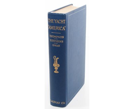

The Yacht America, By Winfield M. Thompson, William P. Stephens, William U. Swan, Together With Material From Contemporary Record, with A Foreword By John E. Spears, Illustrated, Boston, Charles E. Lauriat Co. 1925, a first edition (the dates on the copyright page and title page match - they both say 1925 - and there are no other printings), with a piece of the canvas carried by the America in the first race for The America’s Cup that took place in New York harbor in August 8, 1870 on a paper signed by William U. Swan, the last civilian commander of the America. The gilt on the spine says “The Yacht America, Thompson, Stephens, Swan “ and depicts the America’s Cup in bright gilt, with blue cloth covers, endpapers that show a map of Hampshire and the Isle of Wight, a beautiful frontispiece engraving of The America from the original sketch taken on the spot by Oswald W. Brierly in 1851 and the lettered tissue-guard to protect the frontispiece, then the title page and the copyright page, which says the book was printed at the Colonial Press in Boston. It is 310 pages long, with an eight-page foreword by John Spears, the Contents and six pages of Illustrations - it is fulled with photos and engravings - and a sixteen-page Appendix at the rear that includes what the menu was at the first Cup race in 1851, a complete list of all the Cup races, the names of the cutters and schooners the America beat in 1851, and all the challengers she faced up to 1920, and a nine-page index on top of that. There’s also a very clean fold-out chart of the hull from three different viewpoints at the rear, and they faithfully represent the original lines of the America when it was designed by George Steers in 1851. Without exaggerating, America is the world’s most famous racing yacht, and one of the most beautiful yachts in the world. The reason is simple: the original America put yachting on the map. It is why the most famous trophy in sailing is called The America’s Cup. In 1851, this 139-foot yacht won the ‘Royal Yacht Squadrons’ 100 Guinea Cup given to the winner of a race around the Isle of Wight. It is said that the margin was so great while she was watching America sail past the royal yacht, Queen Victoria famously asked “Who came second?” “Your majesty… there is no second” was the reply. The winners, who were members of the New York Yacht Club, donated the trophy to the Club, to be held as a “challenge” trophy. Thus was born the America’s Cup, named after the boat, not the country. Owned by Commodore John C. Stevens and five other members of the New York Yacht Club, the America was built in New York following the revolutionary design of George Steers and launched in May 1851. A succession of British syndicates attempted to win back the cup, but the New York Yacht Club remained unbeaten for 25 challenges over 113 years, the longest winning streak in the history of sport. Matches were held in the vicinity of New York City from 1870 to 1920, and from 1930 to 1983, the races were sailed off Newport, Rhode Island for the rest of the New York Yacht Club’s reign. The consignor’s wife’s grandmother was related to William Swan, the captain and commander of the America, and why he had the book in his collection, and it is in impeccable condition. The book is 8vo. and measures 8 x 5 5/8 in. wide, the gilt on the spine is bright, and a great addition to anyone who collects maritime and racing memorabilia.
We found 106056 price guide item(s) matching your search
There are 106056 lots that match your search criteria. Subscribe now to get instant access to the full price guide service.
Click here to subscribe- List
- Grid
-
106056 item(s)/page
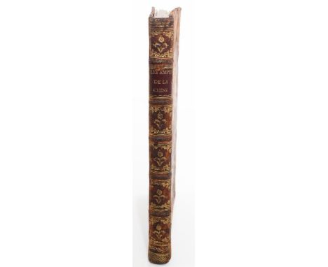
This book depicts scenes with Chinese emperors from the sixteenth century, on finely engraved plates by Isidore Stanislas Helman (1743-1809), a copperplate engraver from Lille, France. The title is Faits Mémorables Des Empereurs De La Chine. Tires des Annales Chinoises, Dédiés a Madame, Orne de 24 Estampes in 4.o., Gravees par Helman, d’apres les Dessins Originaux de la Chine, tires du Cabinet de M Bertin, Mtre. et ancien Sre. d’Etat., A Paris. Chez l’Auteur, Graveur de Madame, Rue St. Honore … Et chez M. Ponce, Graveur de Mgr. Comte d’Artois … 1788, and in English, that means Memorable Facts about the Emperors of China from the Chinese Annals, Dedicated to Madame, Adorned with 24 prints [engravings], from the Original Drawings from China, taken from the Cabinet of M Bertin, minister and former Secretary of State, … at Mr. Ponce, engraver of the Count Artois … 1788. The plates were finely engraved by Helman from designs by the Jesuit artist Jean-Denis Attiret, who went to China in 1737 and was given the title “Painter to the Emperor” by the Qianlong Emperor. The original paintings, from which the engravings are reduced, were commissioned by Attiret, by orders of the Emperor Qianlong, to be drawn and engraved in a western style and based on the work ”Dijian tushuo” (The Illustrated Discussion of the Emperor’s Mirror) from 1573, telling of the heroic deeds of the Emperors of China in parables. The book was privately published and it has five raised bands, with gilt titles, giltflowers and gilt tooling on the spine, gilt borders on the original leather covers, blank endpapers, the dedication page to Madame, who was unnamed, but with a space left open for a name to be filled in later on, and we believe the Madame was actually Marie Antoinette. The book was intended for a French audience, and it was published a year before the French Revolution, and possibly a veiled criticism not only of Louis XVI, but of his wife, Marie Antoinette, as well. At the bottom of the dedication page it reads “prix in 4 en feuilles [in sheets] 12 francset broche en carton 13, 10 sur le papier vélin [vellum] en feuilles, 18 sur le papier d’hollande peint a l’aquarel, 48; il y a aura quelques exemplaires sur le grand papierqui feront suite aux batailles de la chine] prix 18; l’ouvrage entier sera divise en quatre livraisons, qui paraitront tous les deux mois a commencer le 15 avril 1788”, which means the publication was available on different types of paper, and you could buy part 1 in unbound sheets at 12 livres, in paper wrappers at 13 livres and 10 francs, unbound on wove paper for 18 livres, on Holland paper painted in watercolors for 48 livres (₶), and the entire work would be divided into four deliveries, which would come out every two months starting April 16, 1788. ₶ stands for livre tournois, one of several currencies used in medieval France and a unit of value used to show the relative worth of something; according to a law passed in 1262, the livre tournois was established at about 20 sous tournois, or about 81 grams of fine silver. This is a first edition with black and white engravings, published on heavy paper, with wide margins, and all the plates and tissue guards are present. The book is 4to. and measures 10 1/2 x 7 3/4 in. wide, with wear on the boards commensurate with age, faded gilt on the spine and boards, very light browning or foxing, and some offset on the tissue guards from the engravings. A scarce copy ofthis unusual printing designed to appeal to educated Parisians in the 1700’s.
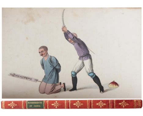
The Punishments of China, Illustrated By Twenty-Two Engravings: With Explanations In English and French, London: Printed For William Miller, Albemarle Street, By S. Gosnell, Little Queen Street. 1808. With five raised bands, a gilt title and gilt devices on the spine, tooled in gilt with blindstamped covers, blank endpapers, and there are two title pages: one in English and the other in French, and the French title follows the English title. The French title is Les Punitions De Chinois, Representes En Vingt-Deux Gravures: Avec Des Explications En Anglais Et En Francais, there are 22 hand-colored stipple-engraved plates, and all the edges are gilt, in a full red straight-grained morocco. The first edition was issued in 1801, followed by a second edition in 1804, and this edition was published in 1808. The text is based on the experiences of George Henry Mason (1770 - 1851), a British army officer who traveled to Canton in 1789, making drawings of the costumes and customs of the region, including these rather disturbing images of torture and execution in China. Canton was one of only two cities in China that outsiders could visit, and he became an author of two influential works, The Costume of China and The Punishments of China. This folio measures 14 1/4 x 10 5/8 in. wide, with exquisite covers, the plates and binding are tight and secure, with just a hint of occasional spots. A rare look at customs and punishments outside this country, with spell-binding plates that make you think about the way people were punished years ago for petty, and sometimes serious, crimes.

This is a first edition of Tennyson’s first published work, written in collaboration with his brother Charles when they were just teenagers. The title is Poems, By Two Brothers. Alfred and Charles Tennyson, London: Printed For W. Simpkin And B. Marshall, Stationers’-Hall-Court; And J. And J. Jackson, Louth. MDCCCXXVII [1827], in a fine binding by F. Bedford, with five raised bands, six gilt-ruled compartments with a gilt title and gilt floral devices on the panels and “1827” at the heel of the spine, with gilt French fillet borders on crushed green morocco, beautiful gilt dentelles on the front free paste-down and burgundy endpapers, the imprint at the end reads “Louth: Printed By J. and J. Jackson, Market-Place”, the top edge is gilt and all the edges of the binding are lined in double gilt fillets too. There’s a blank page on the reverse of the title page, followed by an Advertisement which was basically an apology in case people didn’t like the poems - the poems were written when they were just fifteen and eighteen - and the kids were tickled pink when the Jacksons paid them 20 pounds for the manuscript, a surprisingly large sum for unknown authors; the Jacksons were obviously convinced of its merit, but the poems were published anonymously, probably because Alfred and his brothers weren’t certain of the success of the book. (Alfred’s brother Fredrick wrote four of the poems, but modestly removed himself from the title, if that means anything.) Lo and behold, Alfred went on to become Poet Laureate of England in 1850 and remained Poet Laureate for 42 years during Queen Victoria’s reign, and the future Alfred, Lord Tennyson was the most renowned poet of the Victorian era. The book is 228 pages long, 8vo., and measures 7 7/8 x 5 in. wide, the binding is tight and the pages are clean, with just traces of rubbing along the spines and lightly pencilled notes on a front free endpaper and on blank endpapers at the rear. Still, an exquisite first edition of Tennyson’s first published work, scarce and hard to find.
![This is an attractive copy of Original Poetry by Victor & Cazire [Percy Bysshe Shelley & Elizabeth Shelley], Edited b](https://cdn.globalauctionplatform.com/52450936-dc9c-4d12-829a-af9a0101954b/8c48c520-7576-42e1-b0a0-af9a010b15d7/468x382.jpg)
This is an attractive copy of Original Poetry by Victor & Cazire [Percy Bysshe Shelley & Elizabeth Shelley], Edited by Richard Garnett, C.B., LL.D, Published By John Lane, at the Sign of the Bodley Head in London and New York, MDCCCXCVIII [1898], printed by the Ballantyne Press in London & Edinburgh, and a first edition thus. Shelley (1792 - 1822) was one of the major English Romantic poets; his second wife, Mary, wrote Frankenstein, and Shelley died when he was only 29 years old, in a tragic boating accident at sea, and this is a facsimile of Shelley’s first book of poetry. It is 3/4 bound, in half morocco, with five raised bands, a gilt title and gilt devices on the spine, blue marbled covers and marbled endpapers, with deckled edges, and the top edge is gilt. The front paste-down bears the name “George S. Payson Christmas 1935” in bright gilt letters, so this was probably a Christmas gift from that time, and this is a facsimile copy published in 1898 based on the original printing of the book in 1810. It was the second book written by Shelley and the first of his poetry to be published: the book consisted of sixteen poems and a fragment of a poem, Percy Shelley wrote eleven of the poems and his sister Elizabeth wrote five, and “Victor” was the pen name Shelley used here. The Introduction is eighteen pages long (v - xxvii, with page v unnumbered), followed by a copy of the original title page from 1810, then a Contents page, 64 pages of text and two pages of notes, including errata, and the imprint of Ballantyne, Hanson & Co. at the rear. The book is 8vo. and measures 8 7/8 x 6 in. wide, the pages and text are very clean, with just a tad of rubbing near the bottom of the spine, and an attractive copy of Shelley’s first book of poetry.
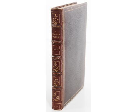
A Channel Passage And Other Poems, By Algernon Charles Swinburne, London, Chatto & Windus 1904, a rare first edition, with five raised bands, gilt titles on red labels, six gilt-ruled compartments with gilt devices and “1904” in gilt at the base of the spine, with gilt-fillet borders on full crushed Levant, gilt dentelle borders with the bookplate of Raphaeli Mauritii Bauer on swirled marbled endpapers, the half-title followed by the imprint of Spottiswoode and Co Ltd, New-Street Square, London, followed by the title page and a dedication to William Morris and Edward Burne Jones, three pages for the table of contents, and 213 pages of text followed by the imprint of Spottiswoode again at the bottom of the last page of text, and the top edge is gilt, all in a fine binding by Zaehnsdorf. Swinburne (1837 - 1909) was an English poet, playwright, novelist, and critic. who wrote several novels and collections of poetry. He devised a poetic form called the roundel, which corresponded to the French rondeau. The title poem here was inspired by a trip to France: in 1855, Swinburne made his first trip abroad with his uncle. As they were crossing the English Channel, a violent storm thrilled the young poet with its awe-inspiring display of lightning and thunder. It was an unforgettable experience that stuck with Swinburne all his life - the poem here which recalled that crossing was written 40 years after the event, just five years before his death. He was influenced by the works of Shakespeare, Shelley, William Morris, Rossetti, Robert Browning, Tennyson, and Victor Hugo - a temple mount of writers and authors - and he was nominated for the Nobel Prize for Literature every year from 1903 to 1907. Swinburne was also a controversial poet. He was an alcoholic and algolagniac and liked to be flogged, and he wrote about many taboo topics, such as lesbianism, sado-masochism, and anti-theism, and he was considered a decadent poet; these taboo subjects often attracted Victorian ire, which led to him becoming persona non grata in high society. Rumors about his perversions often filled the broadsheets. Raphaeli Bauer (1864 - 1947) was born in Germany and was a foreign banker trading from London, as well as a stock broker at Drapers Gardens with Eustace Blundell, so he was a man of means. The title poem was first published individually in 1899, and this is a beautiful copy of the rare first edition. It’s easy to tell this is a first edition, too, because it was published by Chatto and Windus, and there is just a single date of 1904 on the title page and no other printings listed on the copyright page. (See Bill McBride, A Pocket Guide to the Identification of First Editions, McBride / Publisher, 585 Prospect Ave., West Hartford, CT 06105.) The book is crown 8vo. and measures 7 5/8 x 5 1/2 in. wide, with clean text and just a hint of rubbing along the front edge of the spine, at the crown and two tips. Overall a very attractive copy of this first edition by Swinburne, bound by one of the premiere binders of the nineteenth century.
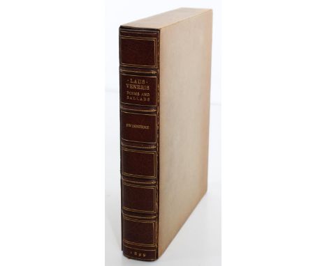
Algernon Charles Swinburne, Laus Veneris, Poems and Ballads, published in Portland, Maine by Thomas B Mosher in 1899, bound by Sangorski & Sutcliffe, one of 450 copies on Van Gelder hand-made paper, 3/4 bound in half morocco, with five raised bands, gilt lettering, six gilt-ruled compartments and “1899” on the spine, marbled boards, marbled endpapers, a frontis portrait of Swinburne from a portrait by Rossetti, with 40 pages of contents (vii - xlvii), a preface and notes, and 355 pages of text including an Appendix, Bibliography, and an Index of the poems, the top edge is gilt, and it comes in a paper slipcase. Swinburne (1837 - 1909) was an English poet, playwright, novelist, and critic. He wrote several novels and collections of poetry such as Poems and Ballads here, and contributed to the famous Eleventh Edition of the Encyclopædia Britannica. He wrote about taboo topics, such as lesbianism, sado-masochism, and anti-theism, and his poems have common themes, such as the ocean, time, and death. He was an accomplished horseman who drank a lot and numbered Sir Walter Scott and Dante Gabriel Rossetti among his friends. Poems and Ballads caused a sensation when it was first published, especially the poems written in homage of Sappho of Lesbos, and Moxon and Co. transferred its publication rights to John Camden Hotten, who was best known for his clandestine publishing of erotic and pornographic titles. The book is 8vo. and measures 8 3/4 x 7 38 in. wide, it is clean, tight, and in very good condition, with just a trace of rubbing along the edge of the spine, in a fine binding by Sangorski & Sutcliffe.
The Cricket On The Hearth, Fairy Tale Of Home, By Charles Dickens, London: Printed And Published For the Author, By Bradbury And Evans, 90, Fleet Street, And Whitefriars. MDCCCXLVI [1846], this is a first edition in the first state, with the illustrated frontispiece and vignette title page by D. Maclise and the ad for Oliver Twist at the rear. This is the third book by Dickens in his Christmas series and one of his most popular. The book has five raised bands, gilt titles and elaborate gilt tooling in six gilt-ruled compartments on the spine, triple gilt-fillet borders surrounding a pattern of gilt fillets on the front cover, gilt-fillet borders with silk moire endpapers, the half-title, an imprint page for Bradbury and Evans after the title page, a dedication page to Lord Jeffrey, a list of Illustrations, 174 pages of text, an ad for Mr. Dickens’ works on the reverse of the Oliver Twist notice, and all the edges are gilt, in a fine binding by Tout. All fourteen plates are present, including the frontispiece and title page on steel engravings by Maclise, and the book has no points of issue, according to John Eckel, Dickens’ first bibliographer. The book is foolscap Octavo and measures 6 5/8 x 4 3/8 in. wide, it is clean and tight, in an exquisite binding, and a beautiful first edition by Dickens. See The First Editions Of Charles Dickens, Their Points and Values, by John C. Eckel 1932 for more information about the book.
Aucassin and Nicolette Done Into English by Andrew Lang, London, Published By David Nutt In The Strand 1887 on the paper dust jacket, with “Aucassin And Nicolette, A. Lang, London 1887” in gilt lettering and fleur-de-lis decorations on the spine of the leather slipcase, with five raised bands on the spine and triple gilt fillets on the green slipcase cover. This is a first edition on Japanese paper; just sixty-three copies were printed on Japanese paper altogether and of these, only fifty-three were for sale, this is number 9 of the 63 copies, and it is signed “D. Nutt “ on the limitation page. The half-title reads “Aucassin And Nicolette, Translated June, 1887, Printed November, 1887”, and prior to the title page, there are two etched engravings by P. J. Hood in two states as issued. The engravings are titled “C’est D’Aucassin Et De Nicolette”, with a tissue guard between the two etchings, and they are basically double frontispieces. The Introduction is sixteen pages long (b - xvi), followed by the “Ballad of Aucassin” and the “Ballad of Nicolette” (xvii - xx), and there are 66 pages of text with four pages of notes (pages 67 to 70) and the colophon of the Chiswick Press at the rear. There is a small bookseller’s label at the bottom of the dustjacket in front (B. H. Blackwell, 50 and 51, Broad St., Oxford), and the bookplate of Chas. B. Foote on the front endpaper; Foote was a noted bibliophile whose book collection was auctioned off by Bangs & Co. (New York) in 1895, and some of those books included editions by Longfellow, Lowell, William Morris, Lewis Carroll, and Andrew Lang, among others. Andrew Lang (1844 - 1912) was a Scottish poet, novelist, and literary critic who collected fairy tales and folk tales, and his wife helped him translate some of these copies into English; Aucassin and Nicolette was also a French medieval love story called a “chantefable” - a sung story - which combines prose and verse. The book is 8vo. and measures 9 x 5 1/2 in. wide and has clean pages and text, and the slipcase measures 9 1/4 x 6 1/8 in. wide and in solid condition, with light rubbing at the extremities of the leather slipcase. A beautiful copy of a rare first edition by Andrew Lang.
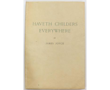
James Joyce, Haveth Childers Everywhere, Fragment From Work In Progress by James Joyce, published by Henry Babou and Jack Kahane in Paris and at The Fountain Press in New York in 1930, and it was printed in France by Decrois Et Colas in Paris in 1930. This is a first edition, and the limitation page says “this volume constituting the only complete original edition of a Fragment of Work In Progress, composed by hand in freshly cast Elzevir Corps16, comprises: 100 copies on Imperial hand-made iridescent Japan, signed by the writer Nos 1 to 100; 500 copies on hand-made pure linen Vidalon Royal (specially manufactured for this edition) Nos 101 to 600; half of each category being for the United States of America.” There were also printed 10 copies called Writer’s Copies on Imperial hand-made iridescent Japan, Nos I to X and 75 copies called Writer’s Copies on pure linen hand-made Vidalon Royal, Nos XI to LXXXV. So it is not signed, but one of 500 first editions of the only complete original edition on handmade pure linen vidalon royal, specially made for this edition. This is copy No. 204 of 500 first editions, with blank endpapers, in the original glassine dust jacket, with a green slipcase; the book is 73 pages long, 4 to. and measures 11 x 7 1/2 in. wide, the binding is tight and secure and the pages and text are very clean, and the glassine dust jacket is in great condition as well, with modest wear on the slipcase. James Joyce (1882- 1941) was an Irish writer, poet, and literary critic who is regarded as one of the most influential and important writers of the 20th century, and his fragment Havers Childers Everywhere ultimately became part of Finnegans Wake, which was written by Joyce in Paris over a period of seventeen years and published in 1939; Finnegans Wake was also Joyce's final work. It blended standard English with portmanteau words, Irish mannerisms and puns in multiple languages, and a stream of consciousness writing style, all to unique effect, and it is a difficult text to read. Faber and Faber published a book edition of Haveth Childers Everywhere in 1931.
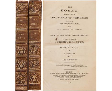
The Koran; Commonly Called the Alcoran of Mohammed, Translated From The Original Arabic. With Explanatory Notes, Taken From The Most Approved Commentators. To Which Is Prefixed, A Preliminary Discourse, By George Sale, Gent. In Two Volumes,A New Edition, London : Printed For J. Walker; White & Cochrane; C. Law; J. Johnson And Co.; Lackington, Allen And Co.; J. Cuthell; J. Nunn; [et al] 1812. The two volumes have three folding genealogical charts, a folding plan of the temple at Mecca, they are 3/4 bound, with five raised bands, gilt titles and elaborate gilt tooling on the spines, marbled covers, marbled endpapers, 244 pages and an 11-page Table [an index] in Vol I, with numerous footnotes, a facsimile letter about Jesus and Mohammed, a fold-out chart about the Genealogical table about the Tribes of the Genuine Arabs, and a fold-out view of the Temple of Mecca; Volume II is 509 pages long, with footnotes, and both volumes are very clean - Volume II has a little bit of spotting, but not much, and it doesn’t detract at all. There’s light rubbing at the crowns and edges of the spines, and it’s hard not to say “wow” when you open up the books and see what’s inside - the text and plates are arranged so well and are eye popping - overall a very attractive set, and each volume measures 8 3/4 x 5 3/4 in. wide. The Koran (or Quran, Qur’an) is the central religious text of Islam. The first edition was published in 1734, and George Sale (ca. 1696 - 1736) was a solicitor and prominent English orientalist who was the first to translate the Koran directly from Arabic to English. His translation is also notable for his inclusion of the “Preliminary Discourse”, which was a description of all that was known about the religion of Islam at the time.
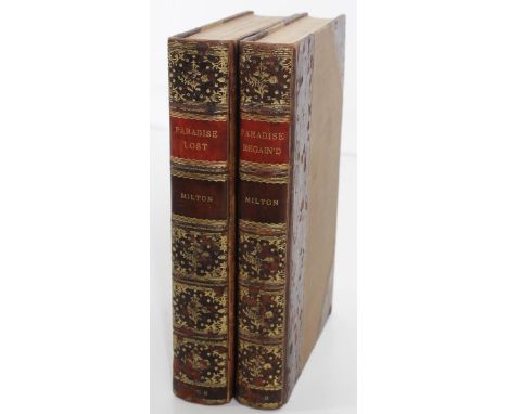
This is a two-volume set of John Milton’s famous epic poems from the seventeenth century. Paradise Lost is a poem in blank verse. The first version, published in 1667, consisted of ten books with over ten thousand lines of verse; a second edition followed in 1674, arranged into twelve books (in the manner of Virgil's Aeneid) with minor revisions throughout. It is considered to be Milton's masterpiece, and it helped solidify his reputation as one of the greatest English poets of all time.The poem concerns the biblical story of the Fall of Man, the temptation of Adam and Eve by the fallen angel Satan, and their expulsion from the Garden of Eden. Paradise Regain’d is apoem by Milton first published in 1671.The volume contained the poet's closet drama Samson Agonistes, and Paradise Regain’d is connected to his earlier and more famous poem, Paradise Lost, because they share similar religious themes. Indeed, the title, its use of blank verse, and its progression through Christian history bring to mind Milton’s earlier work. However, this poem deals primarily with the temptation of Christ as recounted in the Gospel of Luke. Milton composed Paradise Regain'd at his cottage in Buckinghamshire, England: Paradise Lost is twelve books long and comprises 10,565 lines, while Paradise Regain’d is four books long and comprises only 2,065 lines, which is why this title has been called a “brief epic”. The title page for Paradise Lost reads “Paradise Lost. A Poem in Twelve Books. The Author John Milton. From the Text of Thomas Newton D.D., Birmingham, Printed by John Baskerville for J. and R. Tonson in London. MDCCLVIII [1758]. The title page for Paradise Regain’d reads “Paradise Regain’d. A Poem In Four Books. To which is added Samson Agonistes: And Poems upon Several Occasions. The Author John Milton. From the Text of Thomas Newton D.D. Birmingham, Printed by John Baskerville For J. and R. Tonson in London. MDCCLVIII” [1758]. Paradise Lost has a three-page Preface by John Baskerville, followed by an eighteen-page list of Subscribers, two pages in Latin by Samuel Barrow and two more in English by Andrew Marvel, then a page on the meter used in the Verse here, and 69 pages on the life of Milton (a to lxix) before the text. Paradise Lost is 416 pages long and Paradise Regain’d 390 pages. Paradise Lost also has a point of issue that hasn’t been corrected yet - on page 75,line 3, it reads “God is light”, with faint impressions of an h before “is”; it reads “God his light” in the first uncorrected state, and here the h is present, but faint, and it has not been corrected to read “God is light” yet. Each volume is 3/4 bound, with five raised bands, gilt titles on red and burgundy labels and elaborate gilt tooling on the spines, beige boards, marbled endpapers, “bound by Riviere” lightly pencilled on the front free endpapers in both volumes, and all the edges are gilt. Both volumes are 8vo. and measure 9 x 6 1/8 in. wide, the bindings are tight, with clean text, light wear and light rubbing on the leather, and the gilt is exquisite - bright and you can’t miss it. These editions by John Milton are scarce and hard to find, and make an attractive addition to anyone who collects Milton.
Dealings With The Firm Of Dombey And Son, Wholesale, Retail, and for Exportation, By Charles Dickens, With Illustrations By H.K. Browne, London: Bradbury & Evans, Whitefriars. Agents: - J.Menzies, Edinburgh; J.Macleod, Glasgow; J. M’Glashan, Dublin, with twenty monthly parts bound in nineteen, as issued; the last part was a double number (XIX and XX bound together), and all the monthly parts are in the original green wrappers. The first part came out in October, 1846 and they ran through April, 1848. The short title for this book is Dombey and Son, and there are forty plates by H. K. Browne altogether, with all the parts priced at one shilling, except for the last double number, which was priced at two shillings because it contained two parts bound as one. Browne designed the plates as well as etched them, and the sale of the book was so great that “Phiz”, the pen name for Hablot K. Browne, was compelled to etch two sets of plates and some had to be lithographed to meet the demand, so you have to watch out for the lithographed plates because their use indicates a later printing. (See Eckel page 75.) Generally, the captions on the lithographs were “smudgy” and black instead of hairline, and all the plates here have hairline captions - even the so-called Dark Plate in No. XVIII has hairline captions - which means these plates are from the first edition and not a later printing. (The Dark Plate is titled “On the Dark Road” and was created from a printing process that gave the background a darker, more somber effect.) The parts have nearly all the other details to make this a first edition in the first state as well. Part No. V is supposed to have a 12-line errata slip for the Parts to be considered a first issue set, and the errata slip is present here before the plates, as called for. (Eckel says this errata slip is essential.) Another error by the author was not included in the errata - on page 284 of No IX, Dickens used the word “Delight” for “Joy” to describe Mr. Toot’s boat - it was supposed to be called “Joy”, but it got called “Delight” in the first printing - and that error is present and was never corrected. A couple of other typographical errors were included in the errata and have never been correct here either: on the last line of page 324 in No. XI, “Captain” is misspelled “Capatin”, and on line 9 of page 426 in No. XIV, the word “if” is missing at the beginning of the line, and these are all first issue points. The only mistake that has been corrected is the page number at the top of page 431 in No. XIV - the page number was omitted in the earlier copies of Dombey and Son, and the page number is present here. And on the last of the forty plates here - it’s in Part XX - H.K. Browne put the famous hook on Captain Cuttle’s left hand, instead of the right, the way Dickens wanted, another uncorrected error. So nearly all the first issue points are present here - the hairline captions, the errata slip in Part V, the “Delight” for “Joy” mistake, the typographical errors in No. XI and XIV , and the hook on the wrong hand of Captain Cuttle - those errors have not been corrected, and the only corrected error is the missing page number on page 431 - which means the set is almost a first edition in the first state, but not quite - it has to be called a first edition in a mixed state, even if all the other first issue points are here, because the error on page 431 has been corrected. A two-line errata note is also present at the rear of No. XX and it says that on page 494 [in No. XVI], the first line of the chapter reads “downstairs” instead of “above stairs”, and on page 497, line 29 from the top reads “you too”, instead of "you two”. Both mistakes are present in Part XVI and uncorrected here, as called for. (There’s also an eight-line errata at the end of some some copies of No. XX, but that has to be a later printing, according to Hatton and Cleaver, just because it’s eight lines long instead of two.) There a couple of other details to note. Several Parts have colored ads in them: No. I has yellow and green ads at the rear, No. II has a green ad in the rear, No. VI has green ads in the back, and No. IX has a beautiful Dakin & Compy Tea Merchants ad in blue, all as called for, and in No. II, the ad for Dickens’ A New Christmas Tale is present, but it’s supposed to be pink, and here it’s white. All the Dombey and Son Advertisers are present at the front of each part, as called for, and nearly all the other slips and ads are present. VII has a four-page slip in front and IX has two slips at the rear, both as called for. The only missing ads seem to be an ad for Gilbert’s Dictionary at the rear of No. X and an ad for Punch in No. XVI, and those are relatively minor omissions. There are remnants of a bookseller’s label on the front of Parts V and X and the full bookseller’s label is at the bottom of the cover of No. XX, and there are uncut pages in Nos. V, X, XIV, XVI, and XX. H. K. Browne (Hablot K. Browne 1815 - 1822) was an English artist who illustrated many of Dickens’ novels - his pen name was “Phiz” and he was Dickens’ favorite artist - and Dombey and Son was the first time Browne ever used the dark plate technique. The spines are rather clean, with some light bumps here and there, but not much wear on the spines at all; the pages and margins of the text are clean, and all forty plates are present, but most of the them have browning or spots; and No. VI has a half-inch tear at the bottom of the front cover and No. XIV a one and a half-inch tear along the spine at the back. The Parts are housed in a green custom box which measures 9 3/4 x 6 5/8 in. wide with faded letters on the spine, and the Parts measures 8 3/4 x 5 5/8 in. wide apiece. So this is basically a first edition, first issue set with a couple of small kinks - the page number on one page has been added and two minor ads are missing, other than that this is a nearly complete first edition set in the first state. See The First Editions Of Charles Dickens, Their Points and Values, John C. Eckel 1932 and A Bibliography of the Periodical Works of Charles Dickens: Bibliographical, Analytical & Statistical, by Thomas Hatton and Arthur Cleaver 1933 to identify first editions and first states in the periodicals of Dickens.
This is a presentation copy of Longfellow’s “The Hanging of The Crane” from his sister, Anne Longfellow Pierce, to a friend named George. The title page of the book reads“The Hanging Of The Crane, By Henry Wadsworth Longfellow With Illustrations, Boston, Houghton, Mifflin And Company, New York: 11 East Seventeenth Street, The Riverside Press, Cambridge”. It is a first edition by Longfellow: the dates on the title page and copyright page match - they both say 1874. The book looks like it is bound in some sort of tiger maple, but actually it was rebound in perished woodgrain leather, with five raised bands, six gilt-ruled compartments with gilt lettering on one panel and gilt floral devices in the other five, gilt dentelles on the woodgrain leather, gilt dentelles with marbled endpapers, an illustrated frontispiece and the title page, followed by the copyright entry, a four-page list of illustrations, 64 pages of text, and all the edges are gilt. The black-and-white wood engravings were done by V. S. Anthony and W. J. Linton, and the artwork was done by Mary A. Hallock and Thomas Moran. There is a three-page folded letter bound in at the front from Anne Longfellow Pierce, Longfellow’s sister; it’s written in purple ink, and it reads “My Dear George, I cannot let this one greatest event in yr. life pass without my special word of kind remembrance, and most cordial congratulations In token of which let me ask you to make acceptable to yr. self and wife this copy I send you of one of my favorite Poems of my brother, H.W.L, the “Hanging of the Crane” - I thought you would value its coming from Portland, and from the Old Home, so in the Difficulty I had to know what I could find to send you, this thought [ ] me on this volume as most appropriate to the occasion - Holding yr. Mother by the hand as I do, I am full of interest in hearing of your happiness - the wedding, and all its arrangements from her - I recall with pleasure the interview with you and yr. attractive friend friend last all times, and my congratulations, kindest and best [ ], mean far more than if I had never seen her Yrs. truly Anne L Pierce You must excuse the blunders in this, it is the way I do things now, and yr. Mother can excuse my eyes not copying.” The letter is undated, but had to be written between 1874 and 1901, the dates when this book was published and when Anne died. In 1832 Anne married George Washington Pierce, a graduate of Bowdoin College, in the same class with Henry. Three years later, George died from typhus. Anne grew up in the family home on Congress Street in Portland, and lived there for 87 of her 90 years. Eventually Anne became the sole owner of the house, bequeathing it to the Maine Historical Society when she died in 1901. The book is 8vo. and measures 8 1/2 x 6 1/4 in. wide, with light wear on the covers and at the tips, and the spine has been repaired, but the pages are clean and tight and the colors of the boards are very attractive, and an absolutely wonderful copy of this book with the letter from Longfellow’s sister. The letter makes the book very special.
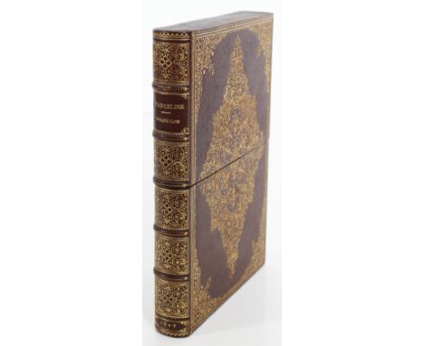
This is a first edition of Evangeline, in the second state, by Henry Wadsworth Longfellow, with a letter written and signed by Longfellow in 1858. The title page reads “Evangeline, A Tale Of The Acadie. By Henry Wadsworth Longfellow. Boston: William D. Ticknor & Company. 1847” and the copyright page is dated 1847 and says the book was stereotyped and printed in Cambridge by Metcalf and Company. The book is Longfellow’s epic poem about an Acadian girl named Evangeline and her search for her lost love, Gabriel, during the time of the expulsion of the Acadians from what is now Canada and Maine during the French and Indian Wars, and it elevated Longfellow’s status to that of the most famous writer in America, and it became his most famous work. The book has yellow boards, with remnants of the original paper label on the spine, there are yellow endpapers, and it is 163 pages long. It is protected by a black vellum-type jacket, and it is also housed in a slipcase with beautiful gilt tooling, five raised bands, six gilt-ruled compartments with “Evangeline Longfellow” on one panel and “1847” in gilt at the bottom of the spine. The poem has the all-important four pages of ads for books published by William Ticknor in front of the title page and “Lo” instead of “Long” as the first word on page 61. (Very shortly after printing began, the "ng" of Long dropped out of the plate, and the word was erroneously printed as "Lo" until it was corrected in the fifth edition. Only about ten copies in this first state with "Long" are known (BAL 12089). Both details are needed for this book to be considered a first edition, first state, and the presence of "Lo" instead of "Long" makes this a first editin, in the second state. Evangeline was a story of loss and devotion, and maybe that is why Longfellow sent the letter here. He was writing a condolence letter to his aunt Abigail after the loss of her husband, Captain Samuel Stephenson. Longfellow was born in their home in Portlandin February, 1807, and the letter was stamped and postmarked “Portland, ME 4 Jun PAID”, where Longfellow lived for a good part of his life. The envelope is attached to the front paste-down of the book, and the folded letter reads “Cambridge May 29, 1858, My Dear Aunt, I have heard with great pain of your sudden bereavement and [always] I feel how unavailing are words of consolation in such great affection, yet I cannot help writing to tell you how deeply I sympathize with you and your family. One of the pleasantest recollections of my childhood is that of your kind and excellent husband and he will always remain in my memory as a courteous gentleman of the old school ... so friendly in manner and so attractive to young people, In fact, he always seemed to be young himself - never to grow old, and the last time I saw him he had lost nothing of his vivacity, but was as amiable and agreeable as ever. But why should I say these things to you, who knows how good and kind he was, and now have only these [prominent] memories of life? May God bless you and and console you, my Dear Aunt, and believe him ever.Affectionately Yours Henry W. Longfellow”. Longfellow also lived in Cambridge, Massachusetts - he grew up in Portland, Maine, and later lived at the Craigie House, a colonial mansion built in Cambridge in 1759,and his home from 1837 until his death in 1882, and that is why the envelope has a postmark from Cambridge, too. The slipcase 7 1/2 x measures 7 5/8 x 5 3/8 in. wide and the book measures 7 3/8 x4 7/8 in. wide, with light separation along the front edge of the spine, very light soiling on the boards, and just occasional brown spots in the margins of the pages; the book is a first edition in the second state, and it comes with a very personal letter from H. W. Longfellow to a beloved family member.
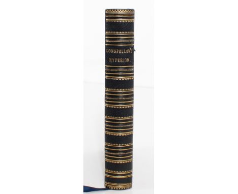
This is the first illustrated edition of Hyperion by Longfellow. The title page reads “Hyperion: A Romance. By Henry Wadsworth Longfellow Author Of “Evangeline” Etc ... Illustrated With Nearly One Hundred Engravings On Wood, From Drawings By Birket Foster. London: David Bogue MDCCCLIII” [1853]. The book has five raised bands, gilt lettering and horizontal gilt lines on the spine, gilt dentelles and gilt fillets on the covers, blue textured boards, wide gilt dentelles with blank yellow endpapers, the imprint after the title page reads “London: Henry Vizetelly, Printer And Engraver, Gough Square, Fleet Street”, with two pages of contents, a four-page list of illustrations, the book is 304 pages long, including the index, and all the edges are gilt. The book is 8vo. and measures 8 x 5 3/4 in. wide, the binding is tight, the text and illustrations are very clean, with just a tad of brown spots near the front endpapers and the index at the rear, a small spot on the front cover, and a speck of rubbing at the crown and heel of the spine, and a very attractive book by Longfellow, in an exquisite binding.

This is a presentation copy of a first edition of Longfellow’s The Courtship Of Miles Standish to his cousin, Anne Stephenson, along with letters from the Doves bindery, the people who replaced the old binding with a striking new one in the late 1890’s. The title page reads “The Courtship Of Miles Standish And Other Poems, By Henry Wadsworth Longfellow, Boston: Ticknor And Fields. MDCCCLVIII” [1858], and the copyright page is dated 1858 as well, so this is a first edition of this famous work by Longfellow, because there is just a single date on the title page and copyright page, and the dates on both pages match. The book is also inscribed by Longfellow on a slip attached to the page facing the title page, and the inscription reads “From The Author, Miss Anne Stephenson, with kind regards of the Author”. Anne was the daughter of Longfellow’s aunt and uncle, Abigail and Samuel Longfellow Stephenson, and we don’t know what the occasion was, but it is clearly signed and meant as a gift from Longfellow. The book has some letters from the Doves Bindery about what the new binding should look like and how much it would cost, and the result was a beautiful binding with striking gilt devices on the spine and covers. (The Doves Bindery name is also imprinted in gilt on the last paste-down at the rear, and the letters were written in 1897 and 1898, so we believe that is when the book was rebound by Doves.) The book has some first issue points, which means it is a first edition, but it is actually a first edition later printing. It is 215 pages long, including notes at the end, as called for, the last line on page 119 reads “cry of pain on crags Caucasian” and the third line on page 124 reads “the revel of the treacherous wine”, instead of the “ruddy wine”; these points are uncorrected and are considered first issue points. However, the 12-page Publisher’s catalogue and the Waverley Novels ad at the front of the book are missing,which makes this a later printing of the first edition. (See BAL 12122.) The poem is about the early days of Plymouth Colony and the legendary love triangle between Miles Standish, John Alden, and Priscilla Mullins, set against the backdrop of a fierce war with the native Americans. The book is 8vo. and measures 7 3/8 x 4 3/4 in. wide and comes in a custom-fitted slipcase that measures 8 1/8 x 5 1/4 in. wide. The slipcase has a metal clasp and a felt-lined box inside that houses the book snugly, and the front of the slipcase has gilt letters which read “The Courtship Of Miles Standish 1858”. The book itself has five raised bands, gilt rules and exquisite gilt designs on both boards, blank endpapers with gilt-ruled borders and corner devices, the book is tight and very clean, all courtesy of the Doves Bindery. So a first edition, later printing of this poem about early life in colonial America, with a presentation inscription from Longfellow to a family member and letters from the binder about the history of the binding itself.
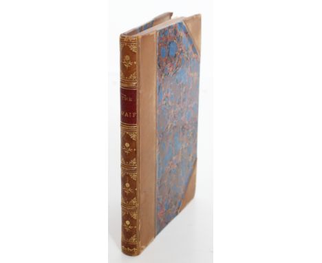
This is a short collection of poems by Henry Wadsworth Longfellow titled The Waif: A Collection Of Poems, and published in Cambridge by John Owen in 1845. It is a second edition - it is dated 1844 on the copyright page and 1845 on the title page, so a second edition - and Longfellow’s name does not appear on the title page, but he compiled all the poems here from a variety of popular poets of the day, including Ralph Waldo Emerson and Thomas Church, and his own “Proem” appears at the beginning of all the poems gathered here. This was also the first time that “Proem” appeared in print.Edgar Allen Poe reviewed this book in 1845 and wrote: Obviously, this volume is a collection of some few of the prettiest shells that have been thrown ashore by the poetic ocean; but, looking behind this idea, we see that Mr. Longfellow's real design has been to make a book of his “waifs,” and his own late compositions, conjointly; since these late compositions are not enough in number to make a book of themselves: - an ingenious thought, too, with which no one can possibly quarrel. There are fifty brief poems in all, exclusive of the Proem which is professedly by the compiler ... [Edgar Allan Poe, Review of Longfellow's Waif (parts I & II) (B), from the New York Weekly Mirror (New York), January 25, 1845, vol. 1, no. 16, pp. 250-251]Henry Wadsworth Longfellow (1807 - 1882) was an American poet and educator. His original works include "Paul Revere's Ride", The Song of Hiawatha, and Evangeline, he was the first American to translate Dante Alighieri's Divine Comedy completely and was one of the fireside poets from New England. Longfellow was born in Portland, Maine, which was then still part of Massachusetts. He graduated from Bowdoin College and became a professor there and, later on, at Harvard College after studying in Europe.He retired from teaching in 1854 to focus on his writing and lived the remainder of his life in the Revolutionary War headquarters of George Washington in Cambridge, Massachusetts; Cambridge is the town where The Waif was published.The book measures 6 3/4 x 4 5/8 in. wide, it is 3/4 bound with five raised bands, six gilt-ruled compartments with a red label and gilt title, gilt tooling with floral devices on the other panels, marbled boards, the bookplate of Thomas Wallace on marbled endpapers, the imprint of Metcalf after the title page - Metcalf was the printer - two Contents pages, and 144 pages of text. BAL 12075The book has light rubbing on the heel and crown of the spine, light rubbing at the tips, some pencilled notes on the blank endpapers in front, small paper remnants on a blank endpaper in front, and still an attractive little ditty, as Edgar Allen Poe might say.
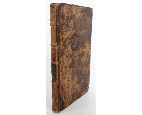
This book has a rather long title - The Theory Of The Earth: Containing an Account Of The Original of the Earth, And Of All The General Changes Which it hath already undergone, Or Is To Undergo, Till The Consummation of all Things. The Last Two Books, Concerning the Burning of the World, And Concerning the New Heavens and New Earth. It was published in London by Walter Kettilby and printed by R. Norton at the Bishop’s Head in St. Pauls Church-Yard in 1690.The book was an old view of the world - Thomas Burnet, who wrote the book, suggested that the Earth was hollow, with most of the water inside until Noah’s Flood, and his calculations of the amount of water on the Earth’s surface led him to believe that there was not enough water to account for the flood.The book is bound in brown boards, there are blank endpapers with an inscription of “Thomas Boyd Croome, Reudcomb, Oct 14th 1690” on the front paste-down, then an illustrated frontis of The Sacred Theory of the Earth, followed by the title page, three pages dedicated to the Queen’s Most Excellent Majesty, a Preface to the Reader, five pages of Contents for the Third and Fourth Books, 224 pages of text, followed by “A Review of the Theory Of The Earth And of its Proofs Especially in Reference to Scriptures”, which is 52 pages long, and one leaf at the end for Books Printed for Walter Kettilby. The book also has marginalia from the printer.Reudcomb Park was in Gloucester, England, and Thomas Burnet (1635 - 1715) was one of the founding fellows of the Royal College of Physicians of Edinburgh and served as its president for two years, from 1696 to 1698. He was physician to Charles II, James II, William and Mary, and Queen Anne, and was knighted sometime before 1691. He was also an English theologian and a notable writer on cosmogony, the scientific theory of how the universe was created.This is a first edition, but is supposed to be a two-volume set and is missing the first volume, which was published in 1684 and contains the first and second books (about the Deluge and Paradise).The book measures 12 x 8 1/4 in. wide, the pages are rather clean, but it has a loose binding, heavy wear on the covers, the spine panels are gone, and is a prime candidate for rebinding and becoming a star in the universe again.
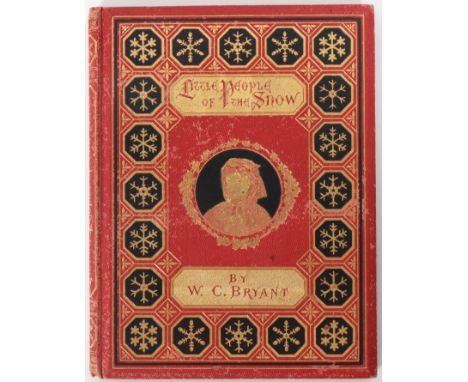
A first edition of The Little People Of The Snow. By William Cullen Bryant. Illustrated From Designs By Alfred Fredericks, Engraved By A. Bobbett. New York: D. Appleton And Company, 549 & 551 Broadway. 1873. The book has a gilt-decorated spine, red pebbled boards with gilt snowflakes on black backgrounds and a girl’s portrait inside a gilt wreath on the front cover, with pale yellow endpapers and inscribed “Carrie Schlieffelier from Papa. Christmas 1872 - Geneva -” on a front free endpaper, a half-title and the title page, the copyright page, and 40 pages of text with beautiful engravings, and all the edges are gilt. The inscription is also dated 1872, which makes this an early first edition.William Cullen Bryant (1794 - 1878) was an American romantic poet, journalist, and long-time editor of the New York Evening Post. Born in Massachusetts, he started his career as a lawyer, but showed an interest in poetry early in his life, and became one of the most significant poets in early literary America; he was one of the Fireside poets, a group of nineteenth-century American poets, mostly situated in the New England area of the United States. Also referred to as the schoolroom or household poets, they wrote in conventional poetic forms to present domestic themes and moral issues. The “fireside” moniker arose out of their popularity, as families would read their books by the fire in their homes. Poets often included in this group were Henry Wadsworth Longfellow, John Greenleaf Whittier, James Russell Lowell, William Cullen Bryant, and Oliver Wendell Holmes Sr.The book is 8vo. and measures 8 5/8 x 6 3/4 in. wide, very tight and clean, with light bumps on the heel and crown of the spine and very light rubbing on the boards, and an attractive copy that would make a perfect Christmas gift for someone’s child this year.
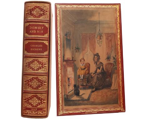
Dombey And Son, By Charles Dickens, With Illustrations By H. K. Browne. London: Bradbury And Evans, 11, Bouverie Street. 1848, imprint of Bradbury And Evans, Printers, Whitefriars on reverse of the title page; Dealings With The Firm Of Dombey And Son, Wholesale, Retail, And For Exportation. By Charles Dickens, London, Bradbury & Evans, Bouverie Street, 1848 on the vignette title page, in a fine binding by Riviere & Son, first edition, first issue, 8 vo., with five raised bands, gilt lettering and six compartments with gilt tooling on the spine and “1848” in gilt at the bottom of the spine, in wine crushed morocco with triple gilt fillet borders on both covers; a lion couchant (a lion laying down) is nestled inside two gilt rings on the front cover, and the lion is holding a star-like cross called a “patoncy" in heraldry; on the front paste-down, an original water color drawing on calf by Helen R. Haywood is bordered by wide gilt dentelles, with red moire silk on the front and rear free endpapers. The binder’s name is at the bottom of the front paste-down, just below the gilt dentelles, and a preliminary leaf reads “With Water Colour Drawing on Calf Doublure by Helen R. Haywood”; the illustrated frontispiece is by H. K. Browne, with a List of Plates and an eight-line Errata page following the List of Plates, and counting the frontispiece and the vignette title page, there are forty plates altogether. The Preface page is unnumbered and dated “Devonshire Terrace, Twenty-Fourth March, 1848”. The original tissue guard between the frontispiece and the illustrated vignette title page is present, there are 624 pages altogether, as called for, and all the edges are gilt. The book has virtually all the points of issue that make this a first edition, first issue. Eckel (page 76) notes one error by the author that was not included in the errata. On page 284, the fifth and sixth lines from the bottom, Dickens mixed up the name of Mr. Toot’s boat - twice he called the little cutter “Delight” when it should have been called “Joy.” That error occurs here - the boat was called “Delight” instead of “Joy” - and Eckel says this detail must be in the book for it to be considered a first edition, first issue. The eight-line errata leaf is present, and this is necessary to be a first issue. We are aware of an eleven-line errata leaf in a later issue, and nearly all the points of issue documented by Walter Smith are present here too - there are over fifty uncorrected points of issue in the book - these include the famous hook on Captain Cuttle’s left hand instead of the right hand, spelling mistakes, raised letters, missing words or quotation marks - all uncorrected details in the book here - and those speak volumes about whether this is a first edition first issue or a later copy. Dombey and Son also contains the first published example of the so-called dark plate (“On the Dark Road” page 547), and the lines on the plates here are clean and clear, not smudgy, which indicates the plates were from an early printing, not a later one. H. K. Browne (Hablot K. Browne 1815 - 1822) was an English artist who illustrated many of Dickens’ novels - his pen name was “Phiz” - and Helen R. Haywood (1908 - 1995) was an English painter who illustrated children’s books and was also the granddaughter of Robert Riviere, founder of the noted bindery which bears his name and which executed this binding; she painted a similar watercolor in Little Dorrit, which is being sold by David Brass Rare Books for $7500, and the watercolor she did here looks like a beautiful wall painting that reproduces in color the plate titled “Paul And Mrs. Pipchin” facing opposite to page 75. This is Dickens’ seventh novel, and it was first issued in monthly parts, and the bound volume which sold for one guinea was published after that; this is the first edition in book form. The book was bound by Riviere about 1930, it comes in a slipcase which measures 8 15/16 x 5 3/8 in. wide and the book measures 8 3/4 x 5 3/4 in. wide, and the book is in exquisite condition … the text and plates are clean and quite attractive. See The First Editions Of Charles Dickens, Their Points and Values, John C. Eckel 1932 and Walter E. Smith, Charles Dickens In The Original Cloth, A Bibliographical Catalogue Part I, Los Angeles: Heritage Bookshop 1982.

Bleak House, By Charles Dickens, in the original monthly parts as issued, complete with the original 20 parts bound in 19, in blue wrappers, with illustrations by H. K. Browne, London: Bradbury & Evans, Bouverie Street, first edition, first issue. The bottom of the front wrapper of No. I reads “Agents: J. Menzies, Edinburgh; Murray And Son, Glasgow; J. M’Glashan, Dublin” and “Notice is hereby given that the Author of ‘Bleak House’ reserves to himself the right of publishing a Translation in France”, and the notice about publishing rights is in heavier type than the line about the agents; this is altered in No. V and subsequent numbers to read “The Author of this work notifies that it is his intention to reserve the right of translating it.” There are 40 plates altogether and all the plates are present, including the Dark Plates, and the parts are housed in a custom slipcase. The book was Dickens’ ninth novel and was published in monthly installments that ran from March 1852 through September 1853. The last installment had two parts - No. 19 and 20 - bound as one and cost 2 shillings, instead of the usual 1 shilling for each of the parts. The outer slipcase measures 9 1/2 x 6 1/2 in. wide and has “Bleak House, Charles Dickens, 1852 - 3, Original Parts” in gilt lettering on the spine, and the blue wrappers are 8vo. and measure 8 7/8 x 5 5/8 in. wide. There are two substantive innovations in this novel: Dickens used short titles instead of long ones, and he changed the wrappers from green to blue. All the plates, slips, and ads which are called for are present to make this a first edition, first issue. There are forty plates altogether, and No. IX has the white slip which reads “An accident having happened to the Plate, it has been necessary to cancel one of the Illustrations to the present Number. It will be supplied in the next Monthly part.” The accident happened because the illustrator made a mistake by introducing Grandmother Smallweed into the etching, instead of the fair “Judy”, and the plate was cancelled, then corrected and issued in the next number, so No. IX only has one plate and No. X has three plates, as called for. (See Hatton and Cleaver page 291.) The following also need to be present, according to Eckel, and they are here: Nos. XI and XIII have the mauve slips concerning “Handley Cross”; No. XV has an eight-page slip about the “Village Pastor”; Nos. XIX and XX have the announcement of the publication of the “The Newcomes” on a yellow slip of paper, and all the parts have the Bleak House Advertiser present at the beginning of each part. According to Hatton and Cleaver, two other ads called for are present here too: the scarce “Grace Aguilar’s Works” ad in Nos. XIII and XVI and the “New Geographical Educational Works” ad in No. XIV. (The Grace Aguilar ad in No. XVI has only 2 of the 8 pages it’s supposed to have, and that is the only lacking in all the parts.) The Dark Plates were the result of “machine-tinting” the steel engravings, which gave an effect of mezzo-tinting. The steel was first closely ruled with fine lines and then the design was etched over the ruling; after that, the plates were burnished and the sense of light and shadow was heightened. The Dark Plates here also have clear lines on the captions, instead of fuzzy or smudged lines, and these clear lines indicate earlier plates and printings. (See Eckel page 73, when Eckel speaks about the captions for the plates in Dombey and Son - this makes a critical difference in understanding whether you have an early printing or a later printing of a Dickens work.) There are other indications of an early printing here too. No. I has uncut pages in the ad for Norton’s Camomile Pills in the rear; page 2 in the front ads of No. IV and VII are not paginated, as well as page 4 of the front ads in No. XVII; the “10” on page 10 of the front ads in No. XI and XIV has bold I’s; the slip for Household Words in No. X is inserted upside down, and a slip for Thomas Anderson & Son is inserted before the Bleak House Advertiser in No. XVII and this error is not mentioned in Hatton and Cleaver at all; and there are five lines of errata at the back of XIX - XX. There are tissue guards in between many of the plates, owners’ names at the top of four wrappers (Nos. VIII, IX, XIII, and XVIII) and light browning or foxing on some plates; some wrappers have numbers circled in pencil on the first page of the front ads (we don’t know why), one plate is loose (in No. XVI) and one plate has a one inch tear in the bottom margin (No. XIV). There is light wear on the heel of a few wrappers and some folds or light wear at the edges of a few wrappers, but the front of the wrappers are generally very clean and have no soiling. There is also a slight seam separation at the top of the outer slipcase, but it does not detract from the binding, and it is difficult to find a complete first edition set with all the points of issue called for, and overall this is a very attractive set of the first issue for Bleak House. See The First Editions Of Charles Dickens, Their Points and Values, John C. Eckel 1932 and A Bibliography of the Periodical Works of Charles Dickens: Bibliographical, Analytical & Statistical, by Thomas Hatton and Arthur Cleaver 1933 for identifying first editions and first issues in the periodicals of Dickens.
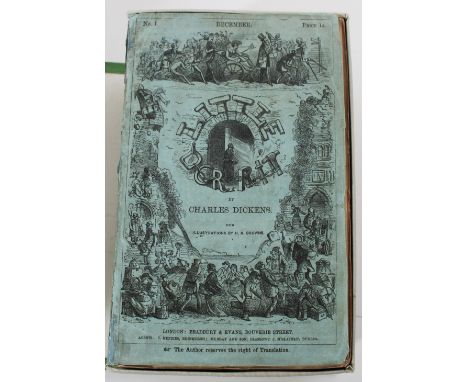
Little Dorrit, By Charles Dickens. With Illustrations By H.K. Browne. London: Bradbury & Evans, Bouverie Street. Agents: J. Menzies, Edinburgh; Murray And Son, Glasgow; J. M’Glashan, Dublin. The Author reserves the right of Translation” on all the front covers, with twenty monthly parts bound in nineteen, as issued; the last part was a double number (XIX and XX bound together) and all the parts are in the original blue wrappers. The first number came out in December, 1855 and ran through June, 1857. There are forty plates by Hablot K. Browne altogether, including the eight Dark Plates. The title page is at the rear of Nos. XIX - XX, with the imprint of Bradbury & Evans on the reverse of the title page (“London: Bradbury & Evans, Printers, Whitefriars”) and an unnumbered page dedicated to Clarkson Stanfield, three pages of preface, followed by four pages of contents, a list of plates on two pages, and three lines of errata at the bottom of page xiv at the rear, and 625 pages of text altogether, and this is a first edition, first issue set with all the slips and ads and plates called for by Eckel and Hatton and Cleaver, including the “Dark Plates”. This was the last time that Dickens worked with Bradbury & Evans and the last of the big novels published by this firm. Part of this was related to a fallout they had about drinking and alcohol - Bradbury & Evans were teetotalers, while Dickens believed in moderate drinking. Chapman & Hall became the publishers of nearly everything Dickens wrote after this. Little Dorrit was perhaps the saddest of all Dickens novels because the story was about imprisonment for debt, an occurrence which happened too often and just rubbed Dickens the wrong way, and the dark plates helped set the somber tone of the novel. Hablot K. Browne (1815 - 1882) was an English artist who illustrated many of Dickens’ novels. His pen name was “Phiz”, and in order to help set this dark tone, Browne incorporated a technique called “dark plate” - the plates were produced by using a ruling-machine that cut close-spaced criss-crossed lines into the steel plates, and these lines created an overall dark cast on the plates, which was ideally suited to convey an atmosphere that matched the somber theme of the book. The dark plates were first introduced in Dombey and Son and Browne continued to use the dark plate technique here and in Bleak House, and there are eight dark plates altogether (in Parts I, II, III, IV, VII, VIII, and XIX - XX). The book was attacked by many critics, but must have been popular with everyday people because it sold very well. Each part cost one shilling, with the last part (Nos. XIX and XX) priced at two shillings because it was a double issue - two numbers in one. All the “Little Dorrit Advertisers” are present at the beginning of each wrapper, there are 12 pages of ads in the front of each part, except for No. I and No. XVI — No. I has 32 pages of preliminary ads and No. XVI has 8 pages of ads in front, all as called for by Hatton and Cleaver. There are very few points of issue to be noted. The main one is the white slip about a name mix-up involving two characters (Rigaud and Blandois), and the second is about another name mix-up (“William” for “Frederick”). The first edition, first issue must have the white slip on page 481 in No. XVI to explain an error in No. XV, and the slip is present here. The slip is about one-third the size of page 481, and on it, Dickens describes the error made in the text of No. XV, in which the names “Rigaud” and “Blandois" had been mixed up. (See Eckel page 84). “Rigaud “ was used for “Blandois” seven times on pages 467 to 473 in No. XV and this error was not corrected in the first issue; in the corrected versions published later on, “Rigaud” was changed to “Blandois”, and the names are uncorrected here, as called for to be a first issue. There’s an errata note at the bottom of the list of plates at the rear of No. XX, and the note says that on page 317 in No. X, line 27 must read “William” instead of “Frederick” for the story to be considered a first issue, and indeed, the uncorrected version with “William” is present here; the corrected version in later issues reads “Frederick” instead of “William”. There are no tissue guards in between the plates, except in No. XX, there are a few uncut pages on the front ads in Nos. III, VII, and XIII and at the rear of No. XX, the owner’s name is on the front of several wrappers, there is light wear at the heel or crown on a few spines, light browning or foxing on some of the plates, but the captions on the Dark Plates are very crisp and not fuzzy or smudged, there’s light soiling on the front of a couple of covers and the rest are very clean, the text is very clean, and there’s been no repairs or restoration to the parts. The green custom box has “Little Dorrit”, “Charles Dickens”, and “Original Parts” in black on the spine and it measures 9 13/16 x 5 5/8 in. wide x 4 1/4 in. across at the spine, and the wrappers are 8vo. and measure 8 7/8 x 5 5/8 in. wide. So overall this is an attractive first edition, first issue set of Little Dorrit in the original wrappers, with all the slips and ads and plates as called for, and both points of issue are present. See The First Editions Of Charles Dickens, Their Points and Values, John C. Eckel 1932 and A Bibliography of the Periodical Works of Charles Dickens: Bibliographical, Analytical & Statistical, by Thomas Hatton and Arthur Cleaver 1933, reprinted by Martino Publishing 1999.
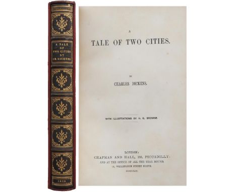
A Tale Of Two Cities, By Charles Dickens, With Illustrations By H. K. Browne, London: Chapman And Hall, 193, Piccadilly; And At The Office Of All The Year Round, 11, Wellington Street North, MDCCCLIX [1859], first edition, first issue in book form, exquisite binding by Marius Michel, 8 Vo., with tooled blue best French crushed levant, five raised bands, six compartments with gilt lettering and gilt devices on the spine, “1859” in gilt at the heel of the spine, triple gilt-ruled borders and gilt devices with a gilt- ruled design inside the triple gilt borders; silk doublures within the gilt-ruled borders on the front paste-down, with the binder’s name in gilt at the bottom; the original marbled endpapers are bound in just after the front free paste-down and just before the silk doublures in the rear, all edges gilt, with the original red boards and spine used to create the custom slipcase here. The list of plates include the illustrated frontispiece, the vignette title page, and fourteen other plates as called for, and all the points of issue called for by Eckel and Walter Smith are present to make this a first edition, first issue: page 213 is misnumbered “113”; “affectionately” is misspelled “affetcionately” on page 134, line 12; signature “b” is at the bottom of the list of plates; the letters “lf” in “himself” are lacking on page 166, five lines from the bottom; page vii in the Contents says Chapter VII of Book the Second is titled “Monsieur the Marquis in Town”, while it reads “Monseigneur in Town” in the text, and page vii in the Contents for Chapter VIII of Book the Second says “Monsieur the Marquis in the Country”, while the text reads “Monseigneur in the Country”; page ix entry 8 in the List of Plates reads “Stryver”, but it is spelled “Striver” in the caption below the illustration on page 94; there appears to be a comma rather than a period after the chapter number on page 98; and page 238, line 14 has triple quotation marks after the exclamation point (Smith page 98); the publisher’s catalogue is lacking, and the captions under the plates are printed in fine lines, which means they are easy to read and come from the early plates - if the captions are difficult to read, that means the plates have worn down and the captions come from later printings (Eckel page 87). The book edition was bound in a vivid red cloth, and the binder Marius Michel used the original red boards here to form the slipcase; his full name was Henri Marius Michel (1846 - 1925) and he was considered the best book binder of his generation, as well as the founder of modern French bookbinding; his bindings are considered works of art, and books bound by him bring high prices. When a book is bound elaborately, the binder will sometimes use leather to cover the interiors of the book’s boards, often with “swoon-inducing” designs; the leather takes the place of paper and these interiors are called doublures; in some cases, the term is used with materials such as decorated silk. The book has 254 pages and measures 8 15/16 x 6 in. wide, and the slipcase measures 9 1/4 x 5 3/4 in. wide; light foxing on a couple of plates, the slipcase has rubbing on the top and bottom and faded lettering on the spine, but the rubbing and fading on the slipcase don’t affect the book at all; overall an exquisite copy of A Tale of Two Cities by a premier book binder in Paris, with all the points of issue called for to make this a rare first edition, first issue. See The First Editions Of Charles Dickens, Their Points and Values, John C. Eckel 1932 and Walter E. Smith, Charles Dickens In The Original Cloth, A Bibliographical Catalogue Part I, Los Angeles: Heritage Book Shop 1982.
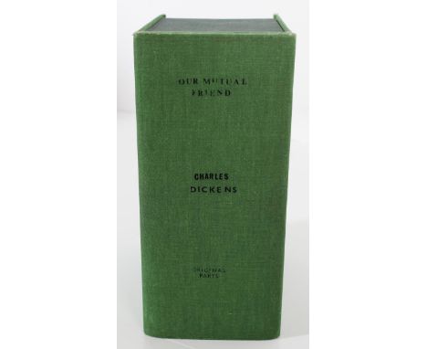
Our Mutual Friend, By Charles, Dickens, in the original monthly parts as issued, complete with the original 20 parts bound in 19, in the original green wrappers, with Illustrations by Marcus Stone, London: Chapman And Hall, Piccadilly, a first edition, first issue, with “The right of Translation is reserved” in small italics at the bottom of the front wrappers. There are 40 plates altogether, all designed by Marcus Stone, and all engraved on wood by Dalziel and W.T. Green (21 by Dalziel and 19 by Green), all the plates are present, and the wrappers are housed in a green custom slipcase. The book was Dickens’ fourteenth novel and was published in monthly installments called “Parts” that ran from May 1864 to November 1865; the last installment had two parts - No. 19 and 20 - bound as one and cost 2 shillings, instead of the usual 1 shilling for each of the parts. It was also Dickens’ last complete novel - he wrote Edwin Drood in 1870, but died later that year, so Edwin Drood was only halfway done and incomplete when Dickens died. Our Mutual Friend also took longer for Dickens to write because he suffered recurrent illnesses towards the end of his life, and the illustrations by Marcus Stone that were engraved on wood by Dalziel and Green also mark a departure from the steel etchings in Dickens’ earlier works. The slipcase measures 9 5/8 x 6 3/4 in. wide and has “Our Mutual Friend, Charles Dickens, Original Parts” in black lettering on the spine, and the green wrappers are 8vo. and measure 8 3/4 x 5 5/8 in. wide. There are many points of issue present that we believe make this a first edition, first issue. The printer’s imprint (W. Clowe’s And Sons) is missing on the front wrapper of Part No. 1 and it appears at the bottom of all the other wrappers, as called for. Part No. 1 has the scare slip addressed to the reader bound in just before the first page of the text; the small white slip reads “The Reader will understand the use of the popular phrase OUR MUTUAL FRIEND, as the title of this book, on arriving at the Ninth Chapter (page 84)”, and Eckel (page 95) says it is a necessity to have this slip “to insure a perfect copy”. It also has the four-page advertisement “The Economic Life Assurance Society” in No. 19 (the ad is tucked underneath the uncut text on pages 257 through 264). Page 13 is misprinted “31” in the front ads in No. 10, and Hatton and Cleaver state that this misprint appears in a few copies. There are other ads which appear in these parts that are often missing too. Each part has the advertisers for “Our Mutual Friend” at the beginning of the ads in front. The Headless Horseman slip appears at the rear in No. 11 and No. 12; the yellow announcement slip for “All The Year Round” is present in No. 8, 12, and 18, and No. 18 has the rare yellow “At The Bar” ad on the slip for “All The Year Round”. No. 1 has the four pages of Thorley ads inserted at the rear and No. 6 has the orange Armadale slip. No. 12 has The People’s Pickwick full-page ad after the 2 plates and before the text, and all the Norton Pill ads and Mappin Webb ads that are required are here. There are numerous ads in green, pink, orange, and blue, and the only ads lacking are the scarce "Economic Life Assurance" ad in Part 14 and the green Foreign Bank Note slip at the rear of Parts 19 - 20, otherwise all the ads called for by Hatton and Cleaver are present. All the plates are clean and present, with tissue guards in between the plates for Nos. 16 and 17. There are light nicks at the edges of some of the wrappers. No. 1 has light soiling and wear along the edges and a tear in the lower right on the front wrapper. No. 5 has slight restoration at the bottom tip on the front wrapper, but you have to look to find it. No. 9 and 10 have small paper loss at the bottom corners of the front wrappers, and there is a faint black oval or circular stamp on the front of No. 7 and a darker circular stamp on the front of No. 11. Otherwise the wrappers and ads and text are clean. Besides WorldCat and abe.com, we used The First Editions Of Charles Dickens, Their Points and Values, John C. Eckel 1932 and A Bibliography of the Periodical Works of Charles Dickens: Bibliographical, Analytical & Statistical, by Thomas Hatton and Arthur Cleaver 1933 as reliable references. Eckel and Hatton and Cleaver are considered the bibles for periodical works by Dickens.
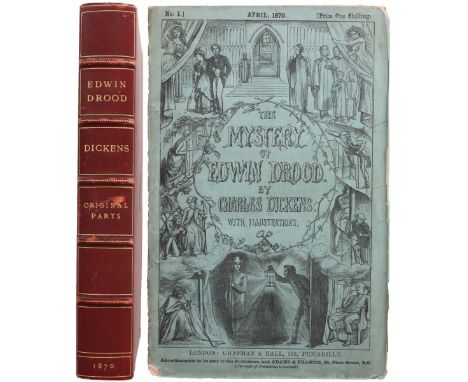
The Mystery Of Edwin Drood, By Charles Dickens, With Illustrations. London: Chapman & Hall, 193, Piccadilly, Advertisements to be sent to the Publishers, and Adams & Francis, 59, Fleet Street, E.C. [The right of Translation is reserved.] on the front cover, in the original green wrappers and in the original six monthly parts, house in a maroon slipcase, and based on Eckel and Hatton and Cleaver, this is a first edition, first issue set. This was Dickens’ last novel. He began writing Edwin Drood in August, 1869 and toiled to get it done, and after he had finished six parts, he died on June 9, 1870, and it became one of the best unfinished mystery stories ever told. The story is named after Edwin Drood, although the text largely focuses on his uncle John Jasper, an opium addict and choir master who is romantically interested in his nephew’s fiancee. In the story, Edwin disappears under mysterious circumstances, and due to Dickens’ premature death, the mystery is never resolved - readers never found out what happened to Edwin Drood after he disappeared. The cover design and the vignette title page were done by Charles Collins, brother of the famous novelist Wilkie Collins; Charles Collins was also the son-in-law of Charles Dickens. Collins married Dickens’ daughter, Kate, but bowed out of doing more designs due to ill health. Dickens then turned to Luke Fildes to illustrate the monthly parts. Fildes produced twelve illustrations before Dickens died. The engraved portrait of Dickens in the last part was done by J.H.Baker, and along with the vignette title page, there are a total of fourteen engraved plates in the six monthly parts. The first number came out April, 1870 and the last September, 1870, and each part was priced at one shilling, until Dickens died and the last part was sold for eighteen pence. There are several points of issue - details - that make this a first edition, first issue. It has the all-important “eighteenpence” slip pasted over the original one shilling price on the front wrapper of No. VI; this is the earliest issue of Part VI - later states are printed with the corrected price - and it cannot be a first issue without this slip at the top of No. VI. The “Edwin Drood Advertiser” is present in each part. There are numerous uncut pages in each part - uncut pages are usually a sign of an early printing - and all the slips and ads in the six parts, including remnants of the Cork Hat ad at the rear of No. II, are present, as called for by Hatton and Cleaver. All the plates are present and very clean in each part, as well. Part VI also has a four-page ad for Willcox & Gibbs titled “A New World At Home For Busy People” rather than a four-page Willcox & Gibbs ad titled “Concerning Stitches”, and Hatton and Cleaver make it clear that either four-page ad is okay in the first issue - “The above two insets are seen alternatively in copies of this part, and in about equal proportions” - so either ad will be acceptable to make this a first edition, first issue set. (See Hatton and Cleaver, page 383. Hatton and Cleaver number the two ads 1A and 1 respectively.) No. I has 36 pages of ads in the front, page 28 is missing part of the 8 in “28” (a printing error), there is a yellow two-page ad for Dr. De Jongh’s Light-Brown Cod Liver Oil, a four-page ad for the Scottish Widows’ Funds Life Assurance Society, four pages of ads for Cassell’s Books, eight pages of ads on yellow paper for Chapman & Hall’s books, and an uncut two-page colored ad for Henry Brett Distillers & Wine Merchants at the rear, and light soiling and wear on the front cover. No. II has 20 pages of ads in the front, with an imperfect 2 on page 2 and an imperfect 6 on page 6 of the front ads, as well as uncut pages in the front, there are four pages of ads for the Willcox & Gibbs Sewing Machine Co. after the text, and remnants of the Cork Hat ad sit between the last page of ads for the Willcox & Gibbs Sewing Machine Co. and the John Brogden ads on the inside of the green wrappers at the rear, with a thin chip at the bottom of the spine. No. III has 20 pages of ads preceding the two plates in front, uncut pages in the text, a yellow two-page ad for Dr. De Jongh’s Light-Brown Cod Liver Oil, a yellow slip for All The Year Round, eight pages of ads for Chapman And Hall’s Recent Publications, four yellow pages of ads for Chapman & Co’s Entire Wheat Flour, and four pages of ads for Cassell’s Books, including a re-issue of the Dore Don Quixote illustration at the rear, with light wear at the bottom of the spine. No. IV has 24 pages of ads preceding the two plates in front, uncut pages in the text, with four pages of ads for Willcox & Gibbs Sewing Machines, four pages of ads in blue for the Scottish Widows’ Funds Life Assurance Society, eight pages of ads for Chapman & Hall’s Recent Publications (including uncut pages), and a full leaf for Chapman Co’s Entire Wheat Flour at the rear. No. V has 20 pages of ads in the front, the two regular plates followed by the text, which has numerous uncut pages, and a two-sided leaf for Land And Water followed by a four-page ad in yellow for Chapman Co’s Entire Wheat Flour at the rear, and page 152 has a one-inch horizontal tear in the margin, which does not affect the text. No. VI has 18 pages of ads in the front, an engraved portrait of Charles Dickens followed by an engraving of a cathedral after the ads in front, with a tissue guard in between, followed by the two regular plates titled “Up The River” and “Sleeping It Off”, with a tissue guard in between these two plates, uncut pages of text, four uncut pages of Contents followed by an Illustrations page and two uncut pages for Dickens books, and an ad for Willcox & Gibbs Sewing Machines and four yellow pages of ads for Chapman & Co’s Entire Wheat Flour at the rear. All the parts have tissue guards between the plates except No. II, there are some light tears or creases here and there, and the original wrappers and pages are completely unrestored - no repairs whatsoever. The maroon slipcase measures 9 1/8 x 6 3/8 in. wide and has five raised bands, six compartments and gilt lettering on the spine, and the date in gilt at the heel of the spine; the gilt lion couchant (a lion laying down) with a star-like cross in one paw (a patoncy) and the initials “C.D.” appear in a gilt ring on the cover of the slipcase, and the wrappers are 8 Vo. and measure 8 7/8 x 5 11/16 in. wide., very light soiling and light wear on the covers, and light soiling and modest wear on the spines. A scarce first edition, first issue set of Edwin Drood in the monthly parts, in a beautiful slipcase, with all the ads and points of issue called for by Eckel and Hatton and Cleaver. See The First Editions Of Charles Dickens, Their Points and Values, John C. Eckel 1932 and A Bibliography of the Periodical Works of Charles Dickens: Bibliographical, Analytical & Statistical, by Thomas Hatton and Arthur Cleaver 1933, reprinted by Martino Publishing 1999.
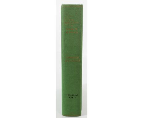
This is the second of two sets of The Mystery of Edwin Drood that are in the auction; it is housed in a green custom slipcase, to distinguish itself from the other set that is housed in a a maroon slipcase. The Mystery Of Edwin Drood, By Charles Dickens, With Illustrations. London: Chapman & Hall, 193, Piccadilly, Advertisements to be sent to the Publishers, and Adams & Francis, 59, Fleet Street, E.C. [The right of Translation is reserved.] on the front cover, in the original green wrappers and in the original six monthly parts, and we believe this is a first edition, second issue set. This was Dickens’ last novel. He began writing Edwin Drood in August, 1869 and toiled to get it done, and after he had finished six parts, he died on June 9, 1870, and it became one of the best unfinished mystery stories ever told. The story is named after Edwin Drood, although the text largely focuses on his uncle John Jasper, an opium addict and choir master who is romantically interested in his nephew’s fiancee. In the story, Drood disappears under mysterious circumstances, and due to Dickens’ premature death, the mystery is never resolved - readers never found out what happened to Edwin Drood after he disappeared. The cover design and the vignette title page were done by Charles Collins, brother of the famous novelist Wilkie Collins; Charles Collins was also the son-in-law of Charles Dickens. Collins married Dickens’ daughter, Kate, but bowed out of doing more designs due to ill health. Dickens then turned to Luke Fildes to illustrate the monthly parts. Fildes produced twelve illustrations before Dickens died. The engraved portrait of Dickens in the last part was done by J.H.Baker, and along with the vignette title page, there are a total of fourteen engraved plates in the six monthly parts. The first number was dated April, 1870, and the last September, 1870, and each part was priced at one shilling, until Dickens died and the last part was sold for eighteen pence. There are several points of issue - details - that probably make this a first edition, second issue. It has the all-important “eighteenpence” slip pasted over the original one shilling price on the front wrapper of No. VI; this is the earliest issue of Part 6 - later states are printed with the corrected price - and it cannot be a first edition without this slip at the top of Part 6. The “Edwin Drood Advertiser” is present in each part. There are some uncut pages in No. I - uncut pages are usually a sign of an early printing - and all the ads are present in the six parts. except for the Cork Hat ad in No. II. No. I has 36 pages of ads in the front, no tissue guard between the two plates after the ads, page 28 is missing part of the 8 in “28” (a printing error), there is a yellow two-page ad for Dr. De Jongh’s Light-Brown Cod Liver Oil, a four-page ad for the Scottish Widows’ Funds Life Assurance Society, four pages of ads for Cassell’s Books, eight pages of ads on yellow paper for Chapman & Hall’s books, and an uncut two-page colored ad for Henry Brett Distillers & Wine Merchants at the rear, with soiling and wear on the front cover and some creases at the lower tips on a few pages of text. For No. II, the owner’s name is inscribed in the margin at the top of the front cover, there are 20 pages of ads in the front, there is an imperfect 2 on page 2 of the front ads, four pages of ads for the Willcox & Gibbs Sewing Machine Co. after the text, the Cork Hat ad is lacking, and there is some browning or spots on the fore-edge on some of the pages and the back cover. No. III has 20 pages of ads preceding the two plates in front, no uncut pages, a yellow two-page ad for Dr. De Jongh’s Light-Brown Cod Liver Oil, a yellow slip for All The Year Round, eight pages of ads for Chapman And Hall’s Recent Publications, four yellow pages of ads for Chapman & Co’s Entire Wheat Flour, and four pages of ads for Cassell’s Books, including a re-issue of the Dore Don Quixote illustration at the rear, with light wear at the edges and two tips. No. IV has a new yellow two-page ad for John F. Dunn (Hatton and Cleaver don’t mention this ad), followed by 24 pages of ads preceding the two plates in front, no uncut pages in the text, with four pages of ads for Willcox & Gibbs Sewing Machines, four pages of ads in blue for the Scottish Widows’ Funds Life Assurance Society, eight pages of Chapman & Hall’s Recent Publications and a full leaf for Chapman & Co’s Entire Wheat Flour at the rear, and slight nicks on the edges of the front cover. No. V has 20 pages of ads in the front, the two regular plates followed by the text, no uncut pages in the text, and a two-sided leaf for Land And Water followed by a yellow four-page ad for Chapman & Co’s Entire Wheat Flour at the rear, light nicks and creases at the bottom of the front cover, a small chip on the rear cover, and light foxing in the text. No. VI has 18 pages of ads in the front, an engraved portrait of Charles Dickens followed by an engraving of a cathedral after the ads in front, followed by the two regular plates titled “Up The River” and “Sleeping It Off”, no uncut pages of text, two pages of ads for Charles Dickens’ works, followed by a title page, three pages of Contents, an Illustrations page, four pages of ads for Willcox & Gibbs Sewing Machines titled “Concerning Stitches” and four yellow pages of ads for Chapman & Co’s Entire Wheat Flour at the rear, and there are brown spots on some ads in the front and a chip on page 180. All the parts have the Edwin Drood Advertiser in the front, but no tissue guards in between the plates in any parts for this set, the plates are very clean, there are some light tears or creases here and there, and the original wrappers and pages are completely unrestored - no repairs whatsoever. The custom green slipcase measures 9 11/16 x 6 11/16 in. wide and has “The Mystery Of Edwin Drood” and “Charles Dickens” in gilt lettering on the spine, followed by “Original Parts” in black lettering and “1870” in gilt at the bottom of the spine of the slipcase, and the wrappers are 8 Vo. and measure 8 7/8 x 5 5/8 in. wide. A scarce first edition, second issue set of Dickens’ last work in the monthly parts, in a custom green slipcase. See The First Editions Of Charles Dickens, Their Points and Values, John C. Eckel 1932 and A Bibliography of the Periodical Works of Charles Dickens: Bibliographical, Analytical & Statistical, by Thomas Hatton and Arthur Cleaver 1933.
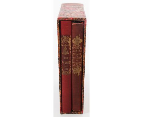
These are two volumes of first edition Christmas books by Dickens in a custom-fitted slipcase. The first is The Chimes: A Goblin Story Of Some Bells That Rang An Old Year Out And A New Year In. By Charles Dickens. London: Chapman And Hall, 186, Strand. MDCCCXLV [1845] on title page, with the imprint “London Bradbury And Evans Printers Whitefriars” on the reverse of the title page, with a list of thirteen illustrations after the imprint page, and it’s a first edition, second issue, with the name of the publishers “Chapman and Hall” at the bottom of the vignette title page, just outside the vignette; the first issue has “Chapman and Hall” printed inside the border of the plate, not outside the vignette. (The location of the publishers’ names on the vignette title page is the only point of issue listed for The Chimes.) The spine shows an image of a bell, the title, and “By Charles Dickens” in gilt, and the red covers are decorated with the title, six chimes, and Dickens’ name in gilt, with an embossed floral border around the gilt decorations on the cover; these are the original red covers. There are yellow endpapers followed by an ad for A Christmas Carol, as called for by Eckel. All the edges are gilt, with 175 pages of text, followed by the imprint of Bradbury And Evans again after page 175. The thirteen illustrations include the frontispiece and the vignette title page, both done by Daniel Maclise, and the rest were done by John Leech, Clarkson Stanfield, and Richard Doyle. This is Dickens’ second Christmas book in his Christmas Books series. Dickens wrote it when he was in Genoa, Italy, but the city didn’t seem to have the local atmosphere he wanted - he went there to see Joseph Grimaldi perform pantomime, but he missed London - and when he got back to London, he performed a reading of the book in front of friends at John Forster’s home, the person who became the noted biographer of Dickens. The top edges of the covers have light soiling, the frontispiece and vignette title page have very light spots on them, the tips have light wear, and the endpapers, text, and the rest of the plates are very clean. The second Christmas book is The Battle of Life, and the title page reads “The Battle Of Life. A Love Story. By Charles Dickens. London: Bradbury & Evans, Whitefriars. MDCCCXLVI” [1846], with the imprint of Bradbury & Evans on the reverse of the title page (“London: Bradbury And Evans, Printers, Whitefriars”), the book is dedicated to “My English Friends In Switzerland”, with a list of thirteen illustrations after the dedication page, and again the frontispiece and the vignette title page were both done by Daniel Maclise, and the rest by John Leech, Clarkson Stanfield, and Richard Doyle. All the edges are gilt, with 175 pages of text, followed by the imprint of Bradbury And Evans (“London: Bradbury And Evans, Printers, Whitefriars”), followed by two pages of publishers’ ads for Works by Dickens at the rear, and it has no points of issue, according to Eckel. It is a romantic novel and the fourth of Dickens’ Christmas books, and it’s a first edition, fourth issue because the cupid is holding a banner on the vignette title page and the publisher’s name has been left off the engraved title page altogether. (See Eckel page 122 for an illustration of the fourth issue.) The front paste-down has three light smudges and a small paper at the bottom which says “Dickens, The Battle of Life: A Love Story. Fine illustrations on wood by Maclise, Doyle, Leech, etc. 12 mo, cloth, gilt edges. London, 1846 Nice, fresh copy” on it. Otherwise, the endpapers, the plates, and the text are clean, with light fraying at the crown and heel of the spine. There are no repairs or restoration to the book at all. The Chimes is a small 8vo. and measures 6 3/4 x 4 1/2 in. wide, The Battle Of Life is also a small 8vo. and measures the same size as The Chimes, and the custom slipcase has Dickens’ name and “The Chimes The Battle Of Life" in gilt on the spine and measures 7 1/8 x 4 7/8 in. wide. See The First Editions Of Charles Dickens, Their Points and Values, John C. Eckel 1932 (pages 116 to 118 for The Chimes and pages 119 to 120 for The Battle of Life). An attractive pair of first edition Christmas books by Dickens in the original cloth and housed in a custom slipcase.
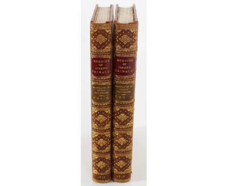
Memoirs of Joseph Grimaldi, Edited by “Boz.” With Illustrations by George Cruikshank. In Two Volumes, London, Richard Bentley, New Burlington Street. 1838, in fine bindings by Morrell of London, 8 Vo, 3/4 bound, with five raised bands, red labels and gilt titles, six gilt-ruled compartments with elaborate gilt tooling on the spines, marbled endpapers, a frontis portrait of Joseph Grimaldi in Volume I and a frontis illustration of “Grimaldi’s kindness to the Giants” in Volume II, and the top edges are gilt. Boz was an early pen name of Charles Dickens. Volume I is 288 pages long and Volume II is 263 pages long. Both volumes have the imprint of Samuel Bentley at the end (“London: Printed By Samuel Bentley, Dorset Street, Fleet Street.”) as called for, and there is a list of embellishments (drawings) on the last page of Volume II, as called for; the list includes seven plates in Volume I, including the frontispiece, and six plates in Volume II, including the frontispiece, all by George Cruikshank. To tell if this is a first edition, first issue, you have to look at the plate on page 238 in the second volume. Eckel says that one distinguishing mark relates to the last plate in the book, known as The Last Song. In order for this to be a first issue, this should have no border, and it doesn’t. In the second issue a very crude attempt was made to “improve” Cruikshank’s drawing by surrounding it with a grotesque border, and there is no border around this plate (Eckel 141). It should also have 36 pages of advertisements for Mr. Bentley’s List of New Works at the end of Volume II, according to Eckel, and these pages are lacking, so it seems like this set is a first edition, mixed issue, rather than a first edition, first issue. Samuel and Richard Bentley were brothers - Richard published and Samuel did the printing at Samuel’s print shop, and George Cruikshank (1792 - 1878) was a British caricaturist and book illustrator praised as the "modern Hogarth" during his lifetime - high praise indeed - and his book illustrations for his friend Dickens reached an international audience, and collections of his works are in the British Museum and the Victoria and Albert Museum. Joseph Grimaldi (1778 - 1837) was a real English actor, comedian, and dancer who easily became the most popular entertainer of the Regency era; he created the stereotype of the sad clown and was so dominant on the London stage that the pantomime role of the Clown became known as "Joey", and both the nickname and Grimaldi's whiteface make-up design were used by other types of clowns, and still are; Dickens also edited the book under his nom de plume “Boz”, possibly because he didn’t know if the book would sell, but actually it was a huge success. The two volumes measure 7 1/2 x 5 in. wide, with light rubbing at the tips, and this is an attractive set in a fine binding written by a premier author and illustrated by one of the top artists of the nineteenth century. See The First Editions Of Charles Dickens, Their Points and Values, John C. Eckel 1932.
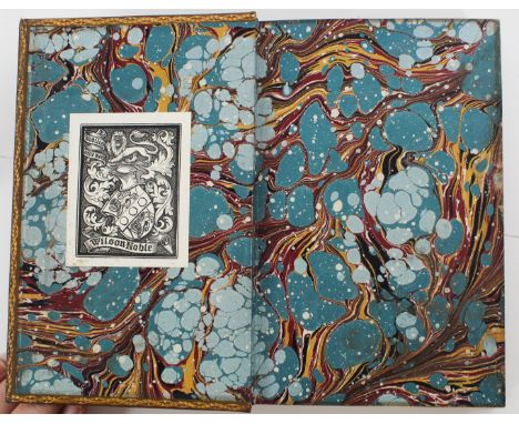
The Life Of Charles Dickens, By John Forster, London: Chapman And Hall, 193, Piccadilly 1873 - 1874, in three volumes, with the imprint of Bradbury, Agnew, & Co, Printers, Whitefriars on the reverse of the title page, The Life Of Charles Dickens on the half-title, 8vo., five raised bands, gilt titles on red and black labels and geometric gilt patterns on the spine, gilt borders on the front and back covers, gilt dentelles on marbled endpapers with the bookplate of Wilson Noble on the front paste-downs, all edges beautifully marbled; the three volumes in fine bindings in full calf by Riviere & Son (Riviere & Son noted at the bottom of the leaf on the reverse of the front free endpaper). Volume The First, 1812 - 1842, thirteenth edition, has a portrait of a young Dickens on the frontispiece; the frontispiece was done after a painting of Dickens by D. Maclise when Dickens was just 27, and it was engraved here by R. Graves, with corrections to the first edition noted on the page before the Table of Contents, which is 12 pages long, and there are 9 illustrations listed after the Table of Contents, and this volume is 398 pages long. Volume The Second, 1842 - 1852, was published by Chapman and Hall in 1873, the frontispiece has a portrait of Dickens engraved by R. Graves after a painting done by W.R. Frith, when Dickens was 47 years old, with a tissue guard between the frontispiece and the title page; with three pages of corrections made in the later editions of the first volume noted just before the list of illustrations and 12 pages for the Table of Contents, and this volume is 462 page long. Volume The Third, 1852 - 1870, Tenth Thousand, was published by Chapman and Hall in 1874, and it has a frontispiece of Dickens engraved by J.C. Armytage after the last photo of Dickens taken when he was in America in 1868 - Dickens was 56 at the time - with a tissue guard between the frontispiece and the title page; there are 13 illustrations followed by 9 pages for the Table of Contents; this volume is 552 pages long, including the Appendix and Index, and the Appendix has some uncut pages. Each volume measures 8 1/2 x 5 3/4 in. wide, with light scuffs on the back of Volume I and on the front and back of Volume II and Volume III, and they don’t detract from the attractiveness of the set. John Forster (1812 - 1876) was an important Victorian English biographer and literary critic who became a close friend of Charles Dickens, he was also the literary executor of Dickens’ estate and had access to virtually all of Dickens’ letters and writings, and he was considered the officially recognized biographer of Dickens because of their friendship and his handling of Dickens’ literary estate; he began this biography of Dickens shortly after Dickens died in 1870 and finished it in 1874, and this three-volume set is the primary work by which Forster is remembered. Wilson Noble (18554 - 1917) was a barrister and Conservative Party politician in England who served as a member of Parliament (an MP) from 1886 to 1895.
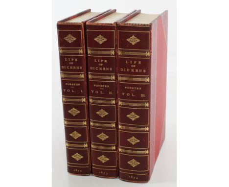
The Life Of Charles Dickens, By John Forster, London: Chapman And Hall, 193, Piccadilly 1872 - 1874, in three volumes, tenth edition, bound by Morrell in red crimson, 8vo., 3/4 bound, with gilt ruled compartments and gilt lettering and gilt devices on the spine, crimson boards, with the bookplate of William King Richardson on the marbled endpapers, the half-title reads The Life Of Charles Dickens, and the top edges are gilt. Volume The First, 1812 - 1842, 1872, has a portrait of Dickens on the frontispiece; the frontispiece was done after a painting of Dickens by D. Maclise when Dickens was just 27, and it was engraved here by R. Graves, with a tissue guard between the frontispiece and the title page; with no notes about corrections to the first edition, the Table of Contents is twelve pages long, with nine illustrations listed after the Table of Contents, and this volume is 398 pages long. Volume The Second. 1842 - 1852, has a portrait of Dickens on the frontispiece when he was “AET 47”, and it was engraved again by R. Graves, with a tissue guard between the frontispiece and the title page and “1873” at the bottom of the title page, followed by the imprint of Bradbury, Evans, And Co., Printers, Whitefriars on the reverse of the title page, then three pages of Corrections Made In The Later Editions Of The First Volume - it appears to be a tenth edition set which Forster himself said was needed because the demand for this biography was so high - followed by an Illustrations page with eleven plates listed, followed by twelve pages for the Table of Contents (ix - xx), with 462 pages of text, and light wear along the edges of the spine. It also has the name of the binder “Morrell, Binder, London” on the reverse of the front free endpaper. We originally believed this to be a first edition set because there are no additional printings on the title page or the reverse of the title page (see Bill McBride, A Pocket Guide to the Identifications of First Editions, West Hartford, Ct., 1995 for first editions by Chapman And Hall), but the three pages about “Corrections Made In The Later Editions Of The First Volume” appear to indicate this is a tenth edition, not a first edition of Forster’s biography of Dickens. Volume The Third. 1852 - 1870, has a frontispiece portrait of Dickens when he was “AET 56”, the frontispiece was engraved by J.C. Armytage, with a tissue guard between the frontispiece and the title page and “1874” at the bottom of the title page, followed by the imprint of Bradbury, Evans, And Co., Printers, Whitefriars on the reverse of the title page and a list of Illustrations with thirteen plates, then nine pages for the Table of Contents, followed by 504 pages of text and a seventeen page Appendix, a blank leaf, and a thirty page Index, for a total of 552 pages, with very light rubbing on the edge of the spine, and it has the name “Morrell, Binder, London” on the reverse of the front free endpaper. John Forster was the officially recognized biographer of Dickens because they were such close friends and he handled Dickens’ literary estate. William King Richardson was a prominent Boston lawyer and bibliophile who assembled a remarkable collection of rare books and manuscripts that are now housed at the Houghton Library at Harvard University. Each volume measures 8 11/16 x 5 5/8 in. wide and this is an attractive set in red crimson.
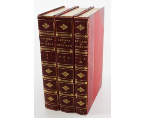
The Letters Of Charles Dickens, Edited By His Sister-In-Law And His Eldest Daughter. In Three Volumes, London: Chapman And Hall, 193, Piccadilly 1880 - 1882, first edition by Chapmen And Hall - there are no additional printings on the copyright pages, which makes this a first edition set - all bound by Morrell of London, with all three errata slips present, as called for, and all the top edges are gilt. Volume I covers 1833 to 1856 and is 3/4 bound in crimson, with “Letters Of Dickens” and “1880” in gilt lettering on the spine, the bookplate of William King Richardson on marbled endpapers, “1880" at the bottom of the title page, with “Charles Dickens And Evans, Crystal Palace Press” on the reverse of the title page, a three-page preface, an eight-line errata slip bound in after the preface - all four points of issue are uncorrected, which makes this a first edition as well - and 463 pages of text. Volume II covers 1857 to 1870 and is 3/4 bound in crimson, with “Letters Of Dickens” and “1880” in gilt lettering on the spine, the bookplate of William King Richardson on marbled endpapers, “1880" at the bottom of the title page, with “Charles Dickens And Evans, Crystal Palace Press” on the reverse of the title page, an errata slip with eleven line - six of the seven points of issue are uncorrected - and it is 464 pages long, including the index. (The fourth point of issue is supposed to be on line 10 on page 130, but it actually appears uncorrected on line 3, and the sixth point of issue which is supposed to read “a head” on page 160, line 32 in uncorrected form actually has been corrected to read “ahead”, and this is the only point of issued that has been corrected.) It says “In Two Volumes” in both Vol I and Vol II, but the third volume was added afterwards because Mamie Dickens and Georgina Hogarth, the eldest daughter and sister-in-law of Dickens, received letters addressed to Lord Lytton that didn’t arrive in time to be included with the first two volumes, so this third volume was added to the set. Volume III covers 1836 to 1870 and is 3/4 bound in crimson, with “Letters Of Dickens” and “1882” in gilt lettering on the spine, the bookplate of William King Richardson on marbled endpapers, “1882" at the bottom of the title page, with “Charles Dickens And Evans, Crystal Palace Press” on the reverse of the title page, a one-page preface, and an errata slip with six lines, and the five points of issue listed on this slip are all uncorrected, which reconfirms that this is a first edition set too, and it is 308 pages long, including the index. William King Richardson was a prominent Boston lawyer and bibliophile who collected illuminated manuscripts, incunabula, illustrated books, and fine bindings, and his collection is housed at Harvard University’s Houghton Library. Each volume measures 8 3/4 x 5 3/4 in. wide, Volume I has wear along the right edge of the spine and very light wear at the tips, Volume II has light rubbing along the right edge of the spine and light wear at the tips, and Volume III has rubbing along the edges of the spine, a tiny chip at the top of the spine, and very light wear at the tips, and still a very attractive first edition set about the letters sent by Charles Dickens during his lifetime. See Bill McBride, A Pocket Guide to the Identifications of First Editions, West Hartford, Ct., 1995 for first editions by Chapman And Hall.
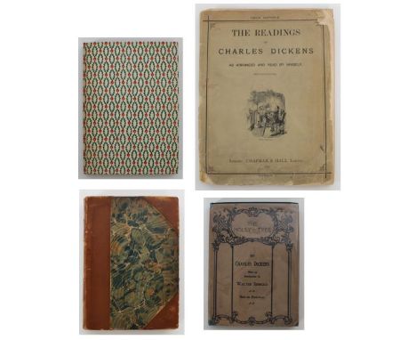
This is one lot with four books by Charles Dickens all related to Christmas. a) A Christmas Carol, Charles Dickens, New York & London, G.P. Putnam’s Sons 1900, Copyright, 1900 (for Designs) By G.P. Putnam’s Sons, The Knickerbocker Press, New York at bottom of the copyright page, the illustrations are from designs by Frederick Coburn, with twelve illustrations in photogravure, including the frontispiece, and nineteen illustrations in black and white, instead of photogravure, with red-captioned tissue guards present for each plate; 3/4 bound, four raised bands, with gilt labels and gilt lettering on the spine, modest decorations on the spine, with marbled covers and endpapers; the top edge is gilt, the book is 157 pages long and measures 7 3/4 x 5 1/2 in. wide, with light rubbing and modest wear at the tips. This was the first of Dickens’ Christmas books and came out in 1843, and it’s a perennial favorite of children and people who love Christmas. b) A Christmas Carol By Charles Dickens, Illustrated By Fritz Kredel For The Peter Pauper Press, Mount Vernon, New York, circa 1944, with a green slipcase, red and green holly decorations on cover, blank endpapers, a red topstain, and inscribed “Ashley Day Leavitt, best times for 1944 - last paragraph on page 26” on the second front free endpaper; Ashley Day Leavitt (1877–1959) was a Yale-educated Congregational minister who led the State Street Church in Portland, Maine, and later the Harvard Congregational Church in Brookline, Massachusetts; he was a frequent public speaker during the early twentieth century and was awarded an honorary degree from Bowdoin College for his pastorship of several congregations during wartime; the last paragraph on page 26 starts with “Mankind is my business. The common welfare was my business; charity, mercy, forbearance, and benevolence were, all, my business”; the book also includes a Christmas card which reads “The Reading of the Christmas Carol by Dr. Leavitt on Wednesday night before Christmas is one of our richest traditions. So we are sending it to you that wherever you may be on date, you may share with us the Christmas Spirit of Harvard Church”; a topstain is a normal coloring applied by the printer and does not indicate a “stain” on a book - it is not a “bad” thing; the book is 8vo. and possibly a first edition by Peter Pauper Press - 1944 is an early date for a Peter Pauper edition of this book - and book is 108 pages long and the slipcase measures 8 3/8 x 6 in. wide, with light browning on the spine and a tape mark on the front free endpaper where the Christmas card was attached to the book; the inscription by Ashley Day Leavitt and the attached card is what makes this book noteworthy. c) The Holly-Tree, By Charles Dickens, With An Introduction By Walter Jerrold, Thirty-one Illustrations, Philadelphia: Henry Altemus Company on the title page, Copyright 1904 Henry Altemus on the copyright page, with the dust jacket, a beautifully illustrated front cover on the book itself, vignette endpapers with the owner’s name and date inscribed on the front free endpaper (“Elva Bommuleir from Mita G Ott, XMas 1910”), with an attractive colored frontis, black and white illustrations inside, 109 pages (counting the illustration on the last page), and the dust jacket reads “The Holly-Tree No. 1” on the spine and is the first in the Holly-Tree series by Altemus. The book measures 7 1/2 x 5 1/2 in. wide and the green hard-bound volume is in excellent condition, while the dust jacket is in great condition on the back and has some modest chips on the crown and the tips of the front cover. The Holly-Tree Inn was originally published as a short story in the Christmas 1855 edition of Household Words, a publication edited by Dickens in the 1850’s, and it was considered a portmanteau story, or a story written by several authors. The portmanteau story lent itself well to the medium of weekly publications because it allowed for authors to work together to compile a single plot rather quickly, and such stories increased in popularity during the Victorian era. Dickens only wrote three of the sections and the framing story for The Holly Tree Inn (The Guest, The Boots, and The Bill), and Wilkie Collins and three others contributed to the rest of this special Christmas extra. The story published in book form here is called a first edition thus by Altemus because it is based on the original story and has only one date on the copyright page and no additional printings. See Bill McBride, A Pocket Guide to the Identifications of First Editions, West Hartford, Ct., 1995 for first editions by Chapman And Hall. d) The Readings Of Charles Dickens As Arranged And Read By Himself, With Illustrations, London: Chapman & Hall 1883 on the front cover, and “Copyright” at the bottom of the front cover, The Readings of Mr. Charles Dickens, As Condensed By Himself on the title page, Price Sixpence, green wrappers, 64 pages, double columns, with ads on the interior front cover and on the interior and exterior covers at the rear. Dickens started doing readings for charity in 1853, and the readings here include A Christmas Carol In Four Staves, Bardell And Pickwick, David Copperfield, Mr. Bob Sawyer’s Party, The Story of Little Dombey, Nicholas Nickleby Four Chapters, Boots At The Holly-Tree Inn, Doctor Marigold, Nicholas Nickleby Three Chapters, and Mrs. Gamp; the book measures 11 1/2 x 8 1/2 in. wide, the front cover is detached and has wear, and there are creases at the tips on some pages, but very readable.
The Dickens- Kolle Letters, Edited by Harry B. Smith, New York, Supplemental To The Letters From Charles Dickens To Maria Beadnell, Printed For Members Only, Bibiliophile Society, Boston 1910, a first edition, limited to 483 copies, 8vo., 3/4 bound, with a white spine, white tips, and brown boards, gilt lettering on the spine, blank endpapers, with tissue guards, a frontis portrait of Charles Dickens from a study in oil by W. R. Frith in the collection of Harry B. Smith, with a facsimile note and cartoon by Dickens from 1838 preceding the frontispiece and a facsimile of a pencil sketch by Dickens after the preface; the book is 90 pages long, with uncut pages and light foxing towards the top of some pages. Maria Beadnell was the first love of Charles Dickens; they met in 1830, and for Charles it was love at first sight, but the romance didn’t work out because her parents did not approve of the relationship; her father was a banker and he felt Charles was too young a suitor and lacking in prospects; Dickens worked as a court stenographer and shorthand reporter at the time, and his dissatisfaction with his own career and a desire to make a more favorable impression with the Beadnells led him to consider becoming an actor, but that didn’t work out, nor did his relationship with Maria; they courted for three years, and eventually Maria broke off the relationship; however, her influence can be seen in David Copperfield and Little Dorrit - she inspired the character of Dora in David Copperfield and Flora Flinching in Little Dorrit. Dickens was a friend of Kolle’s, who was going to marry Maria’s sister, and that’s how these letters came about; the book measures 9 1/2 x 6 7/8 in. wide, and it comes with a two-part slipcase - a smaller one that fits inside an outer one - and both are present here. You can get a sense of what Dickens was like from the books he wrote, but this book offers insights into the life of Charles Dickens that are a little more personal.
This lot contains three books about Charles Dickens, two written by prominent authors and the third a valuable resource for anyone dong research about Dickens. One was written by G. K. Chesterton, an English writer who dabbled in crime novels; the second by Francis Hopkinson Smith, who descended from one of the signers of the Declaration of Independence and helped build the foundation for the Statue of Liberty; and the third is about the Dickens material housed at Yale University’s library. a) Appreciations And Criticisms Of The Works Of Charles Dickens, By G K Chesterton, London: 1911 J.M. Dent & Sons Ltd. and New York: E.P. Dutton, a first edition (the 1911 date on the title page matches the 1911 date on the copyright page), with dark green cloth, gilt lettering on the spine, an embossed cover with gilt lettering, blank endpapers, a frontis portrait of Dickens from an oil painting by R. J. Lane, with a tissue guard protecting the portrait, 8 illustrations including the frontispiece, the book is 243 pages long, the top edge is gilt, and the book measures 8 7/8 x 6 1/8 in. wide. G. K. Chesterton (1874 - 1936) was an English writer, theologian, and literary critic who created the fictional priest-detective Father Brown that we know from the television series by the same name. b) In Dickens’s London, By F. Hopkinson Smith, Illustrated With Charcoal Drawings By The Author, New York: Charles Scribner’s Sons 1916, with 1914 on the copyright page, which makes this a second printing, green cloth with title stamped in gilt on the spine and the front cover and a green wreath below the title on the front, blank endpapers with the bookplate of Charles Irving Thayer and a small label at the bottom of the front free endpaper saying “Chas. E. Lauriat Co.” in Boston, where the book was sold, there are 23 illustrations and 5 documents and photographs in the book, the book is 8vo. and measures 9 5/8 x 6 1/2 in. wide, with a total of 127 pages; Francis Hopkinson Smith was an American author, artist and engineer who is credited with designing the foundation for the Statue of Liberty. c) Dickens And Dickensiana. A Catalogue Of The Richard Gimbel Collection In The Yale University Library, By John B. Podeschi. New Haven: Yale University Library, 1980. A first edition - the dates on the title page and copyright page match, making this a first edition - and the catalogue includes information about major and minor editions by Dickens, translations and adaptations, periodicals, manuscripts, autographed letters and documents, sheet music, playbills and much more. An absolutely great resource for collectors and people wanting to do research on Dickens. Green boards with a paper label on the spine, brown endpapers, with 532 pages of text and a 37-page index at the end. The book measures 9 7/8 x 6 1/4 in. wide, clean and tight, and a great resource for for students and enthusiasts about Dickens.
Greenwich Hospital, A Series of Naval Sketches, Descriptive Of The Life Of A Man-Of -War’s Man. By An Old Sailor, With Illustrations By George Cruikshank, London: Published By James Robins, Ivy Lane, Paternoster Row, And Joseph Robins, Lower Ormond Quay, Dublin. MDCCXXVI [1826], first edition, 3/4 bound, with five raised bands, gilt titles and “1826” in gilt on the spine, half pebbled marbled boards and marbled endpapers, a colored frontis of Billy Culmer & the Goose by Cruikshank, a vignette title page, a Contents page and list of Illustrations, a six-page Introduction, and 200 pages of text, with 12 hand-colored aquatint plates by Cruikshank and sixteen small black-and-white woodcuts by Cruikshank (including the vignette title page), this is a famous early production of Cruikshank’s works, with Cruikshank’s comical treatment of naval life, capturing the frolics of tars ashore and at sea, illustrating the nautical tales of Matthew Henry Barker, who wrote under the pseudonym “An Old Sailor”. Cruikshank was a friend of Barker (1790-1846), who was born at Deptford, London's old shipbuilding dock, and who joined an East Indiaman at the age of 16, then served in the Royal Navy, where "as he was without influence, he never rose beyond the rank of master's mate”. Barker retired in 1813, then commanded an armed schooner that was hired to carry dispatches to the English squadrons along the coasts of France and Spain; at one time, he was captured and detained for some month as a prisoner of war. Barker wrote several other spirited sea tales, but he felt his publishers were not very generous with him - he married, but had increasing difficulty supporting his family, and he died in poverty in 1846. George Cruikshank (1792 - 1878) was a British caricaturist and book illustrator, praised as the "modern Hogarth" during his lifetime. His book illustrations for his friend, Charles Dickens, and many other authors reached an international audience. Cruikshank's early career was renowned for his social caricatures of English life for popular publications and he became one of England's most popular satirists. His first major work was Pierce Egan's Life in London (1821), followed by The Comic Almanack (1835 - 1853), and Cruikshank gained notoriety with his political prints that attacked the royal family and leading politicians. For Charles Dickens, Cruikshank illustrated Sketches by Boz (1836), The Mudfog Papers (1837–38) and Oliver Twist (1838). He also illustrated Memoirs of Joseph Grimaldi (1838), which Dickens edited under his regular nom de plume, "Boz". Cruikshank even acted in Dickens' amateur theatrical company. But the friendship between Cruikshank and Dickens soured when Cruikshank became a fanatical teetotaler in opposition to Dickens' views of moderation. The book is 4to. and measures 10 5/8 x 8 3/4 in. wide, with pencilled notes on the first blank endpapers, light foxing on a couple of plates, and the rest of the plates and text are very clean. A great find for a Cruikshank collector who values quality illustrations.
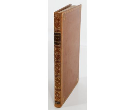
Eccentric Tales From The German Of W. F. Von Kosewitz, With Illustrations By George Cruikshank, from Sketches by Alfred Crowquill, London: James Robins, Ivy Lane, Paternoster Row. MDCCCXXVII [1827], first edition in book form, in a fine binding by Root. The Tales were anonymously translated by Robert Forrester, an English lawyer and writer who was the brother of Alfred Henry Forrester, who used the pseudonym Alfred Crowquill to illustrate the book and provided the sketches that Cruikshank used to illustrate the book. There are only two illustrations by Cruikshank here - the colored frontis and a small black-and-white illustration on page 15. The book has five raised bands, gilt lettering on a maroon label, six gilt-ruled compartments with decorative devices and “1827” in gilt at the heel of the spine, triple gilt-fillet borders with gilt devices in the corners, gilt dentelles on yellow-orange endpapers, a terrific colored frontis by George Cruikshank, the title page followed by a dedication page, a preface, and 181 pages of text.The endpapers also have the bookplate of Frank L. Hadley that features oil wells, a stack of books with an oil lamp, an eagle, and a light shining on a book, so Hadley was obviously a man of means. The book is 8vo. and measures 8 7/8 x 5 5/8 in. wide, with just a hint of wear at the crown and tips.
![Our Own Times, Illustrated By George Cruikshank, Bradbury & Evans, 90, Fleet Street, MDCCCXLVI [1846], The first edition](https://cdn.globalauctionplatform.com/52450936-dc9c-4d12-829a-af9a0101954b/b90f3c25-67da-406c-8761-af9a010be30b/468x382.jpg)
Our Own Times, Illustrated By George Cruikshank, Bradbury & Evans, 90, Fleet Street, MDCCCXLVI [1846], The first edition was issued in only four monthly parts and this copy has all the monthly parts and the full-plate etchings for each part - “An Outline of Society … in Our Own Times”, “The Ragged School”, “Tremendous Sacrifice!”, and “Almacks - Over the Water“ - but it’s missing the title page, which would precede the first plate here. The first part was issued in April 1846 and cost just one shilling, and the copy here has five raised bands, six compartments with two black labels titled in gilt, faded lettering on the spine, triple gilt-fillets borders on polished calf covers, gilt dentelles and marbled endpapers, it’s in a fine binding by Tout, and all the edges are gilt. The book is 128 pages long, it measures 8 3/16 x 5 5/8 in. wide, with some loss at the crown and “London” at the bottom of the spine is partly worn away, there is modest wear inside the gilt borders on the front board and at the tips, light foxing on some of the plates and a slight chip on the last plate, and corner creases in the last part, but the text and the rest of the plates are very clean. With the title page, the starting price would be higher - the rest of the parts and pages are all here - but unfortunately the title page is missing.
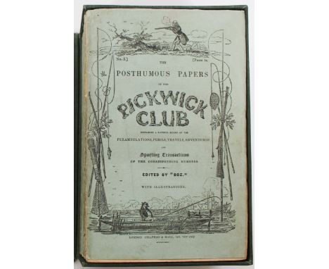
The Pickwick Papers was Charles Dickens’ first novel. The full title was “The Posthumous Papers of the Pickwick Club, and it was originally published in twenty monthly parts or numbers, bound in nineteen parts, priced at one shilling apiece, except the last two (XIX and XX), which were bound as a double issue - it was a double number, so it was priced at two shillings, instead of one. The first part appeared in April 1836 and ran all the way through November 1837, except for a lapse of one month - June 1837 - when Part XV was put off by a death in the author’s family. The monthly parts were like a serial designed to get people to read and anticipate what was coming next, and they’d go out and buy more.Dickens was commissioned to write the novel when he was just 24 because he was working in Parliament as a reporter and a roving journalist, and he had published a collection of sketches on London life known as Sketches by Boz. The publisher of theses sketches, Chapman & Hall, wanted to publish a series of cockney sporting illustrations or plates by Robert Seymour, full with a club, members who were sent on hunting and fishing expeditions into the countryside, their guns would go off by accident, fishhooks would get caught in their hats and trousers, and these and other misadventures would be depicted in Seymour's comic plates.Chapman and Hall asked Dickens to supply the descriptions necessary to go with the plates and to connect them into a sort of picture-novel that was fashionable at the time. He protested that he knew nothing of sport, but still accepted the commission.In a few instances Dickens had to adjust his narrative to plates that had been prepared for him, but typically he led the way with an installment of his story and the artist was compelled to illustrate what Dickens had already written. The story thus became more important than the illustrations, and there you have it - a plot that enriched the lives of English people and others all over the world.Except there were twists. The artist, Robert Seymour, committed suicide, after providing illustrations for just the first two monthly parts. His successor, Robert Willam Buss, illustrated the third installment, but Dickens did not like his work, so the hunt went on for a third artist to illustrate the monthly parts; Dickens finally settled on H K. Browne, otherwise known as Phiz, and Browne - Phiz - subsequently illustrated most of Dickens’ other novels after that.The plot gets better - Chapman and Hall did not expect the novel to sell well, so they only printed 400 copies of the first part and just 500 copies for the second monthly - and lo and behold, sales took off. The public really liked Dickens’ characters and style of writing - and the publishers were caught with their pants down. They had to increase production to meet demand - and here’s where it gets sticky - older plates had to be re-etched as the original plates became soft and worn, this led to plates being mixed up and substituted by other plates, advertisements got cancelled and others added, then the suicide of the first artist and the death of Dickens’ sister-in-law - all this threw the idea of a perfect first edition of Pickwick up in the air - and no one has ever found a perfect copy of the first edition in its first state because of all these changes and unexpected happenings, which makes for a ton of difficulties trying to figure out if the copy you have of The Pickwick Papers is that elusive first edition with all the points of issue that would make it a first edition in the first state. And points of issue are the name of the game from here on out. Raise your hand if you don’t know what a point of issue is - ah, lots of you have raised your hands - they are merely mistakes or details that were made when a book or novel was first printed, and no one ever caught the mistakes till after the book was published. These uncorrected errors or mistakes - errata, in literature circles - give books like The Pickwick Papers its value - and can drive you nutty if you don’t know what to look for - and in Pickwick Papers, there are over 500 points of issue to find or discover that would make this a first edition in the first state - and no one has ever found a perfect copy in the first state. Eckels was probably the first serious bibliographer of Dickens to come along. He wrote The First Editions Of The Writings Of Charles Dickens, Their Points and Values, way back in 1913; he revised it in 1932 and came up with Eleven Points he considered to be essential for a copy of Pickwick Papers to be considered “perfect”: We will use these guidelines to see how close this copy of the Pickwick Papers comes to a perfect edition - and these points don’t even touch on the ads that are supposed to be included in the monthly parts or other errors made in the text or on the plates. Remember, there are over 500 points of issue to look for in the Pickwick Papers - and the very first point Eckels makes is a sticking point: the Parts here have only ten covers (wrappers) with “1836” on the front cover and ten have “1837” on the front wrapper, so right away this is a first edition for some covers, and a later or mixed state for the other covers.Parts I and II only say “With Illustrations”, instead of “With Four Illustrations By Seymour”, and Part III only says “With Illustrations”, instead of “With Illustrations By R. W. Buss.” Part I has two of the four plates signed by Seymour, and Part II has all three plates signed by Seymour, as called for. Part III has both plates signed “Drawn and etched by R.W. Buss” along with the page numbers, as called for. We believe Part IV has the two plates indistinctly signed “Nemo” and not “Phiz” - they are definitely not signed by Phiz - when he signs something, his name is usually easy to make out. Parts X and XV have the addresses by the authors, but Parts II and III are lacking the addresses by Dickens, largely because there were only 500 copies of Part II ever issued in the first state. Parts XVII and XVIII have the addresses by the publishers, but Part XX does not. Point 10 by Eckel is as called for - Plates in Parts I to XII have no captions, only references to the pages where they were inserted, and Parts XIII to XX have neither titles nor numerical guides. And finally, on the vignette title page, in Part XIX and XX, the name “Weller” on the signboard over the door has a “V”, instead of a “W” to spell Sam Weller’s name, and “Phiz fecit” surrounds the tablet at the bottom of the frontispiece. So many of the first edition first state points of issue are present and uncorrected here, but not all. All the plates are present as called for; some of the plates have offset on them and many are very clean, especially towards the last Parts. There a few brown spots or soiling on the plates in Parts XIII and XVIII, but the rest of the plates are pretty clean; the text pages are generally very clean, with just a few brown spots on pages 88 and 89 in Part IV and Pages 214 and 215 in Part VIII, and the Pickwick Advertiser is present from Part XI to the last Parts, XIX - XX. The set comes in a dark green slipcase which measures 9 5/8 x 6 1/8 in. wide, with gilt lettering and “1836 - 7” on the spine, with a couple of bumps and dings on the slipcase, and the wrappers measure 8 7/8 x 5 5/8 in. wide. There are no repairs or restoration to any of the spines or wrappers.So overall a nice set, with some first edition first state points of issue, but definitely not the elusive perfect copy, as many Dickens fans are looking for. Maybe it will turn up one day, but don’t bet the farm on it.

Hans of Iceland. London: J. Robins And Co. Ivy Lane, Paternoster Row 1825, with four original black-and-white plates by George Cruikshank. The author is unnamed, but it was written by Victor Hugo, and this is the first English edition of Hugo’s book. Hugo wrote it in French in 1821 under the title Han d’Islande, and It was Hugo’s first novel. It was published in French in 1823, then published in English in 1825, with the four etchings by Cruikshank. Victor-Marie Hugo (1802 - 1885) was a French Romantic writer and politician. During a literary career that spanned more than sixty years, he wrote in a variety of genres and forms, and is considered to be one of the greatest French writers of all time. The story has all the ingredients of a gothic novel: dreadful murders by the hand of a human monster, a young hero in love with the destitute heroine, royal court intrigues and a rebellious uprising, all set in dungeons, dark towers, and the untamed nature of Norway, back when it was part of Denmark. The book is 7 7/8 x 5 in. wide, in an exquisite maroon binding by Riviere. The spine has six gilt- ruled compartments, a gilt title, gilt devices, and “1825” in gilt at the bottom of the spine. There are gilt-ruled rectangular borders with fleur-de-lis designs at the corners, the binding is done in morocco, the endpapers are a stately blue, with the bookplate of Frank L. Hadley; we don’t know who he was, but there are oil wells on the bookplate, and we believe he was a man of means. The book is 225 pages long, with a leaf before the half-title that lists New Works, Illustrated by George Cruikshank, followed by the half title and a wonderful frontis by Cruikshank titled “Some say this Monster was a witch, Some say it was a devil”, then the title page and a notice complimenting Cruikshank for his “four very ingenious and spirited etchings”, and all four etchings by Cruikshank are present. The imprint of J. Robins follows the last page of text, and there are two pages of ads for works published by J. Robins at the rear, and the top edge is gilt. The binding is tight and secure and the text and etchings are very clean, except for the last plate, which has some light browning in the top left corner that doesn’t affect the etching; there only two titles of the first French edition that we could find online, and those are very expensive, and there are only three listings for this title in English, and they don’t have the same quality as this first English edition.
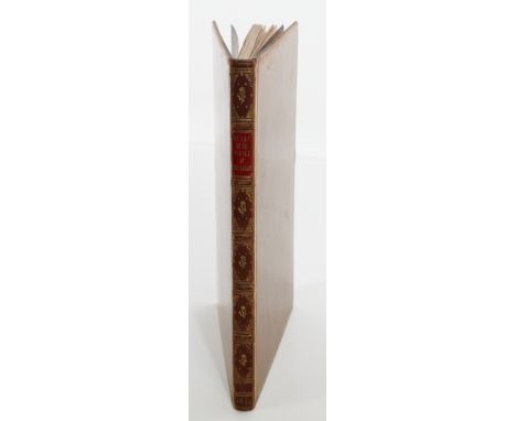
An Essay On The Genius Of George Cruikshank. With Numerous Illustrations Of His Works. (From The Westminster Review, No. LXVI.) With Additional Etchings. Henry Hooper, 13 Pall Mall East MDCCCXL [1840], with five raised bands, a gilt title on a red label, with gilt devices, gilt compartments, and “1840” on the spine, double gilt-fillet borders on polished calf, pebbled endpapers, in a fine binding by Bartlett of Boston, with a vignette frontispiece by Cruikshank titled “May - Old May Day” and 16 other large plates and 38 smaller black-and-white illustrations from Cruikshank’s works, and the top edge is gilt. (This includes the Philoprogenitiveness plate that is often missing, according to Van Duzer, and it is present here.) This is Thackeray’s critical examination of the caricatures of one on the most famous illustrators of the 19th century, George Cruikshank, and it is a first edition, with all the plates and smaller illustrations present, as called for (including the Philoprogenitiveness plate that is often missing, according to Van Duzer.) The book is 60 pages long, it is 8 Vo. and measures 8 1/2 x 5 1/2 in. wide, the binding is tight and secure, and the plates and text are very clean. (To learn more about the Philoprogenitiveness plate, see Henry Van Duzer, A Thackeray Library, First Editions And First Publications, Portraits, Water Colors, Etchings, Drawings, and Manuscripts, Privately Printed 1919. Van Duzer wrote the premier bibliography about the works of Thackeray.)
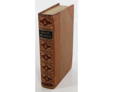
Songs Naval And National Of The Late Charles Dibdin; With A Memoir And Addenda. Collected And Arranged By Thomas Dibdin … With Characteristic Sketches By George Cruikshank. London: John Murray (Publisher To The Admiralty) 1841, a first edition, 3/4 bound, with 5 raised bands, a black label with gilt titles, 6 gilt-ruled compartments with naval decorations on the spine, the frontis illustration is titled “Poor Jack” by George Cruikshank, the book is inscribed “Henry Hillier 1842” at the top of the title page, there’s a list of Patrons, including her Majesty the Queen [Victoria] and a list of subscribers, a seven-page memoir of Dibdin followed by an advertisement for the book, then 336 pages of song and eight black-and-white illustrations by Cruikshank, and the top edge is gilt. This is a collection of patriotic songs by Charles Dibdin (1745 - 1814), a prolific English singer and songwriter whose songs were very popular with the public and the British navy and were officially appropriated for use by the British navy during England’s war with France; his son Thomas (1771 - 1841) was an English songwriter and dramatist and authored this book shortly before his own death, and the book depicts tars singing, dancing and romancing aboard and off ship. The book is 8 Vo. and measures 6 3/4 x 4 1/2 in. wide, the binding is tight and secure, with light rubbing on the spine and very light rubbing at the tips, and the plates and text are pretty free from browning and foxing. It is a first edition confirmed by WorldCat, and a handsome book with an unusual title for Cruikshank lovers.

This book is an exhibition catalogue signed and inscribed by J P Morgan, the title is “Original Manuscripts and Drawings of English Authors from the Pierpont Morgan Library, on Exhibition at the New York Public Library December 8 to April 1 1924 - 1925”, and it’s a presentation copy inscribed “Mr. Henry S. Rowe from J. P. Morgan April 1925” on the front free endpaper. J. P. Morgan’s signature is clear and easy to read. The book is 55 pages long, with uncut pages, and it includes a notice on an uncut leaf near the end which says “Privately printed for the Pierpont Morgan Library by Bruce Rogers and William Edward Rudge, Second Edition”. The covers are a blue cloth, with blank endpapers, and it comes in a blue slipcase with a white strip on it which says “Exhibited At The N.Y. Public Library From The Pierpont Morgan Library”. There are no Cruikshank illustrations - we thought there would be - but the first page of the book highlights Cruikshank’s works and puts him before even the Dickens books on exhibit - it says “Standing Cases” and lists Cruikshank’s works on display, then goes on to list books by Dickens and Rowlandson on display. Cruikshank is at the head of the list. John Pierpont Morgan was an American financier, banker, and art collector, and one of the richest men in the world during the early 1900’s. He was the head of J. P. Morgan, the bank which ultimately became known as J. P. Morgan and Co. The Morgan Library was founded in 1906 to house Morgan's private library, which included manuscripts and printed books, as well as his collection of prints and drawings, and this book comes from that library. The slipcase has a small loose strip on the bottom, but it doesn’t affect the book at all. The book measures 8 1/16 x 5 5/16 in. wide and is very clean and tight, and even though there are no Cruikshank illustrations in the book, we still consider this a worthwhile book for Cruikshank collectors - when and where can you find a book signed by J P Morgan that highlights Cruikshank’s works at the very beginning of the book?
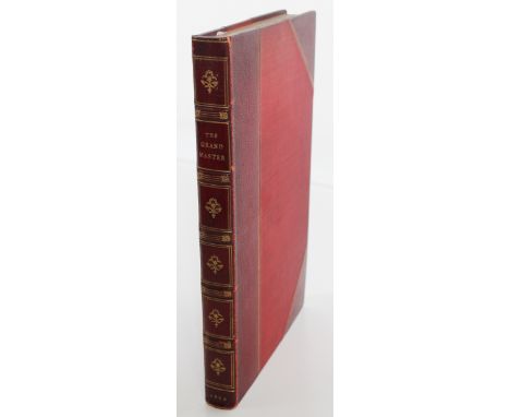
The Grand Master, or, Adventures of Qui Hi? in Hindostan. Hudibrastic Poem in Eight Cantos by Quiz. Illustrated with engravings by Rowlandson. London. Printed by Thomas Tegg, No. M, Cheapside. 1816. A first edition in a fine binding by Riviere, 3/4 bound in red crimson, with five raised bands, a gilt title and six compartments with gilt devices and gilt-ruled borders, marbled endpapers, a wonderful colored fold-out frontis by Thomas Rowlandson, the colored title page followed by a six-page Preface, then an Invocation to Butler, 252 pages of text, a thirteen-line errata slip at the end, and the top edge is gilt. There are twenty-eight hand-colored aquatints altogether, including the colored frontis, the title page, and a sepia-colored plate. All the errata are uncorrected, as called for, and it lacks the C8 cancel, as usual. Some pages are mispaginated. Page 31 is numbered as page 33, and pages 73 and 74 are repeated - they read 72, 73, 74, then 72, 74, and 75, but the text on those pages is not repeated - and those details are points of issue which make this a first edition. The color plates were done by Thomas Rowlandson and the text was written by William Combe, but the book is largely remembered for the color plates by Rowlandson. Rowlandson (1756-1827) was an English artist and caricaturist known for his political satire and social observations. He produced some ten thousand engravings, etchings, ink and watercolor illustrations, and his caricatures are often robust or bawdy. He also produced highly explicit erotica for a private clientele; these were never published publicly at the time and now are only found in a small number of collections. Quiz was likely the pseudonym for William Combe (1742 - 1823), also spelled Coombe, a British miscellaneous writer. His early life was that of an adventurer, his later life was passed chiefly within the "rules" of the King's Bench Prison, which means he spent a lot of time in prison for debt. He is chiefly remembered as the author of The Three Tours of Doctor Syntax, a comic poem also illustrated by Rowlandson. The Grand Master was a stinging satire of British imperial rule in India, and the barbs in Rowlandson’s hand-colored plates were directed at Lord Moira, who was the Marquess of Hastings and served as Governor-General of India from 1813 to 1823. The plates also poked fun at the East India Company for its Hindu prejudices and it satirized the church for its patent disregard of Hindu culture and practices. “Qui hi”, or “Kooee hye", is the Bengali phrase meaning “Who’s there”. No bells were used in the houses of the gentry in India, so servants sat at the doors of the dining or drawing room, and when they were called or summoned by the phrase Qui hi, the servants magically appeared. The book is 8vo. and measures 9 7/8 x 6 3/8 in. wide, with occasional light browning or spots, and this first edition with the highly colorful Rowlandson plates is a great addition to anyone who collects English art from the Georgian era.
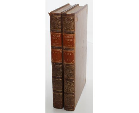
The English Dance of Death, From The Designs Of Thomas Rowlandson, With Metrical Illustrations. By The Author Of Dr. Syntax. London: Printed By J. Diggens, St. Ann’s Lane; Published by R. Ackermann’s Repository Of Arts, 101, Strand; And To Be Had Of All the Book and Print-sellers in the United Kingdom. 1815 at the bottom of the title page in the first book and 1816 at the bottom of the title page in the second book. A first edition set, in two volumes. With five raised bands, six-gilt-ruled compartments and elaborate gilt tooling on the spines, gilt lettering on orange brown panels, double gilt-fillet borders with corner devices on the calf boards, marbled endpapers, followed by a quill pen inscription on a front-free endpaper which reads “Wm Coombe the author of this book is well known never to have affixed his name to any of his books _ For a list of them vide Gents. Mag: vol xciv _ Pub. pt 2nd _ 1824 _”, then the terrific colored frontispiece and the vignette title page, the title page, a three-page advertisement, 295 pages of text in Volume I and 297 pages of text in Volume II, with a four-page index at the end of both volumes, and all the edges are gilt. “William Coombe Esqre” is also inscribed in quill pen below “Doctor Syntax” on the title page of the first volume. There are seventy-four hand-colored aquatint plates altogether, including the frontispiece and vignette title page in Volume I, all designed by Thomas Rowlandson, and the second plate in the text of Volume I says it was published April 1, 1814 and the last plate in the second volume says it was published March 1, 1816. (We couldn’t read the date on the first plate in Vol. I because it was too close to the binding.) The advertisement in the first book also says there were twelve successive numbers in the first volume of the English Dance of Death and “The Second Volume will follow in the same mode of Publication”, so the title came out in twenty-four monthly parts before it was published in book form. William Coombe’s name was never mentioned anywhere except for the hand-written inscriptions in the front of Volume I, but he was the author of this lengthy poem. He was a British miscellaneous writer who spent a lot of time in prison for debt, and Rowlandson was an English artist known for his political satire and one of the top illustrators of the eighteenth century. The books are 8vo. and measure 9 3/4 x 6 3/8 in. wide, the bindings are tight, the text is very clean, with a little offset from some of the plates, light rubbing at the crowns and heels of the spine, modest rubbing on the edges of the spines and at the tips, and very light browning on some of the plates. “London” is faded at the heel of the first volume and bright on the heel of the second one, and a small abrasion on the front of Volume II. Still an attractive first edition of this main work of Rowlandson, with all the satire and humor you’d ever want to find in artwork that poked fun at the grim ways people viewed death in the Middle Ages, and a much easier way to read this poem without trying to find all the monthly parts, which is nearly impossible.
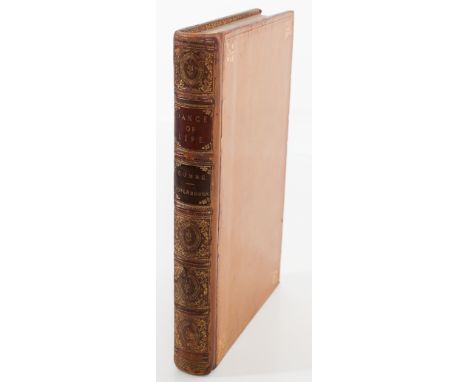
The Dance of Life, A Poem, By The Author of “Doctor Syntax;” Illustrated With Coloured Engravings, By Thomas Rowlandson, London: Published By R. Ackermann, Repository Of Arts, 101, Strand. 1817. This is the sequel to The Dance of Death, published a year later, and a first edition. With five raised bands, six compartments with gilt lettering on burgundy and black panels and gilt tooling on the other panels, triple gilt-fillet borders with corner devices on the calf boards, wide gilt dentelles on marbled endpapers, “bound by Tout” on the first blank endpaper, followed by the colored frontispiece and the colored vignette title page, the title page, an advertisement by the author saying he completed the eight monthly parts which preceded this book, so he is going on to the “accumulated Volume”, which means it is being published for the first time here in book form; a second small advertisement by R.A.(R. Ackermann, the publisher) says the author’s books have been so successful, he plans to write another one, then there is an Index to the Plates, followed by 285 pages of text, and at the bottom of page 285, it reads “J. Diggens, Printer, St. Ann’s Lane, London.” There are twenty-six hand-colored plates by Rowlandson, including the frontispiece and vignette title page, and all the edges are gilt. So the poem was published in eight monthly parts before it came out in book form, the poem was written by William Coombe, even though his name does not appear on the title page, and all the plates by Rowlandson are here. The book is 8vo. and measures 9 5/8 x 6 1/4 in. wide, with tissue guards to protect each plate, the binding is tight, with light rubbing at the heel and at the tips, some of the gilt has rubbed away on the gilt borders of the boards, light foxing on some of the plates, and an attractive companion piece to the Dance of Death.
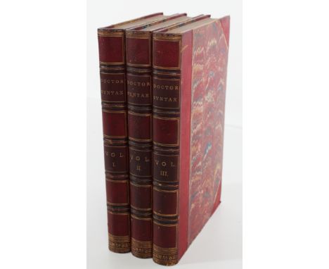
This is a three-volume set of the Tours of Doctor Syntax, written by William Combe, illustrated by Thomas Rowlandson, and published by Nattali and Bond circa 1855. The three titles are a) The First Tour Of Doctor Syntax, In Search Of The Picturesque; b) The Second Tour Of Doctor Syntax, In Search Of Consolation, and c) The Third Tour Of Doctor Syntax, In Search Of A Wife. All three volumes were written by William Combe and illustrated by Thomas Rowlandson, with a total of eighty plates by Rowlandson in the three volumes, and all three were published in London by Nattali and Bond around 1855. The books are undated, but Nattali and Bond published this set in 1855 and 1860, and the 1860 set had a catalogue of books at the rear, which is lacking here, so this set had to be published around 1855; this is also the ninth edition, according to the vignette title page in the first volume, and the ninth edition was published in 1855, so that confirms the approximate date of publication. Each volume is 3/4 bound, with five raised bands, six gilt-ruled compartments and gilt lettering in two panels on the spine, marbled boards and marbled endpapers, with a list of the plates following the blank page after the title page, and all the edges are marbled in each volume. All the plates were hand-colored aquatints, and all are present here - 31 plates in the first volume, 24 in the second, and 25 in the last, for a total of 80 plates by Rowlandson (including the colored frontispieces and vignette title pages in the first and third volumes), and there are 272 pages in the first volume, 277 in the second, and 279 pages in the third volume. The books are 8vo. and measure 9 3/4 x 6 1/2 in. wide, the bindings are tight, and other than light offset on page 225 and a light brown spot on page 276 in the second volume, the text and plates are exceptionally clean and crisp throughout; there are light rubs on the bands of the spines and light wear at the tips and along the outer edges of the boards, and all the plates are present and filled with the color and satire Rowlandson is known for.
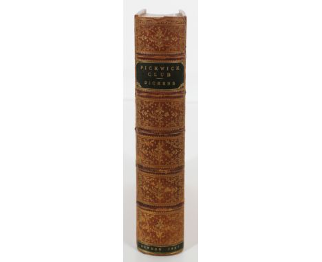
This is a second lot of Dickens’ The Pickwick Papers, this one with the original monthly parts bound in book form, and the same print history as the previous lot. It was published in twenty monthly parts, from April 1836 to November 1837, with a one-month lapse in June 1837, when one part was put off by a death in Dickens’ family. All the parts were priced at one shilling, except for the last double issue, which was priced at two shillings, and the whole set of twenty parts was bound as nineteen because of the double issue at the end. There are five raised bands, with six gilt-ruled compartments and “Pickwick Club - Dickens” in gilt letters on a black panel near the top of the spine and “London 1837” in gilt on a black panel at the bottom of the spine; there are triple-gilt fillets on a calf cover, gilt dentelles and a note from 1767 about a “Good Dwelling to be lett at Pickwick, in the County of Wilts” on the marbled endpapers. The front wrapper of Part No. I is included near the beginning of the text and the rest of the original front wrappers are bound in at the rear, a Message to Sergeant Talfourd after the title page, then a three-page Preface, four pages of Contents followed by Directions to the binder, and the text, which is 609 pages long. There’s also a white slip about the death of Robert Seymour and several addresses by the author and the Chapman and Hall, the publisher, at the rear (the slip about Robert Seymour is dated April 27, 1836, the first address is dated December 1836, the next is an author’s address dated June 20, 1837 and was written at 186, the Strand; then a publisher’s address dated August 26, 1837, and a final publisher’s address dated September 29, 1837, from the Strand) and one leaf with the Pickwick Advertiser bound in at the rear and no other ads in the book, except for the addresses about the books by published by Chapman and Hall.In a few instances Dickens had to adjust his story to the plates which had been prepared for him, but typically he wrote an installment and the artist was obliged to illustrate what Dickens had written about. The story became more important than the illustrations, and that propelled Dickens to the top of the literary world.It still took time for Dickens to find the right illustrator for the novel. The first artist, Robert Seymour, provided illustrations for the first two monthly parts, then committed suicide; Robert Willam Buss illustrated the third installment, but Dickens did not like his work, so Dickens kept up the search for an artist he liked and finally settled on H. K. Browne, otherwise known as Phiz, who illustrated most of Dickens’ other novels afterwards.Again, Chapman and Hall did not expect the novel to sell well, so they printed only 400 copies of the first part and just 500 copies for the second monthly, then sales took off unexpectedly, and the publishers had to readjust their plans - they had to increase production to meet demand, and older plates were re-etched as the original ones wore out, which led to plate errors being made, some ads were cancelled and others added, then the suicide of Robert Seymour and the death of Dickens’ sister-in-law - all this meant there would never be a perfect copy of the first edition in the first state - too many changes and unexpected events, which made for lots of headaches trying to figure out how many errors there were in your copy of the Pickwick Papers - were your errors close to a first state edition, or were they printed and corrected later on?Remember, there are over 500 points of issue in the Pickwick Papers to find or discover, and no one has ever found a perfect copy in the first state. There are about fourteen or fifteen copies that come close, but no one has ever found the elusive perfect copy, so we’ll use John Eckels’ bibliography to sort things out as far as we can. In his book about the writings of Charles Dickens, Eckels came up with eleven points he considered essential for a copy of Pickwick Papers to be called “perfect”:1. All covers must bear the date 1836.2. Parts I and II must carry the words “With Four Illustrations By Seymour”.3. Part III the words “With Illustrations By R. W. Buss.” 4. Part I must have four plates by Seymour, signed, and not re-etched by “Phiz.”5. Part II must have three plates by Seymour signed.6. Part III must have the two plates signed “Drawn and etched by R.W. Buss” and the page numbers.7. Part IV has the two plates indistinctly signed “Nemo” and not “Phiz”.8. Parts II, III, X, and XV must have the addresses by the author.9. Parts XVII, XVIII, and XX must have the addresses by the publishers.10. Plates in Parts I to XII must have no captions, only references to the pages where they were inserted; parts XIII to XX have neither titles nor numerical guides.11. On the vignette title page, the name “Weller” on the signboard over the door must appear with a “V”, and the signature “Phiz fecit” must surround the tablet at the bottom of the frontispiece. “Phiz fecit” means “Phiz made it.”The first point by Eckels is in our favor - all but one of the original front wrappers is dated 1836, the exception being No. XVII, which is dated 1837 in Roman numerals.But Parts I and II say “With Illustrations”, instead of “With Four Illustrations By Seymour”, and Part III only says “With Illustrations”, instead of “With Illustrations By R. W. Buss.” Part I has two of the four plates signed by Seymour, and Part II has all three plates signed by Seymour, as called for. Part III has both plates signed “Drawn and etched by R.W. Buss” along with the page numbers, as called for. We believe Part IV has the two plates indistinctly signed “Nemo” and not “Phiz” - they are definitely not signed by Phiz. Most of the addresses by Dickens and the publishers are bound in at the end, behind the original front wrappers. The plates in Parts I to XII conform to Eckels - there are no captions, only references to the pages where they were inserted, and Parts XIII to the end have no titles or page numbers, per Eckels. On the vignette title page, in Part XIX and XX, the name “Weller” on the signboard over the door has a “V” instead of a “W”, so it reads Sam Veller instead of Sam Weller, and “Phiz fecit” is at the bottom of the tablet on the frontispiece. I.e., there are many first state points of issue uncorrected here, but not all. All the plates are present as called for; the plate on page 89 has very light soiling at one edge, a few of the plates towards the end have offset on them from the text, but most of them are exceptionally clean and bright, with no browning at all. The text is very clean as well, with light offset on a couple of them from the plates, but overall a very clean edition of the Pickwick Papers.The boards measure 9 x 6 1/8 in. wide, the front covers of the original wrappers in back are very clean, especially after being well hidden for over a century, there are a couple of hard-to-see scratches on the covers, with tender joints along the front edge of the spine. So an attractive set, with some first edition first state points, but still not the elusive perfect copy of Pickwick Papers which has every single point of issue Dickens enthusiasts are looking for. Perhaps it will turn up one day … one day … See The First Editions of The Writings of Charles Dickens by John Eckels, Their Points and Values, published in New York by Maurice Inman and in London by the Maggs Bros in 1932, and see A Bibliography of the Periodical Works of Charles Dickens by Thomas Hatton and Arthur Cleaver, published by Chapman and Hall in 1933.
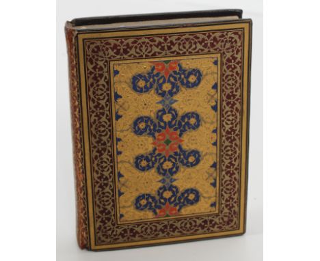
The Tale of King Coustans the Emperor Of Byance, written and bound by William Morris in 1894 at the Kelmscott Press near London and rebound in Ulwar, India, circa just after the book was printed at Kelmscott. The book is in an exquisite Persian-style binding that comes from Ulwar, India. The book binder was Qari Abdurrahman’s Sons, from the state of Ulwar, where some of the best binding was done in India in the late 1800’s. The covers are beautifully decorated in gold leaf with geometric patterns in blue and burgundy on front and back, and with the wonderful William Morris illuminated manuscript style inside. The Kelmscott Press printed 525 copies of “The Tale of King Coustans the Emperor” on hand-made paper, and an additional 20 on vellum, and the Persian binding just adds to the magnificence of this book and tale. We’ve never seen any other copies in this Persian-style binding, and the covers are probably a unique binding, created only for one client. This book is part of a series of medieval French stories produced and translated by William Morris in the 1890’s. It tells the story of the Emperor of Byzantium, who heard a prophecy that a child would marry his daughter and succeed him as emperor. Angered by the prophecy, the Emperor ordered the child in question to be killed and buried in the woods. The knight tasked with murdering the child decided not to bury the child’s body, instead he would leave it at a monastery. The child was found here by the abbot, who healed his wounds and baptized him Coustans. Coustans grows up at the monastery, and when the Emperor hears that Coustans is still alive, summons him to court. The Emperor employs Coustans to deliver a sealed letter to the commander of Byzantium; the letter tells the commander to kill the bearer of the letter. Upon arriving at the city, Coustans wanders into a garden and falls asleep. He is found by the Emperor’s daughter, who switches the letter to one asking the commander to arrange a marriage between Coustans and her, which he does at once. Coustans then fulfills the prophecy and succeeds the Emperor upon his death, converting the city to Christianity and renaming it Constantinople. In its way, this romantic folk tale is actually about how Byzantium - Byance - became the famed city of Constantinople. William Morris (1834 - 1896) was a British textile designer, poet, artist, and writer associated with the British Arts and Crafts Movement, and a major influence on the revival of traditional textile arts in Britain. He designed and illuminated books by hand and was recognized as one of the most important cultural figures of the Victorian Era, and posthumously became famous for his textile and book designs. He collaborated with Emery Walker to found the Kelmscott Press in 1891, and the press only operated for eight years. It got its name from Kelmscott Manor, Morris's home in Oxfordshire, and the rarity of books published by Morris and the Kelmscott Press cannot be overstated. It only published fifty-three books between 1891 and 1898; each book was designed and ornamented by Morris and printed by hand in limited editions, and usually illustrated by Edward Burne-Jones. Kelmscott books sought to replicate the style of fifteenth-century printing and were part of the Gothic revival movement. The Press closed shortly after Morris's death. The book is 130 pages long and measures 5 7/8 x 4 3/8 in. wide, a first edition printed in a limited run, in an exquisite one-of-a kind binding. See Persian And Indian Bookbinding by Thomas Holbein Hendley, Surgeon Lieut-Col., in the Journal of Indian Art, 1886 - 1916, London, Issues 38 - 45, pages 77 -106.
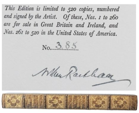
William Shakespeare, The Tempest, Illustrated by Arthur Rackham, London, William Heinemann, and New York, Doubleday Page, 1926, numbered and signed by Rackham on the limitation page, #385 of 520 copies, with 21 color plates, including the extra plate tipped in near the front, and numerous black and white illustrations, in a fine binding by Bayntun / Riviere, of Bath, England. The first 260 numbered copies were issued for sale in Great Britain and Ireland and the next 260 copies were issued for sale in the United States, and this is the first Rackham edition for The Tempest. There are five raised bands, six gilt-ruled compartments with gilt titles and elaborate gilt tooling on the spine, the boards are full crushed blue-tooled Levant with gilt-ruled fillets, with wide gilt dentelles on marbled endpapers, the imprint of the printer Richard Clay and the List of Illustrations after the title page, with 185 pages of text and illustrations, and all the edges are gilt. This copy includes the additional color plate not found in the trade edition, and this plate is captioned “Sea Nymphs hourly ring his knell …” after the limitation page. Arthur Rackham (1867 - 1939) was an English book illustrator and one of the leading figures of the Golden Age of British book illustration; his works were noted for the use of pen and ink drawings, combined with the use of watercolor, and he illustrated books like Rip Van Winkle, Peter Pan in Kensington Gardens, and Fairy Tales of The Brothers Grimm - one of the top illustrators of his day. The book is 4 To. and measures 11 x 9 in. wide, and it is exquisite from stem to stern.
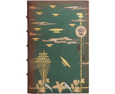
Albert Robida, Voyage de Fiancailles Au XXe Siecle, Paris, Librairie L Conquet 1892, 12 Mo., first edition, in a fine binding by C H Meunier, in full green morocco tooled with beautiful silver and gilt whimsies on the covers, five raised bands, marbled endpapers with a gilt-ruled border, followed by the original colored endpapers bound in, a vignette title page, with a hand-written letter from Charles Meunier, the binder, inserted into the front endpapers, the book is 83 pages long, and all the edges are gilt. The book is in French and the title means “An Engaging Trip to the 20th Century”. This is also a limited and numbered copy - it is No. 2 of 100 copies printed on Japon paper, so it is an early copy in the print run and very well executed. (The page after the colored illustration reads “H.A. Ete Tire, 100 Exemplaires sur japon numerotes, 200 exemplaires sur chine non mis dans le commerce”, which means there were a limited number made on japon paper - a very smooth, natural white sheet suitable for printmaking - and 200 copies made on chine paper that were basically proofs and weren’t meant for sale.) Robida (1848 - 1926) did the artwork on the colored illustration which follows the title page - his name is signed at the bottom of the artwork - and he was a French illustrator, etcher, lithographer, caricaturist and novelist; through the 1880’s, he wrote an acclaimed trilogy of futurist novels, and that can be seen here in the whimsies on the front cover. He founded his own magazine La Caricature, and his futuristic works were often compared to the works of Jules Verne; unlike Verne, he proposed inventions that could be used in everyday life; his La Guerre au Vingtième Siècle described modern warfare, with robotic missiles and poison gas, and his Téléphonoscope was like a flat screen tv that delivered the latest news twenty-four hours a day, the latest plays, courses, and teleconferences, before televisions and computers were even invented. He also imagined the social consequences that arose from them - the social advancement of women, mass tourism, pollution, and so on - and he was a person well ahead of his time. This work is also reminiscent of H G Wells’ The Time Machine, and Robida’s book precedes Wells’ book by three years. The book measures 7 3/8 x 5 in. wide and it is exquisite, in an extraordinary binding that is hard to imagine on a book so far ahead of its time.
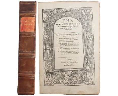
This is the second Speght edition of Chaucer’s famous work published in 1602. Chaucer was the first great English poet (1342 - 1400) and was not a professional writer, but a courtier and civil servant who served three kings over a long and varied career. Be careful when you read the text because some letters like v’s are actually u’s in current-day language. The full title is The Workes Of Ovr Ancient and learned English Poet, Geffrey Chavcer, newly Printed, To that which was done in the former Impression, thus much is new added, 1 In the life of Chaucer many things inserted. 2 The whole worke by old Copies reformed. 3 Sentences and Prouerbes noted. 4. The Signification of the old and obscure words prooued: also Caracters shewing from what Tongue or Dialect they be deriued. 5. The Latine and French, not Englished by Chaucer, translated. 6. The treatise called lacke Vpland, against Friers: and Chaucers A.B.C. called La Priere de nostre Dame, at the Impression added. London, Printed by Adam Islip 1602. This is the second Speght edition, with Tho. Speght's name at the bottom of the dedication page, which reads “To The Right Honovrable Sir Robert Cecil Knight, Principal Secretarie To The Qveens Most Excellent Majestie” and “Tho. Speght” at the bottom. It is folio-sized, with four raised bands, blank endpapers, a gilt title, incised borders on the front and back boards, and it has the standing portrait of Chaucer done by Thomas Occleue as well as Chaucer’s family tree: the family tree is titled “The Progenie Of Geffrey Chaucer”. Chaucer’s portrait and family tree are often missing from this work, but both are here. There are 376 leaves, and additionally A Catalogue of translations and Poeticall devises, in English meter or verse, done by John Lidgate, Monke of Bury …, The old and obscure words in Chaucer explaned … The hard words of Chaucer explaned … So much of the Latine in Chaucer translated …, The French and Latine in Chaucer …, The French in Chaucer translated …, The Authors cited by G. Chaucer in his workes …, and an Errata leaf at the end. The errata leaf is often missing, but is included here, and Lydgate’s “The Storie of Thebes” was erroneously attributed to Chaucer. And to understand the spelling: substitute u’s for v’s. Ovr is Our, Chavcer is Chaucer, worke is work, Prouerbes is Proverbs, prooued is proved, Caracters is Characters, shewing is showing, deriued is derived, Latine is Latin, Iacke Vpland is Jack Upland, Honovrable is Honourable, Qveens is Queens, Progenie is Progeny, Poeticall is Poetical, devises is devices, explaned is explained, and so on. All from the old English. Speght's second edition appeared only four years after his first, and this edition put Chaucer on the map - it helped establish Chaucer in the canons of English literature. Francis Thynne (the son of Chaucer’s former editor, William Thynne) had sent Speght a long letter of criticisms to the edition of 1598; Thynne called these “Animadversions”, and Speght took these criticisms (often misguided) to heart and incorporated Thynne's suggestions into this second edition. The extensive glossary nearly doubled in size from the previous glossary, and Chaucer’s language had become so difficult for readers to understand that the revised glossary was a necessary addition. The folio measures 12 3/4 x 8 7/8 in. wide, the boards appear to be original, the binding is tight and there are no repairs to the book at all, the pages are generally very clean, the book has the standing portrait of Chaucer as well as the leaf for Chaucer’s family tree, and it has the errata leaf at the end. Quite a nice copy of this work by Chaucer.
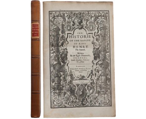
The Historie Of The Raigne Of King Henry The Seventh, Written By the Right Honourable Francis, Lord Verulam, Viscount St. Alban, London, Printed by W. Stansby for Matthew Lownes, and William Barret 1622, with five raised bands, a red label with gilt lettering and “1622” in gilt at the base of the spine, brown calf with triple-ruled borders, blank endpapers, a frontis portrait of King Henry the Seventh, a dedication page to Prince Charles paying homage to his father, the King of England, after the King died; 248 pages of text, with “Faults escaped” [errata or points of issue] on page 248; there are seven faults listed and none of them have been corrected, so this is a first edition, first state of The Historie of the Raigne of King Henry the Seventh. It also has “Highnesse” at the conclusion of the dedication page and “Souldiers” on line 12 of page 3, which are called for to make this a first state of Bacon’s book. Francis Bacon (1561 - 1626) was an English philosopher and statesman who served as Attorney General and Lord Chancellor of England. He led the advancement of natural philosophy and the scientific method and argued for the possibility of scientific knowledge based only upon reasoning and careful observation of events; he believed that scientists should use a skeptical and methodical approach to avoid misleading themselves. His public career ended in disgrace after he fell into debt and was convicted of taking bribes; he spent time in the Tower of London and was released after King James I remitted his fine and Bacon promised to write this history after he was released. More seriously, Parliament declared that Bacon could no longer hold public office and narrowly escaped being stripped him of his titles of nobility. After he completed the work in 1621 and sent a copy to James I, it was published the following year, and it remains his only completed work of history. It also showcases his scientific approach to writing history - he didn’t fancy anything up, but just described events in terms of observation and facts. In the1800’s, someone proposed that Bacon wrote a few or all of the plays attributed to William Shakespeare, an observable fact which is hard to prove. The book measures 11 5/8 x 7 3/4 in. wide, the binding is tight and secure, with light wear at the top of the covers and light foxing on just a couple of pages. So this is a scarce first edition, first state of Bacon’s important history of the reign of King Henry the Seventh.
Francis Bacon, Bacons Advancement of Learning, Instaur Mag P.I. Of The Advancement And Proficience Of Learning or the Partitions of Sciences IX Bookes Written in Latin by the Most Eminent Illustrious & Famous Lord Francis Bacon Baron of Verulam Vicont St. Alban Councilour of Estate and Lord Chancellor of England, Interpreted by Gilbert Wats, Oxford. Printed By Leon: Lichfield, Printer to the University, for Rob: Young & Ed: Forrest, and a frontis portrait of Bacon by Will Marshall dated 1640. This is the first complete edition in English, second issue, with the colophon on the last page of text dated 1640, instead of 1639, and it’s an enlarged and expanded edition from the 1605 Latin version, and an important essay on empirical knowledge by Bacon. It also has the famous allegorical title page showing a ship in full sail passing from the old world into the new, with invocation pages to King Charles after the title page, four pages addressed to The Prince of Great Britain by Gilbert Wats - these pages gave background about Francis Bacon - then eight pages addressed to the Reader, more testimonies about the “Incomparable Philosopher Francis Bacon”, a thirty-five page Preface. then the General Arguments of the nine books - the book titles and what they’re about - and the format of the books which give you insights into how Bacon thought, and 477 pages of text. There’s a Catalogue of Deficients, an Index of the Scriptures that are mentioned, an Index of the authors cited, an Errata page, a Catalogue of books Bacon used or referred to, a thank-you page in Latin, and the colophon page at the rear which mentions the Publisher and the Printers - Lichfield and Robert Young & Edward Forrest respectively - and the date of 1640 - M.DC.XXXX - at the very end. Sir Francis Bacon (1561 - 1626) was an English philosopher, statesman, scientist, orator, and author who had an extremely important impact on philosophy and the way we approach learning - an advocate of the scientific method, which espoused observation and facts - and he is considered the father of modern science. Gilbert Wats did the translation from Latin to English. With five raised bands, a burgundy label with gilt title, dark brown boards, blank endpapers, with a chip on the frontispiece, light wear on the boards, and a very clean text and tight binding. The book is a tall octavo and measures 11 x 7 7/8 in. wide, and a great addition to anyone who collects Bacon’s works and aspires to be a philosopher as well.
An Index to Pickwick. By C. M. Neale. London: Printed For The Author By J. Hitchcock, Streatham. 1897, and bound-in is an Addenda before the title page and a folded note before the Addenda which reads “Common Room, Middle Temple, E.C., 29/ x ii [December 29], Mr. Neale forwards the Enclosed Book in case the Editor of ‘the Athenaeum’ may consider it (although privately printed) of sufficient interest for notice - He believes it to be the first index on a Similar scale & plan to any work of English Fiction — A small sheet of Addenda is is also Enclosed.”, with a notice after the title page about how to buy extra copies of this work for three shillings, followed by a dedication page and a four page Preface ( i - iv), 75 pages, with imprint of Hitchcock, Printer, Stratham, S.W. at the bottom of page 75. A first edition, privately printed, 8 Vo., 3/4 bound by Zaehnsdorf in crushed morocco over gilt marbled boards, with five gilt-ruled raised bands, gilt-decorated floral devices with gilt lettering and “London” on the spine, marbled endpapers, and the top edge is gilt. Zaehnsdorf was a premier book binder in Europe in the 1880’s, where he received many exhibition awards and international recognition, and the Zaehnsdorf name is imprinted at the bottom of the leaf on the reverse of the front free endpaper. The book measures 10 7/16 x 6 13/16 in. wide and is beautifully bound by a premier book binder, and in very fine condition.
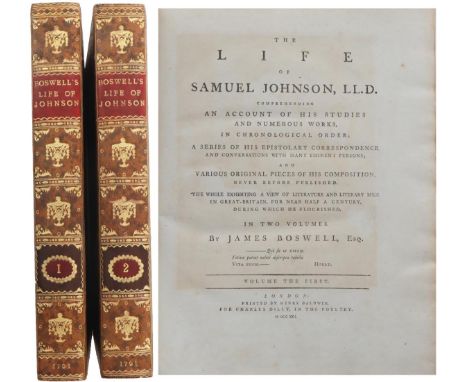
This is a two-volume set of The Life of Samuel Johnson, written by James Boswell and published in 1791, and it is a first edition in the first state. The title page reads The Life Of Samuel Johnson, LL.D., Comprehending An account of the Studies And Numerous Works, In Chronological Order; A Series Of His Epistolary Correspondence And Conversations With Many Eminent Persons; And Various Original Pieces Of His Composition, Never Before Published. The Whole Exhibiting A View Of Literature And Literary Men In Great Britain For Near Half A Century, During Which He Flourished. In Two Volumes. By James Boswell, Esq. London: Printed By Henry Baldwin, For Charles Dilly, In The Poultry, MDCCXCI. [1791] Volume I has a red label, gilt lettering, gilt decorations, and six gilt-ruled compartments on the spines, a fancy gilt border on speckled calf boards, blank endpapers, with the bookplate of Sir John C. Hobhouse Bt. on the front paste-down of each volume. and a frontis portrait of Samuel Johnson done by James Heath after a painting by Sir Joshua Reynolds. After the title page, there’s a three-page dedication to Joshua Reynolds, an advertisement by Boswell thanking people for helping write the book, fifteen pages of an Alphabetical Table of Contents, then a leaf with Corrections for both volumes. Volume I has 516 pages of text and the second volume has 588 pages of text, and all the uncorrected errors are present in both volumes to make this a first edition, first issue set. The first volume has the all-important “gve” misprint on line 10 of page 135, and this is required to be a first issue; “gve” is the earlier state, while later states were corrected to read “give”, and only 1750 copies with “gve” were ever printed in the first print run. The two plates in both volumes are present, as called for - the Round Robin plate on page 92 of Volume I and the facsimiles of Johnson’s handwriting on page 588 of the second volume. All the mistakes described on the Corrections And Additions page in Volume I are present and uncorrected here; there are a total of twenty-four uncorrected mistakes in the two volumes that need to be present to make this a first issue - thirteen in the first volume and eleven in the second volume - and they are all uncorrected and present here. Several page numbers were misnumbered and these uncorrected mistakes are all here - pages 229, 408, 497, 504, and the last three leaves of Volume II are all mispaginated, as called for. All of these details are present and make this set a first edition in the first state. Samuel Johnson (1709 - 1784), often called Dr. Johnson, was an English writer who made lasting contributions as a poet, playwright, essayist, critic, biographer, editor and lexicographer, and The Oxford Dictionary of National Biography calls him "arguably the most distinguished man of letters in English history". He also squabbled with Lord Chesterfield over publicity for a project that was near and dear to Dr. Johnson’s heart - his writing A Dictionary of the English Language - and that squabble is detailed in the books about Lord Chesterfield’s Letters To His Son in the auction here. Boswell (1740 - 1795) was a Scottish biographer, diarist, and lawyer who is best known for his biography of his friend and writer Samuel Johnson, which is commonly said to be the greatest biography written in the English language. John Cam Hobhouse (1786 - 1869), whose name is on the booklplates, was an English politician also known as Baron Brighton and good friends with Lord Byron when they attended Cambridge together, and after Byron died, Hobhouse read the will and took care of the funeral arrangements for Byron. He also had a sympathy for Napoleon which caused a stir after Hobhouse wrote a pamphlet speaking out against the governments in both England and France, and the French translation was seized and the translator and printer were imprisoned in France for the contents of the pamphlet. The two Johnson books are 4 to. and measure 11 1/4 x 9 in. wide, the hinges are tight and secure, there are wide margins, and there are light scuffs on the covers, light wear at the tips and on the edges of Volume II, and light foxing in the second volume. There’s also an old ink note from a quill pen and a couple of pencilled notes dating from 1843 in the margins of the second volume - they seem to be related to the uncorrected mistakes in Volume II - and there’s a short poesy pencilled in on page 345 of the second volume, and they don’t detract from the texts, but seem to add history to the books. The Life of Samuel Johnson was one of the greatest biographies in English literature, and a must-have for a serious collector of British biographies in the first state of the first edition.
This is an American printing of Samuel Johnson’s Dictionary of the English Language, in the original leather binding, with “Johnson’s Dictionary” in gilt letters on the spine, and the title page reads “Long’s Stereotype Edition, Johnson’s Dictionary Of The English Language In Miniature. To Which Are Added, An Alphabetical Account Of The Heathen Deities, And A Copious Chronological Table Of Remarkable Events Discoveries And Inventions In Europe, By The Rev. Joseph Hamilton, M.A. With A Continuation Of The Said Table To The Present Period. Also, A New And Complete American Chronology, Containing an accurate account of Events from the discovery of the New World to this time. First New York, From The Late English Edition. New-York: Printed And Published By G. Long, No.71 Pearl-Street 1817”. The binding has the title in gilt on the spine, with pieces missing from the spine label; the signature of J. Lyman and a bookseller’s label from W.B. Gilley are on the front paste-down - William B. Gilley was a member of the Association of Master Book Binders of New York from 1814 to 1820, which tells you the book had to be purchased in that time period - then the frontis portrait of Dr. Johnson by G. Long of New York, the title page, an Advertisement to the English Edition dated June 1, 1799, the text is 252 pages long with words and their meanings in double columns, then the account of the Heathen Deities, the first Chronological Table, and the Complete Chronological American Table, for a total of 293 pages in all. The first London edition was published in 1755, the first American edition was published in Boston in 1804 - it was an abridged edition because the first London edition took over eight years to compile and required six helpers and listed 40,000 words - and this is the first New York edition published in America. The book is 5 3/4 x 3 5/8 in. wide, has age wear, the missing pieces from the spine label, and it was a handy pocket guide to the English language back in the early 1800’s.
This is a first edition of the Letters from Lord Chesterfield To His Son, written in 1774 The title page reads Letters Written By The Late Right Honourable Philip Dormer Stanhope, Earl Of Chesterfield, To His Son, Philip Stanhope, Esq; Late Envoy Extraordinary At The Court Of Dresden: Together With Several Other Pieces On Various Subjects. Published By Mrs. Eugenia Stanhope, From The Original Now In Her Possession. In Two Volumes. London: Printed For J. Dodsley in Pall-Mall. M.DCC.LXXIV [1774] The two volumes are bound in contemporary polished calf, with five raised bands, red and black labels with gilt titles and faded decorations on the spine, blank endpapers with pencilled notes in both volumes and bookplates titled “Auchincruive”, which was a famous estate in Scotland and the name of the owner of the books inscribed on the first page of text in both volumes - his name was Richard Alex Oswald, he lived at Auchincruive, and was a Scottish merchant and slave trader. Volume I has a half-title, a frontispiece of Lord Chesterfield, the title page, a two-page dedication to Lord North, followed by a five-page advertisement about the death of Lord Chesterfield and a statement about how his private letters intended for his son hopefully could be used for the betterment of other youth; the advertisement was written by Lord Chesterfield’s daughter-in-law, Eugenia Stanhope, after Lord Chesterfield died. She had married Lord Chesterfield’s son in secret because his son didn’t want his father to know that he had married Eugenia. Often in ill health, Philip Stanhope, the son, died of dropsy - heart failure - in France in 1768, when he was only 36 years old. It was generally believed that only after his son died that Lord Chesterfield learned of the existence of Philip's wife and children. Lord Chesterfield received them kindly and took upon himself the cost of the education and maintenance of his grandsons and became very attached to them. When Lord Chesterfield died in 1773, his will provided for the two grandsons with a £100 annuity each, as well as £10,000, but he left Eugenia nothing. Faced with the problem of supporting herself, she sold Chesterfield's letters to a publisher, J. Dodsley, for 1500 guineas. Lord Chesterfield never intended them to be published, and the result was a storm of controversy because of their perceived “immorality”. Chesterfield was a statesman and orator who sat in the House of Commons for forty years; he initially supported Walpole as prime minister, then bitterly turned against him. His abiding interest in the later half of his life was the education of his son, Philip, and that’s where these letters come from. The early death of his son led to his father’s decline, and Lord Chesterfield died five years later. Volume I is 568 pages long and Volume II is 606 pages long, with an errata leaf for the first volume after the last page of Volume II. There are five points of issue on the errata leaf, and four of the five are uncorrected, which makes these two volumes first editions in the first state, and one point of issue is corrected, which falls into the second state. The second volume has an added bonus: a letter from the Edinburgh Advertiser dated May 19th - [1]775 is inserted near the front free endpaper, and this letter is about a character that was supposed to have been drawn by Lord Chesterfield for Dr. Samuel Johnson’s "A Dictionary of the English Language". Lord Chesterfield had a spat with Dr, Johnson about payment and publicity for the dictionary - Lord Chesterfield invested a little bit of money to back the project and Dr. Johnson felt snubbed because Lord Chesterfield never seemed to give it the publicity Dr Johnson had expected - and we don’t know if the character was supposed to be a real drawing or just a description of a character on paper, but the character was supposed to be a nobleman with a variety of traits, and this letter says to see Letter 76 in the first volume of these letters from Lord Chesterfield. The two volumes are 4 To. and measure 11 5/8 x 9 1/4 in. wide apiece, and both volumes have occasional foxing and wear at the crown and heel and edges of the spines, and still a desirable first edition about the letters of Lord Chesterfield to his beloved son.
This is a complete four-volume set of Don Quixote De La Mancha in Spanish from 1738, and it represents a significant landmark in the printing history of Cervantes' Don Quixote: the first deluxe edition of the novel, and the first edition in Spanish published in England. The title in Spanish is Vida y Hechos del Ingenioso Hidalgo Don Quixote de la Mancha. Compuesta por Miguel de Cervantes Saavedra. En Quatro Tomos, En Londres: Por J. y R. Tonson, 1738, which means The Life And Adventures Of That Ingenious Gentleman, Don Quixote of La Mancha, composed by Miguel de Cervantes Saavedra, in four volumes, published by J. and R. Tonson in 1738. Hechos can mean facts, and here we believe it refers to the exploits or adventures of Don Quixote. The set is a large quarto profusely illustrated with 69 copperplate engravings, including the first ever portrait of Cervantes and an allegorical frontispiece. The portrait was painted by William Kent and engraved by George Vertue, John Vanderbank designed 66 of the plates and William Hogarth created one and part of another. The engravers were Gerard Vandergucht, Bernard Baron and Claude du Bosc for the other plates, and since there was no known painting or drawing of Cervantes at the time, Kent composed one by following Cervantes' detailed self-description included in the preface to his Novelas Exemplares. All four volumes have five raised bands, gilt titles on burgundy labels, six compartments and gilt tooling on the spines, geometric borders in gilt on dark blue boards, marbled endpapers with gilt dentelles, and the bookplate of William Adair Esq. on the rear endpapers of each book. Volume I has an allegorical frontispiece followed by the title page, four pages addressed to the Contessa Montijo, who used to be the ambassador at the court of Great Britain, then three pages of advice from John Oldfield (D. Juan Oldfield), three pages from Lord Carteret ((Don Juan Baron de Carteret), who sponsored the printing of the novel, 103 pages about the life of Cervantes by Mayans Isiscar, a nine-page prologue (Prologo), some poetry and sonnets about Don Quixote, four pages of the chapter titles (Tabla de los Capitulos), and 296 pages of text. Volume II has 368 pages of text, Volume III has 311 pages of text, and the last volume has 333 pages of text. Prior to this London edition of 1738, the quality of the letterpress and the engravings contrasted strongly with the low printing standards of many of the seventeenth-century editions. Through the backing of John Carteret, the second Earl of Granville, the text finally received the treatment reserved for works that were considered classics. The printing was commissioned to the heirs of a famous dynasty of English publishers, Jacob and Richard Tonson were the sons of Jacob Tonson the younger, who was the nephew of Jacob Tonson, the exclusive publisher of John Dryden. Many readers viewed the novel as a burlesque piece, a parody about chivalry as well as an example of popular humor. With Lord Carteret’s sponsorship, people started to see the satirical and moralizing aspect of the novel, and it conveyed a sense of the righteousness of Christianity in Spain. The quality of the illustrations told the same story - the triumph of one religion over another. That is why this is called the Carteret edition. Hogarth probably dropped out because he disagreed with William Kent, the painter who designed the portrait of Cervantes - Hogarth’s vision of art differed from the artistic sense presented in the Carteret edition. Hogarth believed that art should be a detailed imitation of life, and many of the illustrations in the Carteret version were allegorical and strove for a much higher purpose. The four volumes are 4 to. and measure 11 5/8 x 9 1/2. wide, with wear at the crowns, heels and edges of the spines, and at the tips. There is browning on the plates and some of the text, and the set is still desirable because it is a first deluxe edition of the novel and the first edition to be published in Spanish in England.
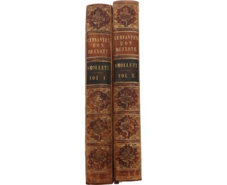
The History and Adventures Of The Renowned Don Quixote. Translated from the Spanish of Miguel De Cervantes Saavedra. To which is prefixed, Some Account of the Author’s Life. By T. Smollett, M.D. Illustrated with Twenty-eight new Copper-Plates, designed by Hayman, And engraved by the best Artists. In Two Volumes. London: Printed for A. Millar, over against Catherine-Street, in the Strand; T. Osborn, T. and T. Longman, C. Hitch and L. Hawes, J. Hodges, and J. and J. Rivington. MDCCLV [1755].With five raised bands, red and black labels with gilt titles, six gilt-ruled compartments with gilt tooling on the spine, gilt dentelle borders on the front and back calf covers; there are wide gilt dentelles with beautiful marbled endpapers, a full-paged frontis engraved by Grignion, followed by the title page, a dedication page to Don Ricardo Wall dated Feb. 7, 1755, twenty pages about the life of Cervantes (i - x x), a six-page Preface to the Reader (C2 - xxviii), and 403 pages of text in Volume I and 466 pages of text in volume II, followed by an Errata leaf for both volumes at the end of Volume II, and all the edges are marbled.Smollett's translation of Don Quixote first appeared in London in 1755 and is historically important because it is one of the principal versions in which Cervantes's novel became known to English and American readers, and the errata details are uncorrected as called for, so this is a first edition of Don Quixote by Smollett.Both books are a large quarto and measure 11 3/4 x 9 3/4 in. wide. The bindings are tight and secure in Volume I, the back cover of Volume II is detached, and both volumes have rubbing along the spine and edges of the boards, and the text has just a hint of browning here and there. The two-volume set is scarce, and we’ve adjusted the opening bid to reflect the detached cover in the second volume.
-
106056 item(s)/page