We found 35023 price guide item(s) matching your search
There are 35023 lots that match your search criteria. Subscribe now to get instant access to the full price guide service.
Click here to subscribe- List
- Grid
-
35023 item(s)/page

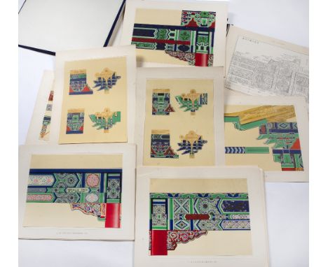
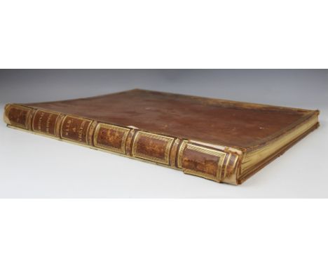
Lot 2
Architectural Folios 12 volumes National Art Survey of Scotland Examples of Scottish Architecture from the 12th to the 17th Century. Edinburgh: George Waterston & Sons, [1921] 4 volumes, folio, original cases; Gotch, J. Alfred & W. Talbot Brown Architecture of the Renaissance in England. London: B.T. Batsford, 1891-1894. 6 volumes, folio, original boards; Belcher, John & Mervyn E. Macartney Later Renaissance Architecture in England. London: B.T. Batsford, 1901. 2 volumes, folio, red cloth cases; sold not subject to return (12)
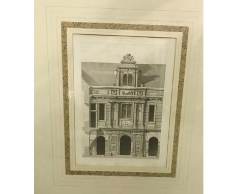
Lot 6
Campbell, Colin Vitruvius Britannicus or The British Architect, containing the Plans, Elevations and Sections of the Regular Buildings both Publick and Private in Great Britain... in 200 large Folio Plates. London: sold by the author, 1717-1717-1725. 3 volumes, folio (440 x 275mm), engraved titles to volumes 1 and 2, printed title to volume 3 in red and black, with 295 engraved plates after Colin Campbell, list of subscribers in all volumes, rebound in period style panelled calf, spines gilt, occasional light spotting, repairs to a few leaves and platesFootnote: Note: A magnificent collection of copperplate engravings. The Vitruvius Britannicus catalogues in fine detail many of the great English country houses and public buildings. Its beautiful illustrations include facades, ground plans, exterior elevations, perspective views and layouts for gardens and parks. Featured buildings include those designed by Inigo Jones, the 17th century architect who introduced Palladianism into England and the Classical-Revival architecture of Sir John Vanbrugh, as well as contemporary designs, including those of the author, the Scottish architect Colin Campbell. This work was instrumental in popularising the Neo-Palladian style in Britain and America during the eighteenth century and stands out as one of the most influential and original English architectural books of all time.
Lot 8
Designs by George Rae and Jesse Hall Architectural plans, elevations, and detail drawings for Rae, George Plans, Elevations Sections and Detail Drawings for the property of John Buddo, Esq. [Seaton House, The Scores, St Andrews], c.1864, comprising 12 coloured drawings, quarter calf album, 40 x 28cm some dust-soiling; [Idem] [A property on] North Street, St Andrews, 1845, comprising 8 coloured drawings signed by Rae, paper wrappers, some soiling and chipping to drawings; Hall, Jesse Plans, Elevations & Sections of Buildings to be Erected for John Paterson Esq., St Andrews, 1856 [St Katharine's Lodge, The Scores], comprising 8 coloured drawings, each signed J.Hall, limp album, 33 x 27cm, some dust-soiling (3)Footnote: Note: George Rae was St Andrews's first native architect, designing many buildings in the town. Seaton House now comprises half of the Best Western Scores Hotel. St Katharine's Lodge now houses the School of History at the University of St Andrews.
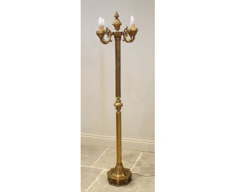
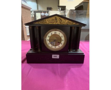
Lot 378
An Italian gilt metal standard lamp, mid 20th century, stamped 'F.B.A.L Italy' to underside of base, the urn shaped finial above four cast scrolling foliate arms, upon a reeded architectural column and relief cast octagonal plinth base, 171cm highLighting lots are sold as decorative items only, prospective buyers must consult with a qualified electrician before use or installation of these items.
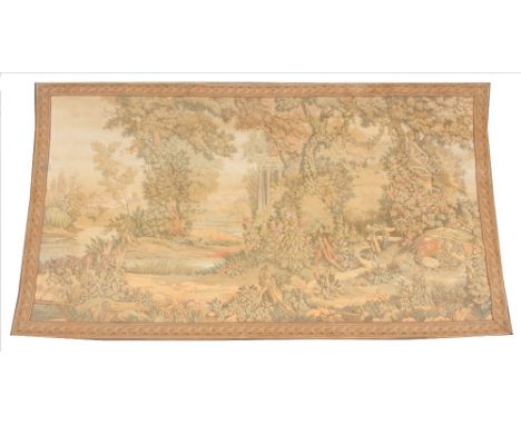
Lot 408
An early 20th century French machine woven tapestry, depicting architectural columns in a tree lined landscape, within a spiralling leaf repeating border, 198cm x 112cm, along with a second similar tapestry depicting a classical female figure within a scrolling foliate border upon a neutral ground, 200cm x 132cm (2)
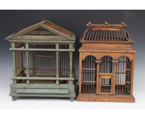
Lot 421
A painted wood and wire work architectural bird cage, 20th century, the triangular gable and twin rail portico raised upon ring turned columns over the hinged access to the metal sliding tray, 45cm H x 38cm W x 27cm D, along with a second bird cage with an ogee wire work roof above an arcaded portico, 43cm H x 31cm W x 20cm D (2)
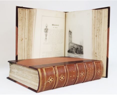
Lot 454
Cranage (D.H.S.), AN ARCHITECTURAL ACCOUNT OF THE CHURCHES OF SHROPSHIRE, limited edition (500 copies), 2 vols, photographic plates by M.J. Harding, ground plans by W.A. Webb, ¾ leather, red cloth boards, gilt Kenyon crest to cover, marbled boards, Kenyon bookplate to inside cover, lithographic frontispiece, Hobson & Co, Wellington, Shropshire 1901 Provenance: The Estate of Lord Kenyon, Gredington.
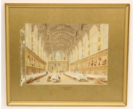
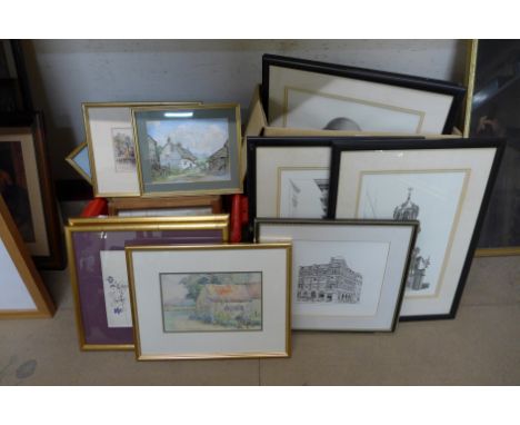
Lot 503
English school (19th century),A bound portfolio of architectural sketches and watercolours, to include views of Wells Cathedral, Ely Cathedral, King's College Chapel and Moscow,The folio bound in full leather with gilt embossed 'Original Drawings' and 'Wild & Vickers' to spine (possibly for Alfred Vickers (1853-1907)),The folio 56.5cm x 44.5cm overall (at fault) CONDITION REPORT: The album contains 19 pictures in total. All are photographed in the accompanied images.
Lot 505
Circle of Joseph Nash (1808-1878),A college dining room scene,Watercolour on paper,Unsigned, gallery labels verso,28.5cm x 38cm,Framed and glazed,With a selection of further watercolours depicting architectural scenes, 19th century and later, by E. Stock and other unknown hands, and a print after Charles Riviere 'Panorama De Paris' (6) Provenance: Albany Gallery Collection
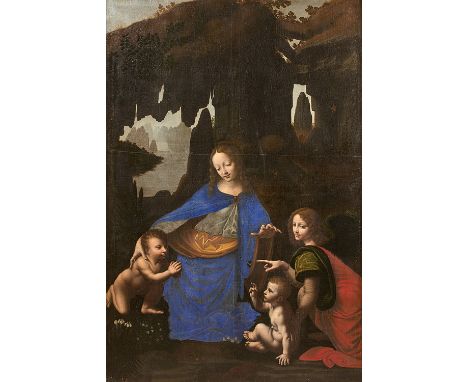
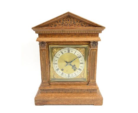
Lot 46
French school c. 1630, follower of Leonardo Da VinciThe Virgin of the rocks On its original canvasold restorations67,7 x 46,1 in.PROVENANCEChâteau de la Pierreuse in Marigny-les-Usages (Loiret), c.1840Remained in the family of the former owners to the present dayOur version of the Virgin of the rocks is an early testimony of France’s fondness for Leonardo da Vinci because the original, now in the Louvre (ill. 1), arrived there very early, around 1508, several years before the master’s arrival in Amboise in 1516.The Virgin of the rocks (ill. 1) was commissioned by a lay brotherhood for the chapel of the Immaculate Conception in the church of San Francesco Grande in Milan, which was destroyed in 1806. It was to be placed in the centre of a complex altarpiece built by the woodcarver Giacomo del Maino. A contract bound Leonardo and his pupils Ambrogio and Evangelista de Prédis to deliver their artwork for the feast of the Immaculate Conception in May 1484 (we attribute to the last two the angels on the side panels). The artists deemed that they had spent too much money on the altarpiece’s gilding and that what they had received was too little, after which they complained to Ludovico Le More (Ludovic Sforza, Duke de Milan). They stated that they had received a much higher offer for the Virgin of the rocks. Twenty-five years of litigation ensued between the three companions and the brotherhood. Leonardo probably yielded his painting, although it is unknown whether it was offered to Louis XII or François Ist. Furthermore, with the participation of the Predis brothers, he produced a replica with some variations that is now in the National Gallery in London (ill.2). Amongst the principal differences between the two paintings most noticeable is the gesture of the angel pointing to the little Saint John at the Louvre, a detail that is absent in the London version. In the English version the figures are haloed and Saint John holds a cross. The sfumato is slightly more shaded, more tanned, and the choice of plant species, with Marian connotations, has been rethought. This holy conversation fascinates us due to the psychological relationship between the four figures. Their presence is strange, both recluse in a cave and inserted in a mountain landscape. Their interaction with the nature that surrounds them is metaphysical. The composition is very simple at first glance, a pyramid as a symbol of elevation, but which breaks down into a very skilful triangulation, reinforced by the stalagmites in the background. The great spirituality that emerges from the image is counterbalanced by the naturalism of the volumes. The alpine topographic realism and the scientific description of each plant species reveal the harmony of Nature and Creation. This balance of contradictory forces, between the microcosm and the macrocosm - a reduced model imitating the entire complexity of the universe - made this painting incredibly innovative at the time and still remains fascinating today. The space is suggested by delicate gradations of colors creating a diffused light. To position his group in space, Leonardo did not rely on a building or an architectural perspective, as had been invented by the painters of the Florentine Renaissance, but on a subtle structure in motion, where the air revolves around the figures and the landscape reflects their state of mind.Leonardo da Vinci’s body of painted works is very small, only fifteen religious compositions and five portraits, though revolutionary, matured and reflected, all of which have marked the history of painting. His studio and his pupils in Milan produced replicas of his paintings at various stages of execution 1. Dozens of replicas of the Saint Anne, the Redeemer and the Virgin of the Rocks are known 2.We do not know the exact date when the latter arrived in France; it was either given to Louis XII, confiscated by Charles II d’Amboise, or offered by the ambassador to François Ist. WHO IS THE AUTHOR OF OUR VERSIONOur painting can be dated in the early 17th century, so outside the sphere of Leonardo’s Milanese pupils. There is every reason to believe that only court artists had access to the paintings in the royal collection at the Château de Fontainebleau. From the 1540s onwards, the collection was exhibited in the Appartement des bains, a suite of rooms built on the model of ancient baths, on the ground floor of the François Ist’s gallery. It consists of three bathrooms and four small salons ending in a vestibule, which were demolished in 1697 to create new accommodations 3. Fontainebleau, which was visited by the last Valois but left untouched, was one of the favourite residences of Henry IV, who wanted to establish himself as the successor to François Ist. From 1593/1594, he undertook major works that doubled the surface area of the palace. Little is known about the layout of the royal collection at this time, as sources are incomplete and contradictory. We have to wait for the inventory of Father Dan in 1642 for precise data. Between April 1594 and May 1600, the date of the Fontainebleau Conference, the arrangements were completed, and the easel paintings were transferred from the hot and humid ovens, to the painting room on the second floor of the central pavilion of the Stoves wing, rebuilt under Henri II. In the baths, the originals were replaced by copies of the same dimensions, inserted into the existing stucco frames. Logically, Henri IV entrusted this task to the artists working on the castle site. Ambroise Dubois reproduced Titian’s Magdalene, his son Jean Dubois reproduced Raphael’s Belle Jardinière, Jean Voltigeant reproduced Raphael’s Saint Margaret slaying the Dragon and perhaps also Sebastiano del Piombo’s Visitation, and Jean Michelin reproduced the Virgin of the rocks 4. This copy was transferred under Louis-Philippe to the Trianon chapel in Versailles5 (for reasons of dates, this Jean Michelin does not seem to be the painter born in Langres in 1623, follower of Le Nain). We propose to attribute our version to the bellifontain milieu of the first third of the 17th century. The deep and soft shadows, the blue (lapis-lazuli) and green of the draperies evoke the palette of Ambroise Dubois’ original creations. The copy of the Mona Lisa, kept at the Clos-Lucé for the last ten years, for example, is attributed to him (the earth tone undercoat of this painting is quite close to that of ours, ill. 3). A direct and late copy of our painting and not of the painting in the Louvre- is known in the church of Boigny-sur-Bionne 7 (ill.4), that is to say a few dozen kilometres south of the castle. This is another element in favour of a bellifontain origin of our work. Here, the painter is committed to transcribing as faithfully as possible the Italian master: the modelling of the volumes, the famous «sfumato», is transcribed in a virtuoso manner, particularly in the faces and bodies of the children, the most difficult parts to reproduce. The fact that he simplified the description of the plants, for example the leaves on the vault of the cave, shows a history painter more attached to and accustomed to figures and narration than to a profusion of details. However he has kept those that are essential to the symbolic and poetic atmosphere of the painting: the swamp iris, the aconite, the St John’s wort... The leaves of the rhapis palm on the left are less detailed and a little larger than at the Louvre.

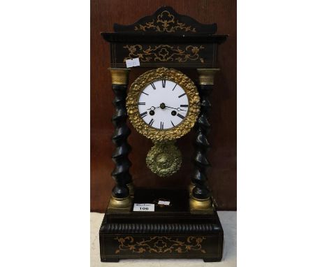
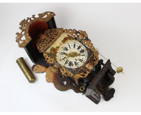
Lot 26
A fine and rare late 19th century French repeating carriage clock with exotic Orientalist coloured metal panelsAchille BrocotThe architectural case surmounted by a substantial handle over a bevelled glass inspection panel and a repeat button over four moulded columns and raised metal side panels depicting Middle-Eastern scenes, on a raised base, the circular white enamel Roman dial with blued-steel tapering hands set within a multi-coloured metal panel showing nomads at a watering hole, the movement stamped with the A*B star, the silvered lever platform escapement with bi-metallic compensated balance striking the hours and half hours on a blued steel gong. Ticking, striking and repeating. 22.5cms (8 1/2inches) high (1)Footnotes:Achille Brocot (1817-74) was the eldest son of Louis-Gabriel Brocot. He carried on his fathers business in Paris. He patented several improvements in escapements and also invented the adjustable pendulum spring suspension which bears his name.This particular style of case can be seen in Fanelli & Terwilliger, A Century of Fine Carriage Clocks, P.49.The theme of Orientalism had been prevalent in Europe for many centuries including Turquerie and Chinoiserie, however, by the beginning of the 19th century Napoleon's invasion of Egypt and Syria (1798-1801) sparked a keen interest in North African and Middle Eastern life. There are two identified branches of Orientalism, the realists who carefully painted what they observed and those who imagined Orientalist scenes without ever leaving the artist's studio.This lot is subject to the following lot symbols: ** VAT on imported items at a preferential rate of 5% on Hammer Price and the prevailing rate on Buyer's Premium.For further information on this lot please visit Bonhams.com
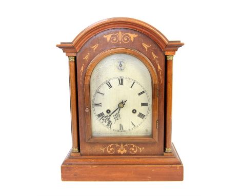
Lot 74
A fine late 17th century ebony architectural longcase clockJohn Fromanteel, LondonThe architectural case with triangular pediment supported by Composite columns and centred by a typical Fromanteel shield mount over spirally twisted turned columns, three quarter to the front and quarter to the rear, over a 42-inch long trunk door with raised moulded edge framing proud panels and a moulded octagonal lenticle over a plain rectangular base on bun feet. The ten inch square brass dial signed along the lower edge 'Johannes Fromanteel, Londini fecit' with winged cherubs head spandrels framing the narrow silvered chapter ring with outer Arabic minute track, Roman hours and inner quarter hour track divided by fleur-de-lyse half-hour markers, the finely matted centre with large Arabic subsidiary seconds dial, matted shutters and chamfered date aperture, with blued steel hands, and four latched dial feet.The weight driven movement with tall rectangular plates measuring 19cms x 12cms (7.5ins x 4.75ins) united by five knopped and ringed pillars latched to the frontplate, the going train with bolt-and-shutter maintaining power and anchor escapement, the strike train with outside countwheel sounding the hour on a bell, further mounted on the backplate with an L-shaped brass bracket to allow secure fixing to the backboard of the case. 1.95m (6ft 4.5ins) high.Footnotes:Comparable longcase clocks by John Fromanteel feature in Garnier & Hollis: 'Innovation & Collaboration' An exhibition held at Bonhams London, September 2018, Exhibit numbers 55, 60, 77 and 78. Two others are illustrated in The Iden Collection, Volume 1, Nos. 9. and 10. Ahasuerus Fromanteel's 1658 advert has ensured that his name willbe forever associated with the introduction of the pendulum clock toBritain, but one could argue that a more involved role was played byhis lesser-known son John. It was after all, John, and not Ahasuerus,who travelled to The Hague in September 1657 and worked alongsideSalomon Coster at the bench in his workshop, discussing the technologies before him. It was John who returned to London andimparted the knowledge to his father and he was surely involved inthe production and finishing of those earliest clocks such as the sublime'Cupid Fromanteel' sold in these rooms June 2011.John was the eldest of three sons. He was born in 1638 andapprenticed to his father in April 1652 at the age of fourteen. He latertransferred to his brother-in-law, Thomas Loomes from whom he wasfreed in July 1663. He died sometime before 1692.( See Loomes,'Clockmakers of Britain', Mayfield Books, 2014, p208)It has been suggested that those clocks signed by him were madebetween circa 1667 when his father left for Holland, and circa1680 when he moved with his brother (Ahasuerus II) to Vijendam,Amsterdam, giving a window of production of only 12 years or so.This lot is subject to the following lot symbols: TPTP Lot will be moved to an offsite storage location (Cadogan Tate, Auction House Services, 241 Acton Lane, London NW10 7NP, UK) and will only be available for collection from this location at the date stated in the catalogue. Please note transfer and storage charges will apply to any lots not collected after 14 calendar days from the auction date.For further information on this lot please visit Bonhams.com
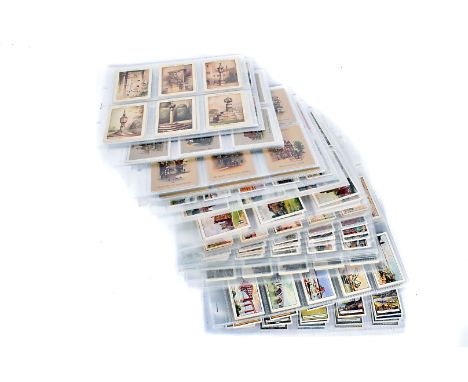
Lot 389
Architectural Themed Cigarette Cards, various sets comprising, Wills Old Sundials L25, Gems of French Architecture, Old Inns A Series, 2nd Series (2), Overseas Dominions Canada, Beautiful Homes L25, British Castles L25, Players Celebrated Gateways, Churchmans Interesting Door Knockers, The Story of London, Edwards Ringer & Bigg Celebrated Bridges 47/50, Stephen Mitchell Famous Crosses, Cope Bros Castles, CWS Famous Bridges and Wills Three Castles Lighthouses, F-G, (15 Sets)
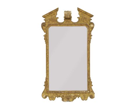
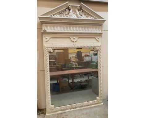
Lot 292
A George II style gilt framed wall mirror,circa 1870, the architectural frame with break-arch pediment, decorated in low relief with shell, acanthus leaf and bell-flowersto a shallow bevelled edge plate61cm wide4cm deep107.5cm highCondition report: The central finial to the pediment is missing, which would have probably a shellThere are other small losses to the frame and a scroll missing from the top right corner.One pediment freize moulding is slightly loose


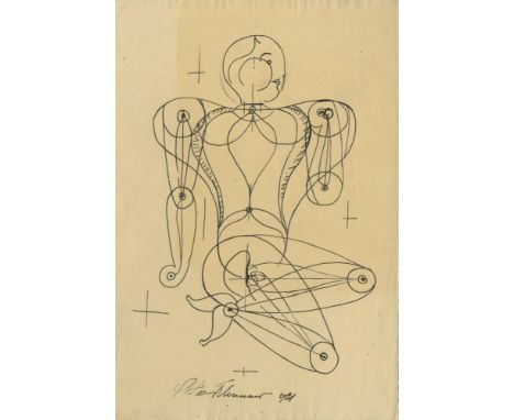
Lot 970
Artist: Oskar Schlemmer (German, 1888 - 1943). Title: "Figur". Medium: Pen and ink drawing. Date: Composed 1921. Dimensions: Overall size: 11 1/4 x 7 9/16 in. (286 x 192 mm). Image size: 9 x 6 1/2 in. (229 x 165 mm).Lot Note(s): Signed and dated, lower center. Cream wove paper. Overall condition good to very good; some slight discoloration to sheet, upper left, recto. Comment(s): Schlemmer was a German painter, sculptor, designer, and choreographer associated with the Bauhaus school. Many of his celebrated works involve the representation of bodies as architectural forms, reducing the figure to a rhythmic play between convex, concave, and flat surfaces. [26874-2-2400]

Lot 57
Artist: Henri Cartier-Bresson (French, 1908 - 2004). Title: "Behind the Gare St. Lazare". Medium: Original vintage photogravure. Date: Composed 1932. Printed 1953. Dimensions: Image size: 13 9/16 x 9 1/8 in. (344 x 232 mm).Lot Note(s): Stamped with the photographer's name, verso. Edition unknown, presumed small. High-grade archival paper. Printed to the edge of the sheet. Fine, quality printing. Very good to fine condition; affixed to very thin and supple archival acid-free support sheet, not mount/board. Comment(s): Although Cartier-Bresson noted that he did not prefer any one of his pictures to the others, historians regard “Behind The Gare Saint-Lazare” as his most iconic photograph. He took the black and white photograph in 1932 outside the Saint-Lazar train station in Paris. Color film did not exist at the time and professional photographers rarely used artificial lighting in their works. Regardless, the natural skylight and the black and white lens add elements to the photograph that color and artificial lighting could not. Cartier-Bresson noticed the beautiful frame from the hardly visible architectural buildings in the background to the pool of rainwater in the foreground. Still, he needed a subject. He waited and waited until a busy businessman ran across the pool of water onto a broken and disregarded ladder. He snapped the picture just as the man was in the process of jumping from the ladder back into the water, adding a layer of contrast between the man’s hurry and the water’s stillness. [25078-3-800]
Lot 2265
Late 19th century walnut cased free standing and coin operated Polyphon by Nicole Freres of Leipzig, the case of architectural form with twin Ionic columns and arched glazed door above a single drawer on turned feet, bearing label to the sides 'Drop a penny in the slot Nicole Freres - Leipzig', with polyphon disc, H97 x W68 x D40cm Provenance: from a private collection of musical boxes to be sold without reserve


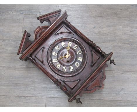
Lot 2308
Late 19th century black slate mantel clock with visible brocot escapement, 8 day movement , striking bell h31cm x w55cm x d14cm together with black slate and marble mantel clock architectural form, 8 day moment signed c Phillippe, striking on a bell, 31cm high width 30cm depth 14cm Provenance: Private and extensive collection of over 100 clocks sent in for sale by the executors of a local deceased estate.
Lot 2310
Early 20th century walnut and marquetry inlaid mantle clock of architectural form, chiming on gongs, silvered dial with Roman numbers. 42cm high 32cm wide 18cm depth Provenance: Private and extensive collection of over 100 clocks sent in for sale by the executors of a local deceased estate.
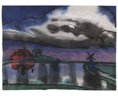
Lot 331
Emil Nolde - - 1867 Nolde/Nordschleswig - 1956 Seebüll/Schleswig-Holstein Friesisches Bauernhaus und Windmühle. Um 1920. Aquarell. Links unten signiert. Auf Japan. 36,5 x 50 cm (14,3 x 19,6 in), blattgroß. [SM]. • Die Marsch in mystischer Abenddämmerung. • Großformatiges Aquarell. • Seit 60 Jahren in Familienbesitz. PROVENIENZ: Sammlung Dr. Nielsen, Flensburg (bis 1960, Stuttgarter Kunstkabinett, 20./21.5.1960). Privatsammlung (1960 vom Vorgenannten erworben, seither in Familienbesitz). LITERATUR: Stuttgarter Kunstkabinett, 35. Auktion, 20./21.5.1960, Los 454. 'So sind auch seine Landschaftsbilder - nun ganz im Sinne der romantischen Landschaftskunst eines Caspar David Friedrich - nicht bloße Stimmungsbilder, auch keine Spiegelungen zufälliger atmosphärischer Erscheinungen im Ablauf des Jahres oder Tages, sondern wahre 'Seelenlandschaften', freier und unmittelbarer Ausdruck des künstlerischen und menschlichen Erlebens.' Martin Urban, in: E. Nolde. Landschaften. Aquarelle und Zeichnungen, Köln 1969, S. 7. Dunkle Abendwolken am Himmel, sanfter noch gespiegelt im Wasserlauf des Watts, sie erzeugen die intensive Vorstellung einer Abendbeleuchtung. In diesem Einwirken der unmittelbar bildhaft-sinnlichen Verläufe der Farben und der daraus entwickelten Vorstellung dieser typischen Marschlandschaft liegt die eigentliche Kraft und Faszination dieses Motivs. Die Grenze zwischen noch bloßer Farbe und schon gegenständlicher Darstellung ist hier offen und fließend, wird nur durch die kraftvoll vorgetragene schwarze Linie existent: So lässt Nolde das übersteigerte Violettrot der Ferne an das satte Grün der Weiden stoßen, gibt dem roten Backsteinhaus architektonische Konturen und begrenzt den Priel, der wie ein echogebender Spiegel das Szenario fließend wiederholt, auch das über den schweren Regenwolken restliche Tageslicht im dunkelblauen Abendhimmel. Die Farben des Aquarells verlaufen und ziehen ein in das Papier, oft viel intensiver und oft auch ganz anders als in der Natur. Aber sie stehen für die Empfindung eines Natureindrucks, den Nolde mit materiell, aufgetragenen Aquarellfarben sucht, mit Farben auf das vom Künstler Gesehene hinweisen möchte. „Vor der Natur waren meistens die vollen, satten Farbenklänge meine Freude. Doch auch zuweilen bewegten mich die zarten und zartesten Vorgänge. […] Dann auch wieder eigentümlich sind die Tage mit dem unendlichen Grau, dem schleswigschen Grau: die Wolken grau, der Himmel grau, die Menschen grau und ihrer aller Gemüt“, so Emil Nolde über ‚seine‘ Landschaft, die ihn zutiefst bewegt (zit. nach: Emil Nolde, Mein Leben, Köln 1993, S. 333). Noldes dynamische Sicht auf die nahe Umgebung seines Wohnhauses in Utenwarf lässt ihn fortwährend über die fließenden Grenzen des Motivs hinauswirken und eine eindrückliche, malerisch sinnliche Malerei entstehen. [MvL] Aufrufzeit: 18.06.2021 - ca. 18.02 h +/- 20 Min. Dieses Objekt wird differenzbesteuert, zuzüglich einer Einfuhrumsatzabgabe in Höhe von 7 % (Ersparnis von etwa 5 % im Vergleich zur Regelbesteuerung) oder regelbesteuert angeboten (N).ENGLISH VERSIONEmil Nolde -1867 Nolde/Nordschleswig - 1956 Seebüll/Schleswig-Holstein Friesisches Bauernhaus und Windmühle. Um 1920. Watercolor. Signed in lower left. On Japon. 36.5 x 50 cm (14.3 x 19.6 in), the full sheet. [SM]. • Marshland in mystical evening twilight. • Large-size watercolor. • Family-owned for 60 years. The expertise was not at hand before printing. PROVENANCE: Collection Dr. Nielsen, Flensburg (presumably until 1960) Private collection. LITERATURE: Stuttgarter Kunstkabinett, May 20/ 21, 1960, 35th auction, lot 454. 'His landscapes - now in the sense of the great landscape art of a Caspar David Friedrich - are not mere atmopsheric pictures, neither are they reflections of random atmospheric phenomena over the course of a year or a day, they are true 'soul landscapes', free and immediate expressions of an artistic and human sensation.' Martin Urban, in: E. Nolde. Landschaften. Aquarelle und Zeichnungen, Cologne 1969, p. 7. Dark evening clouds in the sky, gently reflected on the mudflats, creating an intense impression of evening lighting. The actual quality and fascination of this motif lies in the impact of the colors‘ sensual courses and the idea of the typical marsh landscape that the artist developed from it. The boundary between mere color and representational account is open and fluid here, it only exists in form of the powerful black line: Nolde lets the exaggerated violet-red in the distance clash with the lush green of the willows, gives the red brick house architectural contours and delimits the tidal channel, which, like an echoing mirror, repeats the scenario, as does the remaining daylight above the heavy rain clouds in the dark blue evening sky. The colors, soaked up by the paper and dissolved, are much more intense and very different from their actual occurrence in nature. But they stand for the sensation of an impression of nature that Nolde sought to express with materially applied watercolors, with colors supposed to indicate what the artist saw in front of him. “Before nature, the full, rich color tones were my greatest joy. But sometimes I was moved by the most delicate processes. […] Then again, the days with the infinite gray, the Schleswig gray: the clouds gray, the sky gray, the people gray in both body and soul, ”said Emil Nolde about“ his ”landscape, that so deeply moved him (quote from: Mein Leben, Cologne 1993, p. 333). Nolde's dynamic view of the immediate surroundings of his house in Utenwarf allow him to work beyond the fluid boundaries of the motif and to create impressive and sensual art. [MvL] Called up: June 18, 2021 - ca. 18.02 h +/- 20 min. This lot can be subjected to differential taxation plus a 7% import tax levy (saving approx. 5 % compared to regular taxation) or regular taxation (N).
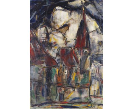
Lot 334
Christian Rohlfs - - 1849 Niendorf/Holstein - 1938 Hagen Aus Dinkelsbühl. 1923. Tempera auf Leinwand. Vogt 682. Rechts unten monogrammiert. Auf dem Keilrahmen betitelt. 111 x 75,5 cm (43,7 x 29,7 in). • Die Architekturbilder um 1920 gehören zu seinen schönsten Werken und erzielen regelmäßig Höchstpreise auf dem Auktionsmarkt. • In den Werken seiner letzten zwei Lebensjahrzehnte manifestieren sich die spezifischen Merkmale und Besonderheiten seiner Kunst. • Direkt vom Künstler erworben und seit ca. 95 Jahren im Besitz der Familie. • 1964 im Stedelijk Museum Amsterdam ausgestellt. PROVENIENZ: Dr. Walter Reinecke, Hagen (direkt beim Künstler erworben) seither in Erbfolge in der Familie. AUSSTELLUNG: Christian Rohlfs, Kunstsammlungen der Universität Göttingen, 1949, Nr. 62. Christian Rohlfs. Gedächtnis-Ausstellung, Karl-Ernst-Osthaus-Museum, Hagen, 18. Dezember 1949 - 15. Januar 1950, Nr. 44. Expressionisme, van Gogh tot Picasso, Stedelijk Museum, Amsterdam 1964, Nr. 140. Rohlfs wird von Zeitgenossen als einer der führenden Vertreter der deutschen Freilichtmalerei gefeiert und entwickelt einen Stil parallel zur Schule von Barbizon und zum französischen Impressionismus. Kein anderer deutscher Künstler hat in seiner künstlerischen Entwicklung einen solch weitreichenden Bogen zwischen den verschiedenen Kunstrichtungen geschlagen. Durch die Vermittlung Henry van de Veldes lernt Rohlfs den Gründer des Folkwang-Museums Karl Ernst Osthaus in Hagen/Westfalen kennen. Dieser stellt ihm ab 1901 im Museum in Hagen ein Atelier zur Verfügung. Der Ortswechsel nach Hagen hat einen unerwarteten Wandel zur Folge. In seinen Werken machen sich zunehmend die Einflüsse van Goghs und des Neoimpressionismus bemerkbar. Deutlich lässt sich hier der enorme Entwicklungsschritt erkennen, den Rohlfs’ Malerei seit seinem Fortgang von Weimar innerhalb kurzer Zeit vollzieht. Ganz im Sinne des Expressionismus sucht der Künstler nun nicht mehr wiederzugeben, was er sieht, sondern was er fühlt. Farbe und Form beschreiben nicht mehr, sondern besitzen Eigenwert. Dem eigenwilligen Maler gelingt es Zeit seines Schaffens, trotz der Fülle der Anregungen seine Eigenständigkeit zu wahren. Seine Auseinandersetzung mit den künstlerischen Strömungen der Zeit erfolgt weniger auf theoretischer Ebene als vielmehr in erster Linie durch die künstlerische Praxis, während des Arbeitsprozesses, im unmittelbaren Umgang mit Material und Technik, mit Themen und Motiven. Unermüdlich experimentiert er mit verschiedensten Techniken. Er arbeitet nicht nur parallel mit diversen Materialien, sondern setzt diese auch im Sinne der Mischtechnik in einem Werk gleichzeitig ein. Seine wohl schönsten Bilder in Öl sind die Architekturbilder, die um 1920 entstehen und Soest, Jena und Erfurt oder das Kloster Andechs zeigen. Diese sind zusammen mit Feiningers Gelmeroda-Gemälden die großartigsten Architekturfolgen der deutschen Malerei des 20. Jahrhunderts. Wie die Stadt Soest inspiriert der mittelalterliche Stadtkern von Dinkelsbühl und dessen Aura längst vergangener Zeiten Rohlfs zu mehreren Arbeiten. Die Straßen und Bauwerke, in die sich die Zeichen der Zeit gegraben haben, die mittelalterlichen Türme und spitzen Dächer der kleinen, eng beieinander stehenden Häuser faszinieren den Künstler. Man braucht keine topografisch genauen Schilderungen architektonischer Gegebenheiten erwarten. Vielleicht kann man den Turm der mittelalterlichen Dinkelsbühler Stadtmauer erkennen. In den Vordergrund rückt das Erlebte: Es ist vielleicht ein stürmischer Tag gewesen, ein Gewitter zieht heran. Durch den dunkel verhangenen Himmel ziehen sich schwarze Bänder, die von den aufkommenden Böen zeugen. Der energetische Pinselstrich lässt die alten Gemäuer vibrieren. Das Geschehen ist in dunklen, vornehmen Farbtönen gehalten und ist zugleich naturnah und naturfern. 'Aus Dinkelsbühl' ist ein herausragendes Beispiel, wie sich das reale Sein und eine von der Farbe bestimmte Bildvorstellung zu einer in sich vollkommenen Komposition vereinen lassen. [SM] Aufrufzeit: 18.06.2021 - ca. 18.08 h +/- 20 Min. Dieses Objekt wird regel- oder differenzbesteuert angeboten.ENGLISH VERSIONChristian Rohlfs -1849 Niendorf/Holstein - 1938 Hagen Aus Dinkelsbühl. 1923. Tempera. Lower right monogrammed. Stretcher titled. 111 x 75.5 cm (43.7 x 29.7 in). • Architecture pictures from around 1920 are among his finest works and realize top prices on the auction market. • Specific traits of his art became manifest in his works from the last two decades of his life. • Acquired from the artist and owned by the same family for ca. 95 years. • Exhibitied at Stedelijk Museum Amsterdam in 1964. PROVENANCE: Dr. Walter Reinecke, Hagen (acquired from the artist) Ever since family-owned through inheritance. EXHIBITION: Christian Rohlfs, Kunstsammlungen der Universität Göttingen, 1949, no. 62. Christian Rohlfs. Commemorative Exhibition, Karl-Ernst-Osthaus-Museum, Hagen, December 18, 1949 - January 15, 1950, no. 44. Expressionisme, van Gogh tot Picasso, Stedelijk Museum, Amsterdam 1964, no. 140. Rohlfs was celebrated by his contemporaries as one of the leading representatives of German plei-air painting and developed a style parallel to the Barbizon school and French Impressionism. No other German artist has undergone a development that covers such a wide range tendencies. Through Henry van de Velde's agency Rohlfs met the founder of the Folkwang Museum, Karl Ernst Osthaus in Hagen / Westphalia. In 1901 he had a studio set up for the artist at the museum in Hagen. The relocation to Hagen resulted in an unexpected change. The influences of Van Gogh and Neo-Impressionism became increasingly noticeable in his works. The enormous development that Rohlfs' painting made within just a short period of time since he had left Weimar can be clearly seen here. Entirely in the sense of Expressionism, the artist no longer tried to reproduce what he sees, but what he feels. Color and shape no longer describe, but have intrinsic value. The headstrong painter managed to maintain his independence despite an abundance of inspirations. His examination of current trends in was less on a theoretical level, but primarily through artistic practice, during the work process, in direct contact with material and technology, with themes and motifs. He experimented with a wide variety of techniques. He not only worked with several materials at once, he also used them simultaneously in one work in the sense of a mixed media work. His most beautiful paintings in oil are the architectural pictures of Soest, Jena, Erfurt or the Andechs monastery from around 1920. Along with Feininger's Gelmeroda paintings, these are the greatest architectural accomplishments in German painting of the 20th century. Like the city of Soest, the center of the town of Dinkelsbühl and its medieval aura inspired Rohlfs to do several works. The streets and buildings that show the signs of the times, the medieval towers and pointed roofs of the small houses in narrow streets fascinated the artist. One doesn't need to expect topographically exact accounts of architectural conditions. Maybe it is possible to identify the tower of the medieval Dinkelsbühl city wall. Sensation comes to the fore: maybe it was a stormy day, a looming thunderstorm. Ribbons of black clouds pervade the sky, harbingers of the upcoming gusts and downpour. The energetic brushstroke lets the old walls vibrate. The scene is kept in dark, elegant colors and is both close to nature and remote at the same time. 'Aus Dinkelsbühl' is an outstanding example of how reality and an image determined by color can form a perfect composition. [SM] Called up: June 18, 2021 - ca. 18.08 h +/- 20 min. This lot can be purchased subject to differential or regular taxation.
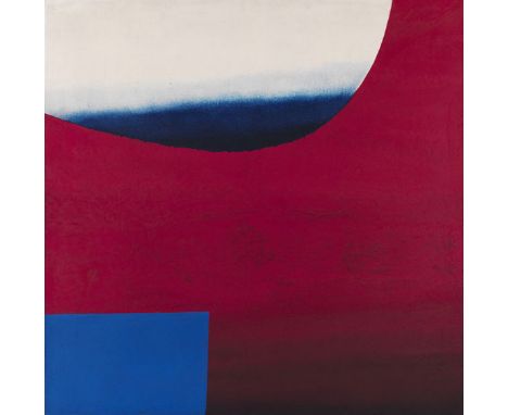
Lot 350
Rupprecht Geiger - - 1908 München - 2009 München OE 250a (2 x Blau vor Rot). 1957. Öl auf Leinwand. Dornacher/Geiger 196. Verso auf der Leinwand unten rechts signiert. Verso auf dem Keilrahmen betitelt in schwarz '2 x Blau zu Rot', 'OE 250/57' sowie in Rot 'OE 250a', datiert und mit den Maßangaben versehen. 110 x 110 cm (43,3 x 43,3 in). [EH]. • Eine der wichtigen frühen Arbeiten noch ausgeführt in der klassischen Maltechnik. • Ein moduliertes Farbfeld und Kontrastfarbe bilden in Rupprecht Geigers Komposition Exponent und Kontrapunkt • Mit den für Rupprecht Geiger so wichtigen Farben Rot und Blau, die in späteren Jahren meist nur noch solitär auftauchen. • Aus der Sammlung der Deutschen Bank. Wir danken Frau Julia Geiger, Archiv Geiger, München, für die freundliche Auskunft. PROVENIENZ: Galerie Schoeller, Düsseldorf (1982 direkt vom Künstler). Sammlung Deutsche Bank (vom Vorgenannten erworben). AUSSTELLUNG: Rupprecht Geiger. Ölbilder und Graphiken von 1950 bis 1982, Fritz Winter Haus, Ahlen, 6.2.-25.4.1982 (verso auf dem Keilrahmen mit einem Etikett). Der 1908 geborene Rupprecht Geiger ist ausgebildeter Architekt und hat 1930-1932 auch eine Maurerlehre absolviert. Dies scheint auf den ersten Blick verwunderlich, doch ist dieser Werdegang in Hinsicht auf seine spätere künstlerische Entwicklung durchaus relevant: denn als Architekt ist der Raum und als Maurer der Umgang mit Materialien wesentlich. Erst während seines Kriegsdienstes in Russland kommt Rupprecht Geiger als Kriegsmaler zur Malerei und arbeitet bei Gemälden zunächst mit der Technik der Eitempera. Unmittelbar nach Kriegsende wendet er sich der Abstraktion zu, um sie im Sinne Kandinskys weiterzuführen. In den 1950er Jahren erlangt Rupprecht Geiger erste große Anerkennung. Dennoch muss er sich nicht zuletzt aus wirtschaftlichen Gründen weiterhin mit architektonischen Fragen beschäftigen. Zum einen entstehen verschiedene Privatgebäude nach seinen Plänen, zum anderen beteiligt er sich an Ausschreibungen im Rahmen des Programms 'Kunst am Bau'. So entsteht z. B. das nunmehr denkmalgeschützte monumentale Plattenrelief des Münchner Hauptbahnhofs, das derzeit für einen späteren Wiedereinbau im neu zu errichtenden Gebäude eingelagert ist. Dort, wie auch bei dem vorliegenden Gemälde, entsteht der Eindruck, dass die Formen in einem undefinierten Raum zu schweben scheinen. Bei unserem Gemälde 'OE 250a (2x Blau vor Rot)' ist die vorherrschende Farbe Rot, in einem aus dem dunkel gehaltenen unteren Bereich herausmodulierten, immer kräftiger und leuchtender werdenden Signalton. Die Farbe Blau ist links unten mit einem klar abgegrenzten Rechteck präsent, vor einem weißen Horizont ruhend in dem oberen halbrunden Ausschnitt der dominierenden roten Farbmodulation. Mehrere wesentliche Aspekte der Kunst Rupprecht Geigers kulminieren in dieser Arbeit. Da ist das Experimentieren mit der Form zu nennen. Rechteck, Halbrund und Oval tauchen auf. Dies sind die Grundformen, mit denen er sich weiterhin beschäftigen wird. Frei von jeglicher Konstruktion legt Rupprecht Geiger die Farbflächen übereinander und gestaltet mehrere Farbräume im Bild. Es lässt sich gar nicht konkretisieren, ob die Flächen räumlich gestaffelt sind, vielmehr schweben sie mal voreinander und mal hintereinander. Zart modulierte Übergänge aus den für die frühen Jahre typischen abgedunkelten Bereichen führen zu strahlender Farbkraft, sowohl im Rot als auch im Blau vor Weiß. Schon in diesem Werk klingen die Formen und Themen an, welche wir in Geigers Bildern der Düsseldorfer Akademiezeit und seinem weiteren Schaffen wiederfinden werden. Aufrufzeit: 18.06.2021 - ca. 18.40 h +/- 20 Min. Dieses Objekt wird regelbesteuert angeboten (R).ENGLISH VERSIONRupprecht Geiger -1908 München - 2009 München OE 250a (2 x Blau vor Rot). 1957. Oil on canvas. Dornacher/Geiger 196. Signed in bottom right on verso of the canvas. Verso of the stretcher titled '2 x Blau zu Rot' and 'OE 250/57' in black as well as 'OE 250a' in red, there also dated and inscribed with the dimensions. 110 x 110 cm (43.3 x 43.3 in). [EH]. • One of the important early works still executed in the classic technique. • In Rupprecht Geiger's composition a modulated color field and a contrasting color make for exponent and counterpoint. • In Rupprecht Geiger's key colors red and blue, which in later years mostly appeared individually. We are grateful to Mrs Julia Geiger, Geiger archive, Munich, for the kind support in cataloging this lot. PROVENANCE: Galerie Schoeller, Düsseldorf (directly from the artist in 1982). Deutsche Bank Collection (acquired from aforementioned). EXHIBITION: Rupprecht Geiger. Ölbilder und Graphiken von 1950 bis 1982, Fritz Winter Haus Ahlen, February 6 - April 25, 1982 (with a label on verso of the stretcher). Born in 1908, Rupprecht Geiger pursued a career as an architect but also completed an apprenticeship as mason in 1930/32. While this appears odd at first sight, it is clearly of significance for his later artistic development: as space is of key relevance for he architect, while the mason is the master of the material. It was not before his military service in Russia that Geiger found his way to painting, as he was employed as war painter, making his first works in egg tempera. Immediately after the end of the war he turned to abstraction, which he sought to continue in the sense of Kandinsky. In the 1950s Rupprecht Geiger gained first recognition. However, it was also for financial reasons that he remained occupied with architectural questions, realizing both private building projects, as well as participating in tenders within the scope of the program 'Kunst am Bau' (Art and Architecture), in context of which he made the monumental relief for the Munich central station, today today a heritage landmark. As the station is currently subject to major reconstruction, the relief is temporarily put in storage and will be part of the new edifice in the future. In both the relief as well as in this painting the forms seem to float in an undefined space. In our work 250a/57 (2x Blau vor Rot) red is the dominant color, modulated from a dark lower part, it turns into a strong and bright signal color. The blue is represented both in a clearly outlined rectangle in lower left and resting in front of a white horizon in the upper semicircle cutout of the dominant red modulation. Several key elements of Rupprecht Geiger's art amass in this work, among them his joy in experimenting with forms, which becomes obvious through rectangle, semicircle and oval, elementary forms that he would continue to examine. Rupprecht Geiger superimposes the color fields free from any form of construction and thus integrates several color spaces into the picture. It is difficult to substantiate whether the fields are spatially staggered, as they more or less seem to float both before each other and one after another. Gently modulated transitions from the darker parts, a characteristic trait of his early years, lead to a radiant red, blue and white. This work here already hints at the forms and themes that we discover in his works from the time at the Düsseldorf Academy and throughout his later creation. Called up: June 18, 2021 - ca. 18.40 h +/- 20 min. This lot can only be purchased subject to regular taxation (R).
Lot 322
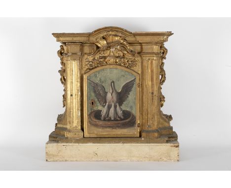
Tabernacle with an architectural structure in carved and gilded wood with decoration of pilasters and floral motifs, painted representation of a pelican with its young. Castilla, 17th century. Saint Isidore of Seville in his "Etymologies", resembles this sacrifice to that of Christ, who like the pelican, opened his side to save men from sin by feeding us with his blood. 61 x 70 x 37 cm.


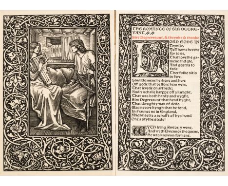
Lot 645
Kelmscott Press. The Romance of Sir Degrevant, edited by F.S. Ellis, Kelmscott Press, 1896, wood-engraved frontispiece after Edward Burne-Jones, wood-engraved border to frontispiece and title and initials designed by William Morris, shoulder notes printed in red, original linen-backed boards, 8voQty: (1)NOTESPeterson A47; Tomkinson 47. One of 350 copies on paper. Provenance: F.L.M. Griggs, Campden, Gloucestershire, his neat inscription to front endpaper. Etcher, illustrator and architect Frederick Landseer Maur Griggs (1876-1938) was born in Hitchin, Herfordshire, where the neo-Gothic architecture of the newly built chapel he attended with his parents had a lifelong effect on his artistic vision. In 1892 Griggs began work as an architectural draughtsman, later establishing his own studio in Hitchin, and exhibiting his first work, an architectural perspective, at the Royal Academy. In 1900 Macmillan & Co. commissioned drawings from Griggs for the Hertfordshire book in their series Highways and Byways. This became his most substantial achievement: over nearly forty years he illustrated twelve volumes of the series, books which demonstrate his technical virtuosity as well as his visionary talents. In 1903 Griggs arrived at Chipping Campden in the Cotswolds, where C.R. Ashbee had established his Guild and School of Handicraft the previous year. The guild's dedication to the preservation of traditional skills and ideals of craftsmanship, following in the footsteps of William Morris, made a great impression on Griggs. He lived there until 1930, quickly making a name as an illustrator, and as an architect working principally on small-scale projects for Campden friends. His major architectural achievement lay in the war memorials he designed during 1919. These works, done without payment, continue to adorn the Gloucestershire countryside at Broadway, Snowshill, Painswick, and Upton St Leonards, as well as his own Chipping Campden, each designed to be appropriate to its setting and the history of the site. He also designed his own family home, New Dover's House, a modern medieval manor house in the finest Cotswold tradition. Like Morris, Griggs was very interested in book design; he set up his own press, and designed several typefaces, notably the Leysbourne (renamed Littleworth), for the Shakespeare Head Press.
-
35023 item(s)/page