

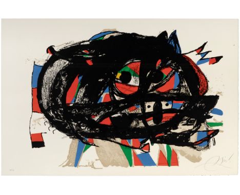
JOAN MIRÓ I FERRÀ (Barcelona, 1893 - Palma de Mallorca, 1983)."Passage De L'Egyptienne 4.Etching aquatint on paper.Signed in pencil in lower right corner.Measurements: 56 x 43 cm; 82 x 69 cm (frame).In this work we can observe soft greyish lines on which a big eye is located on the left side of the composition, at the same time we can find the classic chromatic palette of the author with the use of red, blue, yellow and magenta.Joan Miró trained in Barcelona, between the Escola de la Lonja and the Galí Academy. As early as 1918 he held his first exhibition at the Dalmau Galleries in Barcelona. In 1920 he moved to Paris and met Picasso, Raynal, Max Jacob, Tzara and the Dadaists. There, under the influence of the surrealist poets and painters, his style matures; he tries to transpose surrealist poetry to the visual, based on memory, fantasy and the irrational. From this point onwards his style began to evolve, leading him to more ethereal works in which organic forms and figures were reduced to abstract dots, lines and patches of colour. In 1924 he signed the first Surrealist manifesto, although the evolution of his work, which is too complex, makes it impossible to ascribe him to any particular orthodoxy. His third exhibition in Paris in 1928 was his first great triumph: the Museum of Modern Art in New York acquired two of his works. He returned to Spain in 1941, and that same year the museum devoted a retrospective to him which was to be his definitive international consecration. During the 1950s he experimented with other artistic media, such as engraving, lithography and ceramics. From 1956 until his death in 1983, he lived in Palma de Mallorca in a sort of internal exile, while his international fame grew. Throughout his life he received numerous awards, such as the Grand Prizes at the Venice Biennale in 1954 and the Guggenheim Foundation in 1959, the Carnegie Prize for Painting in 1966, the Gold Medals of the Generalitat de Catalunya (1978) and of the Fine Arts (1980), and was named Doctor Honoris Causa by the universities of Harvard and Barcelona. His work can currently be seen at the Joan Miró Foundation in Barcelona, inaugurated in 1975, as well as in major contemporary art museums around the world, such as the Thyssen-Bornemisza, the MoMA in New York, the Reina Sofía Museum in Madrid, the National Gallery in Washington, the MNAM in Paris and the Albright-Knox Art Gallery in Buffalo.
We found 19515 price guide item(s) matching your search
There are 19515 lots that match your search criteria. Subscribe now to get instant access to the full price guide service.
Click here to subscribe- List
- Grid
-
19515 item(s)/page
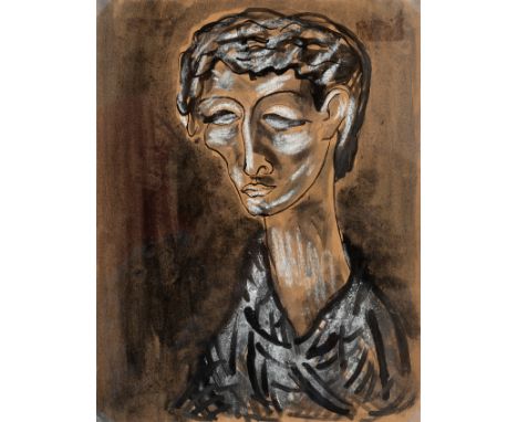
JOAN PONÇ BONET (Barcelona, 1927 - Saint-Paul, France, 1984)."Self-portrait", 1946-47.Mixed media on paper.Signed and dated on the back.This work is published in the artist's online catalogue, ref. 2365.Size: 27 x 21 cm; 60 x 53,5 cm (frame).In his youth, Ponç explored psychological self-exploration through self-portraits, and numerous drawings such as this one, made during his primitivist-expressionist period, have survived.A painter and draughtsman, he trained in Barcelona in the studio of Ramón Rogent and at the Academy of Plastic Arts with Ángel López-Obrero. After devoting himself to painting and drawing in anonymity, he held his first individual exhibition in 1946 at the Galería Arte in Bilbao, which was to be his definitive establishment on the national art scene. In 1948, together with Tharrats, Puig, Cuixart, Tàpies and Brossa, among others, he founded the avant-garde group Dau al Set. Selected by Eugenio D'Ors, he took part in the Salón de los Once in Madrid in 1951 and 1952. In 1952 he took part in the Hispano-American Biennial, and the following year he spent some time in Paris, where he met Joan Miró and managed to exhibit at the Musée de la Villa. On the latter's recommendation, Ponç gained access to Brazilian artistic circles, settling in São Paulo from 1953 to 1962. In 1954, the year of the dissolution of Dau al Set, he held an exhibition at the city's Museum of Modern Art, which was so successful that the organisation acquired all his works. In Brazil he visited the equatorial jungles, where he was impressed by their fauna, especially insects, which he incorporated into his imagery. In 1955 he founded the Taüll group with Marc Aleu, Modest Cuixart, Jaume Guinovart, Jaume Muxart, Mercadé, Tàpies and Tharrats. After returning to Catalonia due to illness, as a fully established artist he shows his work in New York, Rio de Janeiro, Bonn, Paris, Frankfurt, Geneva, Antibes and various Spanish cities. In 1965 he won the International Grand Prize for Drawing at the São Paulo Biennial. Ponç's paintings present phantasmagoric images that are both painful and tortured, in which the subconscious is the protagonist. For the painter, art is nothing more than an introduction to the mystery and secrets of the spirit. More of a draughtsman than a painter, his work is extremely detailed and meticulous. Ponç's production can be divided into six periods: the Dau al Set period (1947), the Brazilian period (1958), the metaphysical-geometric period (1969), the period of the metaphysical characters (1970), the acupainting period (1971) and a final period of synthesis (1972). He is currently represented at the Museo de Arte Contemporáneo de la Universidad de São Paulo, the Museo Patio Herreriano in Valladolid, the MACBA in Barcelona, the Centro-Museo Vasco de Arte Contemporáneo in Vitoria, the Museo de L'Empordà and the Museo Nacional Centro de Arte Reina Sofía.

MIGUEL ORTIZ BERROCAL (Villanueva de Algaidas, Malaga, 1933 - Antequera, Malaga, 2006)."Homage to Arcimboldo", 1976-1979.Bronze, copy 893/1000.Signed and numbered.Measurements: 29 x 16 cm (larger diameter); 6 x 12 cm (base).Miguel Ortiz Berrocal showed a special predilection for articulated and detachable bronze sculptures. Inspired by the main creative forces of the first half of the 1900s, the artist sought his own artistic path. He was inspired by science and created works based on mathematical, physical and scientific principles. He also developed the concept of "dismountability", understood as the process of searching for the inner forms of volumes, which implies that sculptures are composed of elements that must be assembled and disassembled in order to penetrate their invisible space. This sculpture, made up of 30 interlocking bronze elements, is a tribute to the unmistakable Giuseppe Arcimboldo, an artist who painted imaginary portraits composed of flowers and fruit during the 16th century.Berrocal began his training at the Escuela de Artes y Oficios in Madrid, where he was a pupil of Ángel Ferrant. He then went on to the San Fernando School of Fine Arts, where he was a pupil of Ramón Stolz. He complemented his training with work as a draughtsman in the studio of the architect Casto Fernández Shaw and as an assistant to several architects in Rome between 1952 and 1954. During his stay in Paris in 1955, he finally decided to devote himself to sculpture. His early works show the influence of Chillida, while at the same time denoting his preference for articulated and detachable forms in bronze. The difficulty involved in making each of his sculptures led him to decide to produce them in series. With this idea in mind, he produced two hundred copies of the sculpture "Maria de la O", for which he received the prize for sculpture at the Paris Biennale and which was later acquired by the MOMA in New York. In 1966 he settled permanently in Verona, and from 1968 he alternated his work between monumental and small-scale works. Together with several gallery owners, he founded the Società Multicettera, the first industry of small sculptures. He has exhibited in Italy, France, Germany, Spain and the United States, received the gold medal of the Bronze of Padua, the Grand Prize of Honour at the Brazil Biennial, and was named Knight of the Order of Arts and Letters by the French government. He has sculptures in public places in Korea, Bordeaux, Denmark and Switzerland, as well as in various places in Spain. He is represented in the Museums of Modern Art in New York and Paris, the Olympic Museum in Lausanne, the Kunsthalle in Hamburg, the Juan March Foundation in Madrid, the National Gallery in Rome and the Victoria & Albert Museum in London.

EDUARDO ARRANZ BRAVO (Barcelona, 1941)."Dona-retalls", 1981.Oil on canvas.Signed and dated in the lower left corner; titled and located on the back.Measurements: 92 x 73 cm; 95 x 76 cm (frame)."Woman-cuts" is an emblematic painting of the direction Arranz-Bravo's creation took in the seventies and eighties, when he achieved a perfect harmony between the realistic sketch and the colour plane, entering with his neo-figurative language towards a redefinition of the portrait genre.Eduardo Arranz Bravo trained at the Sant Jordi School of Fine Arts in Barcelona between 1959 and 1962. He made his solo debut in 1961 at the University Club of Barcelona, but the exhibition that made him known to the Barcelona critics was organised by the Barcelona Athenaeum in 1961. Between 1968 and 1970 he formed part of the group made up of Gerard Sala, Robert Llimós and Rafael Lozano Bartolozzi. He continued to collaborate with the latter until 1982, alternating joint and solo exhibitions. His contact with these artists influenced his initially abstract style, which approached the new figuration and pop art. He has held exhibitions all over Spain, as well as in Paris, Amsterdam, Venice, São Paulo and Rio de Janeiro. In 1983 he held an anthological exhibition of his work at the Sala Gaspar in Barcelona, and between 1986 and 1988 he was in charge of the artistic direction of Jaime Camino's films "El balcón abierto" and "Luces y sombras". He took part in the VIII Salón de Mayo in Barcelona and in the exhibitions "Muestra de Arte Nuevo" (Barcelona, 1971), "Picasso 90" (Louvre Museum, 1971), "Experiencias conceptuales" (Barcelona, 1971-72), among others. In 1989 he presented an exhibition of the work of his last three years at the Museum of Modern Art in São Paulo, and an anthological exhibition at the Palau Robert in Barcelona. His prizes include the II Bienal Internacional del Deporte, the figure award of the Bienal Estrada Saladich, and the Ynglada-Guillot drawing prize. His work can be found in the Reina Sofía Museum in Madrid, the Fine Arts Museums of Vitoria and Seville, the Museum of São Paulo and the Museum of Modern Art in New York.
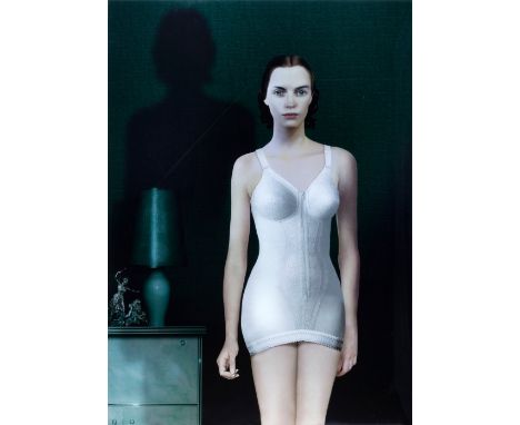
RUUD VAN EMPEL (Breda, 1958)"Study for woman" n.1. 2000.Cibachrome, photographic print on dibond, on plexiglass, copy 2/7.Signed, dated, numbered and titled on the back.Reproduced and inventoried on the artist's official website.Size: 118 x 84,5 cm.A typical feature of Ruud van Empel's work, which we can observe in the composition in question, is the perfection and idealisation of the figure depicted and its surroundings down to the smallest detail. "Van Empel's virtuosity lies in his ability to combine in photography the kind of ideas anchored in painting (historical references, the power of a gaze, the use of colour) and film (multi-image structure and the power of a narrative), and to do so on a large scale," writes Deborah Klochko in the catalogue "Ruud van Empel Photoworks 1995-2010". He studied at the Academie voor Beeldende Kunst St. Joost in Breda in the 1970s. In the late 1980s he moved to Amsterdam to work on his career as a visual artist. Her first photographic series were The Office (1995-2001), Study for Women (1999-2002) and Study in Green (2003). The Groninger Museum presented her first solo exhibition in 1999. She made the international breakthrough with her series World-Moon-Venus, which was shown at the George Eastman House in Rochester, New York. Curator Deborah Klochko invited him to participate in the exhibition entitled "Picturing Eden" at the George Eastman House. In particular, the World series, which explores the theme of innocence, made a deep impression. Van Empel placed neatly dressed black boys and girls in paradisiacal settings of untouched, non-existent nature. Interest in and appreciation of the series continues to this day all over the world. The breakthrough in the United States also brought renewed attention to Dutch museums. Van Empel has had solo exhibitions at the Het Valkhof Museum in Nijmegen, the Groninger Museum and the NoordBrabants Museum in 's-Hertogenbosch. Since the international recognition of his work gave Van Empel the status of an artist with his own independent formal language, he has progressively expanded his oeuvre with the series Theatre, from 2010 to 2013, and Souvenir, which offered a charged image of his youth in Breda. This series was acquired by the NoordBrabants Museum. But there is always a darker, if not always obvious, side to this. Ruud Schenk, curator of the Groninger Museum, wrote about this aspect in reference to the series Study for Women (2000-2002): As a viewer, you feel that there is something wrong with the depiction of the women: they are not completely real, but tend to be a mixture of real women and shop window mannequins. This generates a certain discomfort, an uneasiness that comes close to what was described as "das Unheimliche" (the uncanny) in the early 20th century". Although the photographic images seem to capture an era, it is hardly possible to assign a date to any of them. This timeless element in Van Empel's work has taken on a different meaning in his recent work, as he addresses themes such as transience and vanity in his Still Life series of 2014, and also portrays older people as in the portrait of an older woman in the Sunday series (2012), or in the Nude series (2014), in which he questions the model's pose and the aesthetics of the nude. His work has been reviewed in countless publications and he has held important international exhibitions, not only in institutions specialising in photography but also in renowned museums of modern visual art.

JOSEP MARIA RIERA I ARAGÓ (Barcelona, 1954).Untitled, 1998.Mixed media and collage on canvas.Signed and dated in the lower right-hand corner.Size: 129,5 x 182,5 cm.The poetics of the absurd beats with intensity in Riera i Aragó's "poetic machinism". His interest in transforming machines into living sculptures that express the idea of flight or diving originated in the eighties, and in the nineties (the decade in which he produced the painting in question) this interest had already spread to a variety of techniques, not only in sculpture (graphic art, collage, works on paper...) Wheels and propellers suggest an impossible journey, a flight that is only possible with the imagination. Riera i Aragó somehow picks up on the Dadaist spirit and his passion for creating useless machines, but his is a passion for a very particular type of machine, which has become a rubric, so that his art is recognisable whatever the medium used.A painter and sculptor, Josep Riera i Aragó trained at the Escuela Superior de Bellas Artes in Barcelona. He made his individual debut in 1981 at the Artema gallery in Barcelona. Two years later he took part in the Salón de Otoño in that city, and since then he has shown his work all over the world, in leading galleries in Spain, Mexico, Holland, Israel, Germany, Belgium, France, Luxembourg, Switzerland, Colombia and the United States. Particularly noteworthy are the solo exhibitions he has held at the Musée de Ceret (France, 1989), the Bibliothèque Nationale de Paris (1993), the Oostende Museum of Modern Art (Belgium, 1997), the Joan Prats Gallery in New York (1998), the Tassende Gallery in Los Angeles (2003) and the Museum of Aalst in Belgium (2006), among others. Since 1983, Riera i Aragó has developed his plastic discourse around machinery, with a symbolic language marked by an interest in air and sea transport, which he sees decontextualised, separated from their original function. At the same time, his plastic language has been enriched by the deepening of the line/plane and empty/full dialogue. Never repetitive, each "machine" he creates evokes, without pathos or condescension, a clear and comprehensive vision of humanity. With a visual vocabulary limited to simple forms reminiscent of zeppelins, submarines or aeroplanes, Riera i Aragó develops a fertile iconography charged with meaning which, endowed with a clear irony, speaks of the absurd recklessness of man's creations and of the poetic justice that results when these creations turn against him. His work should be understood as a global story, which is related to languages as disparate as astronomy, botany, mathematics and mysticism, and which offers the spectator the possibility of entering a particular and highly lyrical universe, where reality and fiction cease to be opposing categories. Riera i Aragó is currently represented at the MACBA, the Joan Miró, La Caixa and Vicent Van Gogh foundations, the Museum of Modern Art in Luxembourg, the Rufino Tamayo Museum in Mexico, the Ceret and Reattu Museum in Arles in France, the Otani Museum in Japan and the Heilbronn Museum in Germany, among many others.
JOAN MIRÓ I FERRÀ (Barcelona, 1893 - Palma de Mallorca, 1983)."Le ramoneur furax", 1978.Lithograph on Arches vellum, copy 16/30.Signed and justified by hand.Work published in "Miró lithograph VI, 1976-1981", Maeght Éditeur, p. 102, ref. 1175.Size: 63 x 90 cm; 93 x 120 cm (frame).Joan Miró trained in Barcelona, between the Escola de la Lonja and the Galí Academy. Already in the early date of 1918 he makes his first exhibition, in the Galerías Dalmau in Barcelona. In 1920 he moved to Paris and met Picasso, Raynal, Max Jacob, Tzara and the Dadaists. There, under the influence of the surrealist poets and painters, he gradually matured his style; he tried to transpose surrealist poetry to the visual, based on memory, fantasy and the irrational. From this point onwards his style began to evolve, leading him to more ethereal works in which organic forms and figures were reduced to abstract dots, lines and patches of colour. In 1924 he signed the first Surrealist manifesto, although the evolution of his work, which is too complex, makes it impossible to ascribe him to any particular orthodoxy. His third exhibition in Paris in 1928 was his first great triumph: the Museum of Modern Art in New York acquired two of his works. He returned to Spain in 1941, and that same year the museum devoted a retrospective to him which was to be his definitive international consecration. During the 1950s he experimented with other artistic media, such as engraving, lithography and ceramics. From 1956 until his death in 1983, he lived in Palma de Mallorca in a sort of internal exile, while his international fame grew. Throughout his life he received numerous awards, such as the Grand Prizes at the Venice Biennale in 1954 and the Guggenheim Foundation in 1959, the Carnegie Prize for Painting in 1966, the Gold Medals of the Generalitat de Catalunya (1978) and of the Fine Arts (1980), and was named Doctor Honoris Causa by the universities of Harvard and Barcelona. His work can currently be seen at the Joan Miró Foundation in Barcelona, inaugurated in 1975, as well as in major contemporary art museums around the world, such as the Thyssen-Bornemisza, the MoMA in New York, the Reina Sofía Museum in Madrid, the National Gallery in Washington, the MNAM in Paris and the Albright-Knox Art Gallery in Buffalo.
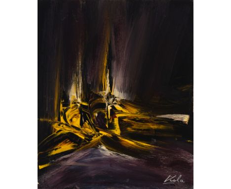
MANUEL VIOLA (Zaragoza, 1916 - San Lorenzo de El Escorial, 1987).Untitled, circa 1970.Oil on panel.Attached certificate issued by Jacobo Viola, son of the artist.Signed in the lower right corner.Measurements: 46 x 38 cm. The piece shows the usual use of black as a background in which the tonalities are reversed, and at the same time they emerge as flashes of light, in an immense inconcrete emptiness. A pictorial space, which becomes a visual poetry, where the tensions generated by the artist, through the contrast of tonalities, such as magenta and armarillo, directly question the spectator. In this apparently simple work, Viola introduces only the primary colours on the black, which he manipulates with great mastery to create a whole range of tonalities that merge between the brushstrokes of the artist, who lets a large amount of matter rest on the support.José Viola Gamón adopted the name by which he is known, Manuel Viola, after the Civil War. A member of the El Paso group, his painting is characterised by an informalist and colourist treatment, in line with the avant-garde movements developed in Spain from the 1950s onwards. He began studying philosophy and literature in Barcelona, but was forced to abandon them because of the war. His first drawings date from these years. After the war he went into exile in France, where he wrote for the surrealist poetry magazine "La main à plume". There he began to exhibit his work in the exhibitions of the so-called Spanish School of Paris. He returned to Spain in 1949, and in 1958 his truly personal style began to emerge, and at the same time he joined the avant-garde pictorial group El Paso, to which Antonio Saura, Rafael Canogar, Luis Feito and Manolo Millares, among others, belonged. He began to express himself through abstract painting with a strong expressionist character and great attention to colour. He definitively left behind the figuration that had prevailed until then in his work. Throughout his life he was awarded numerous prizes, such as the Condado de San Jorge Prize, the Lissones Prize (Milan) and the Gold Medal of the City of Saragossa. He exhibited in the most important galleries in Spain and also abroad, in cities such as Oslo, New York, Venice, São Paulo and Houston. While he was still alive, important retrospective exhibitions of his work were held: in 1965 at the Dirección de Bellas Artes de Madrid, in 1971 at the Museo de Arte Contemporáneo de Madrid, in 1972 at the Lonja de Zaragoza, in 1983 at the Armas Gallery in Miami, and in 1986 in Houston. After his death, anthological exhibitions of his work continued to be held in international galleries and museums. Manuel Viola's work can be seen in the Reina Sofía Museum, the Museum of Modern Art in Cologne, the Museum of Fine Arts in Bilbao, the Guggenheim in New York and Bilbao and the Museum of Spanish Abstract Art in Cuenca, among many others.
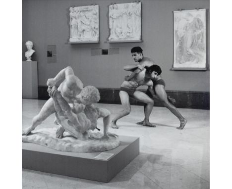
VALERY KATSUBA (Belarus, 1965)."Fighters. Real Académica de Bellas Artes de San Fernando", 2016.Analogue photograph on hand-printed C-Print photographic paper adhered to aluminium. Copy 1/4.Work published in the catalogue "La tradición académica", Real Academia de Bellas Artes de San Fernando, Madrid, 2017, p. 13.Measurements: 100 x 100 cm; 103,5 x 103,5 cm (frame).This work belongs to a set that was exhibited at the Real Academia de Bellas Artes de San Fernando, in collaboration with the Academy of Fine Arts of Saint Petersburg and the City Council of Madrid, among other institutions.Valery Katsuba began his training at the Admiral Makarov Higher School of Marine Engineering in Leningrad (now the Admiral Makarov State Maritime Academy, St Petersburg), where he completed a degree in meteorology at the Arctic Faculty with honours. He then began postgraduate research under the guidance of Academician Vladlen Adamenko. It was at this time that he met journalist Sergey Kalinin and art historian Catherine Phillips, and under their influence he began working in journalism. Throughout his career he has participated in numerous exhibitions including: 2000 Winter tales. Central House of Artists, Moscow Photo Biennale, Moscow, 2002 Strength and beauty, Every passion is blind and wild. Central House of Artists, Moscow Photo Biennale, Moscow, 2005 Seasons. My friends. Moscow Museum of Modern Art, Moscow Photo Biennale, Moscow, 2006 Phiscultur. Society of Fine Arts (Círculo de Bellas Artes), Madrid, 2014 100 Years On. Scientific-Research Museum of the St. Petersburg Academy of Arts, parallel program of Manifesta 10, European Biennale of Contemporary Art, St. Petersburg, 2014 Morning. St. Petersburg Academy of Arts, 2015 Faraway from home. St. Petersburg Academy of Arts, 2017 Academic tradition: Saint Petersburg-Madrid. Museum de Bellas Artes de San Fernando, Madrid, 2018-19 Models: classics and contemporary. National Museum of San Carlos, Mexico City and 2021 Valery Katsuba: Russian Romantic Realism, Shanghai Center of Photography, Shanghai. His work is currently held in numerous major art collections, among which are for example; Georges Pompidou National Center for the Arts, Paris, El Centro de Arte Contemporaneo 2 de mayo, Madrid, Shanghai Center of Photogaraphy, Shanghai, the State Russian Museum, St. Petersburg, Moscow Museum of Modern Art, Moscow. Moscow Museum of Modern Art, Moscow, Multimedia Art Museum, Moscow, Suzdal Museum of Fine Culture, Suzdal, State Archive of Film and Photo Documents, St. Petersburg, French National Association for Contemporary Art, Paris and the Academia de Bellas Artes de San Fernando, Madrid.
LUIS FEITO LÓPEZ (Madrid, 1929).Untitled.Watercolour on paper.Signed in the lower right corner.Size: 29 x 40 cm; 40 x 50 cm (frame).Born and trained in Madrid, he was one of the founding members of the group El Paso. In 1954 he held his first individual exhibition, with non-figurative works, at the Buchholz gallery in Madrid. From then on Feito exhibited regularly in the most important cities in the world, such as Paris, Milan, New York, Helsinki, Tokyo and Rome. Appointed professor at the San Fernando School of Fine Arts in 1954, two years later he left teaching and went to Paris on a scholarship to study the avant-garde movements in force. During this period he was influenced by automatism and matter painting. In 1962 he became a founding member of the El Paso group, with which he had lost contact during his years in Paris. His first works were figurative painting, followed by a phase in which he experimented with cubism and finally moved fully into abstraction. At first he only used black, ochre and white colours, but when he discovered the potential of light he began to use more vivid colours and smooth planes. He evolved until he used red as a counterpoint in his compositions (from 1962) and, in general, more intense colours. In his abstract phase, which includes the 1970s, Feito showed a clear tendency towards simplification, with the circle predominating in his compositions as a geometric form. Possibly, the influence of Japanese art can be seen in his preference for large bands of black. Most of his works are untitled and can therefore be recognised by a number assigned to them. Among his awards is his appointment as an Officer of the Order of Arts and Letters of France in 1985. In 1998 he was awarded the Gold Medal of Fine Arts in Madrid, and was made a Full Member of the San Fernando Royal Academy of Fine Arts. In 2000 he was awarded the Prize of the Spanish Association of Art Critics at the Estampa Salon, in 2002 the AECA Grand Prize for the best international artist at ARCO, in 2003 the prize for the most important artist at the Osaka Art Fair (Japan), in 2004 the Prize for the Culture of Plastic Arts of the Community of Madrid, in 2005 the Francisco Tomás Prieto Prize of the Fábrica Nacional de Moneda y Timbre, and in 2008 the Jorge Alió Foundation Prize and the Grand Prize for Spanish Contemporary Art CESMAI. Luis Feito is represented in the most important museums around the world, including the Gallery of Modern Art in Rome, the Guggenheim, the MoMA and the Chase Manhattan Bank in New York, the Museums of Modern Art in Tokyo, Paris, Rio de Janeiro and Montreal, the Lissone in Italy and the Albright Art Gallery in Buffalo.

Singh, Raghubir -- "After Crossing the Luni River, Barmer, Rajasthan". 1975/printed circa 1985. Dye transfer print. 24,2 x 37,2 cm (43,5 x 55 cm). Unsigned, printer's stamp on the verso.Singh was born in Jaipur to an aristocratic Rajput family. His grandfather was commander-in-chief of the Jaipur armed forces, his father a Thakur or feudal landowner of Khetri (Rajasthan). After independence, the family lost influence and much of its wealth. As a student he discovered "Beautiful Jaipur", Cartier-Bresson's little-known book published in 1948, which aroused his interest in photography. Today he is regarded as one of the great pioneers of early color photography alongside important photographers such as William Eggleston, Stephen Shore, Joel Sternfeld and Joel Meyerowitz. Singh's work documents Indian culture and the changing times the country has faced. Singh's works have primarily been shown in major American institutions, such as the Metropolitan Museum of Art, Museum of Modern Art, Tate Modern, and many others. He has published more than fourteen books on India and received numerous international awards. A print of this image is in the Metropolitan Museum of Art, New York. – A fine print in excellent condition.
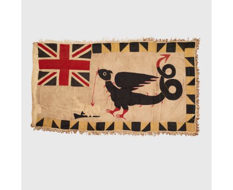
FANTE ASAFO FLAG "WILL YOU FLY OR WILL YOU VANISH" KWEKU KAKANU, SALTPOND, GHANA, C. 1940 - 1950 cotton with sewn applique, a mythical bird with curled arrow tail stands above a fallen hunter, Union Jack in top corner(164 x 82cm)Provenance: Private collection, United Kingdom Note: For a similar example please see: The Brooklyn Museum, accession number 2009.39.1. Asafo flags are a striking and unique mix of traditional West African artistic techniques with European heraldry. Beginning around the 17th century, the Fante peoples who inhabited the south-west coast of modern-day Ghana formed social and military groups known as Asafo (deriving from sa, meaning war, and fo, meaning people). Each group developed elaborate traditions of visual art, most striking of all were the flags shown here. They were comprised of bold imagery appliqued onto a cotton background, commonly depicting indigenous proverbs which relate closely to the commissioning Asafo group. The motifs they depict are varied; some aim to intimidate, some are humorous, whilst others have an undeniably surreal quality - all speak to a rich culture of local folk traditions. The influence of European heraldry is also clear, in the 19th and early 20th century, many groups incorporated versions of the Union Jack into the flag to enhance the power of the imagery (as seen on the present examples). Asafo societies remain a key part of Fante culture into the modern day, flags are paraded at traditional festivals, celebrations and funerals – with the Ghanaian flag replacing the Union Jack since the country’s independence in 1957. *We are grateful to Barbara Eyeson for identifying the specific artists behind these flags.

FANTE ASAFO FLAG "IF YOU SET A TRAP WITH EVIL INTENT, YOU MAY END UP IN IT YOURSELF" BABA ISSAH, cotton with sewn applique, on a yellow patterned ground, a figure is shown caught in a large trap, confronted by a second man armed with a sword, No 1. company in the bottom corner with a Union Jack above(149 x 101cm)Provenance: Private collection, United Kingdom Note: Asafo flags are a striking and unique mix of traditional West African artistic techniques with European heraldry. Beginning around the 17th century, the Fante peoples who inhabited the south-west coast of modern-day Ghana formed social and military groups known as Asafo (deriving from sa, meaning war, and fo, meaning people). Each group developed elaborate traditions of visual art, most striking of all were the flags shown here. They were comprised of bold imagery appliqued onto a cotton background, commonly depicting indigenous proverbs which relate closely to the commissioning Asafo group. The motifs they depict are varied; some aim to intimidate, some are humorous, whilst others have an undeniably surreal quality - all speak to a rich culture of local folk traditions. The influence of European heraldry is also clear, in the 19th and early 20th century, many groups incorporated versions of the Union Jack into the flag to enhance the power of the imagery (as seen on the present examples). Asafo societies remain a key part of Fante culture into the modern day, flags are paraded at traditional festivals, celebrations and funerals – with the Ghanian flag replacing the Union Jack since the country’s independence in 1957.

FANTE ASAFO FLAG "WE CAN DEFEND OUR SACRED TREES FROM ALL PREDATORS" GHANA, C. 1940 - 1950 cotton with sewn applique, on a yellow ground, two armed figures stand either side of a stylised tree, whilst a third figure climbs it, Union Jack in the top corner(160 x 94cm)Provenance: Private collection, United Kingdom Note: Asafo flags are a striking and unique mix of traditional West African artistic techniques with European heraldry. Beginning around the 17th century, the Fante peoples who inhabited the south-west coast of modern-day Ghana formed social and military groups known as Asafo (deriving from sa, meaning war, and fo, meaning people). Each group developed elaborate traditions of visual art, most striking of all were the flags shown here. They were comprised of bold imagery appliqued onto a cotton background, commonly depicting indigenous proverbs which relate closely to the commissioning Asafo group. The motifs they depict are varied; some aim to intimidate, some are humorous, whilst others have an undeniably surreal quality - all speak to a rich culture of local folk traditions. The influence of European heraldry is also clear, in the 19th and early 20th century, many groups incorporated versions of the Union Jack into the flag to enhance the power of the imagery (as seen on the present examples). Asafo societies remain a key part of Fante culture into the modern day, flags are paraded at traditional festivals, celebrations and funerals – with the Ghanian flag replacing the Union Jack since the country’s independence in 1957.


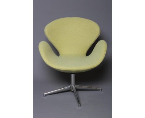
A FRITZ HANSEN TYPE SWAN CHAIR by Arne Jacobson, modern, upholstered in a lime green wool fabric, on swivel chrome plated base, 28" x 17" x 33 1/2" (This item is offered for sale as a work of art. It may not comply with the Furniture & Furnishings (Fire) Safety Regulations 1998 and for this reason, it should not be used in a private dwelling) (Est. plus 21% premium inc. VAT)Very good, no stains/tears

A MOROCCAN BRASS TAZZA. TWO ETHIOPEAN WOODEN WEAVING TOOLS AND A WOODEN PAINTED INDONESIAN CHILD'S TOY TOGETHER WITH A SMALL COLLECTION OF SOUTH AFRICAN TRIBAL ZULU ART BEADWORK, SOME MODERN SHELL JEWELLERY, A CARVED BLACK JET STONE PHOTO FRAME WITH INSET PHOTO, A SIGNED JAPANESE HAIR COMB AND LOVE IN TONGA BOOK, ETC


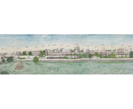
A large and impressive panoramic view of the city of Lahore Punjab, Lahore, circa 1840-45watercolour with some gold on paper, 11 separate joined sheets of paper, identifying inscriptions in Persian on painted surface, in mount, framed 24 x 235 cm.Footnotes:The two peaks of Lahore's fortune as a great city were first under the early Mughal emperors, until the death of Aurangzeb, when it was adorned with palaces, gardens and tombs; and second, the period of Maharajah Ranjit Singh, the acme of Sikh power, from his triumphant entrance into the city in 1799 and the establishment of his regime, to the collapse of Sikh rule in the years after his death, and British control of the Punjab. Between those two events it had been captured twice, first by the Persian Nadir Shah, in his catastrophic invasion of India in 1739, and then again by the Afghan Ahmad Shah Durrani.In 1831 the British political officer and traveller, Alexander Burnes, capturing something of the ancient nature of the city, and its various layers of history, wrote:On the morning of June 18th we made our public entrance into the Imperial city of Lahore, which once rivalled Delhi. We moved among its ruins [...] In our evening at Lahore, we had many opportunities of viewing this city. The ancient capital extended from east to west for a distance of five miles, and an average breadth of three, as may yet be traced by the ruins. The mosques and tombs, which have been more stably built than the houses, remain in the midst of fields and cultivation as caravanserais for the travellers. The modern city occupies the western angle of the ancient capital, and is encircled by a strong wall. The houses are very lofty, and the streets, which are narrow, offensively filthy, from a gutter that passes through the centre. (Travels into Bokhara, London 1834).The city was first of all drawn by various European artists, including Frances ('Fanny') Eden (1801-1841), sister of the more famous Emily Eden, who recorded sketching it in her diary for December 1838 (so roughly contemporary with our painting). However, the European doctor, Martin Honigberger, who was in Lahore at the Sikh court between 1829 and 1833, and then again between 1839 to 1849, recorded that he sold a panorama of Lahore by an Indian artist to the Russian painter Prince Alexis Soltykoff. Honigberger apparently took home similar paintings, since in his illustrated memoir Thirty-Five Years in the East (1852) he included lithograph views based on them (see F. S. Aijazuddin, Lahore: Illustrated Views of the 19th Century, 1991, pp. 48-49, no. 15). Woodcut versions, apparently derived from such paintings, but in a much more naive style, were also being produced in the latter half of the 19th Century: for an example, see F. S. Aijazuddin, op. cit., 1991, pp. 84-85, no. 39. At a similar date, panoramas of Delhi, and other highly detailed topographical studies of the city, were being produced by artists such as Mazhar Ali Khan, at the tail end of Mughal power, and Mughal art (for which see J. P. Losty, 'Depicting Delhi: Mazhar Ali Khan, Thomas Metcalfe, and the Topographical School of Delhi Artists', in W. Dalrymple, Y. Sharma (edd.), Princes and Painters in Mughal Delhi 1707-1857, New York 2012, pp. 52-59.)For another example of such a panorama, see Christie's, Arts of India, 10th June 2015, lot 101 (previously at Sotheby's, Exotica: East Meets West, 1500-1900, 25th May 2005, lot 139), which appeared in the exhibition Interaction of Cultures: Indian and Western Paintings 1780-1910, The Fine Arts Museum of San Francisco, 1998, cat. no. 71 (pp. 278-80). For a smaller example from a similar viewpoint, see Christie's, Art of the Islamic and Indian World, 4th October 2012, lot 221.An example of similar size with both English and Persian inscriptions is in the Singh Toor Collection: for a good discussion, along with a survey of the locations and buildings depicted, see D. Singh Toor, In Pursuit of Empire: Treasures from the Toor Collection of Sikh Art, London 2018, pp. 96-101.The monuments identified identified in the inscriptions include (ten have not been fully deciphered):The Shah's tower.The Tower of Rajah Ranjit Singh, construction of which began in 1839, not completed until 1851.The Shah's Tower of Yakki Gate.The Royal (Padshahi) Samman Tower.The Black Gate.The Gate of Light (Roshnai Gate) (illuminated at night).The White (Jasmine) Gate of Jawahir Singh Jiv.The Masti Gate.The Kashmiri Gate (facing in the direction of Kashmir).The Khizri Gate.The Royal (Padshahi) Mosque.The Old Mosque.The Mosque of Vazir Khan.The Hazuri Garden. The Mazhar 'Ali small garden.The Royal Summerhouse.The Sleeping quarter.The Large Sleeping quarter.The Mansion of [...] Nau Nihal Singh Jiv.The Mansion of Sardar Thij [?] Singh.The Mansion of the officer of the army, Khoshhal Singh.The Mansion of Sardar Ahlu Waliyah [?]. The Mansion of Sardar [...] Singh.The Arsenal [?] of Mazhar 'Ali.The Akbari District.The Akbari stable.For further information on this lot please visit Bonhams.com
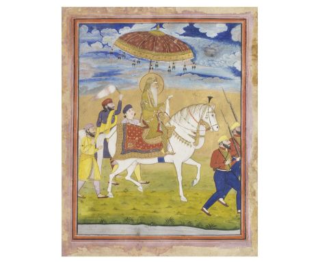
Maharajah Ranjit Singh on horseback with attendants and sepoys Punjab, Lahore, probably from the workshop of Imam Bakhsh Lahori, circa 1830-40gouache and gold on paper, orange and pink borders 289 x 228 mm.Footnotes:Maharajah Ranjit Singh was known as a natural horseman and his love of horses was legendary. He expended considerable sums to maintain a large stable of Arabian thoroughbreds. It was a common saying that the price of the entire city of Lahore was equal to the cost of the Sikh king's horses.The two soldiers that form part of the guard in this painting are men of the infantry, an arm of the Fauj-i-ain or regular army. The Maharajah's meritocratic character and pragmatic approach towards realising his ambitions in the early days of his empire-building career led him to create a modern army made up of all manner of warrior tribes and nations. Hindu Gurkhas, Biharis and Oriyas, as well as Muslim Punjabis and Pathans, were skilfully blended together with the Sikhs to form 19th Century Asia's most formidable fighting force. While his generals were all members of Punjab's new nobility, the men were drilled and marshalled by several dozen foreigners. They included former Napoleonic generals and English deserters from the ranks of the East India Company. Along with Italian, American, Spanish, German, Irish and Greek soldiers of fortune, all contributed to the new army's uniquely cosmopolitan fusion of military cultures. Taking the regular infantry as an example, Ranjit Singh made sure he hand-picked each man. These recruits would be drilled using French words of command.In this Europeanised army, each soldier was given a red jacket every two years. These jackets had a lion, an elephant or a panther on the right sleeve to designate the regiment. Superior officers had no uniformity in their dress. According to General Court (one of the French officers in the Punjab), 'many wore Brandenburg jackets embellished with gold or silver, and an odd cut, poorly imitated from our hussar uniforms'.The painter Imam Bakhsh (active circa 1825–45) was employed by the Sikh nobility but produced commissions for Claude Auguste Court and Jean Baptiste Ventura, French and Italian generals in Ranjit Singh's army. In 1838, General Ventura had French artist Alfred de Dreux paint a large oil painting based on a similar equestrian portrait of the Maharajah by Imam Bakhsh to present to King Louis-Philippe of France (Musée du Louvre Inv. 4096). In 1841 Imam Bakhsh painted another comparable equestrian portrait of Maharajah Ranjit Singh for General Court (Musee Guimet BG 399756).The present composition is closely connected with an illustrated folio (f. 284a) in a manuscript in the Royal Ontario Museum (and sold in these rooms, Bonhams, Islamic and Indian Art, 28th April 2005, lot 115) of the Ain-i-Akbari (Chronicles of Emperor Akbar), Lahore, 1822, which shows Ranjit Singh riding, a parasol above him, surrounded by attendants. The Maharajah sits in an almost identical riding posture, holding a kerchief, and the three men behind the Maharajah and his mount are portrayed in the same poses (other figures are different).For further information on this lot please visit Bonhams.com
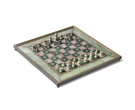
A jade and gold-koftgari steel inlaid chess board North India, 19th Centuryof square form on four ball feet, the spinach jade and brown hardstone board set within a steel frame decorated in gold overlay with an undulating floral vine, the squares inlaid with mother of pearl flowerheads, purple velvet backing; the pieces carved in green and brown hardstone with silver finials the board 45.3 x 45.3 cm.(33)Footnotes:The history of chess can largely be divided into three periods, originating in India with the ancient Hindu game of Chaturanga, followed by the medieval Shatranj and concluding with the modern game as we now know it, which first emerged at the beginning of the 16th Century. From the start of the 19th Century, there was a large demand for decorative chess sets, commissioned by Western traders from Indian exporters. Inlaid flowers, stars, arabesques and figures often feature on Indian chessboards, as demonstrated by the floral motifs in this example. For further discussion see V. Keats, Chessmen for Collectors, London, 1985. An example of a 19th Century Indian jade chess table can be found in the Metropolitan Museum of Art, New York (48.174.70).For further information on this lot please visit Bonhams.com
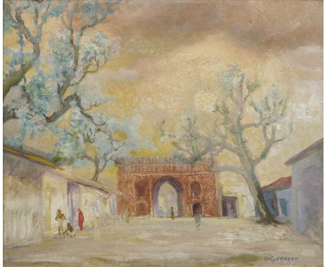
Charles R. Gerrard ARA (British, b. 1892) The Delhi Gate, Delhioil on board, signed C. Gerrard lower right 51 x 61 cm.Footnotes:The Delhi Gate depicted by Gerrard in this painting was built in the 17th Century, comprising one of fourteen such gates built by Shah Jahan within his city walls, having moved his capital from Agra (the city's original name was Shahjahanabad, after its founder). The Delhi Gate stands at the entrance of Daryagani, linking New Delhi city with the old walled city.C. R. Gerrard was Principal of the Sir J. J. School of Art in Bombay from 1936 to 1946, introducing a keen personal observation of 1930s modernist developments in British and European painting, sculpture, graphic design and architecture. He was assisted in this by exiles from the Nazi regime such as Walter Langhammer and Rudi van Leyden, who with Gerrard directed at the School, invigorated the Bombay Art Society and encouraged modernist and art deco European design amongst local architectural practices and in commercial printing. Despite the pupils' necessarily local origins and inability to travel during the war, Gerrard encouraged groupings of pupils to adopt this eye on Western developments.In 1941 a group referred to as the 'Young Turks' held a show featuring the work of P. T. Reddy, M. Y. Kulkarni, A. A. Majeed, C. Baptista and M. Bhople, artists who regarded themselves as being in modernist opposition to the more Victorian and Edwardian style of Dhurandhar, Haldankar, and Trindade. But more notably in the history of modern Indian art the less tentative group known as the Bombay Progressives emerged. This consisted of Francis Newton Souza (whom, however, Gerrard was forced to expel from the School for his connections with the pro-independence movement), H. A. Gade, S. H. Raza, S. K. Bakre, K. H. Ara and M. F. Husain. Some of Gerrard's pupils retained close ties with Bombay (e.g. K. K. Hebbar and Tyeb Mehta) while others, like Souza and Raza, under his influence embarked for Britain and Europe after the war.Gerrard brought the J. J. to maturity: under enlightened predecessors such as Lockwood Kipling, Solomon Gladstone, Cecil Burns and M. V. Dhurandhar a beaux-arts and arts and crafts traditionality had understandably persisted, but with Gerrard the J. J. became modernist.For discussion of Gerrard and his work, his influence on Bakre and others, and the Bombay art scene at this time, see Y. Dalmia, The Making of Modern Indian Art: the Progressives, New Delhi 2001, pp. 27-28, 189, 240-241; and N. Tuli, The Flamed Mosaic: Indian Contemporary Painting, 1997, pp. 196, 200.For further information on this lot please visit Bonhams.com
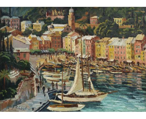
Rudolf von Leyden (German, 1908-83) View of Portofinooil on canvas, signed lower left, label of Chemould Gallery, Bombay, on stretcher 51 x 70 cm.Footnotes:Why does a view of the Italian resort of Portofino, painted by an emigré German artist - feature in a sale devoted to India in Art?Rudolf (Rudy) von Leyden, was art critic of the Times of India, and a political cartoonist and satirist. He 'discovered' and encouraged many of the young artists who became the major figures of modern Indian art post-1947. Syed Haider Raza, for instance, travelled to France in 1950 on a scholarship from the Alliance Francaise, with support from von Leyden and Walter Langhammer, and Paris and France, and its landscape, became fundamental to Raza's work of the 50s and 60s. Von Leyden produced a book about him in 1959.Kekoo Gandhy, of the Jehangir Art Gallery, wrote: 'Remember that in those days, Indian artists had no means of going abroad or of following trends in Europe. Of course, there were magazines, but the unexpected arrival of all these Europeans - most of them Jews fleeing from Austria - really started the Progressive movement off'. ('The Beginnings of the Art Movement', Seminar, no. 528, quoted in D. Singh, 'German-speaking exiles and the writing of Indian art history', arthistoriography.files.wordpress.com, p. 16).Rudy von Leyden was born in 1908 in Berlin to a middle-class family, the younger of two sons. He was a man of Jewish descent and of left-wing political views, so the rise of the Nazi party was naturally the main motivation for him to leave Germany. But while, like other such political refugees, he might have gone to France, Britain or the USA, he seems to have chosen India instead, most probably because his elder brother, Albrecht, had been living and working in Bombay since 1927. Rudolf had just finished his studies (he received his PhD in Geology from the University of Göttingen in 1932) and was looking to embark on his own career. He arrived in Bombay in 1933.Geology was rapidly left behind, and he began working in the publicity department of a textiles firm, but also soon showed his interest in visual art. He set up the Leyden Commercial Art Studio, painted watercolours while travelling around the country, and also began series of political cartoons, which he continued to produce throughout the war, publishing under the pseudonym 'Denley', an English-sounding anagram of 'Leyden', and in which he maintained a resolutely anti-Nazi tone.He was a central figure in the art scene in Bombay and elsewhere, collecting Indian art from various periods, organising exhibitions, and actively promoting young, contemporary artists. He wrote articles, for instance, about the work of the Calcutta Group (whose members included, inter alia, Paritosh Sen and Gopal Ghose), founded in 1943He was a contributing editor of the leading art review MARG from 1946 and served as an adviser for the acquisitions and art commissions of the Tata Institute of Fundamental Research (TIFR), which owned one of the most important collections of post-independence Indian art. He collected, and also became an authority on, antique board games and Indian playing cards (ganjifa). Many German or Austrian nationals were arrested as enemy aliens after the outbreak of war in 1939. Von Leyden had managed to acquire a British passport by that time, and used his contacts to help other German-speaking emigres to navigate the British authorities. One fellow artist and cartoonist, Walter Langhammer, and his wife Käthe were rescued from exile and arrest when von Leyden sent Langhammer's cartoons to several influential people in Bombay, to prove his political disposition and loyalty to the British government. Langhammer later became Art Director of the Times of India.For further information on von Leyden and his context, see N. Tuli, The Flamed Mosaic: Indian Contemporary Painting, 1997, pp. 198-201; S. S. Bean (ed.), Midnight to the Boom: Painting in India after Independence, London 2013, pp. 37-42; and M. Arbuthnot, 'Bombay satire: Rudolf von Leyden's political cartoons in India in the 1930s and 40s', British Library blogpost, 12th December 2018.For further information on this lot please visit Bonhams.com
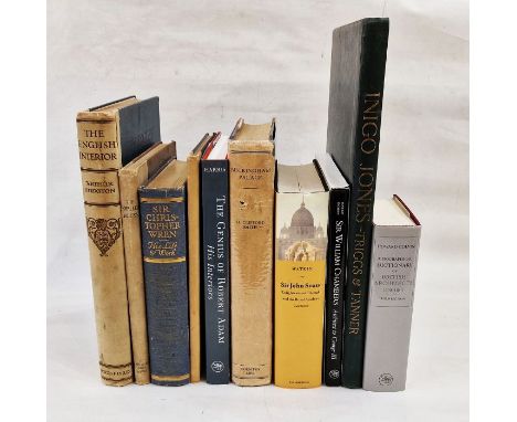
Triggs, H Inigo and Tanner, Henry"Some Architectural Works of Inigo Jones ...", published by Batsford 1901, numerous plates, photographic illustrations, drawings, frontis with tissue guard, light inscription in pencil dated 1903 on half-title, elephant folio with black cloth, gilt titles and decorations, all a bit bumped and rubbed but text and plates clean, possibly rebacked Stratton, Arthur"The Engish Interior, a Review of the Decoration of English Homes and Tudor Times to the 19th Century", Batsford (1920), numerous photographic plates, illustrations throughout the text, blue cloth with a buckram backstrip, gilt titles, backstrip chipped and splitting at the top"The Smaller House ... being selected examples of the latest practise in modern English domestic architecture", The Architectural Press 1924, architectural business stamp on tp, numerous photographic illustrations, diagrams, plans, etc, brown cloth all rather bumped and worn"Sir Christopher Wren, Bicentenary Memorial Volume published under the auspices of the Royal Institute of British Architects", Hodder & Stoughton 1923, colour frontis with tissue guard, numerous plates with architectural drawings, plans, etc, pictorial ep showing a letter from Sir Christopher Wren, blue cloth, gilt armorial crest to front board and gilt titles"Sir Christopher Wren 1632-1723" with contributions by Paul Waterhouse, Reginald Blomfield, etc, The Architectural Press 1923, photographic illustrations, small folio, gilt titles to front boardHarris, Eileen "The Genius of Robert Adam, his Interiors", published for The Paul Mellon Centre for Studies in British Art by The Yale University Press 2001, numerous colour and other illustrations throughtout the text, pictural ep, tan coloured cloth, djClifford Smith, H "Buckingham Palace ...", Country Life Limited 1931, photographic illustrations and others throughout text, blue cloth, gilt titles, dj, bookshop label stuck on ffep not price clippedWatkin, David"Sir John Soane ...", Cambridge University Press 1996, black cloth, gilt title on pastedown to backstrip, dj Harris, John and Snodin, Michael (ed)"Sir William Chambers Architect George III", Yale University Press in association with a Courthold Institute of Art 1996, illustrated throughout, pictorial ep, dark green cloth and dj, in slip caseColvin, Howard"A Biographical Dictionary of British Architects 1600-1840", 3rd edition, Yale University Press 1995, maroon cloth, dj (10)

Sven BERLIN (1911-1999)Girl Drinking from a BottleWatercolour on paperSigned and dated '7349x29cmNote: This study is a very similar work to the watercolour 'Teenagers' in David Bowie's collection, that sold for £20,000 in Sotheby's Bowie/Collector Part II: Modern And Contemporary Art, Day Auction, November 2016. Bowie originally acquired the work from Christies in 1993. We sold another similar black and white work in our April Sven Berlin sale.

Various items of modern, vintage and antique art and coloured glassware, to include an amber and blue art glass centre dish, diameter approx 27cm, vases, goblets, large blue glass fruit bowl, diameter approx 39cm, paperweights, blue glass dishes, tall slender lidded jar, large heavy pressed ruby glass straight-sided vase, height 25cm and two clear cut glass fruit bowls (12).

Various items of modern, vintage and antique mixed glassware, old bottles including Seed's Codd bottle, an 'Essence of Coffee and Chicory Shieldhall' square bodied example, a torpedo-shaped 'Wolvenden Chemist Sale' example, etc, three blue glass chemists' jars, one with lid, a 19th century celery vase with wheel engraved decoration of a swan on water, ferns and inscribed 'Celery', various glass paperweights, green glass tumbler, drinking glasses, small water jug with Mary Gregory style enamelled decoration of a young girl, perfume atomisers and art glass decorative animals, etc.

A small quantity of predominantly mid-century art reference books to include 'The Andy Warhol Diaries' edited by Pat Hackett, 'Andy Warhol Prints - Expanded Edition', 'Poliakoff' by Paul Jenkins, 'The Drawings of L.S Lowry - Public and Private', 'Art of the 40s The Museum of Modern Art - New York' and others.
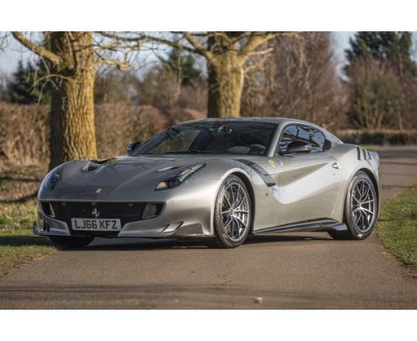
One of only 799, this ultra low mileage 'Tour de France' is finished in a rather stylish colour combination.The F12 Berlinetta is the ultimate front-engined, rear-wheel drive Grand Tourer from Ferrari and made its debut at the 2012 Geneva Show featuring one of Ferrrari’s last naturally-aspirated V12 6.3-litre engines which delivered 740bhp with an impressive 690 Nm of torque offering 0-62mph in just 3.1 seconds and a top speed of 211mph.In October 2015, Ferrari announced a limited-edition variant, the F12tdf, its nomenclature referencing a competition variant of the 250 GT, so named following the latter's many victories in the Tour de France Automobile in the late 1950s/early 1960s. Like its illustrious predecessor, the F12tdf was a lightweight, track-focused model aimed at wealthy connoisseurs and gentleman racers and only 799 were built during the 2016 and 2017 seasons. The F12tdf utilised the same 6.3-litre V12 engine as the standard car, albeit modified by the addition of mechanical tappets and variable-geometry intake trumpets, to produce in excess of 770bhp. 110kg of weight was saved by the use of carbon fibre and fastidious use of lightweight materials for every element of the car. Every aspect of the car was assessed, from the narrow-section five-spoke wheels to the single-piece carbon door cards and even the passenger glovebox was considered unnecessary weight and therefore removed.The body, too, was reconsidered and featured state-of-the-art active aerodynamics that helped generate an 80% increase in downforce at 120mph, as well as unique design elements that paid tribute to the great Ferraris of the past, the most obvious being the 250 GTO–inspired slots over the rear haunches. The chassis, already considered to be excellent by road-car standards, was improved with the introduction of a rear-wheel steering system known as ‘Virtual Short Wheelbase’ to complement the dramatically widened front track and existing electronic control systems (ESC, ABS/EBD, F1-Trac and SSC 3). The result was a reduction of the 0-100 kph time to 2.9 seconds, top speed was now in excess of 340 kph and around Fiorano, the F12tdf was 2.0 seconds quicker than its standard sibling.According to the accompanying paperwork, this Ferrari F12 Tdf (Type F152 ACL), Chassis No. ZFF81BHT 6H0224560 was built during January 2017 in left-hand drive as a Gulf version i.e. subject to the GCC (Gulf Cooperation Council) Homologation requirements and destined for Kuwait. In common with many very special Ferraris, the order was routed through Ferrari’s Atelier Studio which offeried a remarkable level of personalisation and there is a list (in English) of the selected options on a plaque within the car. The special order (extracampionario) exterior colour selected was Argento Auteil with the interior mainly in Cuoio (natural leather) with Nero detailing. There is a full list from Ferrari of all the bespoke details and they include carbon fibre (CF) air filter covers, CF engine bay covers, Ferrari telemetry and track cameras, 20-inch diamond-forged wheels, aluminium brake calipers, Daytona racing seats, a number of alcantara and leather interior bespoke options, adaptive front lights, front suspension lifter, navigation maps, front and rear cameras, hi-power premium hi-fi system and integrated audio system and much more.The car is also accompanied by its ‘Attestato per vetture Serie speciali’ (Attestation for Special series vehicles) dated 8th February 2017 in a stylish sleeved yellow presentation folder showing its journey through the factory when being built and confirming its technical spec.The Ferrari was imported to the UK and first registered here on 1st April 2018, according to its UK V5C, and further documentation including Kuwaiti Registration papers, Kuwaiti Vehicle Quittance and export certificates, HMRC vehicle import post clearance checks, an invoice from Cars UK detailing UK Import Tax of £93,647 and DVLA confirmation of the car’s new UK registration number (LJ66 KFZ).The F12 has been enjoying life in London and, at the time of cataloguing, was displaying an odometer reading of around 1,275km (795 miles). There are a couple of invoices from Rosso Corsa in Milan at 890 km and 1,086 km respectively and one from Dick Lovett in Swindon for £2,779 dated 15th July 2021 at 1,200km covering a routine service, four new Pirellis, an air-con service and a fresh MOT (valid until 8th July 2022). Representing a wonderful opportunity to own one of Ferrari's all-time great, front-engined supercars, this stunning ‘Atelier bespoke’ F12tdf comes complete with its tool kit, locking wheel nut key, service wallet and manuals, and the all-important F12tdf ‘Attestato'. As might be expected of such a low-mileage, one-owner car, this unique F12tdf presents superbly and is, without doubt, the ultimate front-engined Ferrari supercar and a true modern-day collectible that will continue to be held in high esteem by collectors and enthusiasts for years to come..SpecificationMake: FERRARIModel: F12Year: 2017Chassis Number: ZFF81BHT6H0224560Registration Number: LJ66 KFZEngine Number: 34880Drive Side: Left-hand DriveOdometer Reading: 1275 KMMake: LHDInterior Colour: Cuoio AlcantaraClick here for more details and images

Othon Coubine (Czech, 1883-1969)Bouquet of lilacs in a vase, 1929Oil on canvas25-3/4 x 21-1/2 inches (65.4 x 54.6 cm)Signed lower right: Coubine PROVENANCE:Galerie Théophile Bríant, Paris;Private collection, Switzerland;Max Müller, Switzerland, acquired from the above, 1930s;Thence by descent to the present owner, 1973.We are grateful to Dr. Rea Michalová, art historian/curator and specialist on the art of Othon Coubine, for his enthusiastic endorsement of the present work and for preparing this thoughtful catalogue essay.Bouquet of lilacs in a vase is an outstanding example of the floral still lifes painted during the 1920s by Otakar Kubín (known in France as Othon Coubine), the most famous and consistent representative of Czech neoclassicism, an art movement known in France as the "retour à l'ordre". The painter's distinctive, lyrical conception of the motif is characterized by a shimmering sense of atmosphere and near-color harmonies that impart a strong emotional vibration to his work. Coubine's attachment to the neo-realist current reflected his personal sensibilities, his response to the post-war atmosphere, and his particular inspiration from the work of French artists Ingres and Corot—all of which combined to earn him considerable fame in France, where he lived permanently from 1912. The abundance of articles and publications written about his work by French and German art historians and critics not long after his arrival in France was a testament to his rapidly growing reputation. The first monograph on Coubine was published in 1922 by the editors of the Italian magazine "Valori plastici" (Plastic Values), which grouped him together with such luminaries as Carlo Carrà, Giorgio Morandi, Arturo Martini, and Gino Severini. Written by Maurice Raynal, a French theorist associated with a group of artists around Galerie de l'Effort Moderne's Léonce Rosenberg, one of the most influential art dealers of the twentieth century, the monograph laid out the philosophy of this group which sought to create a modern, new classicism. Coubine was thus situated directly in the center of this new European movement.The declaration of war [in 1914] dealt a dramatic blow to the artist. He was sent to an internment camp in Bordeaux and, after his release, material misery deprived him of the opportunity to paint in oil. He thus devoted himself during this period to the study of theoretical and philosophical writings at the Bibliothèque Nationale in Paris. In Blaise Pascal's treatise L'Esprit du géometrie ("Spirit of Geometry"), he discovered a justification for his new artistic inclinations. He frequented the Louvre, where he admired the Italian masters of the Quattrocento. It is in his drawings that his transition to classicism is reflected for the first time.The present painting, Bouquet of lilacs in a vase, shows Coubine, in a quest for ideal beauty, "adjusting" nature into configurations that do not naturally occur in it. On a wooden chest of drawers, he placed a simple, undecorated gray-white vase crowned with an expansive arrangement of a beautiful single-species bouquet of lilacs, plants of the olive family, which growing naturally both in France and abundantly in the Czech Republic. Their powerful perfume would doubtless have had an intensely sensory-emotional significance for the artist.Coubine was repeatedly inspired by the enchanting lilacs. For example, the National Gallery, Prague owns Coubine's Bouquet in a vase of 1924, in which the lilacs form a part of a multi-species bouquet; the Moravian Gallery in Brno owns a Bouquet of lilacs which is supplemented by a marigold, the bridal veil and iris.Against a neutral, silvery-gray background (a color tone inspired by the work of Corot), Coubine centrally placed a charming symphony of pastel-purple tones, conjuring the lilac blossoms with an impressionist "staccato," in contrast to the bottle-green heart-shaped leaves. Not only the bouquet itself, but especially the motif of the yellow drapery, which nonchalantly covers the right part of the chest of drawers, expresses the painter's fascination with the "uncanny" in everyday life that permanently surrounds us. HID12701242017

Maurer, Dóra -- "(de)formation 7"Prägedruck und Radierung auf festem Velin. 1978.57,3 x 43,3 cm (69,5 x 49,8 cm).Signiert "maurer", datiert und betitelt.Griffelkunst 210 C6.Erschienen bei der Griffelkunst-Vereinigung, Hamburg. Maurer, Vertreterin der ungarischen Neoavantgarde, legt der Werkreihe der "(De)formation" die Anordnung, Verschiebung und Zusammenfügung geometrischer Formen sowie die Auseinandersetzung mit mathematischen Berechnungen zugrunde. Arbeiten der Künstlerin sind u.a. in der Nationalgalerie Berlin, der Grafischen Sammlung der Albertina Wien, der Tate Gallery London und dem Museum of Modern Art New York zu finden. Ausgezeichneter Druck mit Rand, oben und unten mit dem Schöpfrand. - Wir bitten darum, Zustandsberichte zu den Losen zu erfragen, da der Erhaltungszustand nur in Ausnahmefällen im Katalog angegeben ist. - Please ask for condition reports for individual lots, as the condition is usually not mentioned in the catalogue.

Ewald Mataré (Aachen 1887 – 1965 Düsseldorf). „Stehende Kuh, Windkuh“. 1923Bronze mit schwarzer Patina. 18,5 × 32 × 14,3 cm (7 ¼ × 12 ⅝ × 5 ⅝ in.). Auf der Plinthe mittig mit dem Künstlersignet.Schilling 15 a.–Guss zu Lebzeiten des Künstlers aus einer Gesamtauflage von 13 Exemplaren (davon ein Guss im Museum of Modern Art, New York). Patina stellenweise etwas unregelmäßig. [3033] Provenienz: Privatsammlung, USAWir berechnen auf den Hammerpreis pauschal 32% Aufgeld und 7% verauslagte Einfuhrumsatzsteuer.

Bloom, Barbara -- Titanic Champagne Bottle.Champagnerflasche in Orig.-Holzkiste. 32 x 8,5 x 8,5 cm (Kiste: 36 x 13 x 12,5 cm). Auflage 33 num. Ex. Auf der Unterseite der Holzkiste mit dem Signaturstempel der Künsterin. 1989.Herausgegeben von der Künstlerin und Jay Gorney Modern Art, New York. Barbara Bloom ist eine amerikanische Konzeptkünstlerin, deren Schwerpunkt auf Multimedia-Installationen liegt. Ihre metikulöse Kunst lotet die Beziehung zwischen Objekten und Bedeutungen aus, die durch ihre Gegenüberstellung und Platzierung entstehen. Sie verwischt die Linie zwischen selbstgemachtem und gefundenem Material, zwischen Vergangenheit und Gegenwart, nimmt aber auch zur Kenntnis, wie die Bedeutung durch den Kontext hergestellt wird. 2008 widmete ihr der Martin Gropius Bau eine Ausstellung. - Wir bitten darum, Zustandsberichte zu den Losen zu erfragen, da der Erhaltungszustand nur in Ausnahmefällen im Katalog angegeben ist. - Please ask for condition reports for individual lots, as the condition is usually not mentioned in the catalogue.

Nicholas Condy (1793-1857)Interior of an Irish Inn at BallyboylebooOil on canvas 47 x 63.5cm (18½ x 25”)SignedExhibited: London, Royal Academy, 1843, No. 415Exhibited at the Royal Academy in 1843, Condy’s recently rediscovered depiction of an Antrim interior populated by twenty very different individuals and with a rich variety of objects on display is an invaluable portrayal of Ulster country life in the middle of the nineteenth century. Although he described the picture as Interior of an Irish Cottage at Ballyboyleboo, what is shown is an inn, tavern or shebeen, making it a rare early depiction of an Irish public house. In contrast, however, to the small body of work showing Irish pubs by artists such as Charles Henry Cook, Erskine Nicol and Nathaniel Grogan, which invariably feature the Catholic Irish peasantry in stereotyped attitudes often verging on the caricature – here the clientele seems distinctly more mixed in terms of class and confession with a noticeably military flavour. The primary interaction in the painting is between the doubly amputated figure standing on the right in smart but sober attire and the seated black man at left who has suffered the loss of just one foot and who leans back in his chair as he raises a toast. This is an extraordinarily rare image of racial equality in an Irish genre scene of this date. Where black figures appear at all in Irish painting of the period it is invariably as marginal, often servile, subsidiary figures as, for example, in Erskine Nicol’s The 16th, 17th (St Patrick’s Day), and 18th March (National Gallery of Ireland). It seems likely that equality – or at least the superficial appearance of equality – has been gained through shared endeavour on the battlefield, and that the seated black man is a veteran toasting his former commanding officer. Certainly the deportment and dress of the man standing, very comfortably it must be said, on his double prosthetic limbs, suggests his elevated social position. The gathering includes both army and naval elements. An advertising bill on the right seeks able seamen, while the format of Condy’s signature, ‘Lt. Condy bf 43rd regt’ reminds us that he had begun his career as an army officer, serving in the Peninsular War, and retiring on half-pay at Christmas 1818. Continuing the military theme, a bust of the Duke of Wellington looks down from a shelf at upper left in the somewhat indecorous company of candlestick and brass kettle (and with a canoodling couple directly beneath his gaze). Prints of naval victories adorn the walls while to the side of the chimney hangs a toleware candle box and pair of bellows. A drunken sailor has passed out under the table his clay pipe and glass lying smashed in front of him while a serving woman brings more refreshments to those at table – a punch bowl, small glasses for toasting and pipes. Music is provided by a fiddler in the background.Claudia Kinmonth notes that Condy’s Ulster subjects ‘convey a real sense of how poor people’s homes in Antrim may well have been in the 1840s’ (Claudia Kinmonth, Irish Rural Interiors in Art (2006) p. 94). However, he also mixes Irish and English elements within his work, sometimes reusing still-life motifs or even whole figurative groups with which he was pleased. On the shelf to the left, the silver-plated vessel with a pouring spout and a handle on the side was used for serving hot chocolate, a delicacy unlikely to be widely available in Irish pubs of the 1840s, and indeed it, and other elements of the composition, appear again in Estate Workers in a Kitchen Interior (Mount Edgcumbe House). Similarly, a small work in the Royal Albert Memorial Museum and Art Gallery, Exeter, repeats almost verbatim the seated man shown here smoking a pipe. This is clearly a reduction from the present work, rather than the other way round, as the man’s motivation for turning round and looking upwards is lost when the figure is shown in isolation and removed from its context.Condy’s composition is artfully created and rather than the mere ‘slice-of-life’ recording of an interior and the objects within it, he offers knowing and witty allusions to the art of the past and also perhaps to that of his contemporaries. He relishes the chance to paint textures as different as scaly fish, metal, glass and ceramics and to record the differing way that light falls on each. The beautifully painted still-life in the lower right corner consisting of earthenware jug, crutch and broom resting on a barrel offers a deliberate reference to the art of David Teniers who time and again places a similar grouping of objects with a prominent diagonal formed by a brush or similar object to lead the eye into the composition. Similarly the still-life of fish may reference Teniers’s ‘well-kept kitchen compositions’ (‘de welvoorziene keuken’). The quotation of Teniers would have been recognised widely, as the seventeenth-century Flemish artist was synonymous with ‘low-life’ genre scenes such as this and his work was avidly collected and frequently engraved.Even more fundamental as a source of inspiration, however, was the phenomenally successful career of David Wilkie who applied the compositional dynamics of Teniers to modern-life subjects. Like Wilkie, Condy here deliberately echoes Teniers earthy ‘old master tonalities’ and shows a similar ‘delight in details and in rough irregular surfaces’ (David Solkin, Painting out of the Ordinary, Yale University Press, 2008, p. 12). Wilkie had also introduced a black soldier into his famous Chelsea Pensioners (Apsley House). Unlike Cushendall, the subject of another Ulster work by the artist, there is no townland in Antrim called Ballyboyleboo. It seems to be an Anglicization – exaggerating the Irishness of the name – of Ballyboley. In the rich account of life in Ulster of a couple of decades earlier written by John Gamble (published as Society and Manners in Early Nineteenth-Century Ireland, edited by Brendán Mac Suibhne, Dublin, 2011, p. 280, n. 4), Gamble records how he stopped ‘at a lone public house between Larne and Ballymena’ and enjoyed a session in which tall stories were narrated. Mac Suibhne suggests that this may be ‘the premises now call the Ballyboley Inn’. An earlier building on this site may also be the setting for Condy’s work, though an older inn only a few miles distant at The Battery is also a possible candidate.

Barry Flanagan (1941 - 2009)Horse on Anvil (2001)Bronze, 55.2 x 50.8 x 21cm (21¾ x 20 x 8¼")Incised with the artist's monogram and stamped by the foundry on the base. No. 4 from and edition of 8 plus 4 artist's proofsProvenance: Private Collection, DublinBarry Flanagan’s Drummer, a monumentally elongated figure of a striding hare beating a bodhrán, resplendently located in the Royal Hospital Kilmainham, is the Irish Museum of Modern Art’s unofficial mascot. As part of IMMA and the Hugh Lane’s joint retrospective of his work in 2006, several more bronze hares were installed along O’Connell St in Dublin. There were comparable installations of hares elsewhere, including New York City. Flanagan, a genuinely anarchic presence, was by then firmly associated with the hare, which had become for him a playful alter ego, but horses, cougars and elephants are also important members of his personal bronze menagerie. Horse sculptures by him are prominently sited in Cambridge and Montreal, for example.Even as he altered and distorted the various animals’ literal appearance in his elaborately anthropomorphic works, the elegantly fluent sculptures retain an uncanny fidelity to the source creatures and, vitally, their individual personalities. Flanagan’s approach is encapsulated in his often cited statement explaining that, for him, each subject reveals itself to his “sculptural awareness” and, it should be said, anyone who spent time with him attested to the extraordinary intensity of his attention. He first turned towards animal sculptures in the late 1970s, he said, when he saw a hare bounding across the Sussex Downs: a free spirit. That idea, the animal and by extension the human as free spirit, shines through all of his animal figures. In 1979 he saw the touring exhibition The Horses of San Marco at the Royal Academy. Some of the most remarkable equine sculptures ever made, believed to be from Constantinople, they top the facade of San Marco in Venice (now in facsimile form). These sculptures had a comparably energising effect on Flanagan. In his horse sculptures he takes the horse as a standard component of classical statuary, usually supporting some illustrious rider and, as with the majestic San Marco horses, restores to it its independence, imbuing it with qualities of playful irreverence, nobility and energy. This is particularly true of his kouros horses, which refer to classical Greek sculptural figures and also, subtly, incorporate aspects of the hares in their lean, elongated forms. Here the animal’s lively, buoyant energy plays against the weight and density of the anvil. Flanagan began his artistic life a long way from representational bronze sculpture, using such materials as rope, sand and flax, bound by fabric supports, in installations that resonated with elements of conceptual and land art, and the arte povera movements (he collaborated with Yoko Ono at one point). Yet Flanagan was always an independent force following his own line of development. His oft acknowledged enthusiasm for Alfred Jarry, the iconoclastic writer known for his singular drama Ubu Roi and his invention of pataphysics - a kind of alternative, imaginary physics - gives a good indication of the flavour of Flanagan’s imagination.Born in North Wales to Irish-Welsh parents, he steadily built an international reputation, exhibiting extensively and representing Britain at the Venice Biennale in 1982. He became an Irish citizen around the turn of the century. A restless spirit, he saw himself as essentially an itinerant artist and spent considerable time in Ibiza, Dublin, Amsterdam, Barcelona and elsewhere.Aidan Dunne, May 2022

Jack Butler Yeats RHA (1871-1957)The Bridge at Skibbereen (1919)Oil on canvas, 46 x 61cm (18 x 24")SignedProvenance: Sold by the artist to Dr Carey, London, 1950; Victor Waddington, London; With Theo Waddington Fine Art; Private Collection, DublinExhibited: Dublin, August 1920, Society of Dublin Painters; Limerick, September 1945, Goodwin Galleries; New York, November 1971, Coe Kerr Gallery, Centennial Exhibition; Dublin, September/October 2004, Douglas Hyde Gallery, Jack B. Yeats Amongst Friends, cat.no. 3; Dublin, October 2010, IMMA ‘The Moderns’; Skibbereen, Co. Cork, July/October 2018, Uillinn, West Cork Arts Centre, Coming Home: Art and the Great Hunger.Literature: Hilary Pyle, Jack B. Yeats: A Catalogue Raisonne of the Oil Paintings, Andre Deutsch, London 1992, No. 116, vol.1In the summer of 1919 Jack B Yeats visited Skibbereen, in Co. Cork, drawing and sketching the surrounding landscape. He wrote to the American collector, John Quinn, telling him that ‘There was good painting ground near to the town. All the creeks and islands of the bay were delightful…’.[1] Yeats produced several oil paintings based on the scenery of Skibbereen and Schull. The Bridge, Skibbereen is the largest and most ambitious of these works and was exhibited at the inaugural show of the newly formed Society of Dublin Painters in 1920.Two boys and two young women stand on a bridge overlooking the river Ilen. Below them is an expansive view of the surrounding hills and the undulating flow of the water through the countryside. Two horses stand in the field below. The bridge is the old metal bridge which spanned the Ilen river and which was removed in 1963 and replaced by the more modern John F. Kennedy Bridge, the following year. The bridge was located beside the West Cork Hotel, a popular destination for tourists.[2] Its stone capstone and metal railings separate the figures from the view, creating an unusual and modern composition. The fashionably dressed young women seem to belong to the more urbane world of travel and fashion than that of the wild nature that extends before them. Their genteel poses are counteracted by those of the youths, one of whom has his arm around his companion’s shoulders, emphasizing their shared elation at observing the horses.The height of the surrounding hills has been exaggerated to create a more dramatic environment but one in which a sense of calm prevails. The outskirts of the town are visible on the hill to the left, with smoke emanating from the chimneys and walled gardens extending down the bank. The distant mountain is made of tones of green and blue and the sky is streaked with salmon pink and grey clouds. This palette is subtly picked up in the pink and blue costumes of the women in the foreground, completing a tightly composed work in which all the components of form and colour subtly compliment and enrich each other.Dr. Roisin Kennedy, May 2022[1] Letter of Jack B. Yeats to John Quinn, 8 October 1919, quoted in H. Pyle, Jack B. Yeats. A Catalogue Raisonne of the Oil Paintings, 1992, I, p.102.[2] I am grateful to Finola Finlay for this information.Dusk is gently setting in, the evening light drawing out and casting pale pink highlights across the clouds. The sunsets’ reflection is captured in the still waters of the river below, while deep blue shadows fall across the rolling hills in the distance. A street of houses stretches off to the left-hand side of the composition and bends swiftly out of view. Smoke can be seen rising slowly from the small townhouses of Skibbereen village. The two boys standing with their backs to us on the bridge appear animated, looking down on a scene below. Their excitement is wonderfully captured in the young boy reaching his arm across his companion to share in his delight. We notice a smile on the other boy’s face with his cheeks lifting in amusement. The boys’ interest seems to be directed at the two horses who are seen grazing in the field beyond. They pay no heed to these on lookers, continuing their evening meal, necks bowed gracefully. The face of the white horse is beautifully rendered by Yeats, the ears tucked back, large eyes searching in the long grass. He even manages to capture the tension of the muscles in the horse’s jaw while eating. Yeats has a wonderful ability to suggest or gesture towards moments in his compositions without fully revealing the whole scene. We are not aware of any relationship between the figures, it seems as they have all by chance happened upon the same vantage spot. The two boys may be visiting the village on holidays, excited by seeing horses in the wild for the first time. Or are local to the town and thrilled at being allowed to stay out later than usual in the summer evenings, stopping by the bridge to visit the paddock. Their excitement does not seem to have affected the two female figures who gaze calmly out into the distance, enjoying the sunset. This work is an excellent example of this earlier period in Yeats style dominated by Romantic depictions of the West coast of Ireland, of its landscape and people. There is a strong use of line in the work and it reflects his time working as an illustrator, sketching in ink and watercolour the experiences of both rural and urban Irish life. While his style will become much more abstracted in the immediate years following this work, in this example the figures are painted with great attention to detail. In particular the features of the woman’s profile, the sharp angle of her jaw and nose, a glimpse of her red hair peeking out from under her hat. For the other figure who is turned away from us, her hat is adorned with a beautiful arrangement of blue summer flowers. He expertly handles the drapery of both women’s coats, showing the cut and folds of the fabric. They complement each other, standing side by side in dusky pink and pale blue. Although the scale of work is extensive, he uses a closely contained composition, placing the figures in the foreground of the picture plain, to create a greater sense of depth and distance to the surrounding landscape. The upright pillar of the bridge juts dramatically out into corner of the work directing our eyeline across the middle of the composition to the town and hills in the distance. There is an openness and breath to the painting. By using the bridge as horizontal plain, Yeats has provided us with a similar vantage point to that of the figures, as if we are standing behind them revelling in the shared twilight spectacle. Niamh Corcoran, May 2022

Sir John Lavery RA RSA RHA (1856-1941)Chiswick BathsOil on canvas board, 51 x 61cm (20 x 24'')Signed; also signed and inscribed versoProvenance: Pyms Gallery, London 1983, label verso; Christie's, London, 8 November 1990, lot 51; de Veres, Dublin, 23 November 2004, lot 40, where purchased by the present owner.Exhibited: Edinburgh, Society of Eight, 1929; P. & D. Colnaghi, London, Their Majesties' Court, Buckingham Palace, 1931 Studies and Other Sketches by Sir John Lavery RA, 1932, no.68, illustrated in exhibition catalogue; Pyms Gallery, London, Autumn Anthology, 1983, no.24; Fine Art Society, London, Sir John Lavery, 1984-85, no.104, with tour to Edinburgh, Belfast and Dublin.Literature: Kenneth McConkey, John Lavery, A Painter and his World, 2010, p.241.Alongside many prominent Irish artists, John Lavery spent time studying at the colony of Grez-sur-Loing where he developed his gentle, impressionist style. Such a technique is perfectly suited to the current subject matter, where delicately dabbed brushstrokes expertly capture the mood of a public bath on a summer’s day.Lavery’s interest in swimming spots was awakened in the 1920s after visits to Monte Carlo and Palm Beach. On his return to London, he turned his attention to the Chiswick Baths which, happily, lay just a short drive from his studio on Cromwell Place.Built in 1910, the Chiswick Baths were among several outdoor pools constructed during the Edwardian period. The modern two-tier changing rooms and lofty diving board added to the excitement of the baths, symbolising an exhilarating and innovative new era. Allowing mixed bathing, the Chiswick baths were particularly popular among London’s youth, providing a place to socialise and flaunt the latest fashions.A playful exercise in colour, Chiswick Baths is a delightful expression of leisure in the first half of the 20th century. Lit from within with splashes of yellow, green and blue, Chiswick Baths exudes heat and leaves the viewer gazing tantalisingly towards the water’s edge. With smudges of pink to represent limbs, we are brought into a crowded scene in which we can hear the chatter of voices and rumbles of laughter.Painted nineteen years after its construction, Lavery’s scene shows the baths as an established structure within the summer social calendar and documents a period of history which promoted pleasure, entertainment and luxury. With the closure of the baths in 1981, Lavery’s work now stands as a visual reminder of what was, re-awakening summer and a carefree culture at a single glance.Helena Carlyle, May 2022

Helen Frankenthaler, Ohne Titel (Original cover for "The Blue Stairs", a book of poetry by Barbara GAcryl und Kreide auf Karton 20,5 x 15,3 cm. Unter Glas gerahmt. Monogrammiert 'HF'. Rückseitig mit Richtungspfeil und -angabe. - Mit leichten Altersspuren.ProvenienzSammlung Barbara Guest, Kalifornien; Privatsammlung, HongkongAusstellungenNew York 1985 (Solomon Guggenheim Museum), Edmonton (The Edmonton Art Gallery), Toronto (Art Gallery of Ontario), Cambridge (Arthur M. Sackler Museum, Harvard University), Baltimore (The Baltimore Museum of Art), San Francisco (San Francisco Museum of Modern Art), Houston (Museum of Fine Arts), Frankenthaler, Works on paper 1949-1984, Ausst.Kat.Nr.36, S.56 mit Abb. (mit rückseitigem Aufkleber)LiteraturBarbara Guest, The Blue Stairs, New York 1968 (mit Farbabb. auf dem Cover)Die hier angebotene ausdrucksstarke Papierarbeit Helen Frankenthalers entsteht 1968 als Titelillustration für den Gedichtband „The blue stairs“ der Lyrikerin und Kunstkritikerin Barbara Guest (1920-2006). Guest ist eine Vertreterin der New York School of Poets, einer den bildenden Künstlern der New York School nahestehenden Gruppe von Lyrikern, deren spontane und humorvolle Gedichte vom literarischen Surrealismus und der Malerei des Abstrakten Expressionismus beeinflusst sind. Auf kleinem Format verdichtet das monochrome Werk die lichte, reduzierte und ungemein kraftvolle Ausstrahlung, die Frankenthalers Oeuvre inne ist und zeigt die Charakteristika, von denen auch ihre Gemälde bestimmt werden: die Farbe, die den Malgrund in einer organischen Form durchdringt, das unbemalte Papier, das ebenso wie die roh belassene Leinwand ihrer Gemälde einen maßgeblichen Teil zur Bildaussage beiträgt, und schließlich die subtilen Bezüge zu Naturformen. „What is striking is the single-mindness of Frankenthaler’s concerns at this time; the notions she explored in watercolors, gouaches, graphics, bookcover studies and large canvases are remarkably consistent. Even a small and modest work, such as the study for the cover of Barbara Guest’s book of poetry (1968) contains all of Frankenthaler’s preoccupations and strengths in miniature”, schreibt Karen Wilkin über dieses Werk (Karen Wilkin, in: Frankenthaler, Works on paper 1949-1984, New York 1984, S.70)Frankenthalers Arbeiten auf Papier sind von außerordentlicher Bedeutung für ihr Werk. Als Ausdruck ihrer zeichnerischen und koloristischen Meisterschaft sind sie nie vorbereitendes Mittel, sondern stehen vollgültig neben ihren großformatigen Gemälden. Das Museum Folkwang Essen widmet aus diesem Grund ihren Papierarbeiten die Ausstellung „Helen Frankenthaler. Malerische Konstellationen“ ab Dezember 2022.

Ernst Barlach, Der Singende MannBronzeplastik. Höhe 49,5 cm. Seitlich unten an Fußstütze und Gewandsaum signiert 'E. Barlach' und mit dem Gießerstempel "H. NOACK BERLIN" versehen. Aus einer bei Laur genannten Gesamtauflage von 57 Exemplaren, davon ca. 16 frühe Lebzeitengüsse aus der Edition der Galerie Flechtheim. Posthumer Guss.Laur 432; Schult I 343ProvenienzWohl bei Roman Norbert Ketterer, Campione d'Italia, erworben (1972); Sammlung Wilhelm Reinold, Hamburg, seitdem Familienbesitz RheinlandAusstellungenU.a. Berlin/Düsseldorf 1930 (Galerie Alfred Flechtheim), November/Dezember, Kat. Nr. 19; New York 1931 (Museum of Modern Art), Art in Our Time; Berlin 1951/1952 (Deutsche Akademie der Künste), Ernst Barlach, Kat. Nr. 54, S. 124; Bremen 1959 (Kunsthalle), Ernst Barlach, Kat. Nr. 34, S. 13 mit Abb.Güsse befinden sich nach Laur in folgenden musealen Sammlungen: Neue Nationalgalerie, Berlin; The Cleveland Museum of Art, Cleveland/Ohio, USA; Lyman Allyn Museum, New London/Connecticut, USA; Museum of Modern Art, New York, USA; Germanisches Nationalmuseum, Nürnberg; Schloss Gottorf, Schleswig; Staatliches Museum Schwerin; Ernst Barlach Stiftung, Güstrow; Hamburger Kunsthalle; Von der Heydt-Museum, WuppertalLiteraturU.a. Alfred H. Barr, Omnibus, German Sculpture, Berlin/Düsseldorf 1932, S. 38-42; Marguerite Devigne, Ernst Barlach, in: Les Beaux-Arts, Brüssel 1935, S. 14; Carl Dietrich Carls, Ernst Barlach, Das plastische, graphische und dichterische Werk, 5. Aufl., Flensburg/Hamburg 1950, S. 58; Paul Fechter, Ernst Barlach, Gütersloh 1957, S. 35; Franz Fühmann (Hg.), Ernst Barlach, Das Wirkliche und Wahrhaftige, Wiesbaden 1970, S. 159; Kunstblätter der Galerie Nierendorf, Ernst Barlach. Plastik, Zeichnungen, Graphik, 13.9.-5.12.1978, Berlin, September 1978, Kat. Nr. 41 mit Abb. Nr. 21 ; Anita Beloubek-Hammer, Ernst Barlach, Plastische Meisterwerke, Leipzig 1996, S. 116 f.; Helga Thieme, Ernst Barlachs Skulptur "Der singende Mann" in der Ausstellung "Neue deutsche Kunst", Oslo 1932, in: Ausst. Kat. Rostock 1998, S. 310 ff.Die prachtvolle Plastik "Der singende Mann" ist das wohl berühmteste bildhauerische Werk Ernst Barlachs. Ein inbrünstig singender Jüngling hält mit den Händen sein rechtes Knie umschlungen, das linke Bein liegt angewinkelt auf dem Boden. Die hierdurch hervorgerufene raumgreifende Dreieckskomposition, die Geste des Zurücklehnens und die geschlossenen Augen betonen den zugleich expressiven und kontemplativen Charakter der Bronze. Entspannt in der Haltung und mit fröhlicher, gelöster Mimik steht sie im Gegensatz zu den sonst eher ernsten, statuarisch wirkenden Arbeiten des Bildhauers. Berthold Brecht, ein scharfer Beobachter seiner Zeit, beschrieb die realistisch-menschliche Qualität des „Singenden Mannes“ 1952 in den „Notizen zur Barlach-Ausstellung“ in West-Berlin: „Der singende Mann, eine Bronze von 1928, singt kühn, in freier Haltung, deutlich arbeitend an seinem Gesang. Er singt allein, hat aber anscheinend Zuhörer. Barlachs Humor will es, dass er ein wenig eitel ist, aber nicht mehr, als sich mit der Ausübung von Kunst verträgt.“ (zit. nach: Der Bildhauer Ernst Barlach. Skulpturen und Plastiken im Ernst Barlach Haus - Stiftung Hermann F. Reemtsma, Hamburg 2007, S. 159).Nach dem Tod von Barlachs Galeristen Paul Cassirer 1926 übernahm Alfred Flechtheim die Betreuung seines bildhauerischen Werks. Er ermunterte den bis dahin ganz auf den Werkstoff Holz konzentrierten Künstler, vermehrt Bronze für seine bildhauerische Umsetzung einzusetzen. Nach dem Güstrower Ehrenmal von 1927 gehört der „Singende Mann“ zu den ersten Skulpturen, die Barlach mit voller Überzeugung in dem für ihn neuen Material denkt. Dies erklärt auch die große Popularität der Plastik, die schon bald nach Erscheinen der Edition bei Flechtheim vergriffen war, nach dem Krieg neu aufgelegt wurde und heute zu den gesuchtesten Plastiken des deutschen Expressionismus zählt.

Maurizio Cattelan, Ohne TitelC-Print unter Plexiglas (Diasec) 182,9 x 228,6 cm. Exemplar 2/10 (auf der Goodman Rechnung vermerkt). - Altersbedingt leicht farbverändert.ProvenienzMarian Goodman Gallery, New York; Privatsammlung, LuxemburgLiteraturMadeleine Schuppli (Hg.), Maurizio Cattelan, Ausst.kat. Kunsthalle Basel, Basel 1999, Abb. auf dem Buchtitel; Francesco Bonami u.a. (Hg.), Maurizio Cattelan, London 2000, S. 133 mit Abb.; Nancy Spector, Maurizio Cattelan: All, Ausst.kat. Solomon R. Guggenheim Museum, New York; New York 2011, S. 87 mit Abb.Einst wurde Maurizio Cattelan (geb. 1960) als Scherzkeks, Provokateur und sogar als Schwindler bezeichnet, der das Kunstsystem stört. Er hat jedoch die meisten seiner Kritiker eines Besseren belehrt und sich als einer der führenden Konzeptkünstler seiner Generation etabliert, dessen Karriere sich über mehr als drei Jahrzehnte erstreckt. Die vorliegende Arbeit 'Ohne Titel' geht auf eine Performance zurück, die Cattelan im November 1998 im Museum of Modern Art, New York, veranstaltete. 'Project#65 - Maurizio Cattelan' bestand aus einem Darsteller, der ein Kostüm und eine überdimensionale Kopfmaske mit den Zügen von Pablo Picasso in seinen späteren Jahren trug. Unverkennbar in seinem charakteristischen französischen Matrosenpulli lief diese „Karikatur“ des größten aller modernen Künstler umher und mischte sich unter die Museumsbesucher, wobei er sich pantomimisch mit ihnen unterhielt und für Fotos posierte, aber auch aufmüpfig wie ein Maskottchen einer Sportmannschaft auftrat, mit dem typischen Repertoire an unhöflichen Gesten, um die entweihende künstlerische Absicht der Performance zu unterstreichen, aber auch zur Belustigung aller. Diese Subversion zwischen Hoch- und Populärkultur steht im Mittelpunkt der Kunst des Italieners, zusammen mit der Entmystifizierung der Sakralität des Museums, dessen mangelnde Inklusivität und langweilige Massenvermarktungsstrategien er infrage stellt. In 'Ohne Titel' posiert unser "Picasso", Alter Ego von Cattelan selbst, vor Roy Lichtensteins 'Interieur with Mobile', das ebenfalls Teil der Sammlung des MoMA ist. Die Arbeit, die kurz nach der Performance entstand, wurde erstmals 1999 in einer Sommer-Gruppenausstellung bei Marian Goodman ausgestellt und markiert den Beginn der Zusammenarbeit des Künstlers mit der Midtown Galerie. Cattelans ständiger Spott über Institutionen und kommerzielle Galerien, die ihn im Laufe der Jahre unterstützt haben, ist integraler Bestandteil seiner ambivalenten Kritik an der hierarchischen Struktur der Kunstwelt, gleichzeitig aber auch ein wirksames Mittel, um deren Instanzen und Klischees anzuerkennen und letztlich zu verstärken."In der großen Tradition der italienischen Komödie, die von der Commedia dell'arte bis zu den Filmen Fellinis reicht, ist Cattelans Werk respektlos, selbstironisch und scharf satirisch. Sein Verhältnis zu seinem Publikum und seinen Gönnern ähnelt dem eines Hofnarren; seine Arbeit amüsiert und provoziert zugleich. Im besten Fall enthüllt er die heiklen Beziehungen und Motivationen derjenigen, die an der Schaffung, Ausstellung und dem Konsum von Kunst beteiligt sind." (Laura Hoptman, in der Pressemitteilung zu 'Projects #65 - Maurizio Cattelan', 6. November - 4. Dezember 1998, MoMA New York City)

Lee (Norman) Friedlander, New York CityGelatinesilberabzug vor 1978. 19 x 28,4 cm (27,7 x 35,3 cm). Rückseitig mit Copyrightstempel des Photographen, darin mit Bleistift signiert, sowie von fremder Hand mit Bleistift verschieden bezeichnet und beziffert. - Im rechten Bildbereich fachmännische Retuschen. Abzug mit leichten Gebrauchsspuren. Unter Passepartout montiert.LiteraturThomas Weski u.a. (Hg.), How you look at it. Photographs of the 20th Century, Ausst.kat. Sprengel-Museum, Hannover, Köln 2000, S. 427 mit Abb.; Peter Galassi (Hg.). Friedlander, Ausst.kat. Museum of Modern Art, New York, New York u.a. 2005, Tafel 120

Willi Ruge, Selbstfoto im Moment des Abspringens (aus der Serie: Ich fotografiere mich beim AbsprungVintage, Gelatinesilberabzug hochglänzend. 14,2 x 20,4 cm (17,8 × 24,3 cm). Rückseitig Papieretikett mit maschinenschriftlichen Angaben zum Motiv und Copyrightvermerk der 'Fotoaktuell GmbH, Berlin', Stempel des 'Archivo Caras y Caretas', dem Stempel 'Col. Fotografica', mit Tinte von fremder Hand bezeichnet 'AVIACION EXTR...', mit Bleistift von fremder Hand bezeichnet 'ojo' und 'Invertir' sowie mit Blei- und Buntstift von fremden Händen verschieden beziffert. - Mit den für Presseabzüge üblichen Gebrauchsspuren.ProvenienzPrivatsammlung, FrankreichLiteraturUte Eskildsen/Felix Hoffmann (Hg.), Willi Ruge. Fotografien 1919 - 1953, Ausst.kat. C/O Berlin, Göttingen 2017, S. 70 mit Abb.; Sarah Hermanson Meister (Hg.), Masterworks of Modern Photography 1900 - 1940. The Thomas Walther Collection of Photography at the Museum of Modern Art, New York, Ausst.kat. Museo d'arte della Svizzera italiana, Lugano u.a., Mailand u.a. 2021, S. 200 mit Abb.„Ein zerschundenes Gesicht und zerschundenes Schienbein, aber… ein paar gute Aufnahmen. Im Ganzen gesehen: Mehr Glück als Verstand…“ (Anm. 1), so kommentierte Willi Ruge (1892 – 1961) die Bilder seiner spektakulären Photoreportage 'Ich fotografiere mich beim Absturz mit dem Fallschirm'. Im Mai 1931 in der 'Berliner Illustrierten Zeitung' erstmals mit einem von ihm selbst verfassten Text abgedruckt, sollte sie diejenige Reportage werden, mit der der Photograph auch international seinen größten Erfolg feierte: Der Veröffentlichung in 'The Illustrated London News' (Juni 1931) folgte wenige Wochen später die Publikation im New Yorker Magazin 'Time' sowie zwei weiteren US amerikanischen Zeitschriften, noch Mitte der 1930er Jahre wurde sie in der 'Weekly Illustrated London' gebracht (vgl. Abbn. 1-3). Der hier zum Aufruf kommende Vintage-Abzug stammt ursprünglich aus dem Archiv der argentinischen Wochenzeitschrift 'Caras y Caretas' (1898 – 1941), die die Serie im September 1931 unter dem Titel 'Por primera vez, en el mundo, un fotógrafo se lanza con su cámera en un paracaídas' publizierte. (Anm. 2) Rückseitig trägt der Abzug ein Papier-Etikett der 'Fotoaktuell', deren Inhaber Willi Ruge war und über die er seine Photographien international vertrieb.Für Ruge muss der Gegenstand dieses Bildberichts das ideale Thema gewesen sein. Zum einen fanden hier seine zwei großen Leidenschaften zusammen: Jene für die Fliegerei – bereits als Schüler hatte er zwei Segelflieger selbst konstruiert, 1916 den Flugzeugführerschein erworben – und jene für seinen Beruf des Photoreporters. Darüber hinaus konnte der auf Luftphotographie spezialisierte Ruge, 1930 in einem Artikel als „tollkühnster Pressephotograph“ (Anm. 3) jener Zeit gewürdigt, hier neben seiner Abenteuerlust auch seinen unverhohlenen Hang zur Selbstdarstellung voll ausleben. Selbst Protagonist seiner Reportage, ist er nicht mehr der außerhalb des Geschehens agierende und objektiv dokumentierende Photograph, sondern macht sich und sein subjektives Empfinden zum Motiv. Das Layout der 'Berliner Illustrierten Zeitung' folgt einer sorgsamen, ganz auf Spannung und Emotionalität setzenden Bildregie: Das Photo der sorgenvoll in den Himmel hinaufblickenden Gattin mit dem wenige Monate zuvor geborenen Sohn im Arm steht hier einem Bild gegenüber, das von einem Kollegen Ruges aus einem zweiten Flugzeug heraus im Moment seines Absprungs aufgenommen wurde; den krönenden Abschluss bildet eine Aufnahme, die den tollkühnen Helden nach der Landung in inniger Umarmung mit seiner erleichterten Liebsten zeigt.Zu den eindrücklichsten Bildern der Serie jedoch gehören zweifelsohne die „Selbstfotos“, die, aufgenommen mit einem eigens zu diesem Zweck „besonders konstruierten Schmalfilmapparat mit automatischer Auslösung“ (Anm. 4), das Gesicht des Photographen in der Nahaufnahme zeigen. Durch die starken Schwarz-Weiß-Kontraste in seiner dramatischen Wirkung noch gesteigert, hebt es sich in unserer Aufnahme vor der im Hintergrund erkennbaren Berliner Vorstadtbebauung ab. Ruges angespannter Gesichtsausdruck mit dem wie zum Schrei geöffneten Mund steht hier in einem seltsamen Kontrast zur Unterschrift, mit der er das Bild später versah: „Während des Sturzes: ‚Die Empfindung des Fallens, der Geschwindigkeit und des Gefahrvollen hatte ich fast nicht.‘“ (Anm. 5) Die Photographie spricht hier aufgrund ihrer starken innerbildlichen Dynamik durchaus eine andere Sprache. Heute kann sie als Sinnbild für eine Epoche gedeutet werden, die von der Faszination an technischem Fortschritt, Tempo und optischen Sensationen geprägt war. Ein identischer Vintage-Abzug unseres Motivs wird aktuell in der vielbeachteten Ausstellung 'Masterworks of Modern Photography 1900 – 1940. The Thomas Walther Collection at The Museum of Modern Art, New York' mit Stationen in Lugano, Paris und Turin gezeigt. Auf einer Auktion kommt diese Aufnahme, von der nach heutigem Kenntnisstand neben dem hier angebotenen Abzug nur noch das erwähnte Exemplar im Museum of Modern Art nachgewiesen ist, erstmals zum Aufruf.Wir danken Ute Eskildsen, Essen, und Sophie Hackett, Toronto, für hilfreiche Auskünfte.Anmerkungen:1. Willi Ruge, Ich fotografiere mich beim Absturz mit dem Fallschirm, in:Berliner Illustrierte Zeitung, Nr. 21, 24. Mai 1931, hier zitiert nach:Ute Eskildsen/Felix Hoffmann (Hg.), Willi Ruge. Fotografien 1919 – 1953,Ausst.kat. C/O Berlin, Göttingen 2017, S. 245f.2. Caras y Caretas, Buenos Aires, Nr. 1721, 26.09.1931.3. Zit. nach Ute Eskildsen, Fotoaktuell – Willi Ruge. Abenteuer für die Presse,in: Eskildsen/Hoffmann 2017, S. 196.4. Eskildsen/Hoffmann 2017, S. 199.5. Eskildsen/Hoffmann 2017, S. 214.


KNOEBEL, IMI1940 DessauTitel: Anima Mundi 19-3. 3-teilig. Datierung: 2013. Technik: Acryl auf Aluminium. Maße: Jeweils: 37 x 28,7 x 5,5cm. Bezeichnung: Signiert und datiert verso auf dem dritten Panel: imi 2013. Zudem jedes Panel verso mit einem Etikett mit Werkangaben versehen. Bei diesem Werk handelt es sich um ein Unikat. Es befindet sich in der originalen Holzkiste inkl. Installationsanleitung.Zu dieser Arbeit liegt ein Zertifikat der Galerie Fahnemann, Berlin, vom 21. April 2014 vor.Provenienz:- Galerie Fahnemann, Berlin - Privatsammlung Nordrhein-Westfalen- Knoebel zählt zu den wichtigsten Vertretern der deutschen Minimal Art- Hochattraktive Farbkombination- Werke des Künstlers befinden sich in zahlreichen bedeutenden Sammlungen, darunter Museum of Modern Art, New York und Museo Reina Sofia, MadridImi Knoebel beschäftigt sich seit 2010 mit der "Anima Mundi" Serie, in der reduzierte Mittel und intensive Farbigkeit direkt aufeinander treffen. Die Konstruktion aller Werke ist identisch - ein hochrechteckiges Mittelfeld wird von vier Profilen eingefasst, jedes Feld in einer eigenen Farbigkeit. Sie stehen einzeln oder in Gruppen. Dadurch eröffnen sich enorm vielfältige Farbvariationen und -kombinationen. Das hier angebotene Werk "Anima Mundi 19-3" ist dreiteilig. Zwei pastellige Farbtafeln flankieren eine kraftvolle, dunkle Tafel im Zentrum. Aus einer eigentlich simplen Komposition entsteht so ein Gesamtwerk von unendlicher Vielfalt und einem spannenden Veränderungspotenzial. Der international renommierte Künstler ist einer der bedeutendsten Vertreter der deutschen Minimal Art. Inspiriert von den Werken Malewitsch' stehen die Beziehungen zwischen Raum, Form und Farbe im Fokus seines Schaffens. Auch experimentiert er immer wieder mit verschiedenen Materialien wie Hartfaserplatten, Aluminium und Papier, später mit Fundstücken wie Eisen, Schläuchen und Wellblech. Knoebels Werke sind in zahlreichen Museen und Institutionen in Deutschland und weltweit vertreten. Imi Knoebel Deutschland Minimalismus Fotografie Nachkriegskunst Unikate 2010er Formen Gemälde Acryl FarbeErläuterungen zum Katalog

BILL, MAX1908 Winterthur - 1994 BerlinTitel: "Transcoloration aus Violet und Rot". Datierung: 1972/74. Technik: Öl auf Leinwand. Maße: 57 x 57cm. Bezeichnung: Signiert und datiert verso mittig: Bill 1972-74. Nochmals signiert, betitelt und datiert auf Keilrahmen: max bill transcoloration aus violet und rot 1972-74. Hier zudem bezeichnet: Diagonal 57cm. Rahmen/Sockel: Modellrahmen. Zu der Arbeit liegt ein Fotozertifikat von Lorenzelli Arte/Archivio Max Bill Italia, Mailand, vom 11. Juni 2005 in Kopie, sowie ein Fotozertifikat der Max Bill Stiftung, Adligenswil, vom 21. Februar 2009 im Original vor. Provenienz:- Privatsammlung Europa- Sammlung Prof. Dr. Thomas Olbricht, Essen- Max Bill gilt als einer der führenden Vertreter der Konkreten Kunst- Das Werk besticht durch kompositorische und farbliche Ausgewogenheit- Charakteristische Arbeit des Künstlers in einem ungewöhnlichen FormatMax Bill konzentriert sich in seinem künstlerischen Schaffen mit, wie er sagt, "logischen Prozessen" auf die Komposition von Farben und geometrischen Formen. Als wichtiges Mitglied der Konkreten Kunst entwickelt er durch seinen besonderen Umgang mit Farbe, Form, Raum und Licht eine unverwechselbare Formensprache, mit der er den Betrachter seiner Werke erreicht: "es ist erwiesen, dass kunstwerke auf die menschen einen einfluss haben. ich strebe an, dass zum beispiel ein bild, durch die art seiner farbigkeit, stimmung, kompositionsidee, im betrachter positive einflüsse auslöst, zum beispiel aktivierung, beruhigung, konzentration, harmonie." (Max Bill, zit. nach: Deutsche Bank AG (Hrsg): Max Bill. Eine Einführung in sein Werk und Schaffen von Eugen Gomringer, Frankfurt a. M. 1984, S. 7)Eine markante Rolle in Max Bills Gesamtwerk spielt das Quadrat - entweder als Binnenform oder als Außenform dient es ihm als Grundlage seiner Kompositionen, die er formal und farblich aufbricht bzw. vervielfältigt.Das hier angebotene Gemälde aus den 1970er Jahren ist ein beispielhaftes Zeugnis aus dem Schaffen Max Bills. Als Ausgangsform dient ihm eine auf der Spitze stehende quadratische Grundfigur. Durch den gezielten Einsatz von Linien und Farbfeldern greift Max Bill diese Einheit auf und lässt im Inneren des Gemäldes ein weiteres Quadrat entstehen, das dem gleichseitigen rautenförmigen Bildträger exakt eingepasst ist. Das Gemälde besticht durch eine sorgfältig durchdachte kompositorische und farbliche Ausgewogenheit und das streng geometrische Quadrat in der Mitte bildet einen ausgleichenden Gegenpol zum ungewöhnlichen Format des Bildträgers. Das Gemälde "Transcoloration aus Violet und Rot" bezieht seinen Reiz durch bewusst gewählte farbliche Kontraste. Im Bildzentrum dieser Arbeit steht ein rosafarbenes Quadrat, das von Farbbalken in Violett und Rot gerahmt wird. Gleichschenklige Dreiecke in Gelb und Hellblau nehmen die Bildecken ein. Max Bill gelingt es in dieser Komposition, Hell-Dunkel-Kontraste wirkungsvoll auszureizen. Die rötlichen Balken erscheinen dabei als begrenzende Rahmung für die neugeschaffene quadratische Bildmitte. Die gegenüberliegenden bzw. aneinandergrenzenden Farbfelder verleihen der rautenförmigen Grundfigur Spannung, wirken jedoch harmonisch und gleichwertig. Es entsteht eine ruhige Hierarchie der neu geschaffenen Farbflächen, die als eine neue Einheit wahrgenommen wird. Max Bill Schweiz Bauhaus Konkrete Kunst Nachkriegskunst Unikate 1970er Linie Malerei ÖlErläuterungen zum Katalog

HÜPPI, ALFONSO1935 Freiburg i. Br.Titel: Holzrelief. Datierung: 2008. Technik: Acryl auf Holz. Maße: 201 x 113,5 x 9cm. Bezeichnung: Signiert und datiert verso: Hüppi 2008. Ausstellungen:- Galerie Henze & Ketterer, Wichtrach/Bern 2010- VAN HAM Kunstauktionen, Köln 2021Provenienz:- Vorlass Alfonso HüppiLiteratur:- Ausst.-Kat. Alfonso Hüppi - Holzwege, Galerie Henze & Ketterer, Wichtrach/Bern 2010, S. 115, Abb.Der künstlerische Vorlass wird seit 2020 von VAN HAM Art Estate betreut. Dieser beinhaltet Holzobjekte und Arbeiten auf Papier aus allen Schaffensphasen des Künstlers. Alfonso Hüppi Schweiz Nachkriegskunst Post War Objekte 2000er Holzrelief Objekt HolzErläuterungen zum Katalog

LEPPIEN, JEAN1910 Lüneburg - 1991 ParisTitel: "7/50 LXXXVII". Datierung: 1950. Technik: Öl auf Hartfaserplatte. Maße: 54 x 43,5cm. Bezeichnung: Signiert und datiert unten links: Jean Leppien 50. Monogrammiert und betitelt verso: JL 7/50 LXXXVII. Gestempelt verso. Rahmen/Sockel: Atelierleiste. Provenienz:- Nachlass Jean LeppienVAN HAM Art Estate vertritt seit 2020 den künstlerischen Nachlass von Jean Leppien. Jean Leppien Deutschland Bauhaus Geometrische Abstraktion Moderne Kunst Post War Unikate 1950er Abstrakt Gemälde ÖlErläuterungen zum Katalog

LEPPIEN, JEAN1910 Lüneburg - 1991 ParisTitel: "8/78 XXV". Datierung: 1978. Technik: Öl auf Leinwand. Maße: 81 x 65cm. Bezeichnung: Monogrammiert, betitelt, bezeichnet und signiert verso unten links: JL 8/78 XXV Fght. 12 Leppien. Rahmen/Sockel: Rahmen. Provenienz:- Galerie Lahumiére, Paris (Aufkleber)- Privatsammlung NorddeutschlandVAN HAM Art Estate vertritt seit 2020 den künstlerischen Nachlass von Jean Leppien. Jean Leppien Deutschland Bauhaus Geometrische Abstraktion Moderne Kunst Unikate 1970er Formen GemäldeErläuterungen zum Katalog

QUINTE, LOTHAR1923 Neisse/Oberschlesien - 2000 Wintzenbach/ElsassTitel: 28/1. Datierung: 1965. Technik: Acryl auf Leinwand. Maße: 100 x 100cm. Bezeichnung: Signiert und datiert verso auf der Leinwand oben rechts: quinte 1965. Rahmen/Sockel: Atelierleiste. Provenienz:- Privatsammlung Nordrhein-Westfalen. Lothar Quinte Deutschland Konkrete Kunst OP Art Nachkriegskunst Unikate 1960er Gemälde AcrylErläuterungen zum Katalog
-
19515 item(s)/page