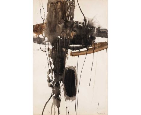

§ Anthony Benjamin (British 1931-2002) Untitled, 1958 signed and dated in pencil (lower right), oil and watercolour on paper Dimensions:90cm x 58cm (35 1/2in x 22 7/8in) Provenance:ProvenanceThe Estate of the Artist. Note: A Journey from Social Realism to Abstract Expressionism: Works from the Estate of Anthony BenjaminFew artists successfully span both Modern and Contemporary periods in British art whilst moving between multiple mediums. Anthony Benjamin (1931-2022) was one such polymath working in painting, drawing, printmaking and sculpture in wood, metal and plastic. Benjamin wrote that, for him, ‘an idea is more important to a man than any physical object’, in the catalogue for his 1966 exhibition at the Institute of Contemporary Arts in London. Chris Stevens, then curator of modern British art and Head of Displays at Tate Britain, described Benjamin as ‘an anarchist who ignored trends and forged his own path’. A bit of a loner and a bit of a thinker, Benjamin was quick to accept opportunities to work in new spaces, learning from the best. It was in Paris in the late 50’s, at Atelier 17 with William Stanley Hayter, that he experimented with new forms of painting, moving away from the landscape abstraction of St Ives. However, a constant in his practice was a precision of line, an incomparable quality of execution and an intense understanding of colour and form. Benjamin thought as he made and his thinking was always one-step ahead of the rest. It was during the 1970s, in collaboration with leading printer Kevin Harris at Calvert Studio, that Benjamin produced his seminal series of screenprints Roxy Bias Suite. Inspired by his student Brian Eno, Benjamin was fascinated by the new electronic music Eno was composing. Each of the six images in the series was named after computer music terms such as Inverse Echo and Multi-Mode Jitter. The screenprints use outrageously clashing bold colours, almost as if electrified and challenge the viewer with uncompromising energy. Sumptuous pieces, they were both of the time but also way-ahead of their time. No matter what Benjamin turned his hand to the results were always perfectly executed. In the 1990s he returned to drawing with a solo show at Gimpel Fils in London. Large scale works, they are more paintings in graphite than drawings. Involving a complex range of techniques of masking and erasure, of painting with graphite dust as well as drawing with broad pencils, these works incorporate texture and atmosphere, geometric forms, polar whites and intense blacks. They are some of the most powerfully evocative images that Benjamin produced. Throughout his career Benjamin held teaching posts at a variety of colleges of art and universities including time spent in the USA and Canada as Professor of Art at the University of Calgary and Hayward State College in California. His work is now held in a great number of international public collections including the Arts Council of Great Britain, the Tate, UK and the Museum of Modern Art in New York.
We found 16093 price guide item(s) matching your search
There are 16093 lots that match your search criteria. Subscribe now to get instant access to the full price guide service.
Click here to subscribe- List
- Grid
-
16093 item(s)/page

§ Geoffrey Clarke R.A. (British 1924-2014) Sea at Aldeburgh, 1978 initialled and dated (lower right), mixed media on polystyrene Dimensions:11cm x 14.5cm (4 1/4in x 5 3/4in) Provenance:ExhibitedStrand Gallery, Aldeburgh, Geoffrey Clarke RA and the Aldebrugh Connection, 16 October - 20 November 2004. Note: This was one of two works acknowledged by Clarke to have been inspired by Aldeburgh. Clarke owned the Martello Tower there and he and his family enjoyed trips to the seaside at Aldeburgh. Geoffrey Clarke: Intimate yet MonumentalThe works by Geoffrey Clarke offered here date from 1951 to 1993, spanning over forty years of his long and prolific career and representing a range of phases within his practice. What they have in common, however, is an intimate yet monumental character in which sculptures as modestly-sized as 10 centimetres high encapsulate a power and presence more readily associated with larger works.Head I of 1951 comes from an early series and was made whilst Clarke was studying at the Royal College of Art in London. Worked in iron, it reveals an exploration of Cubism and Surrealism with a frank appreciation of the materiality of his medium. Clarke graduated the following year, with his talent being immediately recognised with nothing less than his inclusion in the New Aspects of British Sculpture exhibition in the British Pavilion of the 26th Venice Biennale that summer. Clarke’s work was shown alongside that of seven other sculptors, namely Robert Adams, Kenneth Armitage, Reg Butler, Lynn Chadwick, Bernard Medows, Eduardo Paolozzi and William Turnbull. He was therefore positioned within the vanguard of post-war British sculpture and his career was launched to spectacular effect.Maquette for Sainsbury Sculpture Competition of 1965 fast forwards us to the mid-1960s, Clarke’s interest in public commissions and the associated use of cast aluminium; Ann Elliott has described the sandbox he built for this purpose in his studio foundry in Suffolk in 1954 (see Ann Elliott, ‘Clarke, Geoffrey Cyril Petts’, Oxford Dictionary of National Biography, on-line entry accessed 19/9/23). A totemic central element is crowned with a spiralling form whose upwards thrust is akin to organic growth. The varied surface treatment of the two parts is key to expressing the contrast between their presentations of mass and movement.Torrii Prone (i) and Toriio also date from 1965. As Peter Black has explained ‘The title ‘Torii’ applied to this series of sculptures derives from the ceremonial gateways to Japanese Shinto shrines. The essence of these works is the contrast between the inanimate slab of metal and the organic structures that bud and grow from the top.’ (Peter Black, Geoffrey Clarke: Symbols for Man, Sculptures and Graphic Work 1949-94, Lund Humphries, London, 1994, p.70). This series encompassed works based on vertical and horizontal formats in which Clarke explored a softened geometry combined with a curvaceous and rhythmic solidity. It is interesting to compare the organicism of these sculptures with Adams’s contemporary Vertical Form No. 1, an austere and imposing bronzed steel work made on a human scale and the suppleness of Bernard Meadows’ Pointing Figure of two years later.The Sea at Aldeburgh of 1978 is a particularly personal work. Clarke had close links to the Suffolk seaside town, not least owning its Martello Tower between 1967 and 1971; the tower and its surrounding topography fed into his work for some time. Made from mixed media applied to a small rectangle of polystyrene – more readily associated in Clarke’s practice with carving and the casting process – it is a simplified sea view in which the composition is split almost equally between sky and sea.Column and Pyramid both date from 1993. By this point in his career, Clarke had brought together formerly disparate elements to create sculptural planes enlivened by rich, deep-relief patterning which encases (or reveals) a raw core. Both works refer to significant architectural structures, whose power is yet retained in their modest scale.Clarke’s 70th birthday in 1994 was marked by several exhibitions, including a solo show at Yorkshire Sculpture Park which featured a cast of Head I on its catalogue cover. Ever interested in new materials, Clarke made his first work in wood in 1996 and, with an eye to his legacy, donated his archive to Leeds Museums and Galleries in 2012, two years before his death.
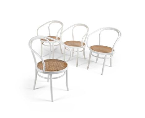
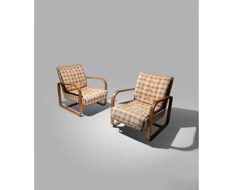
Thonet Set of Four 'Le Corbusier' Dining Chairs model no. B9, painted white bentwood with woven wicker seat Dimensions:82.5cm high, 52cm wide, 44cm deep (32 1/2in high, 20 1/2in wide, 17 1/2in deep) Provenance:ProvenanceAcquired by Leslie Martin and Sadie Speight circa 1960 and thence by descent to the current owner. Note: The architect Leslie Martin (1908-2000) and his wife, the designer Sadie Speight (1906-92) played leading roles in twentieth-century architecture and design and as champions of progressive art. They met at the University of Manchester’s School of Architecture in the 1920s and married in 1935.Martin is renowned as much for his ground-breaking architectural practice as for his research and contribution to education. He held many important public and academic positions, including Principal Assistant Architect for the London, Midland and Scottish Railway (1939-48), Architect to the London County Council (1953-56) and Professor of Architecture at Cambridge University (1956-72). He was the architect of some remarkable post-war buildings, including the Royal Festival Hall on London's South Bank (1951), the Gulbenkian Foundation Centre for Modern Art in Lisbon (1979) and the Royal Scottish Academy of Music and Drama in Glasgow (1988).Speight was also a qualified architect and had a celebrated career as a designer. She was a founder member of the Design Research Unit of the Council of Industrial Design in 1943, established to make designer skills available to industry. Her designs for products such as kettles, electric irons, textiles and rugs are particularly revered. After her death, Martin paid testament to Speight’s skill at converting properties in which they could live and work, creating a ‘background for living’ by the selection and placement of furniture, carpets, fabrics, upholstery, ceramics, books and works of art in homes and studios which were widely admired.One of Martin and Speight’s collaborative projects, and their most obvious promotion of contemporary art, was their involvement with the seminal 1937 publication Circle: International Survey of Constructive Art. Martin was a co-editor with Ben Nicholson and Naum Gabo, whilst Speight acted as Secretary and Barbara Hepworth was responsible for its layout. Circle highlighted the vital British contribution to the European abstract movement and was re-printed in 1971.In 1938, Herbert Read commissioned Martin and Speight as joint authors of The Flat Book, which was published the following year. Conceived as a practical guide to contemporary furniture, fabrics and household projects, it is now considered a reference book about the 1930s Modernist aesthetic and is admired as an essential treatise on how the best of European design could be introduced into the British home. The foreword described its aim to be a ‘catalogue of well-designed furniture and equipment’ whilst attempting to ‘set out certain standards of contemporary design and…furnish at least a basis of criticism…to help the reader in selecting his flat…[and]…the problems of planning and furnishing’.Amongst the items featured in the ‘Living and Sleeping Space’ section was a ‘Nest of tables, by Marcel Breuer, birch, £3 13s 6d (Isokon Furniture Co)’ (p.116) and a ‘Plan’ chair by Serge Chermayeff, described as an ‘Easy chair, 5 gns (Plan Ltd)’ (p.134), manufactured by the cutting-edge design companies Isokon Furniture Company and Plan Ltd respectively. These items alone could be said to encapsulate Modernist living in their innovative use of laminated plywood and sleek, simplified silhouettes. Martin and Speight acquired a set of the Breuer tables (lot 122) and a pair of the Chermayeff chairs (see lot 125) in the late 1930s. They became key features of their homes thereafter, seen for example in the sitting-room and nursery respectively in a 1953 article in House and Garden about their former gardener’s cottage in Tring Park, Hertfordshire.Indeed, Martin and Speight enjoyed a longstanding friendship with Chermayeff and his wife Barbara, who on emigrating from England to the USA via Montreal in 1940, wrote to the couple: ‘We have met with great kindness and hospitality…we leave for the States on April 3 staying with Gropius…[Montreal]… is an astonishing place…the houses are incomplete and unindividual – the ‘Flat Book’ should be read.’ (Letter from Serge and Barbara Chermayeff of 28 March 1940 to Lesie Martin and Sadie Speight, Professor Sir Leslie Martin Personal Archive, National Galleries of Scotland GMA A70/4/1)In about 1960, ‘Le Corbusier’ dining chairs by Thonet were acquired for use in Martin’s studio in The Mill, the central building in a complex converted by the couple in Great Shelford, Cambridgeshire (four offered here as lot 123). Photographs of them in situ are reproduced in Martin’s 1983 publication Buildings and Ideas 1933-83 From the Studio of Leslie Martin and his Associates. In the late 1970s, Martin and Speight purchased a number of ‘Carmite’ chairs by Vico Magistretti, which formed part of the ‘background for living’ at The Barns nearby, to where they moved in 1977 (five offered here as lot 124). Originally built as the village granary in 1642, it was converted and extended for domestic and professional use.Martin and Speight chose their furniture with great care, and once acquired, it was treasured. Indeed, in 1992 Michael Parkin wrote: ‘Most of the contents of the Martins' home dated from this period, from the early Thirties, with chairs by Serge Chermayeff and Marcel Breuer, tables by Alvar Aalto, lights by Jorn Utzon and even a coffee service by Ben Nicholson.’ (Michael Parkin, Obituary of Sadie Speight, The Independent, 27 October 1992). The couple were arbiters of the very best in twentieth-century design and civilised living, in which the tables and chairs presented here played a long-term role.
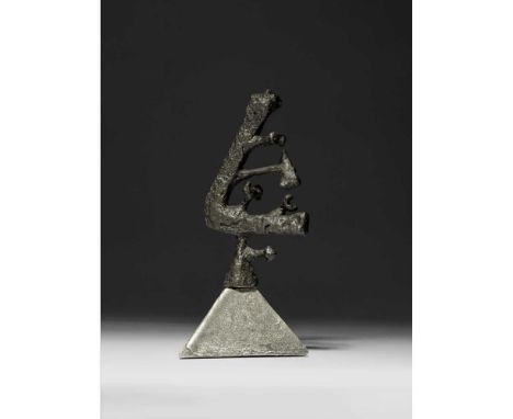
§ Geoffrey Clarke R.A. (British 1924-2014) Head I, 1951 (LeGrove S36) iron on aluminium, unique Dimensions:18cm high (7in high) Provenance:ProvenancePrivate Collection, UK.ExhibitedGimpel Fils, London, Geoffrey Clarke, Peter Potworowski, March - April 1952, no.41;Redfern Gallery, London, Geoffrey Clarke: Recent Sculptures, March - April 1965, no.49;Yorkshire Sculpture Park, Wakefield, Geoffrey Clarke RA: Sculpture and Works on Paper 1950-1994, April-June1994, illustrated on the cover.LiteratureLeGrove, Judith, Geoffrey Clarke Sculptor: Catalogue Raisonné, London: Pangolin and Lund Humphries, 2017, p.29, S36, illustrated. Note: A cross on the top was missing by 1965 and has never been restored. Geoffrey Clarke: Intimate yet MonumentalThe works by Geoffrey Clarke offered here date from 1951 to 1993, spanning over forty years of his long and prolific career and representing a range of phases within his practice. What they have in common, however, is an intimate yet monumental character in which sculptures as modestly-sized as 10 centimetres high encapsulate a power and presence more readily associated with larger works.Head I of 1951 comes from an early series and was made whilst Clarke was studying at the Royal College of Art in London. Worked in iron, it reveals an exploration of Cubism and Surrealism with a frank appreciation of the materiality of his medium. Clarke graduated the following year, with his talent being immediately recognised with nothing less than his inclusion in the New Aspects of British Sculpture exhibition in the British Pavilion of the 26th Venice Biennale that summer. Clarke’s work was shown alongside that of seven other sculptors, namely Robert Adams, Kenneth Armitage, Reg Butler, Lynn Chadwick, Bernard Medows, Eduardo Paolozzi and William Turnbull. He was therefore positioned within the vanguard of post-war British sculpture and his career was launched to spectacular effect.Maquette for Sainsbury Sculpture Competition of 1965 fast forwards us to the mid-1960s, Clarke’s interest in public commissions and the associated use of cast aluminium; Ann Elliott has described the sandbox he built for this purpose in his studio foundry in Suffolk in 1954 (see Ann Elliott, ‘Clarke, Geoffrey Cyril Petts’, Oxford Dictionary of National Biography, on-line entry accessed 19/9/23). A totemic central element is crowned with a spiralling form whose upwards thrust is akin to organic growth. The varied surface treatment of the two parts is key to expressing the contrast between their presentations of mass and movement.Torrii Prone (i) and Toriio also date from 1965. As Peter Black has explained ‘The title ‘Torii’ applied to this series of sculptures derives from the ceremonial gateways to Japanese Shinto shrines. The essence of these works is the contrast between the inanimate slab of metal and the organic structures that bud and grow from the top.’ (Peter Black, Geoffrey Clarke: Symbols for Man, Sculptures and Graphic Work 1949-94, Lund Humphries, London, 1994, p.70). This series encompassed works based on vertical and horizontal formats in which Clarke explored a softened geometry combined with a curvaceous and rhythmic solidity. It is interesting to compare the organicism of these sculptures with Adams’s contemporary Vertical Form No. 1, an austere and imposing bronzed steel work made on a human scale and the suppleness of Bernard Meadows’ Pointing Figure of two years later.The Sea at Aldeburgh of 1978 is a particularly personal work. Clarke had close links to the Suffolk seaside town, not least owning its Martello Tower between 1967 and 1971; the tower and its surrounding topography fed into his work for some time. Made from mixed media applied to a small rectangle of polystyrene – more readily associated in Clarke’s practice with carving and the casting process – it is a simplified sea view in which the composition is split almost equally between sky and sea.Column and Pyramid both date from 1993. By this point in his career, Clarke had brought together formerly disparate elements to create sculptural planes enlivened by rich, deep-relief patterning which encases (or reveals) a raw core. Both works refer to significant architectural structures, whose power is yet retained in their modest scale.Clarke’s 70th birthday in 1994 was marked by several exhibitions, including a solo show at Yorkshire Sculpture Park which featured a cast of Head I on its catalogue cover. Ever interested in new materials, Clarke made his first work in wood in 1996 and, with an eye to his legacy, donated his archive to Leeds Museums and Galleries in 2012, two years before his death.
§ Geoffrey Clarke R.A. (British 1924-2014) Toriio, 1965 (LeGrove S294b) stamped with the artist's mark, numbered 3/10 and 533 and dated 65, aluminium Dimensions:15.2cm high, 7.5cm wide (6in high, 3in wide) Provenance:ProvenancePurchased from Whitford Fine Art, London in 2002 by the current owner.LiteratureLeGrove, Judith, Geoffrey Clarke Sculptor: Catalogue Raisonné, London: Pangolin and Lund Humphries, 2017, p.110, S294b, illustrated. Note: Geoffrey Clarke: Intimate yet MonumentalThe works by Geoffrey Clarke offered here date from 1951 to 1993, spanning over forty years of his long and prolific career and representing a range of phases within his practice. What they have in common, however, is an intimate yet monumental character in which sculptures as modestly-sized as 10 centimetres high encapsulate a power and presence more readily associated with larger works.Head I of 1951 comes from an early series and was made whilst Clarke was studying at the Royal College of Art in London. Worked in iron, it reveals an exploration of Cubism and Surrealism with a frank appreciation of the materiality of his medium. Clarke graduated the following year, with his talent being immediately recognised with nothing less than his inclusion in the New Aspects of British Sculpture exhibition in the British Pavilion of the 26th Venice Biennale that summer. Clarke’s work was shown alongside that of seven other sculptors, namely Robert Adams, Kenneth Armitage, Reg Butler, Lynn Chadwick, Bernard Medows, Eduardo Paolozzi and William Turnbull. He was therefore positioned within the vanguard of post-war British sculpture and his career was launched to spectacular effect.Maquette for Sainsbury Sculpture Competition of 1965 fast forwards us to the mid-1960s, Clarke’s interest in public commissions and the associated use of cast aluminium; Ann Elliott has described the sandbox he built for this purpose in his studio foundry in Suffolk in 1954 (see Ann Elliott, ‘Clarke, Geoffrey Cyril Petts’, Oxford Dictionary of National Biography, on-line entry accessed 19/9/23). A totemic central element is crowned with a spiralling form whose upwards thrust is akin to organic growth. The varied surface treatment of the two parts is key to expressing the contrast between their presentations of mass and movement.Torrii Prone (i) and Toriio also date from 1965. As Peter Black has explained ‘The title ‘Torii’ applied to this series of sculptures derives from the ceremonial gateways to Japanese Shinto shrines. The essence of these works is the contrast between the inanimate slab of metal and the organic structures that bud and grow from the top.’ (Peter Black, Geoffrey Clarke: Symbols for Man, Sculptures and Graphic Work 1949-94, Lund Humphries, London, 1994, p.70). This series encompassed works based on vertical and horizontal formats in which Clarke explored a softened geometry combined with a curvaceous and rhythmic solidity. It is interesting to compare the organicism of these sculptures with Adams’s contemporary Vertical Form No. 1, an austere and imposing bronzed steel work made on a human scale and the suppleness of Bernard Meadows’ Pointing Figure of two years later.The Sea at Aldeburgh of 1978 is a particularly personal work. Clarke had close links to the Suffolk seaside town, not least owning its Martello Tower between 1967 and 1971; the tower and its surrounding topography fed into his work for some time. Made from mixed media applied to a small rectangle of polystyrene – more readily associated in Clarke’s practice with carving and the casting process – it is a simplified sea view in which the composition is split almost equally between sky and sea.Column and Pyramid both date from 1993. By this point in his career, Clarke had brought together formerly disparate elements to create sculptural planes enlivened by rich, deep-relief patterning which encases (or reveals) a raw core. Both works refer to significant architectural structures, whose power is yet retained in their modest scale.Clarke’s 70th birthday in 1994 was marked by several exhibitions, including a solo show at Yorkshire Sculpture Park which featured a cast of Head I on its catalogue cover. Ever interested in new materials, Clarke made his first work in wood in 1996 and, with an eye to his legacy, donated his archive to Leeds Museums and Galleries in 2012, two years before his death.

§ Denis Mitchell (British 1912-1993) Untitled, 1969 initialled and dated (to underside of base), unique, brass on slate base Dimensions:36.5cm high x 5cm wide x 3.5cm deep (14 3/8in high x 2in wide x 1 3/8in deep) Provenance:ProvenanceCommissioned by the artist George Dannatt and thence by family descent; Askew Art, London, where acquired by the current owner.ExhibitedMaltby Contemporary Art, Winchester; Rosenberg & Co., New York. Literature George Dannatt and Friends, exhibition catalogue, Osborne Samuel, London, 2015, p.50, illustrated p.62; Modern British Masters, Rosenberg & Co., New York, 2017.

§ Susan Hiller (American-British 1940-2019) Lucid Dreams IV, 1983 set of four works, C-type photograph with ink on Agfa lustre paper Dimensions:each 67cm x 49.5cm (26 3/8in x 19 1/2in) Provenance:ProvenanceGimpel Fils, London.ExhibitedOrchard Gallery, Derry, Susan Hillier New Work, March - April 1984;National Portrait Gallery, London, Self-Portrait Photography 1840s - 1980s, October 1986 - January 1987;Gimpel Fils, London, Collector's Choice II, 8 March - 28 April 2017. Note: Susan Hiller (1940-2019) is widely regarded as one of the most influential women artists of her generation, as well as a pioneer of installation and multimedia art. Born in the USA, she made London her home in the late 1960s, where she became a key voice in the nascent counter-culture and feminist movements. Her practice spanned a broad range of media including installation, video, photography, painting, sculpture, performance, artist's books and writing. Her work often took for its subject aspects of culture that were overlooked, marginalised, or disregarded – which in turn spoke to issues of gender, class and politics. Hiller freely collaged ordinary found objects into her work, using photo-mat machines, children’s wallpaper, postcards and other commonly disregarded or denigrated aspects of popular culture, blurring the boundaries between ‘high’ and ‘low’, challenging our perceptions of cultural value After graduating from Smith College, Massachusetts, in 1961, Hiller had pursued doctoral studies in anthropology at Tulane University in New Orleans, conducting fieldwork in Mexico, Guatemala and Belize. However, she became uncomfortable with academic anthropology's claim to objectivity; she wrote that she did not wish her research to become part of anthropology's “objectification of the contrariness of lived events”. During a lecture on African art, she made the decision to abandon anthropology to become an artist. She lived in France, Morocco, Wales and India with her husband, the writer David Coxhead, before settling in London, where she made that very ‘contrariness of lived events’ the basis of her practise, focussing on the products of our society – our dreaming through commodities – that are often overlooked, ignored, or repressed. Her projects have been described as ‘investigations into the unconscious of our culture’. As she explained: “I’m committed to working with what I call ghosts, that is, with cultural discards, fragments and things that are invisible to most people but intensely important to a few: situations, ideas and experiences that haunt us collectively.” In regards to the Lucid Dreams works, Hiller noted – “I’m trying to erode the supposed boundary between dream life and waking life. The work is clearly positioned in the waking world since [it] start[s] off with photomat portraiture, but uses the disconnected and fragmented images produced automatically by these machines as analogies for the kind of dream images we all know, for instance suddenly catching a glimpse of oneself from the back… it doesn’t seem to me accidental that the machines produce this kind of image because, as I’ve been saying for years about popular, disposable imagery, there is something there beyond the obvious, which is why it’s worth using in art (the Artist quoted in Susan Hiller 1973-83: The Muse My Sister, The Orchard Gallery, Londonderry, 1984, p.25) Hiller's work features in numerous international private and public collections including the Tate Gallery, London; Museum of Modern Art, New York; National Gallery of Art, Washington D.C.; National Portrait Gallery, London; British Museum, London; Centre Pompidou, Paris; National Museum of Norway, Oslo; Ludwig Museum, Cologne; Serralves Museum of Contemporary Art, Porto; Art Gallery of New South Wales, Sydney; and the Inhotim Centro de Arte Contemporañea, Brumadinho, Brazil.

§ Anthony Benjamin (British 1931-2002) District II, 1968 stamped, dated and numbered BENJAMIN 1968 1/5, chromed steel and acrylic Dimensions:30cm high x 30.5cm wide x 22.5cm deep (11 3/4in high x 12in wide x 8 7/8in deep) Provenance:ProvenanceGimpel Fils, London.ExhibitedComsky Gallery, Beverly Hills, 1971. Note: A Journey from Social Realism to Abstract Expressionism: Works from the Estate of Anthony BenjaminFew artists successfully span both Modern and Contemporary periods in British art whilst moving between multiple mediums. Anthony Benjamin (1931-2022) was one such polymath working in painting, drawing, printmaking and sculpture in wood, metal and plastic. Benjamin wrote that, for him, ‘an idea is more important to a man than any physical object’, in the catalogue for his 1966 exhibition at the Institute of Contemporary Arts in London. Chris Stevens, then curator of modern British art and Head of Displays at Tate Britain, described Benjamin as ‘an anarchist who ignored trends and forged his own path’. A bit of a loner and a bit of a thinker, Benjamin was quick to accept opportunities to work in new spaces, learning from the best. It was in Paris in the late 50’s, at Atelier 17 with William Stanley Hayter, that he experimented with new forms of painting, moving away from the landscape abstraction of St Ives. However, a constant in his practice was a precision of line, an incomparable quality of execution and an intense understanding of colour and form. Benjamin thought as he made and his thinking was always one-step ahead of the rest. It was during the 1970s, in collaboration with leading printer Kevin Harris at Calvert Studio, that Benjamin produced his seminal series of screenprints Roxy Bias Suite. Inspired by his student Brian Eno, Benjamin was fascinated by the new electronic music Eno was composing. Each of the six images in the series was named after computer music terms such as Inverse Echo and Multi-Mode Jitter. The screenprints use outrageously clashing bold colours, almost as if electrified and challenge the viewer with uncompromising energy. Sumptuous pieces, they were both of the time but also way-ahead of their time. No matter what Benjamin turned his hand to the results were always perfectly executed. In the 1990s he returned to drawing with a solo show at Gimpel Fils in London. Large scale works, they are more paintings in graphite than drawings. Involving a complex range of techniques of masking and erasure, of painting with graphite dust as well as drawing with broad pencils, these works incorporate texture and atmosphere, geometric forms, polar whites and intense blacks. They are some of the most powerfully evocative images that Benjamin produced. Throughout his career Benjamin held teaching posts at a variety of colleges of art and universities including time spent in the USA and Canada as Professor of Art at the University of Calgary and Hayward State College in California. His work is now held in a great number of international public collections including the Arts Council of Great Britain, the Tate, UK and the Museum of Modern Art in New York.
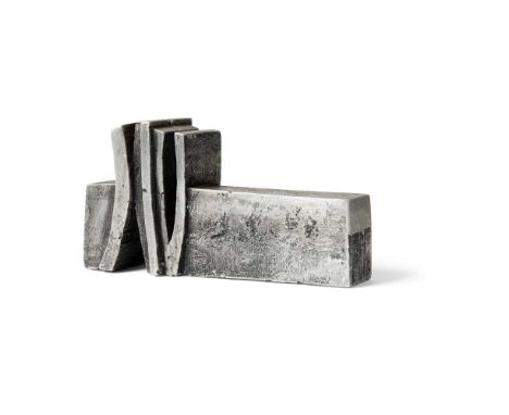
§ Geoffrey Clarke R.A. (British 1924-2014) Torii Prone One (i), 1965 (LeGrove S276) stamped artist's mark, numbered 1/10 and 512 and dated 65, aluminium Dimensions:10cm high, 19.5cm wide (4in high, 7 5/8in wide) Provenance:ProvenancePurchased from Whitford Fine Art, London in 2002 by the current owner.LiteratureLeGrove, Judith, Geoffrey Clarke Sculptor: Catalogue Raisonné, London: Pangolin and Lund Humphries, 2017, p.106, S276, illustrated. Note: Geoffrey Clarke: Intimate yet MonumentalThe works by Geoffrey Clarke offered here date from 1951 to 1993, spanning over forty years of his long and prolific career and representing a range of phases within his practice. What they have in common, however, is an intimate yet monumental character in which sculptures as modestly-sized as 10 centimetres high encapsulate a power and presence more readily associated with larger works.Head I of 1951 comes from an early series and was made whilst Clarke was studying at the Royal College of Art in London. Worked in iron, it reveals an exploration of Cubism and Surrealism with a frank appreciation of the materiality of his medium. Clarke graduated the following year, with his talent being immediately recognised with nothing less than his inclusion in the New Aspects of British Sculpture exhibition in the British Pavilion of the 26th Venice Biennale that summer. Clarke’s work was shown alongside that of seven other sculptors, namely Robert Adams, Kenneth Armitage, Reg Butler, Lynn Chadwick, Bernard Medows, Eduardo Paolozzi and William Turnbull. He was therefore positioned within the vanguard of post-war British sculpture and his career was launched to spectacular effect.Maquette for Sainsbury Sculpture Competition of 1965 fast forwards us to the mid-1960s, Clarke’s interest in public commissions and the associated use of cast aluminium; Ann Elliott has described the sandbox he built for this purpose in his studio foundry in Suffolk in 1954 (see Ann Elliott, ‘Clarke, Geoffrey Cyril Petts’, Oxford Dictionary of National Biography, on-line entry accessed 19/9/23). A totemic central element is crowned with a spiralling form whose upwards thrust is akin to organic growth. The varied surface treatment of the two parts is key to expressing the contrast between their presentations of mass and movement.Torrii Prone (i) and Toriio also date from 1965. As Peter Black has explained ‘The title ‘Torii’ applied to this series of sculptures derives from the ceremonial gateways to Japanese Shinto shrines. The essence of these works is the contrast between the inanimate slab of metal and the organic structures that bud and grow from the top.’ (Peter Black, Geoffrey Clarke: Symbols for Man, Sculptures and Graphic Work 1949-94, Lund Humphries, London, 1994, p.70). This series encompassed works based on vertical and horizontal formats in which Clarke explored a softened geometry combined with a curvaceous and rhythmic solidity. It is interesting to compare the organicism of these sculptures with Adams’s contemporary Vertical Form No. 1, an austere and imposing bronzed steel work made on a human scale and the suppleness of Bernard Meadows’ Pointing Figure of two years later.The Sea at Aldeburgh of 1978 is a particularly personal work. Clarke had close links to the Suffolk seaside town, not least owning its Martello Tower between 1967 and 1971; the tower and its surrounding topography fed into his work for some time. Made from mixed media applied to a small rectangle of polystyrene – more readily associated in Clarke’s practice with carving and the casting process – it is a simplified sea view in which the composition is split almost equally between sky and sea.Column and Pyramid both date from 1993. By this point in his career, Clarke had brought together formerly disparate elements to create sculptural planes enlivened by rich, deep-relief patterning which encases (or reveals) a raw core. Both works refer to significant architectural structures, whose power is yet retained in their modest scale.Clarke’s 70th birthday in 1994 was marked by several exhibitions, including a solo show at Yorkshire Sculpture Park which featured a cast of Head I on its catalogue cover. Ever interested in new materials, Clarke made his first work in wood in 1996 and, with an eye to his legacy, donated his archive to Leeds Museums and Galleries in 2012, two years before his death.
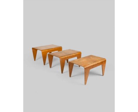
Marcel Breuer (Hungarian 1902-1981) for Isokon Set of Three Nesting Tables, designed 1936 each stamped MADE IN ESTONIA (to underside), laminated birch plywood, manufactured by Venesta, Estonia for Isokon Furniture Company Ltd., London, United Kingdom Dimensions:the largest 37cm high, 61cm wide, 45.5cm deep (14 1/2in high, 24in wide, 17 7/8in deep) Provenance:ProvenanceAcquired by Leslie Martin and Sadie Speight in the late 1930s and thence by descent to the current owner. Note: This design was created in February 1936, around the same time as Breuer was perfecting the Long Chair. The earliest models of the nesting tables were made by Venesta in Estonia, with later production moved to England. The architect Leslie Martin (1908-2000) and his wife, the designer Sadie Speight (1906-92) played leading roles in twentieth-century architecture and design and as champions of progressive art. They met at the University of Manchester’s School of Architecture in the 1920s and married in 1935.Martin is renowned as much for his ground-breaking architectural practice as for his research and contribution to education. He held many important public and academic positions, including Principal Assistant Architect for the London, Midland and Scottish Railway (1939-48), Architect to the London County Council (1953-56) and Professor of Architecture at Cambridge University (1956-72). He was the architect of some remarkable post-war buildings, including the Royal Festival Hall on London's South Bank (1951), the Gulbenkian Foundation Centre for Modern Art in Lisbon (1979) and the Royal Scottish Academy of Music and Drama in Glasgow (1988).Speight was also a qualified architect and had a celebrated career as a designer. She was a founder member of the Design Research Unit of the Council of Industrial Design in 1943, established to make designer skills available to industry. Her designs for products such as kettles, electric irons, textiles and rugs are particularly revered. After her death, Martin paid testament to Speight’s skill at converting properties in which they could live and work, creating a ‘background for living’ by the selection and placement of furniture, carpets, fabrics, upholstery, ceramics, books and works of art in homes and studios which were widely admired.One of Martin and Speight’s collaborative projects, and their most obvious promotion of contemporary art, was their involvement with the seminal 1937 publication Circle: International Survey of Constructive Art. Martin was a co-editor with Ben Nicholson and Naum Gabo, whilst Speight acted as Secretary and Barbara Hepworth was responsible for its layout. Circle highlighted the vital British contribution to the European abstract movement and was re-printed in 1971.In 1938, Herbert Read commissioned Martin and Speight as joint authors of The Flat Book, which was published the following year. Conceived as a practical guide to contemporary furniture, fabrics and household projects, it is now considered a reference book about the 1930s Modernist aesthetic and is admired as an essential treatise on how the best of European design could be introduced into the British home. The foreword described its aim to be a ‘catalogue of well-designed furniture and equipment’ whilst attempting to ‘set out certain standards of contemporary design and…furnish at least a basis of criticism…to help the reader in selecting his flat…[and]…the problems of planning and furnishing’.Amongst the items featured in the ‘Living and Sleeping Space’ section was a ‘Nest of tables, by Marcel Breuer, birch, £3 13s 6d (Isokon Furniture Co)’ (p.116) and a ‘Plan’ chair by Serge Chermayeff, described as an ‘Easy chair, 5 gns (Plan Ltd)’ (p.134), manufactured by the cutting-edge design companies Isokon Furniture Company and Plan Ltd respectively. These items alone could be said to encapsulate Modernist living in their innovative use of laminated plywood and sleek, simplified silhouettes. Martin and Speight acquired a set of the Breuer tables (lot 122) and a pair of the Chermayeff chairs (see lot 125) in the late 1930s. They became key features of their homes thereafter, seen for example in the sitting-room and nursery respectively in a 1953 article in House and Garden about their former gardener’s cottage in Tring Park, Hertfordshire.Indeed, Martin and Speight enjoyed a longstanding friendship with Chermayeff and his wife Barbara, who on emigrating from England to the USA via Montreal in 1940, wrote to the couple: ‘We have met with great kindness and hospitality…we leave for the States on April 3 staying with Gropius…[Montreal]… is an astonishing place…the houses are incomplete and unindividual – the ‘Flat Book’ should be read.’ (Letter from Serge and Barbara Chermayeff of 28 March 1940 to Lesie Martin and Sadie Speight, Professor Sir Leslie Martin Personal Archive, National Galleries of Scotland GMA A70/4/1)In about 1960, ‘Le Corbusier’ dining chairs by Thonet were acquired for use in Martin’s studio in The Mill, the central building in a complex converted by the couple in Great Shelford, Cambridgeshire (four offered here as lot 123). Photographs of them in situ are reproduced in Martin’s 1983 publication Buildings and Ideas 1933-83 From the Studio of Leslie Martin and his Associates. In the late 1970s, Martin and Speight purchased a number of ‘Carmite’ chairs by Vico Magistretti, which formed part of the ‘background for living’ at The Barns nearby, to where they moved in 1977 (five offered here as lot 124). Originally built as the village granary in 1642, it was converted and extended for domestic and professional use.Martin and Speight chose their furniture with great care, and once acquired, it was treasured. Indeed, in 1992 Michael Parkin wrote: ‘Most of the contents of the Martins' home dated from this period, from the early Thirties, with chairs by Serge Chermayeff and Marcel Breuer, tables by Alvar Aalto, lights by Jorn Utzon and even a coffee service by Ben Nicholson.’ (Michael Parkin, Obituary of Sadie Speight, The Independent, 27 October 1992). The couple were arbiters of the very best in twentieth-century design and civilised living, in which the tables and chairs presented here played a long-term role.
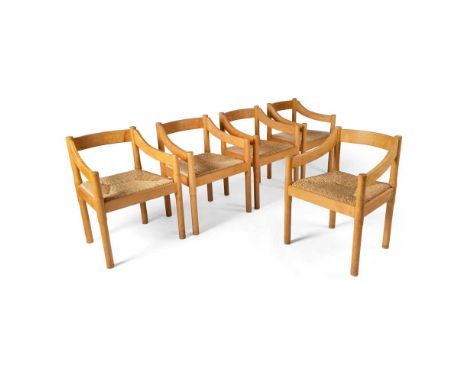
Vico Magistretti (Italian 1920-2006) Set of Five 'Carimate' Chairs beech and rush seats Dimensions:75cm (29 1/2in) high, 52cm (20 1/2in) wide, 58cm (27 7/8in) deep Provenance:Provenance:Acquired by Leslie Martin and Sadie Speight in the late 1970s and thence by descent to the current owner. Note: The architect Leslie Martin (1908-2000) and his wife, the designer Sadie Speight (1906-92) played leading roles in twentieth-century architecture and design and as champions of progressive art. They met at the University of Manchester’s School of Architecture in the 1920s and married in 1935.Martin is renowned as much for his ground-breaking architectural practice as for his research and contribution to education. He held many important public and academic positions, including Principal Assistant Architect for the London, Midland and Scottish Railway (1939-48), Architect to the London County Council (1953-56) and Professor of Architecture at Cambridge University (1956-72). He was the architect of some remarkable post-war buildings, including the Royal Festival Hall on London's South Bank (1951), the Gulbenkian Foundation Centre for Modern Art in Lisbon (1979) and the Royal Scottish Academy of Music and Drama in Glasgow (1988).Speight was also a qualified architect and had a celebrated career as a designer. She was a founder member of the Design Research Unit of the Council of Industrial Design in 1943, established to make designer skills available to industry. Her designs for products such as kettles, electric irons, textiles and rugs are particularly revered. After her death, Martin paid testament to Speight’s skill at converting properties in which they could live and work, creating a ‘background for living’ by the selection and placement of furniture, carpets, fabrics, upholstery, ceramics, books and works of art in homes and studios which were widely admired.One of Martin and Speight’s collaborative projects, and their most obvious promotion of contemporary art, was their involvement with the seminal 1937 publication Circle: International Survey of Constructive Art. Martin was a co-editor with Ben Nicholson and Naum Gabo, whilst Speight acted as Secretary and Barbara Hepworth was responsible for its layout. Circle highlighted the vital British contribution to the European abstract movement and was re-printed in 1971.In 1938, Herbert Read commissioned Martin and Speight as joint authors of The Flat Book, which was published the following year. Conceived as a practical guide to contemporary furniture, fabrics and household projects, it is now considered a reference book about the 1930s Modernist aesthetic and is admired as an essential treatise on how the best of European design could be introduced into the British home. The foreword described its aim to be a ‘catalogue of well-designed furniture and equipment’ whilst attempting to ‘set out certain standards of contemporary design and…furnish at least a basis of criticism…to help the reader in selecting his flat…[and]…the problems of planning and furnishing’.Amongst the items featured in the ‘Living and Sleeping Space’ section was a ‘Nest of tables, by Marcel Breuer, birch, £3 13s 6d (Isokon Furniture Co)’ (p.116) and a ‘Plan’ chair by Serge Chermayeff, described as an ‘Easy chair, 5 gns (Plan Ltd)’ (p.134), manufactured by the cutting-edge design companies Isokon Furniture Company and Plan Ltd respectively. These items alone could be said to encapsulate Modernist living in their innovative use of laminated plywood and sleek, simplified silhouettes. Martin and Speight acquired a set of the Breuer tables (lot 122) and a pair of the Chermayeff chairs (see lot 125) in the late 1930s. They became key features of their homes thereafter, seen for example in the sitting-room and nursery respectively in a 1953 article in House and Garden about their former gardener’s cottage in Tring Park, Hertfordshire.Indeed, Martin and Speight enjoyed a longstanding friendship with Chermayeff and his wife Barbara, who on emigrating from England to the USA via Montreal in 1940, wrote to the couple: ‘We have met with great kindness and hospitality…we leave for the States on April 3 staying with Gropius…[Montreal]… is an astonishing place…the houses are incomplete and unindividual – the ‘Flat Book’ should be read.’ (Letter from Serge and Barbara Chermayeff of 28 March 1940 to Lesie Martin and Sadie Speight, Professor Sir Leslie Martin Personal Archive, National Galleries of Scotland GMA A70/4/1)In about 1960, ‘Le Corbusier’ dining chairs by Thonet were acquired for use in Martin’s studio in The Mill, the central building in a complex converted by the couple in Great Shelford, Cambridgeshire (four offered here as lot 123). Photographs of them in situ are reproduced in Martin’s 1983 publication Buildings and Ideas 1933-83 From the Studio of Leslie Martin and his Associates. In the late 1970s, Martin and Speight purchased a number of ‘Carmite’ chairs by Vico Magistretti, which formed part of the ‘background for living’ at The Barns nearby, to where they moved in 1977 (five offered here as lot 124). Originally built as the village granary in 1642, it was converted and extended for domestic and professional use.Martin and Speight chose their furniture with great care, and once acquired, it was treasured. Indeed, in 1992 Michael Parkin wrote: ‘Most of the contents of the Martins' home dated from this period, from the early Thirties, with chairs by Serge Chermayeff and Marcel Breuer, tables by Alvar Aalto, lights by Jorn Utzon and even a coffee service by Ben Nicholson.’ (Michael Parkin, Obituary of Sadie Speight, The Independent, 27 October 1992). The couple were arbiters of the very best in twentieth-century design and civilised living, in which the tables and chairs presented here played a long-term role.
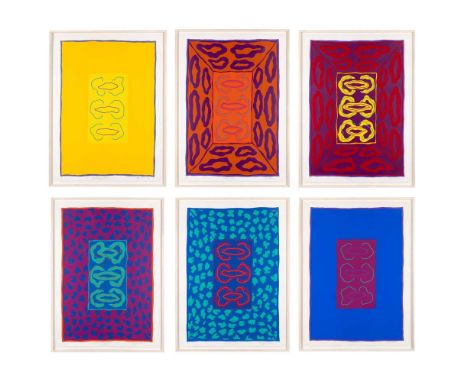
§ Anthony Benjamin (British 1931-2002) Roxy Bias Suite, 1972 complete set of six, comprising Butterfly Echo, Erase Function, Inverse Echo, Multi-Mode Jitter, O Factor and Ringing Filter, each signed, titled, dated and numbered 59/95 in pencil (in the margin), silkscreen on BFK Rives handmade paper, printed by Kevin Harris at Calvert Studio Dimensions:each sheet 105.5cm x 76.5cm (41 1/2in x 30 1/8in) Provenance:ProvenanceThe Estate of the Artist. Note: A Journey from Social Realism to Abstract Expressionism: Works from the Estate of Anthony BenjaminFew artists successfully span both Modern and Contemporary periods in British art whilst moving between multiple mediums. Anthony Benjamin (1931-2022) was one such polymath working in painting, drawing, printmaking and sculpture in wood, metal and plastic. Benjamin wrote that, for him, ‘an idea is more important to a man than any physical object’, in the catalogue for his 1966 exhibition at the Institute of Contemporary Arts in London. Chris Stevens, then curator of modern British art and Head of Displays at Tate Britain, described Benjamin as ‘an anarchist who ignored trends and forged his own path’. A bit of a loner and a bit of a thinker, Benjamin was quick to accept opportunities to work in new spaces, learning from the best. It was in Paris in the late 50’s, at Atelier 17 with William Stanley Hayter, that he experimented with new forms of painting, moving away from the landscape abstraction of St Ives. However, a constant in his practice was a precision of line, an incomparable quality of execution and an intense understanding of colour and form. Benjamin thought as he made and his thinking was always one-step ahead of the rest. It was during the 1970s, in collaboration with leading printer Kevin Harris at Calvert Studio, that Benjamin produced his seminal series of screenprints Roxy Bias Suite. Inspired by his student Brian Eno, Benjamin was fascinated by the new electronic music Eno was composing. Each of the six images in the series was named after computer music terms such as Inverse Echo and Multi-Mode Jitter. The screenprints use outrageously clashing bold colours, almost as if electrified and challenge the viewer with uncompromising energy. Sumptuous pieces, they were both of the time but also way-ahead of their time. No matter what Benjamin turned his hand to the results were always perfectly executed. In the 1990s he returned to drawing with a solo show at Gimpel Fils in London. Large scale works, they are more paintings in graphite than drawings. Involving a complex range of techniques of masking and erasure, of painting with graphite dust as well as drawing with broad pencils, these works incorporate texture and atmosphere, geometric forms, polar whites and intense blacks. They are some of the most powerfully evocative images that Benjamin produced. Throughout his career Benjamin held teaching posts at a variety of colleges of art and universities including time spent in the USA and Canada as Professor of Art at the University of Calgary and Hayward State College in California. His work is now held in a great number of international public collections including the Arts Council of Great Britain, the Tate, UK and the Museum of Modern Art in New York.

§ Susan Hiller (American-British 1940-2019) Saving and Spending - Ikons of Desire, 1977-80 set of 14 works, version 1 of 2, the final work signed (in pen), colour xerox and ink Dimensions:each 29cm x 20.2cm (11 3/8in x 8in) Provenance:ProvenanceGimpel Fils, London.ExhibitedGimpel and Hanover, Zurich, Susan Hiller, March 1982;Midland Group, November 1982;Gimpel Fils, London, Susan Hiller, Monument and Other Works, 1982;Third Eye Centre, Glasgow, Ten Years Work, 1984. Note: Susan Hiller (1940-2019) is widely regarded as one of the most influential women artists of her generation, as well as a pioneer of installation and multimedia art. Born in the USA, she made London her home in the late 1960s, where she became a key voice in the nascent counter-culture and feminist movements. Her practice spanned a broad range of media including installation, video, photography, painting, sculpture, performance, artist's books and writing. Her work often took for its subject aspects of culture that were overlooked, marginalised, or disregarded – which in turn spoke to issues of gender, class and politics. Hiller freely collaged ordinary found objects into her work, using photo-mat machines, children’s wallpaper, postcards and other commonly disregarded or denigrated aspects of popular culture, blurring the boundaries between ‘high’ and ‘low’, challenging our perceptions of cultural value After graduating from Smith College, Massachusetts, in 1961, Hiller had pursued doctoral studies in anthropology at Tulane University in New Orleans, conducting fieldwork in Mexico, Guatemala and Belize. However, she became uncomfortable with academic anthropology's claim to objectivity; she wrote that she did not wish her research to become part of anthropology's “objectification of the contrariness of lived events”. During a lecture on African art, she made the decision to abandon anthropology to become an artist. She lived in France, Morocco, Wales and India with her husband, the writer David Coxhead, before settling in London, where she made that very ‘contrariness of lived events’ the basis of her practise, focussing on the products of our society – our dreaming through commodities – that are often overlooked, ignored, or repressed. Her projects have been described as ‘investigations into the unconscious of our culture’. As she explained: “I’m committed to working with what I call ghosts, that is, with cultural discards, fragments and things that are invisible to most people but intensely important to a few: situations, ideas and experiences that haunt us collectively.” In regards to the Lucid Dreams works, Hiller noted – “I’m trying to erode the supposed boundary between dream life and waking life. The work is clearly positioned in the waking world since [it] start[s] off with photomat portraiture, but uses the disconnected and fragmented images produced automatically by these machines as analogies for the kind of dream images we all know, for instance suddenly catching a glimpse of oneself from the back… it doesn’t seem to me accidental that the machines produce this kind of image because, as I’ve been saying for years about popular, disposable imagery, there is something there beyond the obvious, which is why it’s worth using in art (the Artist quoted in Susan Hiller 1973-83: The Muse My Sister, The Orchard Gallery, Londonderry, 1984, p.25) Hiller's work features in numerous international private and public collections including the Tate Gallery, London; Museum of Modern Art, New York; National Gallery of Art, Washington D.C.; National Portrait Gallery, London; British Museum, London; Centre Pompidou, Paris; National Museum of Norway, Oslo; Ludwig Museum, Cologne; Serralves Museum of Contemporary Art, Porto; Art Gallery of New South Wales, Sydney; and the Inhotim Centro de Arte Contemporañea, Brumadinho, Brazil.
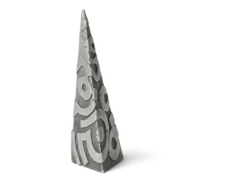
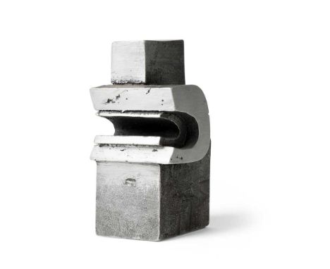
§ Geoffrey Clarke R.A. (British 1924-2014) Pyramid, 1993 (LeGrove S703) stamped artist's mark, aluminium Dimensions:20.5cm high (8in high) Provenance:ProvenancePrivate Collection, UK.ExhibitedThe Fine Art Society Limited, London, Geoffrey Clarke: Sculpture, Constructions and Works on Paper 1949-2000, 9 October - 2 November 2000, no.75.LiteratureLeGrove, Judith, Geoffrey Clarke Sculptor: Catalogue Raisonné, London: Pangolin and Lund Humphries, 2017, p.211, SS703, illustrated. Note: Geoffrey Clarke: Intimate yet MonumentalThe works by Geoffrey Clarke offered here date from 1951 to 1993, spanning over forty years of his long and prolific career and representing a range of phases within his practice. What they have in common, however, is an intimate yet monumental character in which sculptures as modestly-sized as 10 centimetres high encapsulate a power and presence more readily associated with larger works.Head I of 1951 comes from an early series and was made whilst Clarke was studying at the Royal College of Art in London. Worked in iron, it reveals an exploration of Cubism and Surrealism with a frank appreciation of the materiality of his medium. Clarke graduated the following year, with his talent being immediately recognised with nothing less than his inclusion in the New Aspects of British Sculpture exhibition in the British Pavilion of the 26th Venice Biennale that summer. Clarke’s work was shown alongside that of seven other sculptors, namely Robert Adams, Kenneth Armitage, Reg Butler, Lynn Chadwick, Bernard Medows, Eduardo Paolozzi and William Turnbull. He was therefore positioned within the vanguard of post-war British sculpture and his career was launched to spectacular effect.Maquette for Sainsbury Sculpture Competition of 1965 fast forwards us to the mid-1960s, Clarke’s interest in public commissions and the associated use of cast aluminium; Ann Elliott has described the sandbox he built for this purpose in his studio foundry in Suffolk in 1954 (see Ann Elliott, ‘Clarke, Geoffrey Cyril Petts’, Oxford Dictionary of National Biography, on-line entry accessed 19/9/23). A totemic central element is crowned with a spiralling form whose upwards thrust is akin to organic growth. The varied surface treatment of the two parts is key to expressing the contrast between their presentations of mass and movement.Torrii Prone (i) and Toriio also date from 1965. As Peter Black has explained ‘The title ‘Torii’ applied to this series of sculptures derives from the ceremonial gateways to Japanese Shinto shrines. The essence of these works is the contrast between the inanimate slab of metal and the organic structures that bud and grow from the top.’ (Peter Black, Geoffrey Clarke: Symbols for Man, Sculptures and Graphic Work 1949-94, Lund Humphries, London, 1994, p.70). This series encompassed works based on vertical and horizontal formats in which Clarke explored a softened geometry combined with a curvaceous and rhythmic solidity. It is interesting to compare the organicism of these sculptures with Adams’s contemporary Vertical Form No. 1, an austere and imposing bronzed steel work made on a human scale and the suppleness of Bernard Meadows’ Pointing Figure of two years later.The Sea at Aldeburgh of 1978 is a particularly personal work. Clarke had close links to the Suffolk seaside town, not least owning its Martello Tower between 1967 and 1971; the tower and its surrounding topography fed into his work for some time. Made from mixed media applied to a small rectangle of polystyrene – more readily associated in Clarke’s practice with carving and the casting process – it is a simplified sea view in which the composition is split almost equally between sky and sea.Column and Pyramid both date from 1993. By this point in his career, Clarke had brought together formerly disparate elements to create sculptural planes enlivened by rich, deep-relief patterning which encases (or reveals) a raw core. Both works refer to significant architectural structures, whose power is yet retained in their modest scale.Clarke’s 70th birthday in 1994 was marked by several exhibitions, including a solo show at Yorkshire Sculpture Park which featured a cast of Head I on its catalogue cover. Ever interested in new materials, Clarke made his first work in wood in 1996 and, with an eye to his legacy, donated his archive to Leeds Museums and Galleries in 2012, two years before his death.
Serge Chermayeff (Russian / British 1900-1996) Pair of 'Plan' Chairs, designed 1933 laminated beech plywood and upholstery Dimensions:77cm (30 1/4in) high, 66cm (26in) wide, 75cm (29 1/2in) deep Provenance:ProvenanceAcquired by Leslie Martin and Sadie Speight in the late 1930s and thence by descent to the current owner. Note: The architect Leslie Martin (1908-2000) and his wife, the designer Sadie Speight (1906-92) played leading roles in twentieth-century architecture and design and as champions of progressive art. They met at the University of Manchester’s School of Architecture in the 1920s and married in 1935.Martin is renowned as much for his ground-breaking architectural practice as for his research and contribution to education. He held many important public and academic positions, including Principal Assistant Architect for the London, Midland and Scottish Railway (1939-48), Architect to the London County Council (1953-56) and Professor of Architecture at Cambridge University (1956-72). He was the architect of some remarkable post-war buildings, including the Royal Festival Hall on London's South Bank (1951), the Gulbenkian Foundation Centre for Modern Art in Lisbon (1979) and the Royal Scottish Academy of Music and Drama in Glasgow (1988).Speight was also a qualified architect and had a celebrated career as a designer. She was a founder member of the Design Research Unit of the Council of Industrial Design in 1943, established to make designer skills available to industry. Her designs for products such as kettles, electric irons, textiles and rugs are particularly revered. After her death, Martin paid testament to Speight’s skill at converting properties in which they could live and work, creating a ‘background for living’ by the selection and placement of furniture, carpets, fabrics, upholstery, ceramics, books and works of art in homes and studios which were widely admired.One of Martin and Speight’s collaborative projects, and their most obvious promotion of contemporary art, was their involvement with the seminal 1937 publication Circle: International Survey of Constructive Art. Martin was a co-editor with Ben Nicholson and Naum Gabo, whilst Speight acted as Secretary and Barbara Hepworth was responsible for its layout. Circle highlighted the vital British contribution to the European abstract movement and was re-printed in 1971.In 1938, Herbert Read commissioned Martin and Speight as joint authors of The Flat Book, which was published the following year. Conceived as a practical guide to contemporary furniture, fabrics and household projects, it is now considered a reference book about the 1930s Modernist aesthetic and is admired as an essential treatise on how the best of European design could be introduced into the British home. The foreword described its aim to be a ‘catalogue of well-designed furniture and equipment’ whilst attempting to ‘set out certain standards of contemporary design and…furnish at least a basis of criticism…to help the reader in selecting his flat…[and]…the problems of planning and furnishing’.Amongst the items featured in the ‘Living and Sleeping Space’ section was a ‘Nest of tables, by Marcel Breuer, birch, £3 13s 6d (Isokon Furniture Co)’ (p.116) and a ‘Plan’ chair by Serge Chermayeff, described as an ‘Easy chair, 5 gns (Plan Ltd)’ (p.134), manufactured by the cutting-edge design companies Isokon Furniture Company and Plan Ltd respectively. These items alone could be said to encapsulate Modernist living in their innovative use of laminated plywood and sleek, simplified silhouettes. Martin and Speight acquired a set of the Breuer tables (lot 122) and a pair of the Chermayeff chairs (see lot 125) in the late 1930s. They became key features of their homes thereafter, seen for example in the sitting-room and nursery respectively in a 1953 article in House and Garden about their former gardener’s cottage in Tring Park, Hertfordshire.Indeed, Martin and Speight enjoyed a longstanding friendship with Chermayeff and his wife Barbara, who on emigrating from England to the USA via Montreal in 1940, wrote to the couple: ‘We have met with great kindness and hospitality…we leave for the States on April 3 staying with Gropius…[Montreal]… is an astonishing place…the houses are incomplete and unindividual – the ‘Flat Book’ should be read.’ (Letter from Serge and Barbara Chermayeff of 28 March 1940 to Lesie Martin and Sadie Speight, Professor Sir Leslie Martin Personal Archive, National Galleries of Scotland GMA A70/4/1)In about 1960, ‘Le Corbusier’ dining chairs by Thonet were acquired for use in Martin’s studio in The Mill, the central building in a complex converted by the couple in Great Shelford, Cambridgeshire (four offered here as lot 123). Photographs of them in situ are reproduced in Martin’s 1983 publication Buildings and Ideas 1933-83 From the Studio of Leslie Martin and his Associates. In the late 1970s, Martin and Speight purchased a number of ‘Carmite’ chairs by Vico Magistretti, which formed part of the ‘background for living’ at The Barns nearby, to where they moved in 1977 (five offered here as lot 124). Originally built as the village granary in 1642, it was converted and extended for domestic and professional use.Martin and Speight chose their furniture with great care, and once acquired, it was treasured. Indeed, in 1992 Michael Parkin wrote: ‘Most of the contents of the Martins' home dated from this period, from the early Thirties, with chairs by Serge Chermayeff and Marcel Breuer, tables by Alvar Aalto, lights by Jorn Utzon and even a coffee service by Ben Nicholson.’ (Michael Parkin, Obituary of Sadie Speight, The Independent, 27 October 1992). The couple were arbiters of the very best in twentieth-century design and civilised living, in which the tables and chairs presented here played a long-term role.
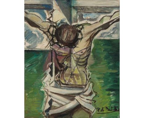
§ Roy De Maistre C.B.E. (Australian / British 1894-1968) Crucifixion, 1945 signed (lower right), oil on canvas Dimensions:25cm x 20.5cm (9 7/8in x 8in) Provenance:ProvenanceCelia Broadbent (neé Keogh) and by direct descent to the present owner.Celia Broadbent was de Maistre’s cousin once removed, and his executor and friend; her older sister, Camilla Margery Keogh, was the subject of ‘La Folie', considered one of de Maistre’s major works. Note: with label signed and inscribed THIS CRUCIFIXION, painted from notes and studies made at St. Jean-de-Luz in 1932 was begun on the day after the first atomic bomb was dropped on Hiroshima - painted in Sorrow for the innocent victims and in condemnation of those politicians who perpetrated this appalling act of mass murder in defiance of Christian love and compassion. / 13 Eccleston Street, London, 1945. (to reverse) Roy de Maistre: ‘Fellas doing things to Fellas’Described as ‘the man who taught Francis Bacon to paint’ (Ronald Alley interviewed by Heather Johnson 1988), Roy de Maistre moved from his native Australia to London in 1930, where he lived for the rest of his life. He had trained at Sydney Art School and the Royal Art Society, had spent two years travelling in Europe between 1923 and 1925 and had had two solo exhibitions, at the Macquarie Galleries in Sydney in 1926 and 1928. Despite this successful start to his career, de Maistre looked to London for a more progressive art world into which he was immediately admitted. In his first year in the English capital, de Maistre had a solo show at the Beaux Arts Gallery and a joint exhibition of paintings and furniture with Francis Bacon, held in the latter’s studio at 7 Queensberry Mews.De Maistre’s friendship with Bacon was closest in the early 1930s, though they remained in contact until the former’s death in 1968. There is some debate as to whether they had studios in the same buildings but on different floors, but what is certain is de Maistre’s fascination with Bacon’s working spaces, which he painted on several occasions. As de Maistre’s biographer, Heather Johnson, has declared ‘the main importance of the association between de Maistre and Bacon is the influence on their respective work…in the early 1930s de Maistre had just as great or greater influence on Bacon.’ (Heather Johnson, Roy de Maistre: The English Years 1930-1968, Craftsman House, Roseville East, 1995, p.22).The 1930s were a particularly fertile period in de Maistre’s career; his work featured in cutting-edge publications, such as Herbert Read’s 1933 Art Now and in group exhibitions including at the Zwemmer Gallery and Leicester Galleries. He had solo exhibitions at the avant-garde Mayor Gallery in 1934 and at the Calmann Gallery four years later. In 1934 he established the School of Contemporary Painting and Drawing with Martin Bloch, with its stated aim acting as a manifesto for his own work, namely ‘to help the pupils to give expression to their enjoyment of the beauty and significance of things seen and experienced; to understand and appreciate the materials they use and to recognise the logic of the laws of colour and composition’ (see Johnson, op.cit., p.82).Two Figures dates from this important period. Johnson explained that in this painting, compared with other contemporary works, ‘de Maistre has…concentrated on a sensitive and intellectual rapport between the figures rather than a purely sexual one, the blending of the figures and their closeness is much more successful’ (Johnson, ibid., p.28). Two Figures is all the more significant given de Maistre’s instructions to his Executors that, following his death, ‘a large body of work, described as ‘fellas doing things to fellas’ be destroyed (see Johnson, ibid., p. 28). The two men are seen unclothed, caught in a moment of intimate relaxation – both have their eyes closed and are viewed in profile. Bold black outlining provides the structure of a pictorial design based on shallow depth, whilst a harmonious palette, direct technique and frank appreciation of the male form create an image which is at once sensual and bold.In contrast, Crucifixion of 1945, whilst based on earlier notes and studies, was painted in response to the dropping of the first atomic bomb, on Hiroshima on 6 August of that year. By this point in his career, de Maistre was becoming known as a modernist religious painter, not least with the acquisition in 1944 of a work of the same Biblical scene to Iona Abbey. De Maistre formally converted to the Roman Catholic faith in 1951. The 1940s saw him receive solo exhibitions in Leeds and Birmingham and culminated in one at Adams Gallery, London in 1950.The influence of Bacon’s working methods can arguably be detected in Man and Tree of 1959. Johnson posits that Bacon’s use of Portrait of Innocent X by Diego Velázquez in a series of works started in 1951, may have encouraged de Maistre to look to past masters for inspiration. Indeed, she established that Man and Tree is based on a work by Henri Matisse, reproduced in an article about Fauvism in the December 1934 issue of the D’Aci I D’Alla magazine, of which de Maistre owned a copy. (M. A. Cassanyes, ‘Fauvisme’, D’Aci D’Alla, no.179, vol. XXII, December 1934 see Johnson, ibid., pp.163 and 165). This work dates from the period during which de Maistre was preparing his retrospective exhibition at the Whitechapel Gallery, London, which opened in May 1960.All three of the works by de Maistre presented here formerly belonged to Celia Broadbent (née Keogh). She was a daughter of the artist’s cousin, Camilla Keogh (1866-1948) who was one of his most significant patrons and muses. Celia went on to support de Maistre herself, not least in asking him to design tapestry versions of some of his paintings, which she then stitched (see Johnson, ibid., p. 112).As de Maistre’s patron, Rab Butler, proclaimed: ‘His most impressive quality as an artist was his absolute integrity. He went through long periods of difficulty in earning his living from painting because he refused to conform to any standards other than those which he had rigorously laid down for himself.’ (quoted in Johnson, ibid. p.55)

§ David Meredith (1973-), Reclining Hare,a patinated bronze model of a hare at rest, signed and numbered 43/50 to the bronze13 x 35cm This lot has been donated by Cambridge Contemporary Art and is sold to benefit Cambridge4Ukraine, a volunteer initiative established to help Ukrainian refugees in Cambridge


Henry Singleton (1766-1839), Admiral Nelson Boarding the St Joseph during the Battle of Cape St Vincent, 14 February 1797, unsigned, oil on canvas, 51 x 67 cm, in an ornate gilt gesso frame (with losses), frame 74 x 90 cmLabelled verso, 'Exhibition of Art Treasures 1857 - J.G. Firth Esq.' and listed as such in 'The Catalogue of Art Treasures of the United Kingdom collected at Manchester in 1857' (catalogued as John Singleton)No obvious holes or tears, but the painting has been professionally restored, possibly for cracking to the surface. Re-touching and over-painting are visible under UV light throughout. The painting would benefit from cleaning. There are significant losses to the frame, both front and back, but it does look contemporary to the canvas.

IMMENDORFF, Jörg(1945 - 2007) Bibel und Skulptur "Affe mit Ring"Wissen Media Verlag GmbH. Gütersloh, München. 2006. Bibel 36 x 27 x 8 cm, Bronze H 26 cm und dazugehöriger Plexiglassockel. Altes und Neues Testament mit Illustrationen des Künstlers, im silbergeprägten Ledereinband mit Silberschnitt. / Bronzeplastik mit Signatur und Nummerierung im Bronzesockel. Dazu Beiheft und Zertifikat. Höhe ca. 26 cm. Beide Exemplare nummeriert 739/998. Jörg Immendorff (* 14. Juni 1945 in Bleckede; † 28. Mai 2007 in Düsseldorf) war ein deutscher Künstler (Malerei, Bildhauerei, Grafik und Aktionskunst) und Kunstprofessor. Immendorff wurde seit Beginn der 1980er Jahre zu einem der bekanntesten deutschen Künstler der Gegenwart. Aufrufzeit 28. | Okt 2023 | voraussichtlich 10:53 Uhr (CET) IMMENDORFF, Jörg(1945 - 2007) Bible and sculpture "Monkey with ring"Wissen Media Verlag GmbH. Gütersloh, Munich. 2006. bible 36 x 27 x 8 cm, bronze H 26 cm and matching plexiglass base. Old and New Testament with illustrations by the artist, in silver embossed leather binding with silver edges. / Bronze sculpture with signature and numbering in bronze base. Comes with booklet and certificate. Height ca. 26 cm. Both copies numbered 739/998. Jörg Immendorff (* June 14, 1945 in Bleckede; † May 28, 2007 in Düsseldorf) was a German artist (painting, sculpture, graphics and action art) and art professor. Immendorff became one of the most famous contemporary German artists since the early 1980s. Call time 28 | Oct 2023 | expected 10:53 am (CET)*This is an automatically generated translation from German by deepl.com and only to be seen as an aid - not a legally binding declaration of lot properties. Please note that we can only guarantee for the correctness of description and condition as provided by the German description.

† TAHA AL SABBAN (SAUDI ARABIAN B.1948) TAKWEENsigned and dated al Sabban 93 lower left; inscribed in Arabic on the reverseoil on canvas122 x 90.5cm; 48 x 35 3/4in130.5 x 99cm; 51 3/4 x 39in (framed)Property of a Gentleman, LondonProvenanceAcquired from the artist by a private collector, Saudi ArabiaSale, Sotheby's Doha, Contemporary Art Doha,13 October 2014, lot 35Purchased at the above auction by the present owner

LOVEMORE KAMBUDZI (ZIMBABWEAN B.1978) STODART POLICE STATION signed and dated L. KAMBUDZI / 2007 lower right oil on canvas 83.5 x 129cm; 33 x 50 3/4in(unframed) ProvenancePurchased from the artist, 2007Property from a Private Collection, LondonBorn in Zimbabwe in 1978, Lovemore Kambudzi grew up in Mbare, in inner city Harare. He trained at the National Gallery of Zimbabwe (NGZ) Visual Arts Studios in Mbare (1996-98). Known locally as the eyes of the people, Kambudzi records life in Harare, and his artworks often comment on the local political and economic situations, e.g. water shortages and the cholera outbreak.Kambudzi employs pointillistic brushstrokes, in vibrant colours, to create lively compositions. His paintings are densely packed with figures, right up to the foreground, thus encroaching on the viewer and giving us the impression that we are amidst the action. He has exhibited at a selection of shows across the world, including the Migration Exhibition, Gallery Delta, Harare (2015), Eye of the People, Gallery Delta and NGZ, Harare (2007) and Witness - The spectre of memory in contemporary African art, Ed Cross Fine Art, Edinburgh (2010).

† ABDEL HADI AL GAZZAR (EGYPTIAN 1925-1966) A CHILD'S FACEsigned in Arabic lower leftpencil on paper, laid on board22.5 x 17cm; 8 3/4 x 6 3/4in40 x 35cm; 15 3/4 x 13 3/4in (framed)ProvenanceCollection of Dr Mohammed Said FarsiThence by descentLiteratureDr Sobhy Al Sharouny, A Museum in a Book, Cairo, 1998, pp. 280 and 287, illustratedTo be included in the Abdel Hadi El Gazzar: Catalogue Raisonné of the paintings by Valerie Didier and Hussam RashwanBorn in Alexandria, Al Gazzar was a leading figure in modern Egyptian art of the 20th century. He enrolled at the Faculty of Fine Arts in Cairo in 1944 and then joined the Contemporary Art Group founded by Hussein Youssef Amin, his master. Growing up in the Sayeda Zeinab district of Cairo, he depicts the people of Cairo in a folkloric way with a unique expressionistic, metaphysical style. His arrest in 1949 by King Farouk’s forces re-invigorated Al Gazzar’s wish to represent the realities of the poor and their life struggles and included magic symbols, folk beliefs and rituals in his works.Widely recognised during his short lifetime, Al Gazzar's exhibited in France in 1949, at the Venice Biennale in 1952 and in São Paulo in 1953. Today, his works are in private collections in Cairo, Alexandria, Rome, Paris and Brussels, but also in major institutions around the world, such as the Metropolitan Museum of Art in New York or the Mathaf: Arab Museum of Modern Art, Doha.

DOTMASTER, PIN UPS spray paint on card album cover, signed and dated31cm x 31cm Dotmaster is a London based artist who exploded on the international art scene in the 1990s and is known for his half-tone work, stark black and white street pieces and unique, photo-real colour stencils which all create street-based illusions that fool the eye. He takes a sideways look at a populist media with a typically English sense of humour. Dotmaster also caught the attention of the legendary film director, Martin Scorsese, which led him to collaborating on the film set of Scorsese’s movie, ‘Tomorrow’, which was shot in London in 2014. The Dotmaster exhibits internationally taking part in Banksy’s Waterloo ‘Cans Festival’ and his artwork has been featured in the Oscar-nominated ‘Exit Through the Gift Shop’. He is also an integral part of Norway’s independent contemporary street and urban Nuart festival. Instagram: dotmasters
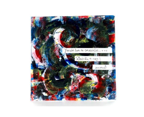
LOUISE DONNELLY, DON'T DIE A COPY acrylic on card album cover, signed and dated31cm x 31cm Louise Donnelly is a contemporary Irish artist, based in Scotland. She keeps her style fluid flitting between realism and abstraction, the narrative driving the outcome of her work. With over ten years experience in art education she seeks to continually inspire and bring the arts to all. Instagram: louisedonnellyartist
RYCA, HARDCORE KING acrylic and spray paint on card album cover, signed31cm x 31cm Ryan Callanan, who works in the street scene under the alias of RYCA, is a contemporary artist whose ‘Poptarian’ style combines Street Art, popular culture, and current affairs. Ryan's art features playful jokes and political references in refreshing and accessible compositions. Callanan is a master of experimentation with a signature street style encompassing emojis and pop culture references. He studied Modelmaking at Barking College before he rose to fame in the street scene and chose his moniker RYCA after producing his first set of 3D smiley faces, emblematic of the 1980s Acid Rave culture. His experimentation with lyrics has resulted in highly collectible editions amongst musicians, music producers, and writers. Instagram: ryca_artist

HANNAH SHILLITO, YAS QUEEN Artist's Proof giclee print on card album cover, signed and numbered A/P31cm x 31cm Hannah Shillito is a contemporary artist who has lived all over the world including Tokyo, New York, London, Cape Town, the Himalayas and Milan and is now based in Brighton, UK. Her work has drawn attention from celebrities with clients including social media sensation Arron Crascall and punk poet John Cooper Clarke as well as Bimini Bon Boulash in a Barclaycard advert! A native of the north west of England, Hannah’s love of colour and maximalism is brash, honest and playful and her distinctive personal style emanates joy and vibrancy with its punchy statements and attention grabbing fluorescence. She exhibits alongside some of the top names in contemporary art such as Grayson Perry, Tracy Emin and Damien Hirst, all over the UK and Ibiza, and has featured in two editions of British Vogue. Having worn many hats as a freelance writer and photographer, poet, children’s author and teacher, Hannah’s love of words as well as images are brought to life through contrasting and bold colours and compositions. As the artist explains, “A picture tells a thousand words but I like to condense those words and pack a punch.” Instagram: hannahshillito.art

SKELETON CARDBOARD MIND YOUR HEAD acrylic and spray paint on card album cover, signed31cm x 31cmSkeleton Cardboard is an anonymous artist, currently based in Hackney, who works in a variety of media across different disciplines... From the studio to the street. Originally inspired by a trip to Mexico and the 'Dia De Los Muertos' festival of the dead. This later fused with an interest in street art and numerous other contemporary influences, that lead the artist to arrive at his own uniquely recognisable style. His iconography and symbolism is an irreverent commentary on consumerism and modern urban living and his work has been shown in numerous galleries globally. Instagram: theskeletoncardboard
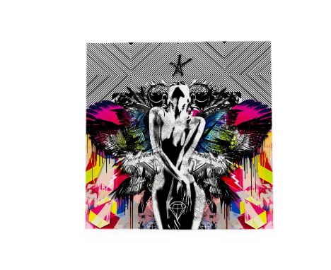
BEN ALLEN, AMERICAN GOD NO assembled paper cut created with fine art giclee prints on 330gsm archival paper, on card album cover, signed31cm x 31cmBorn in 1979, Newquay based Ben Allen is a contemporary artist, known for his distinctive and sought after Pop paintings, prints and graffiti artwork. Instagram: benallenart
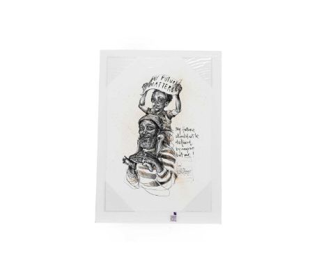
HERA OR HERAKUT, MY FUTURE MATTERS artist's proof hand finished print on heavy mold paper, signed, dated and numbered A/P48cm x 33cmJasmin Siddiqui is a German born artist better known as Hera. Recognised for her urban contemporary and graffiti art, who uses a variety of different mediums to created her truly emotive artworks. Hera’s works can be found on their collaboration with URBAN NATION on Project M/13 in 2018. Coming from a half-Pakistani, half-German background, Hera had been brought up half-Muslim and half-Catholic, Hera knows quite a lot about ethical differences and complications even before school. Though she didn’t entirely know how to deal with those perspectives until she found graffiti. A graduate in Graphic Design, Hera’s works tend to combine traditional techniques and spray painting to portray mythological creatures and darkly comedic and satirical scenes. These images often point towards the notions of present issues with regards to political injustice and social awareness. Instagram: hera_herakut
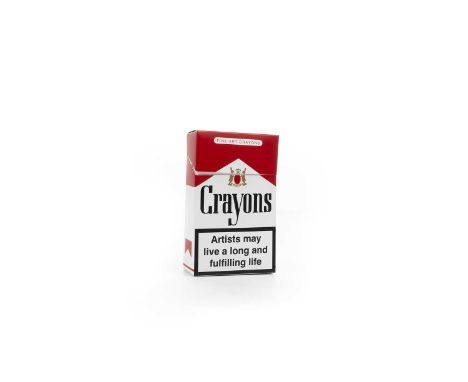
IMBUE, HIGHLY ADDICTIVE (MARLBORO) from the Death + Taxes Exhibition; a pack of crayons in a cigarette style box. Artists may live a long and fulfilling life. From a sold out edition of 200.Futuristic, provoking and detail-orientated briefly sums up the work of brilliant British artist, who goes by the name of Imbue. A contemporary artist, he plays, provokes and prods at themes and well-known icons on the current landscape. There's a buzz that surrounds his artwork, and unsurprisingly, a loyal following has ensued. Take his mystery prints for example, where the artist releases one every few months, the said print is limited edition and only available for 24 hours. Embrace the art frenzy. Instagram: imbue
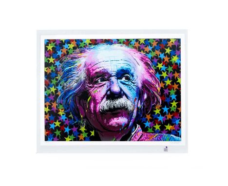
ROAMCOUCH, EINSTEIN 2022 artist's proof 16 colour giclee print on 320gsm Fedrigoni Stucco Tintoretto Gesso fine art paper, signed and numbered A/P60cm x 90cmRoamcouch is a Japanese stencil artist, and an urban, contemporary master in his own right. He brings new meaning to “stencilism," and produces meticulously detailed and rich stencil paintings on canvas, and clean-cut screen prints on paper. Some describe his work ethic as that of a modern master, because he can take up to a year to create one piece of his work. His stencils involve an unfathomable and highly professional level of intricacy, with certain images requiring fifty different layers of stencil, which are all hand-drawn and hand-cut. His works involve such detail yet manage to portray a feeling of romanticism and fluidity, through the use of his selected subject matter. Roamcouch was a former designer and resided in a more corporate setting. Several years ago he was diagnosed with a serious illness, which made him rethink his life and career. It stimulated Roamcouch to drastically change his life by pursuing his dream – becoming an artist. Instagram: roamcouch
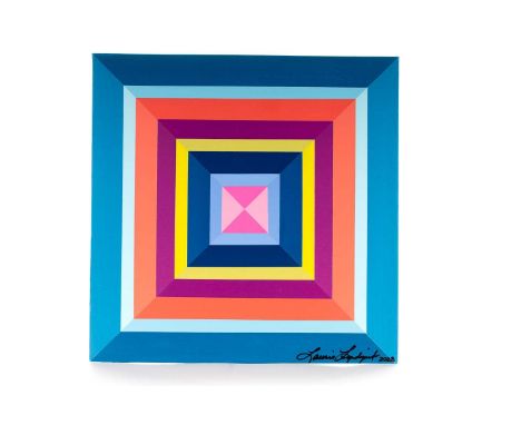
LAURIE LINDQVIST, CAPTIVATING acrylic and varnish on card album cover, signed31cm x 31cmA resident of Texas, contemporary artist, Laurie Lindqvist, was raised in New York and attended the Art Institute of Dallas. As an artist, interior designer, and artistic consultant, Lindqvist’s works employ vibrant color and bold composition designed to bring an often-dramatic sense of joy. She began her career creating sculptural and functional art and then fell in love with the process of painting. Working in acrylics, her current work features vivid hard-edge geometric designs with the occasional use of shaped canvas. Her work has been exhibited throughout the United States. Her paintings can be found in private collections in the United States, Europe, and New Zealand.Instagram: laurielindqvist
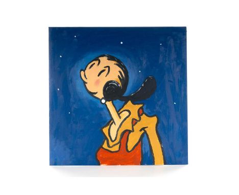
TOBY URSELL, STARRY, STARRY NIGHT oil on card album cover, signed31cm x 31cmToby Ursell is a British Postwar & Contemporary artist who was born in 1981 who graduated from UWIC, Cardiff (2003) and completed a painting MA at Wimbledon College Of Art in 2009. He has participated in numerous group shows across the UK. He lives and works in London.Instagram: thedavincitobe
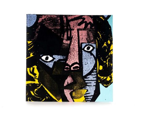
A. CE, UNTITLED 3 acrylic and screenprint on card album cover, signed31cm x 31cmA.CE is a London based artist. He has been active in the UK scene for the last 2 decades. In that time, his instantly recognisable wheat-pasted images, in his bold signature style, have featured prominently across the urban landscape, drawing inspiration in part from Dadaism, Pop art, collage, graffiti and the skate scene of the 80’s and 90’s. A.CE’s work is a raw presentation of nostalgic imagery intuitively selected, blended and remixed with contemporary fragments, resulting in a new narrative with ambiguities and incongruities, humor and messages that reflect the absurdities of popular culture and a media-rich consumer drive society. His art has been featured in a number of notable books and magazines and exhibited in galleries across the world, including London, Paris, Chicago, Tokyo and New York. Instagram: a.celondon
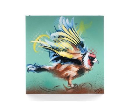
MICHAEL CORR, GOLDFINCH acrylic and spray paint on card album cover, signed31cm x 31cmMichael Corr is an award-winning contemporary painter and mural artist, who is based at his garden studio space in Alloa, Scotland. His work centres around portrait painting with an emphasis on colour and spontaneous mark making. Graduating from Duncan of Jordanstone College of Art and Design (Dundee), Corr’s formal training as a Graphic Designer along with a primary interest in expressive art, have developed into a uniquely powerful style of painting and drawing. Corr’s work has been featured in both group and solo exhibitions across Scotland. His work has private collectors in the UK and internationally. You can currently find his large scale mural work around Scotland and the US. Instagram: michaelcorrartist

AMELIA PRESCOTT, FLAMINGO oil on card album cover, signed31cm x 31cm Amelia Prescott is an artist based in Greater Manchester. In 2020, Amelia achieved a HND in Fine Art at Warrington and Vale Royal college. It was during this period Amelia found her passion for oil painting, and this has been her preferred medium ever since. Amelia's recent work focuses on the combination of abstract and realistic style. The backgrounds are formed by the application of oil paint scraped on with palette knives, the use of loose brush strokes, and simple representational lines in order to emphasise the detailed subject matter in the foreground. The use of vivid colours are used to make the subject matter less mundane, and more anomalous. By merging these characteristics, a contemporary formation is created, which has become Amelia's visual identity. Instagram: ameliaprescottart

A. CE, UNTITLED 2 acrylic and screenprint on card album cover, signedA.CE is a London based artist. He has been active in the UK scene for the last 2 decades. In that time, his instantly recognisable wheat-pasted images, in his bold signature style, have featured prominently across the urban landscape, drawing inspiration in part from Dadaism, Pop art, collage, graffiti and the skate scene of the 80’s and 90’s. A.CE’s work is a raw presentation of nostalgic imagery intuitively selected, blended and remixed with contemporary fragments, resulting in a new narrative with ambiguities and incongruities, humor and messages that reflect the absurdities of popular culture and a media-rich consumer drive society. His art has been featured in a number of notable books and magazines and exhibited in galleries across the world, including London, Paris, Chicago, Tokyo and New York. Instagram: a.celondon31cm x 31cm

A. CE, UNTITLED 1 acrylic and screenprint on card album cover, signed31cm x 31cmA.CE is a London based artist. He has been active in the UK scene for the last 2 decades. In that time, his instantly recognisable wheat-pasted images, in his bold signature style, have featured prominently across the urban landscape, drawing inspiration in part from Dadaism, Pop art, collage, graffiti and the skate scene of the 80’s and 90’s. A.CE’s work is a raw presentation of nostalgic imagery intuitively selected, blended and remixed with contemporary fragments, resulting in a new narrative with ambiguities and incongruities, humor and messages that reflect the absurdities of popular culture and a media-rich consumer drive society. His art has been featured in a number of notable books and magazines and exhibited in galleries across the world, including London, Paris, Chicago, Tokyo and New York. Instagram: a.celondon

ROAMCROUCH, LOST ANGELS 2020 artist's proof 36 colour hand-pulled screenprint on 310gsm fine art paper, signed and numbered A/P42cm x 91cmRoamcouch is a Japanese stencil artist, and an urban, contemporary master in his own right. He brings new meaning to “stencilism," and produces meticulously detailed and rich stencil paintings on canvas, and clean-cut screen prints on paper. Some describe his work ethic as that of a modern master, because he can take up to a year to create one piece of his work. His stencils involve an unfathomable and highly professional level of intricacy, with certain images requiring fifty different layers of stencil, which are all hand-drawn and hand-cut. His works involve such detail yet manage to portray a feeling of romanticism and fluidity, through the use of his selected subject matter. Roamcouch was a former designer and resided in a more corporate setting. Several years ago he was diagnosed with a serious illness, which made him rethink his life and career. It stimulated Roamcouch to drastically change his life by pursuing his dream – becoming an artist. Instagram: roamcouch

ZEDSY, BURNING LOVE spray paint on grey board in artist's frame, signed25cm x 25cmThe anonymous British artist Zedsy’s work has appeared at Banksy’s Dismaland and Tate Modern, yet little is known about the elusive, mysterious street-art figure. Zedsy has a similar stencil aesthetic to Banksy, using spray and acrylic paint to produce murals, paintings, prints, and ephemera. Using imagery taken from pop culture, such as Disney characters or Andy Warhol’s “Campbell’s Soup Cans,” Zedsy makes irreverent and satirical comments on contemporary life and politics. The Campbell’s tomato soup can has a reduced-price sticker; Snow White is absorbed in her iPhone. In 2016, Zedsy staged an intervention at Tate Modern, installing one of his “Reduced Soup Cans” in the galleries. Instagram: @zedsy.art

JEROME MASI, CLOUDS acrylic on card album cover, signed verso31cm x 31cm Jerome Masi is a French illustrator and artistic director who was born in 1977. After living a long time in Lyon, he now lives in Annecy with his little family. He graduated from the Emile Cohl school in Lyon in 2001 and started to be a freelance graphic designer in 2005. Jerome enjoyed working in a variety of areas from video games to artistic directing, from film directing to illustrating. In 2010 he decided to focus on his own creative style through vector illustration. Recently he has taken up his paint brushes again to illustrate this synthetic and minimalistic universe on various noble mediums to create unique and contemporary art. Create is to live twice ! Instagram: jerome.masi

DAN BALDWIN, ENGAGE WITH THE WORLD pure pigment, acrylic, parker pen and Posca pen on card album cover, signed31cm x 31cmThe work of contemporary artist Dan Baldwin addresses big ideas: from the political to the religious, from innocence to experience, Baldwin’s fierce aesthetic is no wallflower. A modern take on object trouvé, Baldwin explores the use of the ‘real’ in his work. In the past, he has incorporated fragments of Iraqi and American currency, vintage crucifixes, and real bullets to press on the fine line between art and reality. Blending the abstract with the figurative, Baldwin’s work sits at the intersection of reality and fantasy. Frequently recurring motifs – from skeletons to swallows, flowers to firearms, crucifixes to cartoon characters – are often contradictory, juxtaposed to create an uncomfortable visual paradox. Today, Baldwin's work is well-known as a collectable sensation and is exhibited across the world. He has worked with a range of global brands, from Max Factor to Paolo Nutini, and his work is owned by a number of notable collectors including Damien Hirst. Instagram: danbaldwinart

JOHN "CRASH" MATOS, UNTITLED mixed media on paper, signed and dated20.5cm x 24cmBorn John Matos in 1961, CRASH was raised in the Bronx, New York. At the age of 13, he began following the older teens from his neighborhood to the train yards and began bombing. Taking the name “CRASH” after he accidentally crashed the computer in his school, his name began appearing on trains circulating all throughout New York City. CRASH’s career took off and he saw instant popularity throughout Europe and America, and eventually Asia. CRASH has been part of numerous museum and gallery shows around the world focusing on Graffiti and Street Art, and has works in many permanent museum collections. Visually iconic, he has partnered with many companies for projects including Absolut Vodka, Fender Guitars, SoBella Handbags, Levi’s, and most recently, Tumi luggage and Morphik. He is the co-owner of contemporary art gallery WALLWORKS NEW YORK and the co-owner of Wallworks TWO, a locally driven retail boutique, both in The Bronx. Instagram: crashone
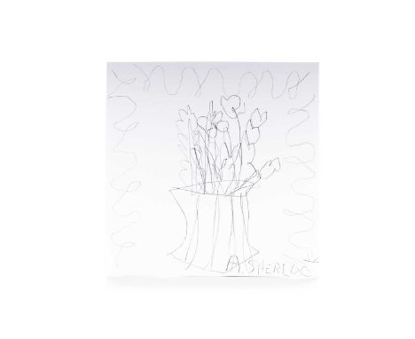
ALICE SHERLOCK, LOST FLOWERS FOR A LOST ALLEY CAT pencil on card album cover, signed31cm x 31cm Alice Sherlock (b. 1997, Guildford) lives and works in Glasgow. Sherlock is an interdisciplinary artist working in print, painting and sculpture. Her work focuses around the idea of verbatim aural storytelling and reflective nostalgia, focusing on locality, the everyday, and the mundane. She takes recorded familial conversations discussing childhood stories and turns them into a visual language. Her work is not a literal translation of these stories but a romanticised, fantasied, bittersweet look at nostalgia. Sherlock has recently graduated from the MLitt Fine Art Practice Print Media from the Glasgow School of Art in September 2022. She also studied BA Hons Fine Art and Theatre at Lancaster University graduating in 2019 focusing on contemporary performance. Instagram: alicesherlockart

EIKE KÖNIG, VATER VS FATHER screenprint on card album cover, signed31cm x 31cm An internationally recognised German design artist and founder of Berlin creative collective HORT, Eike König makes use of typographical, pop art and contemporary techniques to provoke. Celebrated for its conceptual, political, emotional and visual approach, König believes that “something can be incredibly poetic but also aggressive at the same time”, and he is “always looking for a moment that allows for contradictions to be read in the broadest possible way.” Rather than producing answers, König’s work triggers discourse. Instagram: eikekoenig
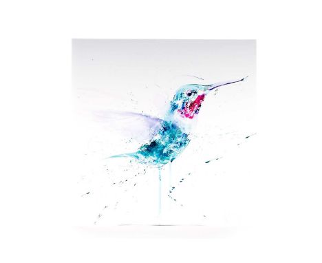
DAVE WHITE, HUMMINGBIRD 2023 watercolour on card album cover, signed31cm x 31cmDave White is a contemporary British Artist who dedicates his work to celebrating popular culture and interpreting emotive issues. White graduated with a BA (Hons) Fine Art (Painting) at Liverpool John Moores University and has enjoyed success from the inception of his career, with selection for the Northern Graduates exhibition at the Royal College of Art. Dave has successfully exhibited at exhibitions and galleries across the world. Whilst White has pursued many subject matters over the last twenty years, for the last decade he has been focussed on environmental issues by promoting endangered species with his signature expressive portraits. White continues to support international charities with donations of work for special projects and auctions. Instagram: davewhitestudio
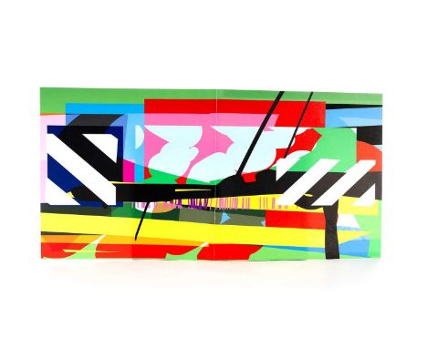
MASER, ON LOOP high quality giclee print on card album cover, signed, 1/131cm x 31cmMaser truly embodies the centric spirit of contemporary visual art in Ireland today. Having created artwork since 1995, over the last 24 years, Maser has earned much respect professionally and has generated a large and dedicated following in Ireland and abroad – through his seamlessly imaginative and unique graphic style. Maser is internationally recognized for his expansive repertoire of contemporary visual art, which includes works on canvas, sculptures, prints, immersive installations, interactive exhibitions and exquisite large-scale murals. His unique, artistic style draws upon numerous influences including optical art and mid-century art, and is regularly complemented with bold colors, pattern and text. Maser is ambitious and is unafraid to experiment with any artistic format. Instagram: maserart
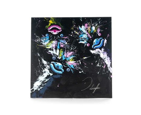
DEAN DOUGLAS, HAPPY PLACE acrylic on card album cover, signed31cm x 31cm Dean Douglas is a contemporary Manchester wildlife artist who uses a modern abstract style to bring his original paintings to life. A passionate artist, Dean’s positive, lively outlook on life is reflected in his art. When not painting, Dean is energetic and active, playing many sports and regularly giving early morning fitness classes at the David Lloyd Leisure Club in Trafford, Manchester. Dean has exhibited at David Lloyd Clubs and also in London with Anusa Creatives and is available for private commissions. Instagram: ddouglasart
LUCY BRYANT, CROC acrylic on card album cover, signed31cm x 31cmContemporary artist and graphic designer Haus of Lucy, AKA Lucy Bryant merges classical fine art with satirical elements from contemporary culture for a wry and caustic aesthetic. Working across collage, print and sculpture, Haus Of Lucy’s work is a modern-day take on the Dadaist practice of objet trouvé. Taking ‘found’ original artworks, Haus Of Lucy adds unexpected details: an EasyJet Plane soaring above a pastoral idyll or a hot dog in the hand of a porcelain figurine. Influenced by Pop Art and Punk, the sacrilegious approach to classicism is both rebellious and tongue-in-cheek. But the clash of past and present can be thought provoking too: Haus Of Lucy’s art asks the viewer to question contemporary culture, by placing it in the framework of historical perspective.

λ PATRICIA O'BRIEN (IRISH B. 1927) THE LESSON Oil on canvas Signed and dated '90 (lower right); further signed and titled to frame (verso) 81 x 100cm (31¾ x 39¼ in.)Exhibited: London, Stephen Bartley Gallery, 1990 Patricia O'Brien's artistic journey took off in 1977 when she first exhibited her work at the Upper Street Gallery in London. This initial exhibition marked the beginning of a flourishing career that would see her gain representation by Stephen Bartley and participate in numerous international exhibitions. From 1981, O'Brien's talent and unique artistic vision caught the attention of the Royal Academy. She participated in the prestigious Royal Academy Summer Exhibition, a renowned annual event that showcases the best of contemporary art. John Russell Taylor, an esteemed critic, hailed O'Brien as an "out-and-out discovery" in his review of the 1989 Royal Academy Summer Show. In a remarkable testament to the impact of her work, O'Brien's painting titled "The Fruit Eaters" became the main promotional press image for the Royal Academy Summer Show in 1990. Throughout Patricia O'Brien's body of work, the female figure takes centre stage, becoming a focal point of her compositions. O'Brien delves into the complexities of human relationships, exploring their dynamics, inviting viewers to interpret and question the narratives presented. O'Brien repeatedly portrays three figures, possibly a connotation to her own complicated relationships. Her works exude an intense visual poetry, compelling viewers to unravel the stories behind each character and scene portrayed on the canvas. O'Brien creates a sense of stillness in her work, capturing a fleeting moment suspended in time whether that be taking a lesson (Lot 96), eating fruit (Lot 98) or purchasing flowers at the market (Lot 100). There is a mystical and disquieting quality to her pieces, evoking a sense of melancholy that adds depth and complexity to the overall atmosphere. The deliberate absence of traditional perspective in O'Brien's work contributes to her distinctive style, along with a subdued colour palette and meticulous composition of objects and figures within the surrealist landscapes. These elements make O'Brien's art instantly recognisable and draw the viewer into a world of carefully constructed beauty.In 1972, Patricia O'Brien made the decision to settle down in the perfume capital of France, Grasse. Drawn to the allure of its mountainous landscapes and expansive vistas, these majestic surroundings served as a prominent influence in her work, providing the backdrop against which her pensive figures would come to life as can be seen in lot 98 and 99. It was during her time in France that she forged a close friendship with Frederick Gore, a fellow artist.Patricia O'Brien's artwork is a captivating blend of surrealist iconography and Renaissance influences, creating a unique and distinctive style. O'Brien was especially drawn to fifteenth century Italian artists such as Sandro Botticelli and Piero della Francesca whose focus on exquisite attention to detail, with a particular emphasis on depicting the human form with individuality, empathy, and sensitivity, inspired her. Humanism permeates O'Brien's work, as she delves deep into the layers of emotions experienced by her figures and situates them within the natural world, infusing her paintings with spiritual meaning. One striking aspect of O'Brien's paintings is the luminous complexion and porcelain skin of her figures particularly apparent in Lot 99 which shows three female nudes attending to flowers beneath the mountainous landscape beyond. Condition Report: Very light surface dirt throughout. There is a small cluster of minute losses to the edge of the woman's pink dress. In overall good original condition. Condition Report Disclaimer
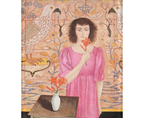
λ PATRICIA O'BRIEN (IRISH B. 1927) BIRDS OF PREY Oil on canvas Signed and dated '94 (lower left); titled to frame (verso) 36 x 31cm (14 x 12 in.)Patricia O'Brien's artistic journey took off in 1977 when she first exhibited her work at the Upper Street Gallery in London. This initial exhibition marked the beginning of a flourishing career that would see her gain representation by Stephen Bartley and participate in numerous international exhibitions. From 1981, O'Brien's talent and unique artistic vision caught the attention of the Royal Academy. She participated in the prestigious Royal Academy Summer Exhibition, a renowned annual event that showcases the best of contemporary art. John Russell Taylor, an esteemed critic, hailed O'Brien as an "out-and-out discovery" in his review of the 1989 Royal Academy Summer Show. In a remarkable testament to the impact of her work, O'Brien's painting titled "The Fruit Eaters" became the main promotional press image for the Royal Academy Summer Show in 1990. Throughout Patricia O'Brien's body of work, the female figure takes centre stage, becoming a focal point of her compositions. O'Brien delves into the complexities of human relationships, exploring their dynamics, inviting viewers to interpret and question the narratives presented. O'Brien repeatedly portrays three figures, possibly a connotation to her own complicated relationships. Her works exude an intense visual poetry, compelling viewers to unravel the stories behind each character and scene portrayed on the canvas. O'Brien creates a sense of stillness in her work, capturing a fleeting moment suspended in time whether that be taking a lesson (Lot 96), eating fruit (Lot 98) or purchasing flowers at the market (Lot 100). There is a mystical and disquieting quality to her pieces, evoking a sense of melancholy that adds depth and complexity to the overall atmosphere. The deliberate absence of traditional perspective in O'Brien's work contributes to her distinctive style, along with a subdued colour palette and meticulous composition of objects and figures within the surrealist landscapes. These elements make O'Brien's art instantly recognisable and draw the viewer into a world of carefully constructed beauty.In 1972, Patricia O'Brien made the decision to settle down in the perfume capital of France, Grasse. Drawn to the allure of its mountainous landscapes and expansive vistas, these majestic surroundings served as a prominent influence in her work, providing the backdrop against which her pensive figures would come to life as can be seen in lot 98 and 99. It was during her time in France that she forged a close friendship with Frederick Gore, a fellow artist.Patricia O'Brien's artwork is a captivating blend of surrealist iconography and Renaissance influences, creating a unique and distinctive style. O'Brien was especially drawn to fifteenth century Italian artists such as Sandro Botticelli and Piero della Francesca whose focus on exquisite attention to detail, with a particular emphasis on depicting the human form with individuality, empathy, and sensitivity, inspired her. Humanism permeates O'Brien's work, as she delves deep into the layers of emotions experienced by her figures and situates them within the natural world, infusing her paintings with spiritual meaning. One striking aspect of O'Brien's paintings is the luminous complexion and porcelain skin of her figures particularly apparent in Lot 99 which shows three female nudes attending to flowers beneath the mountainous landscape beyond. Condition Report: In good original condition. Condition Report Disclaimer
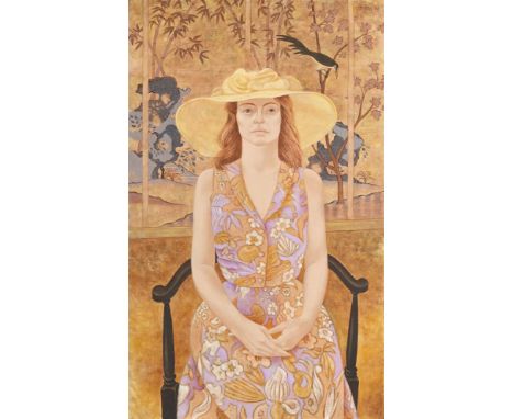
λ PATRICIA O'BRIEN (IRISH B. 1927) THE YELLOW HAT Oil on canvas Signed and dated '96 (upper right); titled to frame (verso) 102 x 61cm (40 x 24 in.)Patricia O'Brien's artistic journey took off in 1977 when she first exhibited her work at the Upper Street Gallery in London. This initial exhibition marked the beginning of a flourishing career that would see her gain representation by Stephen Bartley and participate in numerous international exhibitions. From 1981, O'Brien's talent and unique artistic vision caught the attention of the Royal Academy. She participated in the prestigious Royal Academy Summer Exhibition, a renowned annual event that showcases the best of contemporary art. John Russell Taylor, an esteemed critic, hailed O'Brien as an "out-and-out discovery" in his review of the 1989 Royal Academy Summer Show. In a remarkable testament to the impact of her work, O'Brien's painting titled "The Fruit Eaters" became the main promotional press image for the Royal Academy Summer Show in 1990. Throughout Patricia O'Brien's body of work, the female figure takes centre stage, becoming a focal point of her compositions. O'Brien delves into the complexities of human relationships, exploring their dynamics, inviting viewers to interpret and question the narratives presented. O'Brien repeatedly portrays three figures, possibly a connotation to her own complicated relationships. Her works exude an intense visual poetry, compelling viewers to unravel the stories behind each character and scene portrayed on the canvas. O'Brien creates a sense of stillness in her work, capturing a fleeting moment suspended in time whether that be taking a lesson (Lot 96), eating fruit (Lot 98) or purchasing flowers at the market (Lot 100). There is a mystical and disquieting quality to her pieces, evoking a sense of melancholy that adds depth and complexity to the overall atmosphere. The deliberate absence of traditional perspective in O'Brien's work contributes to her distinctive style, along with a subdued colour palette and meticulous composition of objects and figures within the surrealist landscapes. These elements make O'Brien's art instantly recognisable and draw the viewer into a world of carefully constructed beauty.In 1972, Patricia O'Brien made the decision to settle down in the perfume capital of France, Grasse. Drawn to the allure of its mountainous landscapes and expansive vistas, these majestic surroundings served as a prominent influence in her work, providing the backdrop against which her pensive figures would come to life as can be seen in lot 98 and 99. It was during her time in France that she forged a close friendship with Frederick Gore, a fellow artist.Patricia O'Brien's artwork is a captivating blend of surrealist iconography and Renaissance influences, creating a unique and distinctive style. O'Brien was especially drawn to fifteenth century Italian artists such as Sandro Botticelli and Piero della Francesca whose focus on exquisite attention to detail, with a particular emphasis on depicting the human form with individuality, empathy, and sensitivity, inspired her. Humanism permeates O'Brien's work, as she delves deep into the layers of emotions experienced by her figures and situates them within the natural world, infusing her paintings with spiritual meaning. One striking aspect of O'Brien's paintings is the luminous complexion and porcelain skin of her figures particularly apparent in Lot 99 which shows three female nudes attending to flowers beneath the mountainous landscape beyond. Condition Report: Very light surface dirt. Some minute pooling of varnish scattered across the surface. Overall in good original condition. Condition Report Disclaimer
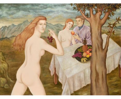
λ  PATRICIA O'BRIEN (IRISH B. 1927) THE OFFERING Signed (lower right) 91 x 122cm (35¾ x 48 in.)Provenance: Solomon Gallery, Dublin Patricia O'Brien's artistic journey took off in 1977 when she first exhibited her work at the Upper Street Gallery in London. This initial exhibition marked the beginning of a flourishing career that would see her gain representation by Stephen Bartley and participate in numerous international exhibitions. From 1981, O'Brien's talent and unique artistic vision caught the attention of the Royal Academy. She participated in the prestigious Royal Academy Summer Exhibition, a renowned annual event that showcases the best of contemporary art. John Russell Taylor, an esteemed critic, hailed O'Brien as an "out-and-out discovery" in his review of the 1989 Royal Academy Summer Show. In a remarkable testament to the impact of her work, O'Brien's painting titled "The Fruit Eaters" became the main promotional press image for the Royal Academy Summer Show in 1990. Throughout Patricia O'Brien's body of work, the female figure takes centre stage, becoming a focal point of her compositions. O'Brien delves into the complexities of human relationships, exploring their dynamics, inviting viewers to interpret and question the narratives presented. O'Brien repeatedly portrays three figures, possibly a connotation to her own complicated relationships. Her works exude an intense visual poetry, compelling viewers to unravel the stories behind each character and scene portrayed on the canvas. O'Brien creates a sense of stillness in her work, capturing a fleeting moment suspended in time whether that be taking a lesson (Lot 96), eating fruit (Lot 98) or purchasing flowers at the market (Lot 100). There is a mystical and disquieting quality to her pieces, evoking a sense of melancholy that adds depth and complexity to the overall atmosphere. The deliberate absence of traditional perspective in O'Brien's work contributes to her distinctive style, along with a subdued colour palette and meticulous composition of objects and figures within the surrealist landscapes. These elements make O'Brien's art instantly recognisable and draw the viewer into a world of carefully constructed beauty.In 1972, Patricia O'Brien made the decision to settle down in the perfume capital of France, Grasse. Drawn to the allure of its mountainous landscapes and expansive vistas, these majestic surroundings served as a prominent influence in her work, providing the backdrop against which her pensive figures would come to life as can be seen in lot 98 and 99. It was during her time in France that she forged a close friendship with Frederick Gore, a fellow artist.Patricia O'Brien's artwork is a captivating blend of surrealist iconography and Renaissance influences, creating a unique and distinctive style. O'Brien was especially drawn to fifteenth century Italian artists such as Sandro Botticelli and Piero della Francesca whose focus on exquisite attention to detail, with a particular emphasis on depicting the human form with individuality, empathy, and sensitivity, inspired her. Humanism permeates O'Brien's work, as she delves deep into the layers of emotions experienced by her figures and situates them within the natural world, infusing her paintings with spiritual meaning. One striking aspect of O'Brien's paintings is the luminous complexion and porcelain skin of her figures particularly apparent in Lot 99 which shows three female nudes attending to flowers beneath the mountainous landscape beyond. Condition Report: The work appears to be in good original condition.Condition Report Disclaimer

Huw Griffith Artwork titled No,9 Parquet, signed and framed 100 x 84cm (Apt 1)Huw Griffith trained at Camberwell School of Art. After an apprenticeship as a fine art framer, Griffith began his career working in the picture department of Phillips Auctioneers (writing condition reports). This proved to be a free education in everything from old masters to contemporary art. The artist’s artist, he takes inspiration from found objects – such as old letters, ephemera and frames – picked up on his travels and from trawling antiques fairs. He is intensely instinctive by nature and shows scant regard for creative constraints and any artistic rulebook, preferring the peripheries of the art world and the traditional marketplace – he started off selling his work on the street and has worked his way up from there. The son of the late actor, Kenneth Griffith, his aesthetic has one foot in the historical past, and the other in Outsider Art.Â
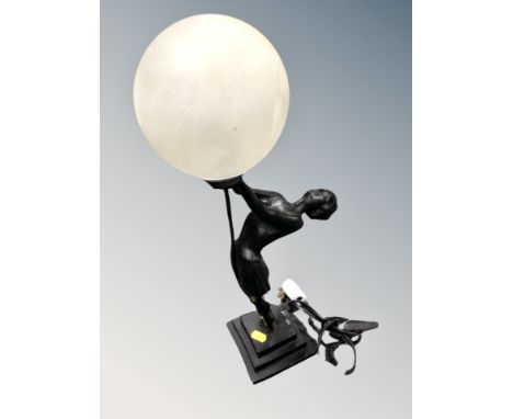


SEVEN BOXES OF BOOKS containing over 260 miscellaneous titles in hardback and paperback formats, subjects include encyclopaedic works, art and antiques, Observer books, biography, a large collection of Reader's Digest compilations, classic and contemporary fiction including over twenty novels by Wilbur Smith, Nancy Drew Mysteries and Ladybird books
-
16093 item(s)/page