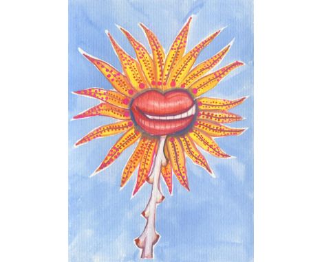

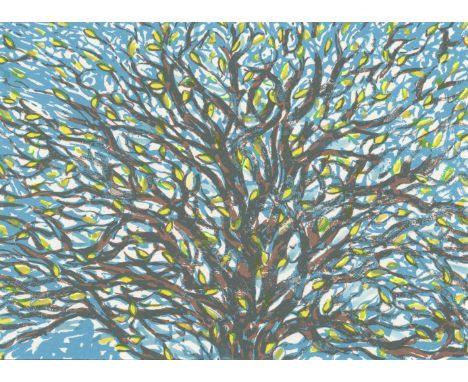
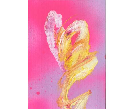
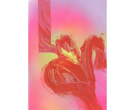
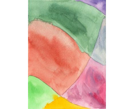
Celina Teague What You Lookin At, 2021 Gouache on Paper Signed on verso 15 x 10cm (5¾ x 3¾ in.) Teague's paintings take their cue from current affairs - particularly events that affect the wellbeing of the planet, such as bush fires, rainforest destruction, poaching and climate-change-denying politicians. She is equally interested by the dissemination of information in the digital era; how it affects the way we interpret and handle crisis events. She asks whether armchair activism is a dangerously false economy or better than no activism at all. Teague currently lives and works in Portugal. Exhibitions 2006-2007 MA Fine Art, Central Saint Martins College, London 2004-2005 Fine Art Program, Universidad de Bellas Artes, Oaxaca, Mexico 2000-2004 Trinity College Dublin, BA Double First Class Honours in English and Drama 3rd year abroad at The Freie Universität, Berlin2021 Money & Fairy Tales, Kristin Hjellegjerde Gallery, Berlin (solo) 2020 The House is On Fire, XVA Gallery, Dubai (solo) 2020 Plastic, Tashkeel, Dubai (group) 2019 The Animal Ball Art Show, 9 Cork Street Galleries, London (group) 2018 Not For the Kid's Room, Kristin Hjellegjerde Gallery, London (solo) 2017 Everything Exists Now, Kristin Hjellegjerde Gallery, London (group) 2016 London Art Fair, Kristin Hjellegjerde Gallery, London Business Centre (group) 2015 I Think Therefore I Hashtag, Kristin Hjellegjerde Gallery, London (solo) 2013 In Search of Lost Space, Kristin Hjellegjerde Gallery, London (solo) 2013 Brave New World Hits a Glitch, Rook and Raven Gallery, London (solo) Representation Kristin Hjellegjerde Gallery About the Postcards These two works are the first of a series of paintings and drawings of flowers and animals being overcome by human elements
We found 983 price guide item(s) matching your search
There are 983 lots that match your search criteria. Subscribe now to get instant access to the full price guide service.
Click here to subscribe- List
- Grid
-
983 item(s)/page
Monika Maurer-Morgenstern If I knew that tomorrow the world would end, I would plant an apple tree today, 2021 Mixed Media on Paper Signed on front and verso 15.9 x 12cm (6¼ x 4½ in.) INTERNATIONAL ACADEMIE FOR FINE ARTS SALZBURG Exhibitions WEISS BERLIN 2020, ARTCRU Berlin 2016, Raitenbucher Castle Kallmünz 2011, Association for Original Etchings München 2009, Galerie Ohse Bremen, 2008, Kavaliershaus Langenargen 2005, Oberwallis Arts Association (Switzerland) 2004, Galerie Kudlek Köln 2001+2003, Galerie Albrecht München 1998,95,93, Friedrichstadt Arts Association Berlin Center 1994, Alpirsbacher Galerie 1988, Müncher Stadtmuseum 1986 2019+2018 Berlin Galerie Parterre "Drawing of Presence II", Cavin Morris Gallery NYC " Rings around theMoon" 2018, "Freshhet" Cavin Morris Gallery NYC 2014, Zink und Gegner + Kudlek "way home" 26 Postcards 2005, Düsseldorf Palace Art Museum, Hanck Collection 2000+1999 , BBK München "really unreal" 1988, Galerie Eisenmann Böblingen 1983 PARTICIPATION WITH ART FAIRS: OAF NEW YORK, OAF PARIS, BRUSSELS, ZÜRICH,KARLSRUHE , KÖLN WORKS IN COLLETIONS: Craphics Collection Berlinische Galerie, Stuttgart State Gallery Graphics Collection ( Collection Digital 80 Drawings) Munich State Graphics Collection Basel Prints and Drawings Düsseldorf Palace Art Museum ( Collection Hanck) Artohek München Artothek Köln Grcic-Ziersch Art Trade AWARDS: 2010 Golden Lion in Scholarship Kallmünz 2007,1994 Catalog Promotion in München Capital 2005 Awarded the Kavaliershaus Langenargen / Lake Constance Scholarship Baden Würtemberg for 3 Month 1994 + 1989 Free placement in the International Summer Academy for Free Arts Salzburg Gallery Representation Henry Boxer Gallery Richmond, Cavin Morris Gallery NYC
Monika Maurer-Morgenstern Aus Dem Kosmos, 2021 Mixed Media on Paper Signed on front and verso 15.9 x 12cm (6¼ x 4½ in.) INTERNATIONAL ACADEMIE FOR FINE ARTS SALZBURG Exhibitions WEISS BERLIN 2020, ARTCRU Berlin 2016, Raitenbucher Castle Kallmünz 2011, Association for Original Etchings München 2009, Galerie Ohse Bremen, 2008, Kavaliershaus Langenargen 2005, Oberwallis Arts Association (Switzerland) 2004, Galerie Kudlek Köln 2001+2003, Galerie Albrecht München 1998,95,93, Friedrichstadt Arts Association Berlin Center 1994, Alpirsbacher Galerie 1988, Müncher Stadtmuseum 1986 2019+2018 Berlin Galerie Parterre "Drawing of Presence II", Cavin Morris Gallery NYC " Rings around theMoon" 2018, "Freshhet" Cavin Morris Gallery NYC 2014, Zink und Gegner + Kudlek "way home" 26 Postcards 2005, Düsseldorf Palace Art Museum, Hanck Collection 2000+1999 , BBK München "really unreal" 1988, Galerie Eisenmann Böblingen 1983 PARTICIPATION WITH ART FAIRS: OAF NEW YORK, OAF PARIS, BRUSSELS, ZÜRICH,KARLSRUHE , KÖLN WORKS IN COLLETIONS: Craphics Collection Berlinische Galerie, Stuttgart State Gallery Graphics Collection ( Collection Digital 80 Drawings) Munich State Graphics Collection Basel Prints and Drawings Düsseldorf Palace Art Museum ( Collection Hanck) Artohek München Artothek Köln Grcic-Ziersch Art Trade AWARDS: 2010 Golden Lion in Scholarship Kallmünz 2007,1994 Catalog Promotion in München Capital 2005 Awarded the Kavaliershaus Langenargen / Lake Constance Scholarship Baden Würtemberg for 3 Month 1994 + 1989 Free placement in the International Summer Academy for Free Arts Salzburg Gallery Representation Henry Boxer Gallery Richmond, Cavin Morris Gallery NYC
Monika Maurer-Morgenstern Dispute on the Phone, 2021 Mixed Media on Paper Signed on front and verso 15.9 x 12cm (6¼ x 4½ in.) INTERNATIONAL ACADEMIE FOR FINE ARTS SALZBURG Exhibitions WEISS BERLIN 2020, ARTCRU Berlin 2016, Raitenbucher Castle Kallmünz 2011, Association for Original Etchings München 2009, Galerie Ohse Bremen, 2008, Kavaliershaus Langenargen 2005, Oberwallis Arts Association (Switzerland) 2004, Galerie Kudlek Köln 2001+2003, Galerie Albrecht München 1998,95,93, Friedrichstadt Arts Association Berlin Center 1994, Alpirsbacher Galerie 1988, Müncher Stadtmuseum 1986 2019+2018 Berlin Galerie Parterre "Drawing of Presence II", Cavin Morris Gallery NYC " Rings around theMoon" 2018, "Freshhet" Cavin Morris Gallery NYC 2014, Zink und Gegner + Kudlek "way home" 26 Postcards 2005, Düsseldorf Palace Art Museum, Hanck Collection 2000+1999 , BBK München "really unreal" 1988, Galerie Eisenmann Böblingen 1983 PARTICIPATION WITH ART FAIRS: OAF NEW YORK, OAF PARIS, BRUSSELS, ZÜRICH,KARLSRUHE , KÖLN WORKS IN COLLETIONS: Craphics Collection Berlinische Galerie, Stuttgart State Gallery Graphics Collection ( Collection Digital 80 Drawings) Munich State Graphics Collection Basel Prints and Drawings Düsseldorf Palace Art Museum ( Collection Hanck) Artohek München Artothek Köln Grcic-Ziersch Art Trade AWARDS: 2010 Golden Lion in Scholarship Kallmünz 2007,1994 Catalog Promotion in München Capital 2005 Awarded the Kavaliershaus Langenargen / Lake Constance Scholarship Baden Würtemberg for 3 Month 1994 + 1989 Free placement in the International Summer Academy for Free Arts Salzburg Gallery Representation Henry Boxer Gallery Richmond, Cavin Morris Gallery NYC
Luke Elwes Spring, 2021 Mixed Media on Paper Signed on verso 10 x 15cm (3¾ x 5¾ in.) Luke Elwes was born in London (1961) and spent his early years in Iran, where the light and space of the desert were a formative influence. Luke Elwes' paintings are meditations on our place in the world. They often refer to particular journeys and to the passing of time. Education He holds degrees from Bristol University (1983) and UAL (Camberwell school of Art 1985), and completed his Masters in Art History at London University (Birkbeck) in 2007. Following a spell working at Christie's he began to travel and write, and after meeting Bruce Chatwin in 1987 he went to the central Australian desert to explore the landscape and its use in indigenous storytelling and artforms. Since then he has continued to travel extensively, discovering and revisiting remote locations in India, Asia and North Africa. In 1998 he was artist in residence on an expedition to Mount Kailash, a holy mountain in western Tibet. Since 2000 he has worked for extensive periods on an island off the East Coast of the UK. In 2013 he was awarded a grant to study at the Vermont Studio Center and in 2015 he was resident artist at the Albers Foundation (USA). The idea of a journey is central to his painting, both its physical and temporal unfolding and its recollection in memory. The surfaces recall maps, tracing the marks of history and the fragile signs of belief, and moving between what is revealed and concealed of these often empty and distant terrains. Rooted in the particular, the images also probe an interior space. The art critic Andrew Lambirth has written about them: 'The map is nearly erased, a distressed palimpsest; it is difficult to decipher a single clear meaning. The viewer must, like a scryer, read the signs and interpret accordingly'. More recently the writer Robert Macfarlane has described how 'they hover between encryption and archetype, enigma and fabulous openness' Exhibitions Since 1990 his work has been exhibited in the following galleries: Frestonian Gallery (London), Adam Gallery (London), Broadbent (London), Art First Contemporary (London), Browse & Darby (London), Art First (New York), Galerie Vieille du Temple (Paris), Galerie Marceau Bastille (Paris), Grand Palais (Paris), Palazzo Lanfranchi (Pisa), Galleria Ceribelli (Milan & Bergamo), Galleria Ghelfi (Vicenza). He has participated in shows at the following UK institutions: Royal Academy London, Christies London, Barbican Gallery London, National Trust, Estorick Collection London, Kettles Yard Cambridge, Southampton Art Gallery, Bury Art Gallery Manchester, Young Gallery Salisbury, Minories Colchester. He has also written about contemporary art for journals including Modern Painters, Royal Academy Magazine, Galleries Magazine, Abstract Critical and other digital platforms. In 2011 he was invited to give an 'Artist's Eye' talk at the National Gallery.
Luke Elwes Camino, 2021 Mixed Media on Paper Signed on verso 10 x 15cm (3¾ x 5¾ in.) Luke Elwes was born in London (1961) and spent his early years in Iran, where the light and space of the desert were a formative influence. Luke Elwes' paintings are meditations on our place in the world. They often refer to particular journeys and to the passing of time. Education He holds degrees from Bristol University (1983) and UAL (Camberwell school of Art 1985), and completed his Masters in Art History at London University (Birkbeck) in 2007. Following a spell working at Christie's he began to travel and write, and after meeting Bruce Chatwin in 1987 he went to the central Australian desert to explore the landscape and its use in indigenous storytelling and artforms. Since then he has continued to travel extensively, discovering and revisiting remote locations in India, Asia and North Africa. In 1998 he was artist in residence on an expedition to Mount Kailash, a holy mountain in western Tibet. Since 2000 he has worked for extensive periods on an island off the East Coast of the UK. In 2013 he was awarded a grant to study at the Vermont Studio Center and in 2015 he was resident artist at the Albers Foundation (USA). The idea of a journey is central to his painting, both its physical and temporal unfolding and its recollection in memory. The surfaces recall maps, tracing the marks of history and the fragile signs of belief, and moving between what is revealed and concealed of these often empty and distant terrains. Rooted in the particular, the images also probe an interior space. The art critic Andrew Lambirth has written about them: 'The map is nearly erased, a distressed palimpsest; it is difficult to decipher a single clear meaning. The viewer must, like a scryer, read the signs and interpret accordingly'. More recently the writer Robert Macfarlane has described how 'they hover between encryption and archetype, enigma and fabulous openness' Exhibitions Since 1990 his work has been exhibited in the following galleries: Frestonian Gallery (London), Adam Gallery (London), Broadbent (London), Art First Contemporary (London), Browse & Darby (London), Art First (New York), Galerie Vieille du Temple (Paris), Galerie Marceau Bastille (Paris), Grand Palais (Paris), Palazzo Lanfranchi (Pisa), Galleria Ceribelli (Milan & Bergamo), Galleria Ghelfi (Vicenza). He has participated in shows at the following UK institutions: Royal Academy London, Christies London, Barbican Gallery London, National Trust, Estorick Collection London, Kettles Yard Cambridge, Southampton Art Gallery, Bury Art Gallery Manchester, Young Gallery Salisbury, Minories Colchester. He has also written about contemporary art for journals including Modern Painters, Royal Academy Magazine, Galleries Magazine, Abstract Critical and other digital platforms. In 2011 he was invited to give an 'Artist's Eye' talk at the National Gallery.
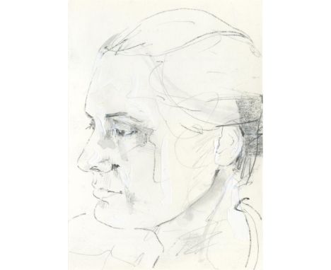
Paul Hodgson Portrait of E, 2021 Pencil and Acrylic on Paper Signed on verso 15 x 10cm (5¾ x 3¾ in.) Paul Hodgson creates hybrid works that incorporate photography, digital print and paint, and that defy neat categorization. His work is indebted to the history of Western painting, and certain of his earlier works reference the colours, lighting, and figurative poses of iconic art historical works, but they are manipulated and restructured to bring to the fore a contemporary reading of the image. Subsequent works have seen Hodgson concentrate on historical epochs of expansion and transition, using the conventions of portraiture and figure painting to construct large-scale tableaux vivant - alongside intimate studio portraits - to explore moments of great change, but also of ambiguous merit. In recent works, he has chosen to use a relatively confined space in which to construct each scene. Working with a set of simple objects, his focus has been the placement and positioning of objects and figures in space (and in front of a camera) as a means to explore notions of gesture and intentionality within the process of image making. These works operate in an area between painting and photography, both in terms of the language that they employ and the process through which they have been made. Paul Hodgson was born in Shrewsbury in 1972 and lives and works in London. 1998 - 2000 M.A. Printmaking. Royal College of Art, London 1991 - 1995 B.A. (Hons) Fine Art. Newcastle University 1990 - 1991 Foundation Art and Design. Shrewsbury College of Art & Technology Selected Group Exhibitions 2020Summer Exhibition, Royal Academy of Arts, London 2016 Discerning Eye, the Mall Galleries, London. Invited by Michael Glover 2014 Beauty by Design: Fashioning the Renaissance, Scottish National Portrait Gallery 2013 Image Search: Photography from the Collection, Pérez Art Museum Miami 2011 Unbounded, Proje4L, Elgiz Museum of Contemporary Art, Istanbul Selected Solo Exhibitions 2010 Paul Hodgson: Art in the Entrance Hall, Cambridge University Library 2008 Rise + Fall, RISE Berlin, Berlin 2007Sovereign Rights, Marlborough Fine Art, London Awards 2010 Director's Visitor, Institute for Advanced Study, Princeton Over the past twenty years I have been represented by Marlborough Fine Art, London, Feigen Contemporary, New York, and Houldsworth, London. I am currently working with an independent dealer in London. About the Postcards I often make works on paper as a way to reconsider motifs that have featured in larger painted and printed works, and to introduce new elements to my art practice. I like the immediacy and fluidity that working on paper can offer - the unexpected results that can occur when you use various media together, or the simplicity of limiting yourself to a few simple materials. These two portraits were made partly from observation and partly from photographs. They might appear as stages in a process - from concise and pared down, to layered and complex. They are indicative of the 'push and pull' that often happens when I'm making images in the studio.
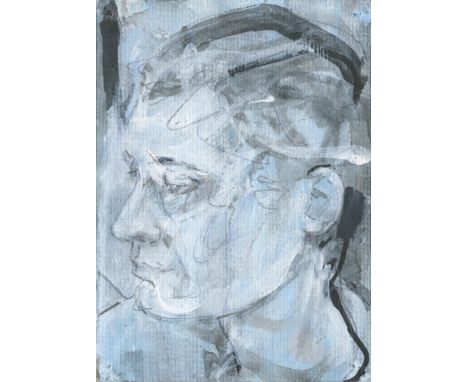
Paul Hodgson Portrait of E.2, 2021 Pencil, Acrylic and Ink on Paper Signed on verso 15 x 10cm (5¾ x 3¾ in.) Paul Hodgson creates hybrid works that incorporate photography, digital print and paint, and that defy neat categorization. His work is indebted to the history of Western painting, and certain of his earlier works reference the colours, lighting, and figurative poses of iconic art historical works, but they are manipulated and restructured to bring to the fore a contemporary reading of the image. Subsequent works have seen Hodgson concentrate on historical epochs of expansion and transition, using the conventions of portraiture and figure painting to construct large-scale tableaux vivant - alongside intimate studio portraits - to explore moments of great change, but also of ambiguous merit. In recent works, he has chosen to use a relatively confined space in which to construct each scene. Working with a set of simple objects, his focus has been the placement and positioning of objects and figures in space (and in front of a camera) as a means to explore notions of gesture and intentionality within the process of image making. These works operate in an area between painting and photography, both in terms of the language that they employ and the process through which they have been made. Paul Hodgson was born in Shrewsbury in 1972 and lives and works in London. 1998 - 2000 M.A. Printmaking. Royal College of Art, London 1991 - 1995 B.A. (Hons) Fine Art. Newcastle University 1990 - 1991 Foundation Art and Design. Shrewsbury College of Art & Technology Selected Group Exhibitions 2020Summer Exhibition, Royal Academy of Arts, London 2016 Discerning Eye, the Mall Galleries, London. Invited by Michael Glover 2014 Beauty by Design: Fashioning the Renaissance, Scottish National Portrait Gallery 2013 Image Search: Photography from the Collection, Pérez Art Museum Miami 2011 Unbounded, Proje4L, Elgiz Museum of Contemporary Art, Istanbul Selected Solo Exhibitions 2010 Paul Hodgson: Art in the Entrance Hall, Cambridge University Library 2008 Rise + Fall, RISE Berlin, Berlin 2007Sovereign Rights, Marlborough Fine Art, London Awards 2010 Director's Visitor, Institute for Advanced Study, Princeton Over the past twenty years I have been represented by Marlborough Fine Art, London, Feigen Contemporary, New York, and Houldsworth, London. I am currently working with an independent dealer in London. About the Postcards I often make works on paper as a way to reconsider motifs that have featured in larger painted and printed works, and to introduce new elements to my art practice. I like the immediacy and fluidity that working on paper can offer - the unexpected results that can occur when you use various media together, or the simplicity of limiting yourself to a few simple materials. These two portraits were made partly from observation and partly from photographs. They might appear as stages in a process - from concise and pared down, to layered and complex. They are indicative of the 'push and pull' that often happens when I'm making images in the studio.

Jules Julien Light Face, 2021 Hand punched drawing on Paper Signed on verso 15 x 10cm (5¾ x 3¾ in.) Jules Julien is an Amsterdam based French artist and illustrator working across many media including digital drawings, patterns, collages, installations and visual storytelling. He uses minimalist concepts to create pictural narrations. His work plays with the meaning of the images, they become symbols creating infinite stories and identities with a great enigmatic charge. Exhibitions Julien's work has been seen through solo exhibitions at Aoyama Diesel Gallery in Tokyo, La Chapelle des Calvairienne in Mayenne, Fontevraud Royal Abbey in Fontevraud, Pumpkin Film in Zürich, Archiginnasio of Bologna, Rise Berlin in Germany, Espaï Tacel in Valencia, Pocko Gallery in London and Labo. Art in Milan and through many group shows. In addition, he created stories for clients such as Apple, Cartier, Cartoon Network, Diesel, Die Zeit, Gardner Museum, GQ Italia, Louis XIII, Netflix, Nike, Seat, Sony, The New Yorker and The New York Times... High school diploma of applied Arts. Bachelor's degree Design GraphicSolo Exhibitions2015 Anatomy of Identity, Archiginnasio, Bologna.2015 Pouvoirs, Fontevraud Royal Abbey, Fontevraud.2015 Encounters, Labo Art, Milan.2015 Encounters, Labo Art, London.2014 Blue Series, Espaï Tactel, Valencia.2013 Blackout, Rise Berlin Gallery, Berlin.2011 Overall Mural, New-York.2010 Aimer mArie, Chapelle des Calvairiennes, Mayenne.2010 Met Jules Julien, Pumpkin Film, Zurich.2009 Cadavres Exquis, Diesel art Gallery, Tokyo. About the postcard artwork Hand-punched, this postcard depicts an ancient Greek bust. More murmured than shouted, the play of light makes the face appear or disappear.
Kate Dunn Don Dada, 2021 Spray Paint and Oil Bar on Paper Signed on verso 15 x 10cm (5¾ x 3¾ in.) Kate Dunn makes work pulling on themes of renaissance, rave, light and sacred space, to create varying environments of worship. Since 2018 she has used structures reminiscent of the altar to discuss the internal archive one experiences when faced with such a shape. Recently she moved into multi-sensory experience as a means to address her concern with the potential to be passive in the age of information overload. Kate uses sight-specific installation and UV reactive materials to manipulate the display of her paintings and create a confrontation with the viewer. In June 2021 she has a solo show, THE TABERNACLE at TJ Boulting and a two-person show, FUGUE with Robert Cooper at The Tub, London. Kate Dunn (Edgware, UK, 1993) is a London based artist. She has studied at Central Saint Martins School of Art and Design, The Florence Academy of Art and City & Guilds of London Art School, where she is now a tutor. 2021 THE TABERNACLE, welcome to pharmakon (solo), TJ Boulting, UK 2021 FUGUE: Robert Cooper x Kate Dunn, The Tub, UK 2020SKIN OF LIGHT (solo), SET Alscot Rd, UK 2020when shit hits the fan, GUTS Gallery, Online 2020The House We Built, London, UK 2019The Discerning Eye Exhibition, Mall Galleries, UK 2019Seen or Seeing, Bethnal Green Railway Arches, UK 2018 Contemporary British Painting Prize, Huddersfield Art Gallery, & Menier Gallery, UK 2018 Great Women Artists x Palazzo Monti Residency, Italy 2018 MA Fine Art Show, City and Guilds of London Art School, UK 2018Interim, City and Guilds of London Art School, UK 2017The Great Women Artists Exhibition, Mother London, UK 2017 The Ruth Borchard Self-Portrait Prize, Piano Nobile Kings Place, UK 2016 The Summer Exhibition, Royal Academy of Arts, UKN/A About the Postcards Through drawing I have been looking into the aesthetics of digital intimacy and digital touch over the past year. What does it feel like to exist intimately in a digital state, how do colour and expression equate through such a medium, and what does this look like when returned to the physicality of the studio. The colours steal from the oversaturation of the screen. The marks imitate those left by our fingers after a session of scrolling. The works question how relationships manifest spatially in this realm; how close or communicative can we be within the formally constructed programs of the digital age. When plugged in how do we burst, scream, hum or do we simply sit static. The works draw their titles from the music listened to around the time of making; they are a continuation of the conversation that began during the creation of FUGUE, a two-person show opening in June with Robert Cooper at The Tub, London.
Kate Dunn Passion - Naked Mix, 2021 Spray Paint and Oil Bar on Paper Signed on verso 15 x 10cm (5¾ x 3¾ in.) Kate Dunn makes work pulling on themes of renaissance, rave, light and sacred space, to create varying environments of worship. Since 2018 she has used structures reminiscent of the altar to discuss the internal archive one experiences when faced with such a shape. Recently she moved into multi-sensory experience as a means to address her concern with the potential to be passive in the age of information overload. Kate uses sight-specific installation and UV reactive materials to manipulate the display of her paintings and create a confrontation with the viewer. In June 2021 she has a solo show, THE TABERNACLE at TJ Boulting and a two-person show, FUGUE with Robert Cooper at The Tub, London. Kate Dunn (Edgware, UK, 1993) is a London based artist. She has studied at Central Saint Martins School of Art and Design, The Florence Academy of Art and City & Guilds of London Art School, where she is now a tutor. 2021 THE TABERNACLE, welcome to pharmakon (solo), TJ Boulting, UK 2021 FUGUE: Robert Cooper x Kate Dunn, The Tub, UK 2020SKIN OF LIGHT (solo), SET Alscot Rd, UK 2020when shit hits the fan, GUTS Gallery, Online 2020The House We Built, London, UK 2019The Discerning Eye Exhibition, Mall Galleries, UK 2019Seen or Seeing, Bethnal Green Railway Arches, UK 2018 Contemporary British Painting Prize, Huddersfield Art Gallery, & Menier Gallery, UK 2018 Great Women Artists x Palazzo Monti Residency, Italy 2018 MA Fine Art Show, City and Guilds of London Art School, UK 2018Interim, City and Guilds of London Art School, UK 2017The Great Women Artists Exhibition, Mother London, UK 2017 The Ruth Borchard Self-Portrait Prize, Piano Nobile Kings Place, UK 2016 The Summer Exhibition, Royal Academy of Arts, UKN/A About the Postcards Through drawing I have been looking into the aesthetics of digital intimacy and digital touch over the past year. What does it feel like to exist intimately in a digital state, how do colour and expression equate through such a medium, and what does this look like when returned to the physicality of the studio. The colours steal from the oversaturation of the screen. The marks imitate those left by our fingers after a session of scrolling. The works question how relationships manifest spatially in this realm; how close or communicative can we be within the formally constructed programs of the digital age. When plugged in how do we burst, scream, hum or do we simply sit static. The works draw their titles from the music listened to around the time of making; they are a continuation of the conversation that began during the creation of FUGUE, a two-person show opening in June with Robert Cooper at The Tub, London.
Kate Dunn Baby's on Fire, 2021 Spray Paint and Oil Bar on Paper Signed on verso 15 x 10cm (5¾ x 3¾ in.) Kate Dunn makes work pulling on themes of renaissance, rave, light and sacred space, to create varying environments of worship. Since 2018 she has used structures reminiscent of the altar to discuss the internal archive one experiences when faced with such a shape. Recently she moved into multi-sensory experience as a means to address her concern with the potential to be passive in the age of information overload. Kate uses sight-specific installation and UV reactive materials to manipulate the display of her paintings and create a confrontation with the viewer. In June 2021 she has a solo show, THE TABERNACLE at TJ Boulting and a two-person show, FUGUE with Robert Cooper at The Tub, London. Kate Dunn (Edgware, UK, 1993) is a London based artist. She has studied at Central Saint Martins School of Art and Design, The Florence Academy of Art and City & Guilds of London Art School, where she is now a tutor. 2021 THE TABERNACLE, welcome to pharmakon (solo), TJ Boulting, UK 2021 FUGUE: Robert Cooper x Kate Dunn, The Tub, UK 2020SKIN OF LIGHT (solo), SET Alscot Rd, UK 2020when shit hits the fan, GUTS Gallery, Online 2020The House We Built, London, UK 2019The Discerning Eye Exhibition, Mall Galleries, UK 2019Seen or Seeing, Bethnal Green Railway Arches, UK 2018 Contemporary British Painting Prize, Huddersfield Art Gallery, & Menier Gallery, UK 2018 Great Women Artists x Palazzo Monti Residency, Italy 2018 MA Fine Art Show, City and Guilds of London Art School, UK 2018Interim, City and Guilds of London Art School, UK 2017The Great Women Artists Exhibition, Mother London, UK 2017 The Ruth Borchard Self-Portrait Prize, Piano Nobile Kings Place, UK 2016 The Summer Exhibition, Royal Academy of Arts, UKN/A About the Postcards Through drawing I have been looking into the aesthetics of digital intimacy and digital touch over the past year. What does it feel like to exist intimately in a digital state, how do colour and expression equate through such a medium, and what does this look like when returned to the physicality of the studio. The colours steal from the oversaturation of the screen. The marks imitate those left by our fingers after a session of scrolling. The works question how relationships manifest spatially in this realm; how close or communicative can we be within the formally constructed programs of the digital age. When plugged in how do we burst, scream, hum or do we simply sit static. The works draw their titles from the music listened to around the time of making; they are a continuation of the conversation that began during the creation of FUGUE, a two-person show opening in June with Robert Cooper at The Tub, London.
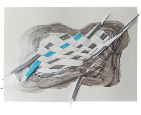
Ilga Leimanis Silver Linings, Warrior Clouds, 2021 Liquid Metal, Ink, Marker, Pastel and Paper on Paper Signed on verso 10 x 15cm (3¾ x 5¾ in.) Ilga Leimanis is a visual artist, educator and author based in London. She studied art history and painting at Concordia University in her native Montreal, Canada and painting and drawing at the Art Academy of Latvia. Ilga works at education institutions such as University of the Arts London and advises companies and organisations internationally in drawing, sketching and creative practice. Ilga's visual arts practice explores contemporary issues of identity, collaboration and inter- disciplinary. In addition to her solo practice, Ilga works collaboratively on two different projects: Ortelius Drew (2008-19) and Architecture of Conversation (2015-present). She is a member of Five Years, and artist-run gallery in London and contributes to its programming. Ilga founded Drawn in London, a monthly urban sketching group in 2007. She is the author of Sketching Perspective published by The Crowood Press (2021), three chapters in Creative Sketching Workshop (2015) and co-author of "Drawing as an Inclusive Practice" in Inclusion and Intersectionality in Visual Arts Education (2019). 2020 Around and Around, Copper Beech Café North Dulwich, London, UK 2019 Excess All Areas, Five Years, London, UK. 2017 Rooted in Limbo, Five Years, London, UK. 2015 Bang Your Head: Architecture of Conversation, Five Years, London, UK. (Architecture of Conversation) 2014popUp & popOFF, flutter_, London, UK. (Ortelius Drew) 2012A Plotted Affair, A Collaboration with Rochelle Fry, Five Years, London, UK. (Ortelius Drew) 2009 Profiles: Friendship in the Digital Age, Gallery Istaba, with interdisciplinary seminar at e-text-textiles, Riga, Latvia. 2008Take Off, Dokhuis Gallery, Amsterdam. (Ortelius Drew) About the Postcards Silver Linings, Warrior Clouds (2021) This new body of work builds on two previous series: 'Excess All Areas' (2019) where I was interested in exploring excess: overflowing vessels pour forth their contents and offer a vehicle to visualise the rhythm and energy of overflow and inundation. 'Around and Around' (2020) was an attempt to visualise journeys into and across slippery spaces. This new work returns to representation, these are recognisably clouds, their volumes punctured with slivers of paper woven into and through the surface. I see these slivers as dynamic lines, swords or daggers: ready to fight, but they can also been seen as mending a whole, the holding together of both sides of the cloud. The clouds and their silver linings represent possibility and hope.
Shezad Dawood Overcast but Beautiful Watercolour on Paper Signed on verso 15 x 10cm (5¾ x 3¾ in.) Shezad Dawood Shezad Dawood works across the disciplines of painting, film, neon, sculpture, performance, virtual reality and other digital media to ask key questions of narrative, history and embodiment. Using the editing process as a method to explore both meanings and forms, his practice often involves collaboration and knowledge exchange, mapping across multiple audiences and communities. Through a fascination with the esoteric, otherness, the environment and architectures both material and virtual, Dawood interweaves stories, realities and symbolism to create richly layered artworks.Shezad Dawood was born in London in 1974 and trained at Central St Martin's and the Royal College of Art before completing his PhD at Leeds Metropolitan University. Dawood is a Senior Research Fellow in Experimental Media at the University of Westminster. He lives and works in London. 2004 - 2008 Leeds Metropolitan University PhD (Fine Art) 2000 - 2003 Royal College of Art, London MPhil Fine Art (Photography) 1998 - 2000 Royal College of Art, London MA Fine Art (Photography) Unit B1, Ink Court 419 Wick Lane London E3 2PW Phone: 0208 880 7690 studio@shezaddawood.com www.shezaddawood.com 1994 - 1997 Central St Martin's College of Art & Design, London BA (Hons) Critical Fine Art Practice (First Class)Recent solo exhibitions include: Timothy Taylor, London (2020-21), Kai Art Center, Tallinn (2020), New Art Exchange, Nottingham (2020), The Bluecoat Liverpool (2019); MOCA Toronto (2019); FriezeLIVE, London (2019); Kunstverein, Munich (2019); A Lost Future: Rubin Museum of Art, New York (2018); Fondazione Querini Stampalia, Venice (2017); Timothy Taylor, London (2016); Galerist, Istanbul (2016); Pioneer Works, Brooklyn (2015); Fig.2 at the ICA studio, London (2015); Parasol Unit, London (2014); Leeds Art Gallery and OCAT Xi'an, China (both 2014), Modern Art Oxford (2012). Group exhibitions include: Guggenheim, New York (2021), Southbank Centre, London (2020-21) Boghossian Foundation - Villa Empain (2020), WIELS Bruxelles (2020), Manifesta 13 (2020), Lahore Biennial (2020), Dhaka Art Summit (2020), Sharjah Biennial 14, UAE (2019) - Jury Prize for Encroachments; Gwangju Biennale, Gwangju, South Korea (2018); Mori Art Museum, Tokyo (2016); Taipei Biennial (2014), Marrakech Biennial (2014), MACBA Barcelona (2014), Witte de With (2013), Busan Biennale (2010), Tate Triennial: Altermodern (2009), and the Venice Biennale (2009). Selected collections include Tate; UBS; LACMA, Los Angeles; National Gallery of Canada; Government Art Collection, UK; US Government Art Collection; The British Museum, London; Sharjah Art Foundation; Kiran Nadar, Delhi; Rubin Museum of Art, New York; and Mathaf, Doha. His film works have been screened internationally, including at the ICA, London; MoMA, New York and at various film festivals including CPH:DOX, Oberhausen, Aesthetica (winner of Artist's Film Prize 2015); his 2013 Feature Film, Piercing Brightness, was released theatrically and on Blu-Ray/DVD by Soda Pictures.Timothy Taylor, London; Jhaveri Contemporary, Mumbai; Barakat Contemporary, Seoul; The RYDER, Madrid. Continuing a series of pencil and watercolour studies drawing on my time spent on Fogo Island in Newfoundland in 2018 and 2019, exploring a convergence of textile traditions, esoterica and the sea.

Shezad Dawood On a Clear Day, 2021 Watercolour on Paper Signed on verso 15 x 10cm (5¾ x 3¾ in.) Shezad Dawood Shezad Dawood works across the disciplines of painting, film, neon, sculpture, performance, virtual reality and other digital media to ask key questions of narrative, history and embodiment. Using the editing process as a method to explore both meanings and forms, his practice often involves collaboration and knowledge exchange, mapping across multiple audiences and communities. Through a fascination with the esoteric, otherness, the environment and architectures both material and virtual, Dawood interweaves stories, realities and symbolism to create richly layered artworks.Shezad Dawood was born in London in 1974 and trained at Central St Martin's and the Royal College of Art before completing his PhD at Leeds Metropolitan University. Dawood is a Senior Research Fellow in Experimental Media at the University of Westminster. He lives and works in London. 2004 - 2008 Leeds Metropolitan University PhD (Fine Art) 2000 - 2003 Royal College of Art, London MPhil Fine Art (Photography) 1998 - 2000 Royal College of Art, London MA Fine Art (Photography) Unit B1, Ink Court 419 Wick Lane London E3 2PW Phone: 0208 880 7690 studio@shezaddawood.com www.shezaddawood.com 1994 - 1997 Central St Martin's College of Art & Design, London BA (Hons) Critical Fine Art Practice (First Class)Recent solo exhibitions include: Timothy Taylor, London (2020-21), Kai Art Center, Tallinn (2020), New Art Exchange, Nottingham (2020), The Bluecoat Liverpool (2019); MOCA Toronto (2019); FriezeLIVE, London (2019); Kunstverein, Munich (2019); A Lost Future: Rubin Museum of Art, New York (2018); Fondazione Querini Stampalia, Venice (2017); Timothy Taylor, London (2016); Galerist, Istanbul (2016); Pioneer Works, Brooklyn (2015); Fig.2 at the ICA studio, London (2015); Parasol Unit, London (2014); Leeds Art Gallery and OCAT Xi'an, China (both 2014), Modern Art Oxford (2012). Group exhibitions include: Guggenheim, New York (2021), Southbank Centre, London (2020-21) Boghossian Foundation - Villa Empain (2020), WIELS Bruxelles (2020), Manifesta 13 (2020), Lahore Biennial (2020), Dhaka Art Summit (2020), Sharjah Biennial 14, UAE (2019) - Jury Prize for Encroachments; Gwangju Biennale, Gwangju, South Korea (2018); Mori Art Museum, Tokyo (2016); Taipei Biennial (2014), Marrakech Biennial (2014), MACBA Barcelona (2014), Witte de With (2013), Busan Biennale (2010), Tate Triennial: Altermodern (2009), and the Venice Biennale (2009). Selected collections include Tate; UBS; LACMA, Los Angeles; National Gallery of Canada; Government Art Collection, UK; US Government Art Collection; The British Museum, London; Sharjah Art Foundation; Kiran Nadar, Delhi; Rubin Museum of Art, New York; and Mathaf, Doha. His film works have been screened internationally, including at the ICA, London; MoMA, New York and at various film festivals including CPH:DOX, Oberhausen, Aesthetica (winner of Artist's Film Prize 2015); his 2013 Feature Film, Piercing Brightness, was released theatrically and on Blu-Ray/DVD by Soda Pictures.Timothy Taylor, London; Jhaveri Contemporary, Mumbai; Barakat Contemporary, Seoul; The RYDER, Madrid. Continuing a series of pencil and watercolour studies drawing on my time spent on Fogo Island in Newfoundland in 2018 and 2019, exploring a convergence of textile traditions, esoterica and the sea.
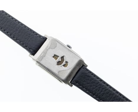
A Swiss Art Deco nickel plated jump hour mechanical digital wrist watch, 1920s-30s, with Adolf Schild AS340 digital jump hour movement, as used in the Rolex Marconi jump hour watch, the three cream and gold rotating round dials with black Arabic numerals, displaying the hours, minutes and seconds through three shaped apertures in the 33 x 25mm. two-piece hinged case, concave back, case no. 110493, on a later black leather strap, the movement marked 'Swiss'. * Mechanical digital jump hour watches were marketed during the 1920s-30s as optimal sports and polo watches, due to their robust design which could withstand heavy use.
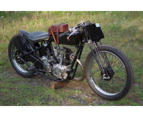
2012/2016 Wadkin-Snaith Brooklands Sprint SpecialTotally artisan built 500cc sprint machine constructed on the lines of a 1920’s Brooklands race bikeThe creation of specialist engineer Carl Wadkin-Snaith over a period of 4 years No castings were used for the engine and gearbox as all components were machined from solid using non C&C machines From the owner: A more complete version of this is available on Easy Live Auction.I selected the Suzuki DR800 engine as a donor for it's huge 90mm stroke and purchased one from a breaker on eBay. The plan was to use a Velocette piston for a long stroke 500cc. But on stripping the engine it turned out to be a 750 with 6mm shorter stroke, at this point my Father unfortunately died and returning the engine was obviously not a priority, so when work started again a Yamaha SR500 piston was selected for 500cc.CAD design work began in April 2012. Much midnight oil was spent with my artist's hat on to arrive at an aesthetically pleasing result, for example the cant of the engine was varied in 2° increments back and forth until I was happy.The DR engine has conventional modern gear primary drive on the right and rotates forward, I needed chain primary on the left to look period correct: As a consequence the engine had to rotate backwards, driving the upside down, flipped over DR gearbox internals in reverse for forward motion! It all sounds a little unlikely, but the gearbox dogs are not undercut and I'm relieved to say it all worked fine.Metal cutting began in late June 2012, no castings are used, everything carved from solid billet on my manual milling machines and lathes (no CNC). A vast amount of time was spent hand finishing the billetparts which I then bead blasted to give the illusion of castings. Much of the really tricky machining, of crankcase webs for example, was done on my trusty pre-WW2 Alexander Master Toolmaker milling machine, whereas the heavier work was completed on my large turret mill.After discovering period racing bike experiments with total loss battery ignition, it was decided to have the ignition on the end of the cam and drive the oil pump from the cam wheel. This pump is my own design; a simple feed and scavenge gear type. There are feeds to the end of the crankshaft and the camshaft/follower interface, scavenge from the bottom of the crankcase and the timing cover, the latter prevents excess oil leaking past the seal onto the digital ignition circuit board. I used the Pazon digital ignition; a very impressive unit with built in timing light and digital advance etc.I decided to go with the Mikuni Yamaha SR500 race carburettor as I hoped this would avoid aggravation setting up, this proved to be the case, only needing a change of pilot jet.The clutch was converted to chain driven dry operation by cutting off the primary drive gear and replacing it with a custom made sprocket incorporating the DR shock absorbing springs. The DR lifting mechanism is in the clutch cover, pulling the clutch off and obviously not suitable. By drilling right though the gearbox mainshaft I was able to convert the clutch to push off from the opposite side in the conventional manner. Despite now running dry the clutch works fine. Replicating the complex die cast interior of the Suzuki gearbox casing was probably the most difficult task in the whole construction saga. Initially I set the bike up with hand/knee change, partly because I had a nice piece of teak to make the knob; more on this later.The frame is my own design and manufacture and aimed at spinning the wheel rather than wheelying. I took a punt at the unidentified bare girder fork blades on eBay after no one showed interest, these were then bushed and a stem, spindles, links, yokes, steering damper etc made to suit. The spring is a modified auto jumble find. I bent the handlebars myself for the authentic Brooklands style, this proved to be a mistake as they were incredibly uncomfortable and impractical, they have since been replace with some flat bars. I was not happy with the quality of commercial classic style throttle and handlebar controls, the chrome plate just looked totally wrong too so I carved the clamps, choke control and a quick action throttle from billet steel. None period ball end levers are necessary to comply with ACU Regs.Front wheel is a from a Yamaha DT50 (21” rim) though I made a new period style backplate with anchor to suit my forks, plus an aluminium brake lever. Rear hub is from a Honda CB250RSA, much modified and laced into a 19” rim. Chainguards made to suit, the primary one having a quickly detachable outer plate as this is required for ACU competition events. I bent up the exhaust pipe with the characteristic large radius front bend myself and made the Brooklands can as the ones available just weren't right for the period, theoretically this should not protrude beyond the rear wheel for ACU sprints, though no one has noticed yet.The oil tank was a piece of cake compared to the petrol tanks: Fortunately only the right one needed to be leak free as the left is a dummy containing the Pazon ignition module, coil, ignition switch and gel battery (mounted upside down) for the total loss system. As a result the whole electrical system can be removed as one unit in minutes.This is secured with a couple of charity shop sourced leather belts.Apart from the exhaust pipe and handlebars I dull nickel plated everything myself. Fasteners are all stainless steel, the heads of commercial bolts were machined flat to be more in keeping with my period. Naturally I used slotted screws and traditional fabricinsulation tape where necessary.Since then I've refined various features, added an oil filter in the scavenge return and making primary chain adjusters. At the Brooklands Museum the bike flies up Test Hill, in fact the wide ratio DR750 gear set is ideally suited to the engine.The bike has proved an ideal publicity vehicle for my one man business resulting in some interesting projects, for example:A commission to design and build the new vintage style Wardill Motorcycle, subsequently officially launched at the Brooklands Museum in 2018, I recently completed the first production model. A one off fishtail silencer for the Perry Barwick/Brooklands Museum Freddie Clarke Triumph Tiger 80 replica, created using the only existing photo of the bike. A new billet front brake back plate incorporating improvements for a Parilla 175 MSDS racer.My Brooklands SS has been exhibited at two shows and won an award at both. It is always satisfying when older enthusiasts are thrown by the bike believing it to a genuine 20's racer, however when an auction house valuer said he could see it on display in a collector's house as a work of art I was delighted. I wonder what my Art School tutors would have thought?
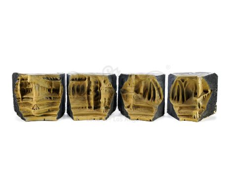
This lot will be auctioned on Tuesday, June 29th. The auction will begin at 9:00am PDT and lots are sold sequentially via live auctioneer; tune in to the live streaming broadcast on auction day to follow the pace. Note other lots in the auction may close on June 30th or July 1st. An execution arena design maquette from George Lucas' Star Wars: Attack of the Clones. In the Battle of Geonosis, the Jedi faced off against Separatist forces in a Geonosian execution arena. This design maquette was created by Industrial Light & Magic (ILM) to help the production design team and art department establish the environment of the massive arena. The sequence was then brought to life with physical model miniatures as well as digital sets. This detailed foam maquette is split into four sections numbered "3" through "6" and marked "SE," "S," "SW," "W," and "NW" on top for their positions in the digital arena. The front of each piece is ornately sculpted, cast in dense foam and painted tan to resemble cavernous, carved stone, while their backs are all painted black. The maquette is in good overall condition with exposed foam, flaking paint, and scuffs throughout from production and age. Dimensions: 18" x 14" x 7" (45.75 cm x 45.75 cm x 18 cm) δ Estimate: $6,000 - 8,000
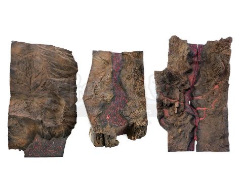
This lot will be auctioned on Tuesday, June 29th. The auction will begin at 9:00am PDT and lots are sold sequentially via live auctioneer; tune in to the live streaming broadcast on auction day to follow the pace. Note other lots in the auction may close on June 30th or July 1st. A Mustafar planet surface design maquette from George Lucas' Star Wars: Revenge of the Sith. After murdering the Separatist Council on the volcanic planet Mustafar, Anakin Skywalker (Hayden Christensen) fell in a lightsaber duel with his former master, Obi-Wan Kenobi (Ewan McGregor). This design maquette was created by Industrial Light & Magic (ILM) to help the production design team and art department establish the look of the molten planet's surface. It also represents the site near two small lava streams where the epic duel concluded, as Obi-Wan informed Anakin that he had the high ground. The sequence was then brought to life with a combination of live-action stunt work, digital environments effects, and physical model miniatures. This large foam and paper composite maquette is split into four sections, each of which is ornately molded and painted brown and gray to resemble craggy, mountainous stone with red and black lava running underneath. The maquette is in good overall condition with exposed foam, flaking paint, and scuffs throughout from production and age. Dimensions (each): 18" x 17" x 5" (45.75 cm x 43.25 cm x 12.75 cm) Estimate: $8,000 - 10,000
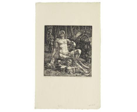
WILLIAM EVAN CHARLES MORGAN (1903-1979)Perseus Engraving, 1929, on cream laid paper, signed, dated, titled and numbered 6/70 in pencil, the full sheet; together with two other engravings, The Source, 1927, signed, dated, titled and numbered 15/50 in pencil; Nymphs Bathing, 1928, signed, dated, titled and numbered 2/83 in pencil, each on laid paper, in good condition (3)Plate 220 x 207mm. (8 5/8 x 8 1/8in.); Sheet 462 x 284mm. (18 1/4 x 11 1/4in.)Footnotes:William Morgan studied at Camberwell School of Art and the Slade. He was a key figure in the revival of interest in engraving in the 1920s and was awarded the 1924 Prix de Rome, spending four years in Italy perfecting his technique. Inspired by Renaissance engravings, particularly the work of Durer, he produced a series of allegorical subjects, including Perseus which is considered to be his masterpiece.The Source depicts the imaginary guardian of the spring of life in an enchanted forest and was selected as the artist's exhibition piece at the Royal Academy in 1928. In Nymphs Bathing he depicts three figures from three different viewpoints, doubtless influenced by the figures he would have seen in Italian paintings where the artists displayed their skill in rendering different aspects of the human form within the same image.Click for an instant shipping quoteThis lot is subject to the following lot symbols: * AR* VAT on imported items at a preferential rate of 5% on Hammer Price and the prevailing rate on Buyer's Premium.AR Goods subject to Artists Resale Right Additional Premium.For further information on this lot please visit Bonhams.com
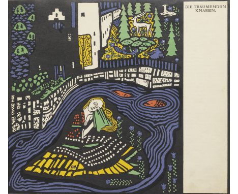
OSKAR KOKOSCHKA (1886-1990)Die Träumenden Knaben (The Dreaming Youths) (Wingler & Welz 22-29) The volume comprising ten lithographs (eight in colours), 1908, on wove paper, signed, dated 1967 and dedicated to Greta in pencil on the front free endpaper, numbered 183 in ink on the justification label, from the second edition of 275 copies, published in 1917 by Kurt Wolff, Leipzig, Germany, the full sheets, with pale time staining, the colours fresh and vibrant, in good overall condition, bound (as issued), with title page, text in German, within the original hessian-covered boards with lithograph in black on the front cover and black slipcaseSheets 240 x 290mm. (9 1/2 x 11 3/8in.); Volume 243 x 298mm. (9 1/2 x 11 3/4in.)Footnotes:ProvenanceGifted by the artist to Margaret Fisher.Thence by descent to the current owner.Kokoschka was a major exponent of the Expressionist movement in Austria and was one of the great colourists of the twentieth century. Die Träumenden Knaben was his first graphic work and marks an important moment early in his career, not just as a landmark illustrated artist's book, but also representing a period of transition between the traditional Viennese ornamental style and the more emotionally charged and unconventional Expressionist style, employing intense colours and distorted figures. The work combines several of the artists' influences; medieval art where several scenes are shown within one image, folk art with its bold, flat colours, Japanese art in the use of black outlines and the intricate highly decorative imagery of Secessionist Art. The work was commissioned by Fritz Wärndorfer, the Director of the Wiener Werkstätte design cooperative, for the Kunstschau arts and handicrafts exhibition in Vienna 1908, organized by Kokoschka's friend and mentor Gustav Klimt, to whom the work is dedicated. The commission had been intended as a children's fairy-tale. However, inspired by his unrequited love for Lilith, a fellow student, Kokoschka took the liberty of producing rather more adult content to accompany his poem about a young boy's dream, in which youths travel through various exotic landscapes. The poem and images reference the awakening of adolescent sexuality which was regarded as inappropriate and very few of the 500 copies were sold. In 1917 the Wiener Werkstätte publisher, Kurt Wolff, recognizing the importance of the work in the context of the Expressionist movement and seeing that Kokoschka's reputation was in the ascendant, bought the remaining 275 copies of the book and re-issued it as a bound volume.The words and images express powerful personal emotions and Kokoschka later referred to the book as 'my first love letter'. This passion for his subject, together with his dramatic use of colour and composition, mean that this is considered to be one of the most important and beautiful artist's books of the twentieth century.This copy has a handwritten dedication to Margaret Fisher (known as Greta), who worked for her aunt, Lea Bondi-Jaray, one of the foremost dealers in Expressionist Art, first at the Galerie Würthle in pre-war Vienna and later in London, having fled the Nazi occupation in 1939.Click for an instant shipping quoteThis lot is subject to the following lot symbols: ARAR Goods subject to Artists Resale Right Additional Premium.For further information on this lot please visit Bonhams.com
Andy Warhol (1928-1987)Wrapping Paper (not in Feldman & Schellmann) Offset lithograph with hand-colouring, 1957, on wove paper, with the Estate of Andy Warhol and Andy Warhol Art Authentication Board Inc. stamps verso, with initials T.J.H. and number PM.24.0006 in pencil on the reverse, from an edition of unknown size, the full sheet, the pink attenuated, framed Sheet 737 x 584mm. (29 x 23in.)Footnotes:ProvenanceSotheby's Contemporary Art Day Sale, London, 27 June 2002, lot 287.Acquired from the above sale by the current owner.Click for an instant shipping quoteFor further information on this lot please visit Bonhams.com

Lucian Freud (1922-2011)Head of Bruce Bernard (Hartley 26) Etching, 1985, on cream Arches wove paper, signed with initials and inscribed 'trial proof' in pencil, a proof aside from the edition of fifty (there were also 15 artist's proofs), printed by Palm Tree Studios, co-published by James Kirkman, London, and Brooke Alexander, New York, 1986, the full sheet, in very good condition, framedPlate 295 x 295mm. (11 5/8 x 11 5/8in.); Sheet 506 x 467mm. (19 7/8 x 18 3/8in.)Footnotes:ProvenanceJames Kirkman, London. Desmond Page Limited, London.Timothy Taylor Gallery, London. Rex Irwin, Woollahra, Australia.Purchased from the above by the current owner.ExhibitedLucian Freud: Works on Paper, 1988-89, Arts council/Southbank Centre, LondonTouring Exhibition: Hayward Gallery, London; Ashmolean Museum, Oxford; The Fruitmarket Gallery, Edinburgh; Ferens Art Gallery, Hull; Walker Art Gallery, Liverpool; Royal Albert Memorial Museum, Exeter; and The Fine Arts Museums of San Francisco (illustrated in catalogue)Click for an instant shipping quoteThis lot is subject to the following lot symbols: * AR* VAT on imported items at a preferential rate of 5% on Hammer Price and the prevailing rate on Buyer's Premium.AR Goods subject to Artists Resale Right Additional Premium.For further information on this lot please visit Bonhams.com

William Kentridge (born 1955)Reeds (Krut pp. 54-55) Etching and aquatint with drypoint printed in black and red with hand-colouring in pastel, 1996, on wove paper, signed, dated and numbered 5/40 in pencil, published by David Krut Fine Art, London, the full sheet, in very good condition, framed Sheet 1186 x 1575mm. (46 3/4 x 62in.)Footnotes:ProvenanceDavid Krut Fine Art, London.Acquired directly from the above by the current owner.Click for an instant shipping quoteThis lot is subject to the following lot symbols: * TP* VAT on imported items at a preferential rate of 5% on Hammer Price and the prevailing rate on Buyer's Premium.TP Lot will be moved to an offsite storage location (Cadogan Tate, Auction House Services, 241 Acton Lane, London NW10 7NP, UK) and will only be available for collection from this location at the date stated in the catalogue. Please note transfer and storage charges will apply to any lots not collected after 14 calendar days from the auction date.For further information on this lot please visit Bonhams.com
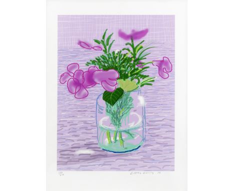
David Hockney (born 1937)Untitled No.329, from A Bigger Book: Art Edition A iPad drawing in colours, 2010/2016, printed on archival paper, signed, dated and numbered 130/ 250 in pencil, co-published by the artist and Taschen, Berlin, with their blindstamp, the full sheet, in very good condition, with the original blue fabric-covered portfolio, together with the publication A Bigger Book, copy number 130, and the accompanying Marc Newsom stand, the iPad drawing framedImage 439 x 330mm. (17 x 13in.); Sheet 559 x 432mm. (22 x 17in.)Footnotes:Click for an instant shipping quoteThis lot is subject to the following lot symbols: ARAR Goods subject to Artists Resale Right Additional Premium.For further information on this lot please visit Bonhams.com
CHAE KYUNG (KOREAN, B.1981) - CELL PHONE 2008 X-ray photography and Chinese ink, mounted on hanging scroll With artists seal lower right From the 'Ghost in the Machine' series Sold with certificate of authenticity 99cm x 40cm Condition: No obvious condition issues Additional Information: About the artist: Kyung Chae attempts to arrange a marriage of polarities: painting and photography, East and West, traditional and modern, analog and digital, science and art. Through these marriages, she aims to inspire a new way of introspection into our modern world of technology. She humanizes technology and uses an interesting mix of mediums such as x-ray photography, Korean paper and ink to explore the obscure organic nature in technological objects; just like organs being parts of a body, it is the same with the mechanisms of a technological gadget.
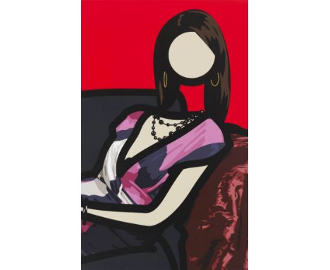
Julian Opie - - 1958 London - lebt und arbeitet in London IKA 4.2011. 2011. Inkjet auf Leinwand. Auf der umgeschlagenen Leinwand signiert. Unikat. 192 x 119 cm (75,5 x 46,8 in). • Großformatiges Anti-Porträt des britischen Meisters der Entindividualisierung. • Julian Opie war u. a. 2000 in der legendären ersten Ausstellung der Reihe 'New British Art' in der Tate Britain, London, vertreten. • Opie wird u. a. von der Lisson Gallery, London/New York, und der Opera Gallery, London, vertreten. • Arbeiten Opies befinden sich u. a. in den Sammlungen des Museum of Modern Art, New York, dem Victoria and Albert Museum, London, und dem Stedelijk Museum, Amsterdam. PROVENIENZ: Lisson Gallery, London/New York (auf dem Keilrahmen mit dem Etikett). Privatsammlung Rheinland (vom Vorgenannten erworben). 'Looking at older art led to collecting it. Not just to contemplate but to learn from, I think learning from art is an essential part of making it. Reynolds said he’d give up everything to own a good Titian.' Julian Opie, zit. nach: Julian Opie, Ausst.-Kat. Lisson Gallery, London, 15.10.–15.11.2008, o. S. Für seine stark stilisierten Werke nutzt Julian Opie, bedeutender Vertreter der New British Art, Fotografien als Grundlage, die er digital bearbeitet. Durch die Eliminierung aller überflüssigen Details vereinfacht er seine Motive auf das Wesentliche und entwickelt auf diese Weise die für ihn charakteristische, reduzierte und sehr präzise Formensprache. Opie bedient sich dabei verschiedenster Medien: Neben Serigrafien und Gemälden erstellt er auch animierte LCD- und LED-Arbeiten, die auf Flachbildschirmen oder Displays präsentiert werden. Wunderbar ist im vorliegenden Gemälde Opies radikale Auseinandersetzung mit der kunstgeschichtlichen Tradition der Porträtmalerei zu erkennen. Indem Opie uns die Dargestellte in der klassischen Pose eines Brustbildes gegenüberstellt und lediglich Schmuck und Kleidung in wiedererkennbarer Detailgenauigkeit wiedergibt, während er die individuellen Züge der dargestellten Person konsequent ausklammert und das Gesicht als leere Kreisform wiedergibt, thematisiert der Künstler elementare Fragestellungen: Was macht uns und unsere, gerade in der zeitgenössischen kapitalistischen Gesellschaft, vielbeschworene Individualität letztlich aus? Was ist besonders, was austauschbar? Opie ist mit dem vorliegenden Gemälde ein meisterhaftes Paradoxon gelungen, ein Porträt, das von der Dargestellten nur eine zeichenhaft entindividualisierte Hülle zeigt und sich damit dem zentralen Charakteristikum des traditionsreichen malerischen Genres radikal verweigert. In besonderer Weise irritierend ist darüber hinaus der fehlende Hals, der eine Art Durchblick durch den transparenten Menschen auf das eigentlich dahinter verborgene Sofa freigibt und durch diesen Verfremdungseffekt spielerisch thematisiert, dass wir hier keinen Menschen, sondern eben nur eine leere und damit austauschbare Hülle vor uns haben. Opie hat mit seinen berühmten Comic-artigen und oftmals gesichtslosen Darstellungen Tendenzen weiterentwickelt, die bereits in der Kunst der amerikanischen Pop-Art, vor allem in den augenlosen Wesselmann-Akten angelegt waren, und damit zu seiner ganz eigenen, charakteristischen künstlerischen Handschrift gefunden. Opie war u. a. im Jahr 2000 auf der legendären ersten Ausstellung der dreiteiligen Ausstellungs-Folge 'New British Art' in der Tate Britain, London, vertreten. 1995 wird Opie zum Ehrenmitglied der 'British School at Rome' ernannt. Im Jahr 2001 wird er mit dem 'Best illustration award' der Music Week CADS für die Gestaltung eines Albumcovers der britischen Band Blur ausgezeichnet. Julian Opie ist mit seinen Arbeiten weltweit in zahlreichen renommierten Museen vertreten, darunter die Tate Gallery, London, das Museum of Modern Art, New York, und das Stedelijk Museum, Amsterdam. [JS] Aufrufzeit: 18.06.2021 - ca. 20.00 h +/- 20 Min. Dieses Objekt wird regel- oder differenzbesteuert angeboten.ENGLISH VERSIONJulian Opie -1958 London - lebt und arbeitet in London IKA 4.2011. 2011. Inkjet on canvas. Signed on the reverse. Unique work. 192 x 119 cm (75.5 x 46.8 in). • Large-size anti-portrait by the British master of de-individualization. • Julian Opie was part of the legendary first show of 'New British Art' at Tate Britain, London in 2000. • Opie is represented by, among others, Lisson Gallery, London/New York and Opera Gallery, London. • Works by Opie are part of, among others, the collections of the Museum of Modern Art, New York, the Victoria and Albert Museum, London, and the Stedelijk Museum, Amsterdam. PROVENANCE: Lisson Gallery, London/New York (with the label on the stretcher). Private collection Rhineland (acquired from above). 'Looking at older art led to collecting it. Not just to contemplate but to learn from, I think learning from art is an essential part of making it. Reynolds said he`d give up everything to own a good Titian.' Julian Opie, quote from: Julian Opie, ex. cat. Lisson Gallery, London, October 15 - November 15, 2008, no p. Julian Opie, an important representative of New British Art, uses photographs as a basis for his highly stylized works, which he processes digitally. By eliminating all unnecessary details he simplifies his motifs to the essentials and thus develops the reduced and very precise formal language characteristic of him. Opie uses a wide variety of media: In addition to serigraphs and paintings, he also creates animated LCD and LED works that are presented on flat-screen TV or on displays. In the present painting Opie's radical examination of the art-historical genre of portrait painting becomes quite obvious. By contrasting us with the sitter in the classic pose of a half length portrait and at the same time only rendering jewelry and clothing in recognizable detail, while excluding any individual traits of the depicted person and showing the face only as an empty circular shape, the artist addresses elementary issues: What ultimately defines us and our individuality, which is so strongly emphasized in today‘s capitalist society? What is special, what is interchangeable? With this painting offered here Opie has succeeded in creating a masterful paradox, a portrait that only shows a symbolically de-individualized shell of the sitter and thus radically rejects the central characteristic of the traditional painterly genre. What is particularly irritating is the missing neck, which allows a view through the transparent person onto the sofa that is actually hidden behind it and, through this alienation effect, playfully shows us that we are not dealing with a real person here, but just an empty and thus replaceable shell. With his famous comic-like and often faceless depictions Opie develops tendencies that we already find in American Pop Art, especially in Wesselmann‘s eyeless nudes, and thus he attained his very own signature style. Opie was represented, among others, in the legendary first exhibition of the three-part exhibition series 'New British Art' at Tate Britain, London in 2000. In 1995 Opie became honorary member of the “British School at Rome“. In 2001 he received the 'Best Illustration Award' from Music Week CADS for designing an album cover for the British band Blur. Julian Opie's work is represented in numerous renowned museums around the world, including the Tate Gallery London, the Museum of Modern Art, New York, and the Stedelijk Museum, Amsterdam. [JS] Called up: June 18, 2021 - ca. 20.00 h +/- 20 min. This lot can be purchased subject to differential or regular taxation.
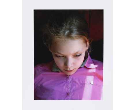
Gerhard Richter - - 1932 Dresden - lebt und arbeitet in Köln Ella. 2014. Digital Fine Art-Druck. Butin 163 (online). Signiert und nummeriert. Auf Fotopapier. 54,5 x 44 cm (21,4 x 17,3 in), Blattgröße. Das gleiche Motiv hat Richter 2007 in Öl ausgeführt (WVZ 903-1). [SM]. • Aus einer kleinen Auflage. • Selten auf dem internationalen Auktionsmarkt angeboten. • Das gleiche Motiv hat Richter in Öl ausgeführt. Aufrufzeit: 19.06.2021 - ca. 16.24 h +/- 20 Min. Dieses Objekt wird regel- oder differenzbesteuert angeboten.ENGLISH VERSIONGerhard Richter -1932 Dresden - lebt und arbeitet in Köln Ella. 2014. Digital Fine Art-Print. Butin 163 (online). Signed and numbered. On photo paper. 54.5 x 44 cm (21.4 x 17.3 in), size of sheet. Richter executed the same motif in oil in 2007 (catalog raisonné 903-1). [SM]. • From a small edition. • Very rare on the international auction market. • Richter executed the same motif in oil. Called up: June 19, 2021 - ca. 16.24 h +/- 20 min. This lot can be purchased subject to differential or regular taxation.
Mika Tajima - - 1975 Los Angeles - lebt und arbeitet in New York Negative Entropy (Edward J Darby & Son Inc., Pennsylvania Wire Works, Double). 2014. Mischtechnik. Gewebte Baumwolle, Wolle, Filz und Holz. 137 x 99 cm (53,9 x 38,9 in). Tajimas Arbeiten der Werkserie 'Negative Entropy' bestehen zu großen Teilen aus Materialien, die auch für die Schalldämmung verwendet werden. Für ihre Arbeiten lässt Tajima bei Textilfabriken Aufnahmen von Produktionsgeräuschen machen, die anschließend mithilfe einer speziellen Software in digitale Spektrogrammbilder umgewandelt werden. Den Wellenformen werden verschiedene Farben zugewiesen und von einem Webtechniker in ein Muster übersetzt, um schließlich das auch hier sichtbare sogenannte Jacquard-Gewebe zu erzeugen. So sind die Arbeiten sowohl Kunstwerke als auch materielle Dokumentationen ihrer eigenen Herstellung. PROVENIENZ: 11R Gallery, New York. Privatsammlung Großbritannien (vom Vorgenannten erworben). Aufrufzeit: 19.06.2021 - ca. 19.05 h +/- 20 Min. Dieses Objekt wird differenzbesteuert, zuzüglich einer Einfuhrumsatzabgabe in Höhe von 7 % (Ersparnis von etwa 5 % im Vergleich zur Regelbesteuerung) oder regelbesteuert angeboten (N).ENGLISH VERSIONMika Tajima -1975 Los Angeles - lebt und arbeitet in New York Negative Entropy (Edward J Darby & Son Inc., Pennsylvania Wire Works, Double). 2014. Mixed media. Cotton, wool acoustic baffling felt, and wood. 137 x 99 cm (53.9 x 38.9 in). Tajima's works in the series 'Negative Entropy' consist largely of materials that are also used for sound insulation. For his work, Tajima has recordings of production noises made at textile mills, which are then converted into digital spectrogram images with the help of special software. Different colors are assigned to the waveforms and translated into a pattern by a weaving technician in order to finally create the so-called jacquard fabric, which is also visible here. They are both works of art and material documentation of their own production . PROVENANCE: 11R, New York Private Collection, UK, acquired from the above. Called up: June 19, 2021 - ca. 19.05 h +/- 20 min. This lot can be subjected to differential taxation plus a 7% import tax levy (saving approx. 5 % compared to regular taxation) or regular taxation (N).
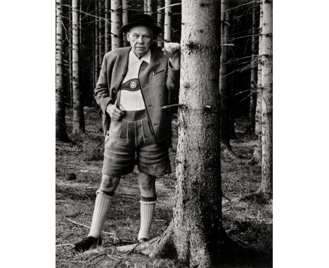
Moses, Stefan -- Oskar Maria Graf, Berg, from the series "Grosse Alte im Wald". 1964/printed circa 2000. Large-format digital art print. 59,8 x 50 cm. Signed, annotated and dated by the photographer in blue crayon and photographer's stamp on the verso.Slightly buckled, otherwise in very good condition. Lit.: Ulrich Pohlmann/ Matthias Harder (eds.). Stefan Moses. Die Monographie. Munich 2002, ill. from the same series p. 97.
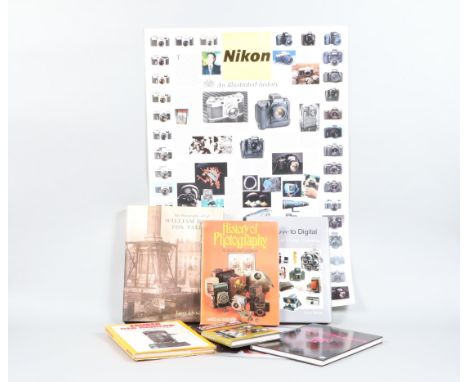
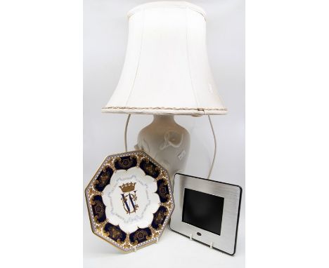
Camera History Books. The Photographic Art of William Henry Fox Talbot by Larry J. Schaaf, From Daguerre to Digital 150 Years of Classic Cameras by John Wild, History of Photography Techniques and Equipment by Camfield and Deirdre Wills, Nikon F. The Camera by Uli Koch, Zeiss Ikon Cameras 1926-39 by D.B. Tubbs, a German language camera history book, Zauber Der Kamera, a Nikon Illistrated History poster and a 2002 Photographic Collectors club wall callender
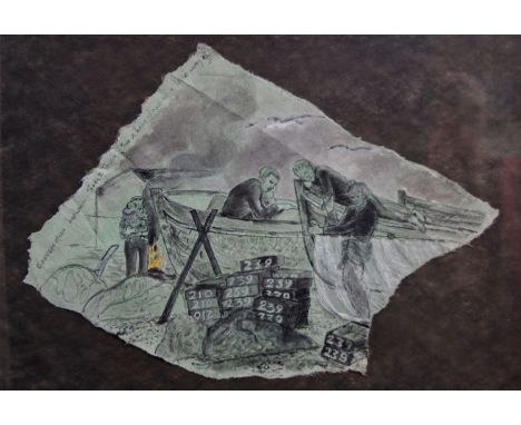
Laetitia Yhap (b.1941) Conversation, 1981 Liquitex on printed Vilene 58 x 76 cm Hastings Museum and Art Gallery is celebrating Laetitia Yhap’s 80 years of ‘Vital Life’ and work this year with an exhibition of her paintings and drawings chronicling the working lives of the town’s fisherman.* Born in London during the Blitz to an Austrian mother and Chinese father, Yhap studied at Camberwell School of Arts and Crafts and in 1962 travelled to Italy for a year on a Leverhulme Scholarship studying Renaissance art and architecture. On her return, she was a postgraduate student at the Slade School of Fine Art in London before moving to Hastings. She recalls: “I had arrived in Hastings in 1967 and was making large scale watercolour and tempera paintings which excluded the human presence. For me the only way to understand the extraordinary world and work of the fishermen, was to do it the slow way by drawing from direct observation out of doors. I did not possess a camera and it would not have occurred to me to use one. The first 18 months of research was spent entirely and exclusively drawing. Later, as I became familiar with the scene, I made paintings and more complete drawings could be developed. It was always important to me that the people I depicted were recognisable.” Yhap is represented in public collections including the Arts Council of Great Britain, the British Council, the Contemporary Art Society, the Government Art Collection, Hastings Museum and Art Gallery, Hove Museum and Art Gallery, New Hall Cambridge, the Nuffield Foundation, Rugby Museum, South East Arts Collection, Tate, Unilever, University College London and the Walker Art Gallery in Liverpool. * My Vital Life: Laetitia Yhap at 80 at the Hastings Museum & Art Gallery. The Covid-19 pandemic necessitated a digital version of the exhibition and the artist’s gallery tour can be viewed on the website. However, now selected watercolour paintings and drawings will be on view in Museum’s Walkway Gallery until 2 January 2022.
Amer Shomali (Kuwait, born 1981)Broken Weddings in Salameh 729 DMC spools mounted on aluminium and woodexecuted in 2018125 x 125cm (49 3/16 x 49 3/16in).Footnotes:'I reconstructed the details of dresses from several depopulated villages using balls of yarn. I replaced each stitch with a whole new ball that was never used to embroider any piece... Dresses that were not embroidered, broken weddings, unperformed songs, unbuilt homes, unborn children.The balls of yarn are aligned like gravestones, like bags of corpses after a disaster, like abandoned beehives, like dried wells.Threads unable to liberate themselves from their balls to say what they have to say... Broken weddings, witnesses of the possibilities of lives that were amputated in 1948'- Amer ShomaliTO BE SOLD FOR THE BENEFIT OF THE INASH ASSOCIATIONProvenance:Property from a private collection, DubaiNote:Proceeds from the sale of the present lot will benefit the Inash AssociationAmer ShomaliAmer Shomali is a Palestinian multidisciplinary artist, using painting, films, digital media, installations and comics as tools to explore and interact with the sociopolitical scene in Palestine. Much of Shomali's work examines the creation and the use of the Palestinian revolution's iconography.His art works are part of several collections: The British Museum, The Arab World Institute, Barjeel Art Foundation, The Samawi collection, The Museum of Manufactured Response to Absence (MoMRtA), Birzeit University Museum, and the Al-Qattan Foundation. Shomali co-directed an award winning animated documentary, The Wanted 18, which premiered at the Toronto International Film Festival in 2014. Born in Kuwait in 1981, Shomali holds a BSc in Architecture from Birzeit University in Palestine, and a Master's degree in Animation from Bournemouth University in the United Kingdom. He is currently based in Ramallah, Palestine. teaching at the Faculty of Art, Music and Design at Birzeit University. The Inash AssociationFor 50 years Inaash has provided opportunities for thousands of women to earn income and provide needed financial support for their families.Skill, beauty and empowerment through the point of a needle. Maximizing employment opportunities for female artisans one stitch at a time, by producing high quality, hand made traditional embroidery.Nearly one-third of the registered Palestine refugees, more than 1.5 million individuals, live in 58 recognized Palestine refugee camps in Jordan, Lebanon, the Syrian Arab Republic, the Gaza Strip and the West Bank, including East Jerusalem. Currently Lebanon hosts close to 450,000 Palestinian refugees in 12 camps. Conditions for the communities living in refugee camps in Lebanon are notoriously difficult. Throughout the last five decades Inaash has worked to both preserve this culture and harness it as a means of livelihood for its practitioners in some five camps located across Lebanon. Since inception, over 2,000 women benefited from the production of Inaash products, both in monetary terms and through a sense of community and continuity. Successive generations have passed on the skill from mother to daughter. Their work with Inaash and the ancillary services it provides have had a positive impact not just on the women but on their families.This lot is subject to the following lot symbols: ** VAT on imported items at a preferential rate of 5% on Hammer Price and the prevailing rate on Buyer's Premium.For further information on this lot please visit Bonhams.com
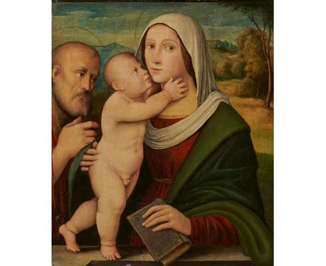
FRANCIA, GIACOMOBologna 1486 - 1557Titel: Heilige Familie. Technik: Öl auf Holz. Maße: 63,5 x 51,5cm. Rahmen/Sockel: Rahmen. Provenienz:Privatbesitz, Deutschland.Giacomo Francia wurde 1486 geboren und war der älteste Sohn des berühmten Bologneser Malers Francesco Raibolini, genannt Francia, sowie der Bruder von Giulio, der ebenfalls Maler war. Francesco Francia weihte seine beiden Söhne in die Kunst der Malerei ein und Giacomos Stil (wie auch der seines Bruders) wurde dem seines Vaters so ähnlich, dass sein Mitwirken in den komplexen Kompositionen Francias nicht immer eindeutig herauszulesen ist. Das vorliegende Gemälde zeigt eine klassische Andachtsdarstellung der Heiligen Familie, welche Francesco Francia in vielen Variationen anfertigte und sein Sohn somit sehr genau studieren sowie in sein Bildvokabular aufnehmen konnte. Die Zuschreibung des vorliegenden Gemäldes an Giacomo resultiert aus der Solidität und Robustheit der Figuren in Verbindung mit einer Vereinfachung der Formensprache, die ihn von der raffinierteren und akribischeren Manier seines Vaters unterscheidet. Obwohl der Duktus des Künstlers streckenweise unsicher erscheint, zeichnet sich die Tafel durch eine saubere und ruhige Ausführung aus, welche sich auch in ihrem guten Erhaltungszustand widerspiegelt.Wir danken Daniele Benati, Bologna, der die Zuschreibung des vorliegenden Gemäldes auf Grundlage einer hochauflösenden Digitalfotografie bestätigt hat.Erläuterungen zum KatalogGiacomo Francia Italien 16.Jh. Originale Religiöse Darstellung Andachtsbild Leben Christi FRANCIA, GIACOMOBologna 1486 - 1557Title: Holy Family. Technique: Oil on Wood. Measurement: 63,5 x 51,5cm. Frame/Pedestal: Framed. Provenance: Private ownership, Germany.Born in 1486, Giacomo Francia was the eldest son of the famous Bolognese painter Francesco Raibolini, called Francia, and the brother of Giulio, who was also a painter. Francesco Francia initiated both his sons into the art of painting and Giacomo's style (as well as his brother's) became so similar to his father's that his involvement in Francia's complex compositions cannot always be clearly read out. The present painting shows a classical devotional depiction of the Holy Family, which Francesco Francia produced in many variations and which his son was thus able to study very closely as well as incorporate into his pictorial vocabulary. The attribution of the present painting to Giacomo results from the solidity and robustness of the figures combined with a simplification of formal language that distinguishes him from the more refined and meticulous manner of his father. Although the artist's ductus appears uncertain in places, the panel is characterised by a clean and calm execution, which is also reflected in its good state of preservation.We are grateful to Daniele Benati, Bologna, for confirming the attribution of the present painting on the basis of a high-resolution digital photograph.Explanations to the Catalogue
SPADA, LIONELLO1576 Bologna - 1622 ParmaTitel: Samson und Delilah. Technik: Öl auf Leinwand. Montierung: Randdoubliert. Maße: 152 x 193cm. Rahmen/Sockel: Rahmen. Provenienz:Privatbesitz, Deutschland.Das vorliegende Gemälde stammt aus einer Privatsammlung in Deutschland, wo es seit etwa einem Jahrhundert mit der Zuschreibung an die italienische Schule aufbewahrt wird. Die korrekte Zuschreibung an den Bologneser Maler Lionello Spada wurde von Davide Dossi im Rahmen der Katalogisierung des Gemäldes vorgeschlagen und von Daniele Benati bestätigt.Das großformatige Gemälde stellt eine alttestamentliche Erzählung aus dem Buch der Richter dar, die von Samson handelt, einem Helden mit ungeheurer Kraft, die ihm direkt von Gott verliehen wurde. Die in den Helden verliebte Delilah erfährt, dass Samsons Stärke in seinen Haaren liegt, woraufhin sie - in Vereinbarung mit den Philistern, die ihr eine große, verlockende Belohnung versprochen hatten - Samson auf ihren Knien einschlafen lässt und ihm die Haare abschneidet. Nachdem er seine Kräfte verloren hat, wird Samson von den Philistern geblendet, gefangen genommen und nach Gaza gebracht, wo er in Ketten gelegt wird, um in einem Gefängnis den Mühlstein zu drehen. Die auf dem Gemälde dargestellte Szene zeigt den Moment, in dem Samson auf dem Schoß von Delilah schläft, die wiederum von einer alten Frau im Hintergrund eine Schere gereicht bekommt - ohne dabei den Blick von dem schlafenden Samson abzuwenden. Zwei Philister auf der linken Seite beobachten die Szene, die unbestrittenen Protagonisten sind jedoch Dalilah und Samson, deren Körper den Großteil der Bildfläche einnehmen. Diese Darstellung war in den ersten Jahrzehnten des 17. Jahrhunderts besonders beliebt: Fast jeder Künstler versuchte sich an diesem Sujet, das sowohl als moralische Warnung als auch als galante Szene verstanden werden konnte.Es ist anzunehmen, dass das vorliegende Werk, dessen Auftraggeber und Provenienz vor etwa 1900 bislang noch unbekannt sind, im zweiten Jahrzehnt des 17. Jahrhunderts gemalt wurde. Nach einem Aufenthalt in Malta zwischen 1609 und 1610, wo Lionello Spada den Auftrag erhielt, drei Räume des Großmeisterpalastes mit Fresken auszustatten, und einem etwa fünfjährigen Aufenthalt in Rom, kehrte Spada um 1614 nach Bologna zurück. Das Gemälde mit Dalilah und Samson dürfte aufgrund der offensichtlichen stilistischen Affinitäten zu weiteren Werken in seiner zweiten Bologneser Schaffenszeit entstanden sein. Diese zeichnen sich insbesondere in der in seiner frühen Jugend erlernten Fähigkeit und Neigung zur perspektivischen Dekoration (die der Künstler mehrere Jahrzehnte später erneut verwendete), dem ornamentalen Reichtum und den neo-manieristischen Farben aus. All dies sind Elemente, die sich zu einer erneuerten klassizistischen Manier summierten, die durch die Kunst von Domenichino und Annibale Carracci in Rom und Neapel belebt wurde. Ein besonders interessanter Vergleich lässt sich mit dem Werk "Das Konzert" im Louvre anstellen, das Spada um 1615 malte. Auch hier sind die oben erwähnten stilistischen Merkmale zu erkennen, die die beiden Gemälde untrennbar miteinander verbinden.Wir danken Daniele Benati, Bologna, der die Zuschreibung des vorliegenden Gemäldes auf Grundlage einer hochauflösenden Digitalfotografie bestätigt hat.Erläuterungen zum KatalogLionello Spada Italien Bologna Schule 16./17. Jh. Originale Religiöses Thema Gemälde Altes Testament SPADA, LEONELLO1576 Bologna - 1622 ParmaTitle: Samson and Delilah. Technique: Oil on canvas. Mounting: Edges relined. Measurement: 152 x 193cm. Frame/Pedestal: Framed. Provenance:Private ownership, Germany.The present painting comes from a private collection in Germany, where it has been kept for about a century with the attribution to the Italian school. The correct attribution to the Bolognese painter Lionello Spada was suggested by Davide Dossi in the course of cataloguing the painting and confirmed by Daniele Benati.The large-format painting depicts an Old Testament narrative from the Book of Judges about Samson, a hero with tremendous strength bestowed upon him directly by God. Delilah, who is in love with the hero, learns that Samson's strength lies in his hair, whereupon - in agreement with the Philistines, who had promised her a great, tempting reward - she makes Samson fall asleep on her knees and cuts off his hair. After losing his strength, Samson is blinded by the Philistines, captured and taken to Gaza, where he is put in chains to turn the millstone in a prison. The scene depicted in the painting shows the moment when Samson is sleeping on the lap of Delilah, who in turn is handed a pair of scissors by an old woman in the background - without taking her eyes off the sleeping Samson. Two Philistines on the left observe the scene, but the undisputed protagonists are Delilah and Samson, whose bodies take up most of the picture space. This depiction was particularly popular in the first decades of the 17th century: almost every artist tried his hand at this subject, which could be understood as both a moral warning and a gallant scene.It can be assumed that the present work, whose patron and provenance are as yet unknown before about 1900, was painted in the second decade of the 17th century. After a stay in Malta between 1609 and 1610, where Lionello Spada was commissioned to fresco three rooms of the Grand Master's Palace, and a stay of about five years in Rome, Spada returned to Bologna around 1614. The painting with Delilah and Samson was probably created during his second creative period in Bologna, due to the obvious stylistic affinities with other works. These stand out in particular in the skill and inclination for perspective decoration learned in his early youth (which the artist used again several decades later), the ornamental richness and the neo-Mannerist colours. All these are elements that added up to a renewed classicist manner, enlivened by the art of Domenichino and Annibale Carracci in Rome and Naples. A particularly interesting comparison can be made with the work "The Concert" in the Louvre, which Spada painted around 1615. Here, too, the stylistic features mentioned above can be seen, which inextricably link the two paintings.We are grateful to Daniele Benati, Bologna, for confirming the attribution of the present painting on the basis of a high-resolution digital photograph.Explanations to the Catalogue
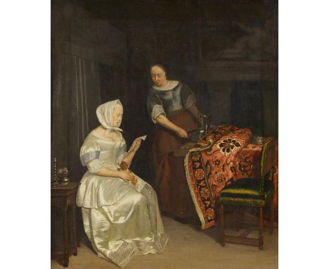
OCHTERVELT, JAKOBum 1635 Rotterdam - um 1709 AmsterdamTitel: Die Briefleserin. Interieur mit lesender Dame und Magd. Technik: Öl auf Leinwand. Montierung: Doubliert. Maße: 91,5 x 78,5cm. Rahmen/Sockel: Rahmen. Gutachten:Eduard Plietzsch, Köln Mai 1954;das Gemälde ist dokumentiert in der Datenbank des RDK, Den Haag, unter der Abb.Nr. 247618.Literatur:Susan Donahue Kuretsky: The paintings of Jacob Ochterveldt (1634-1682), with catalogue raisonne. Montclair 1979, S. 85f, Nr. 77, Abb. 89.Ausstellungen:Ausstellung von Werken Alter Kunst aus Berliner Privatbesitz, Berlin Mai - Juni 1915, im Katalog Abb. Tafel 90;Akademie der Künste, Berlin, Ausst. des Kaiser-Friedrich-Museums-Verein, Juli - August 1925, Kat.Nr. 288.Provenienz: Sammlung Young, England;Sammlung Baron Königswarter, Wien, vor 1906;Sammlung Paul von Schwabach, Berlin, bis 1915;Sammlung Nathan und Benjamin Katz, Dieren, bis 1940;Munich Central Art Collecting Point (Mü.-Nummer 2447);Restitution an die Niederlande, nach 1945;Sammlung ten Bos, Amelo;Privatbesitz, Deutschland.Der in der Mitte des 17. Jahrhunderts in Rotterdam und Amsterdam tätige Jacob Ochtevelt soll zeitgleich mit Pieter de Hooch Schüler des Haarlemer Landschafts- und Tiermalers Nicolas Berchem gewesen sein, doch scheinen beide eher von dem - wie sie in Rotterdam lebenden - Ludolf Leendertsz de Jongh beeinflusst zu sein. Wie de Jongh spezialisierten sich de Hooch und Ochtervelt auf Interieurs mit Genreszenen überwiegend des gehobenen, feinen Bürgertums. Dabei begrenzt Ochtervelt den Hintergrund häufiger, wie auch im vorliegenden Bild, wie einen dunklen Bühnen-Raum, vor dem die "Akteure", die Farbigkeit und die Textur der ausgewählten edlen Stoffe besonders leuchtend zur Geltung kommen. In der minutiösen Darstellung der Stofflichkeit steht Jacob Ochtervelt auch den gleichaltrigen Frans von Mieris, Gabrile Metsu oder Gerard ter Borch nahe.Die Hauptperson des Gemäldes trägt ein nicht eben alltagstaugliches, leuchtend weißes, aufwendig besticktes Seidenkleid und liest sitzend einen Brief, der vermutlich einen sehr intimen Inhalt hat. Dies suggeriert der kleine Hund, den die Briefleserin im Schoß hält ebenso wie die unverhohlene Neugierde der Bediensteten, die das Tablett mit einer Kanne unaufmerksam halb unter die Falten des Teppichs schiebt, der den Tisch bedeckt. Steht der leere, in schillerndem Grün bespannte Stuhl für einen erwarteten männlichen Besucher bereit, für den auch die auf dem Tisch stehende Tabakdose bereit gestellt ist? Der Betrachter ist eingeladen, neugierig über den Briefinhalt zu spekulieren.Wir danken Ellis Dullaart, RKD, Den Haag, die die Zuschreibung des vorliegenden Gemäldes auf Grundlage einer hochauflösenden Digitalfotografie bestätigt hat.Erläuterungen zum KatalogJakob Ochtervelt Originale Genre Malerei Hunde OCHTERVELT, JAKOBca. 1635 Rotterdam - ca. 1709 AmsterdamTitle: Lady Reading a Letter. Interior with reading lady and maid. Technique: Oil on canvas. Mounting: Relined. Measurement: 91,5 x 78,5cm. Frame/Pedestal: Framed. Certificate:Eduard Plietzsch, Cologne May 1954;the painting is listed and documented in the database of the RDK, The Hague, under the Ill. No. 247618.Literature:Susan Donahue Kuretsky: The paintings of Jacob Ochterveldt (1634-1682), with catalogue raisonne. Montclair 1979, p. 85f, no. 77, ill. 89.Exhibitions:Exhibition Werke Alter Kunst aus Berliner Privatbesitz, Berlin May - June 1915, in catalogue ill. panel 90;Akademie der Künste, Berlin, Exhibition of the Kaiser-Friedrich-Museums-Verein, July - August 1925, cat. no. 288.Provenance: Collection Young, England;Collection Baron Königswarter, Vienna, from 1906;Collection Paul von Schwabach, Berlin, to 1915;Collection Nathan and Benjamin Katz, Dieren, to 1940;Munich Central Art Collecting Point (Mü.-Number 2447);Restitution to the Netherlands, after 1945;Collection ten Bos, Amelo;Private ownership, Germany.Jacob Ochtevelt, who was active in Rotterdam and Amsterdam in the mid-17th century, is said to have been a pupil of the Haarlem landscape and animal painter Nicolas Berchem at the same time as Pieter de Hooch, but both seem to have been more influenced by Ludolf Leendertsz de Jongh - who lived in Rotterdam, as they did. Like de Jongh, de Hooch and Ochtervelt specialised in interiors with genre scenes mainly of the upper, fine bourgeoisie. Ochtervelt often limited the background, as in the present picture, like a dark stage space, against which the "actors", the colourfulness and the texture of the selected noble fabrics are particularly luminous. In the detailed depiction of materiality, Jacob Ochtervelt is also close to his contemporaries Frans von Mieris, Gabrile Metsu or Gerard ter Borch.The main character in the painting wears a bright white, intricately embroidered silk dress that is not exactly suitable for everyday use and is seated reading a letter that presumably has very intimate content. This is suggested by the little dog the reader holds in her lap, as well as the unconcealed curiosity of the servant, who inattentively pushes the tray with a jug halfway under the folds of the cloth covering the table. Is the empty chair, covered in iridescent green, ready for an expected male visitor, for whom the tobacco box on the table is also provided? The viewer is invited to speculate curiously about the contents of the letter.We are grateful to Ellis Dullaart, RKD, The Hague, for confirming the attribution of the present painting on the basis of a high-resolution digital photograph.Explanations to the Catalogue
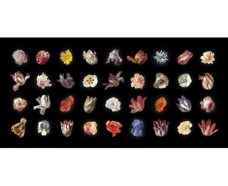
Rob and Nick Carter (b.1968 and 1969) 36 Flowers from the Dutch Golden Age C Type Supergloss Print, Diasec face-mounted, 2019 Number 48 of edition of 95 Accompanied by signed certificate 49cm x 102cm Horatio's Garden will receive 100% of the proceeds from this lot. Rob and Nick Carter are a husband and wife artistic duo who have been collaborating for over 20 years. The Carter's work is centered on the boundaries between the analogue and the digital and has taken many mediums including camera-less photography, painting, installation, neon, sculpture and time-based media. Their acclaimed Transforming series has been 10 years in the making and creates a unique intersection between the art of the past and cutting edge computer generated imagery. Their work is housed in the collections of the Frick, Pittsburgh; Mauritshuis, The Hague; Frans Hals Museum, Haarlem; Victoria & Albert Museum, London; David Roberts Foundation, London; Städel Museum, Frankfurt; and the Fondation Custodia, Paris, as well as being the first living artists to show a work at the Frick Museum, New York. Collectors include Sir Elton John, Jude Law, and Sir Peter Blake.
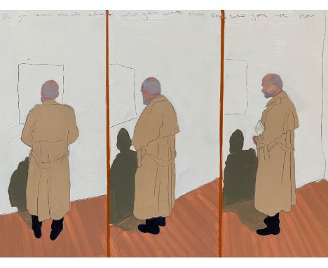
Christabel Blackburn (b.1986) Then and Now Signed verso Oil on panel 30 x 40cm. Horatio's Garden will receive 50% of the hammer price. Christabel Blackburn is an artist who studies and specialises in the human form. After finishing her degree in Classics at Newcastle University she learnt portraiture in Italy. Embracing this traditional foundation in drawing and sculpting techniques, she completed a further two years at the London Atelier of Representational Art. Influenced by Edward Hopper's realism, photography by Philip-Lorca diCorcia as well David Hockney's architectural traits, Christabel's work has evolved dramatically over the last ten years. Her strong sense of observation has enabled her to refine her technique, paring down detail yet still capturing the very essence of people in their environments and the symbiosis between the two. Be it a lone figure in a gallery or a child in an urban park, the stillness she portrays in her everyday scenes draws the viewer in and like photography, holds you in that moment in time. The intimacy she creates pulls you closer, giving you a greater sense of the people in the picture, their thoughts and their feelings. The simplicity of her work often conveys the loneliness and anonymity felt in a crowded city as well as challenging the impact of mental health caused by this digital age. Christabel's scenes transcend the everyday; they are stories about society and how we live our lives. Christabel won Sky Arts Portrait Artist of the Year 2020.
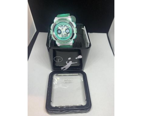
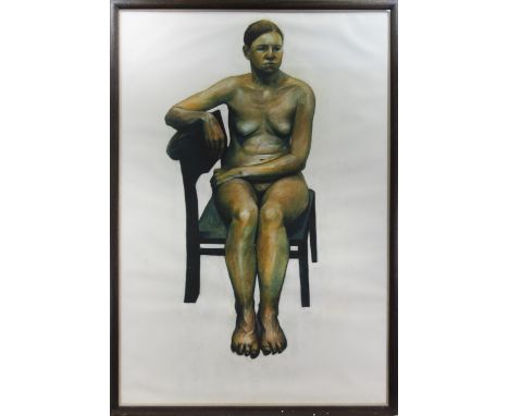
* CRAIG MULHOLLAND (SCOTTISH B. 1969), LIFE DRAWING NO. 2 mixed media on paper, inscribed with title verso and signed "M" as is the artist's norm. 134cm x 91.5cm ( (52 1/2 x 36 inches) Framed and under glass. Provenance: Duncan R Miller Fine Arts (144 West Regent Street, Glasgow) label verso. Art Hire framers label verso. Note: Craig Mulholland was born in Glasgow and studied Drawing and Painting at Glasgow School of Art. He lives and works in Glasgow and is currently Course Leader and Lecturer in Fine Art at The Glasgow School of Art. Mulholland’s work is included in a variety of public and private collections including: Scottish National Gallery Of Modern Art, Glasgow; The Royal Bank of Scotland; the Rudin Dewoody Collection; the Gregory Papadimitriou Collection and The Fleming Collection, London. He has been the recipient of a number of visual arts awards from the Scottish Arts Council and Creative Scotland, and exhibits regularly. Artistically, Mulholland is pre-occupied with dialogues between emerging digital technologies and the clearer limits of more traditional painting and sculpture. As the title (Life Drawing No 2) indicates, this is a rare early work by Mulholland.
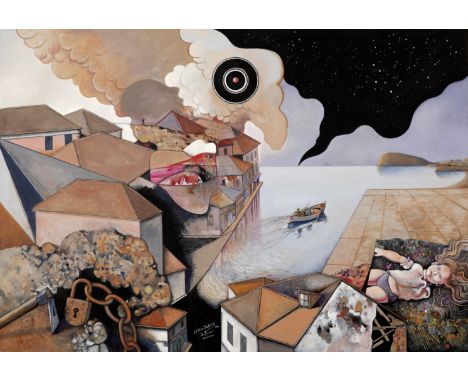
Rallis Kopsidis (Greece 1929-2010)Lac de rêve signé en grec et daté '1988' (en bas au centre)acrylique sur toile100 x 145.5cm (39 3/8 x 57 5/16in).signed in Greek and dated (lower center) acrylic on canvasFootnotes:ExposéAthens, National Gallery - Alexandros Soutzos Museum, Rallis Kopsidis, March 1 - April 2, 1989, no. 162 (illustrated in the exhibition catalogue, p. 44).Alexandroupolis, Rallis Kopsidis, 1994. Patras, Municipal Art Gallery, Rallis Kopsidis Retrospective Exhibition of Painting and Engraving, April 6 - May 16, 1994.Athens, Aenaon International Centre of Fine Arts, The Metaphysical in Modern Greek Painting, December 1996 (illustrated in the exhibition catalogue, p. 37). LittératureContemporary Greek Art institute Digital Platform, dp.iset.gr, Rallis Kopsidis Works, p. 5 (illustrated). This lot is subject to the following lot symbols: ARAR Goods subject to Artists Resale Right Additional Premium.For further information on this lot please visit Bonhams.com
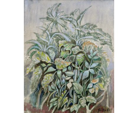
Nikos Hadjikyriakos-Ghika (Greek, 1906-1994)Plante signé et daté 'Ghika 81' (en bas à droite)huile sur papier marouflée sur toile42.5 x 34.5cm (16 3/4 x 13 9/16in).Peint en 1981signed and dated 'Ghika 81' (lower right) oil on paper laid on canvasFootnotes:ExposéAthens, Zoumboulakis Galleries, Ghika 1979-1981, March 1981.Athens, Municipal Gallery of Athens, Ghika, Landscapes and Interiors, November 29, 2006 - January 29, 2007 (illustrated in the exhibition catalogue, p. 61).LittératureContemporary Greek Art institute Digital Platform, dp.iset.gr, Nikos Hadjikyriakos-Ghika Works, p. 5 (illustrated). '1981... It's the year of another Ghika exhibition, the thirty-second one-man show in a career that began in 1923 when the artist was seventeen and exhibited in the Salon des Indépendants. Ghika is the most important Greek painter of the twentieth century, and in the current show he both continues with subjects and themes he has dealt with over the years, and adds something new. The end result is a fresh and tender view of nature, a nature more dreamlike and mellow than in the past, although still victorious ... It's hard to leave one Ghika painting and move on to the next.'11 H. Livas, Contemporary Greek Artists, Vantage Press, New York 1993, p. 19.This lot is subject to the following lot symbols: ARAR Goods subject to Artists Resale Right Additional Premium.For further information on this lot please visit Bonhams.com

* CRAIG MULHOLLAND (SCOTTISH B. 1969), LIFE DRAWING NO. 2 mixed media on paper, inscribed with title verso and signed "M" as is the artist's norm. 134cm x 91.5cm ( (52 1/2 x 36 inches) Framed and under glass. Provenance: Duncan R Miller Fine Arts (144 West Regent Street, Glasgow) label verso. Art Hire framers label verso. Note: Craig Mulholland was born in Glasgow and studied Drawing and Painting at Glasgow School of Art. He lives and works in Glasgow and is currently Course Leader and Lecturer in Fine Art at The Glasgow School of Art. Mulholland’s work is included in a variety of public and private collections including: Scottish National Gallery Of Modern Art, Glasgow; The Royal Bank of Scotland; the Rudin Dewoody Collection; the Gregory Papadimitriou Collection and The Fleming Collection, London. He has been the recipient of a number of visual arts awards from the Scottish Arts Council and Creative Scotland, and exhibits regularly. Artistically, Mulholland is pre-occupied with dialogues between emerging digital technologies and the clearer limits of more traditional painting and sculpture. As the title (Life Drawing No 2) indicates, this is a rare early work by Mulholland.
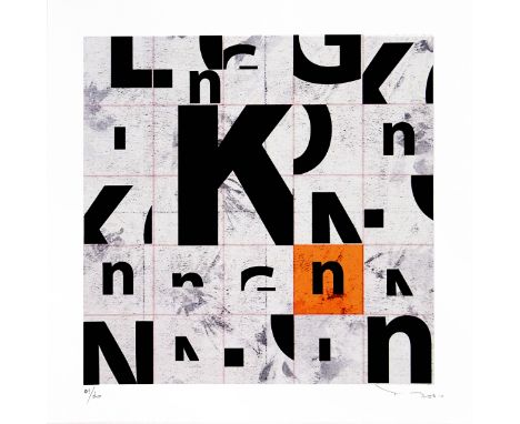
Edition of 30, Medium-Ink giclee print on strong fine art paper, Size-50 x 50cm, Condition report-As new SHIPPED FROM EUROPE PLEASE NOTE : you are bidding for the number 7/30 ( not the number on the picture ) Tehos artwork has been exhibit worldwide.( Uk, Hong Kong, France, swizzerland, etc..)you can google Tehos to get more infomations.His artworks have been used for the cover of the newspaper " Le monde Diplomatique" and others magazines.He illustrate one of the advertisement posters of the "Art monaco" art fair 2014he won the price of the Jury of the IAA Unesco in Monaco 2011.and has been feature as emerging artist of the week in Dubai and Abu Dabhi in March 2020, in a exhibition on over 1000 digital screens and giant screens all over the two cities.
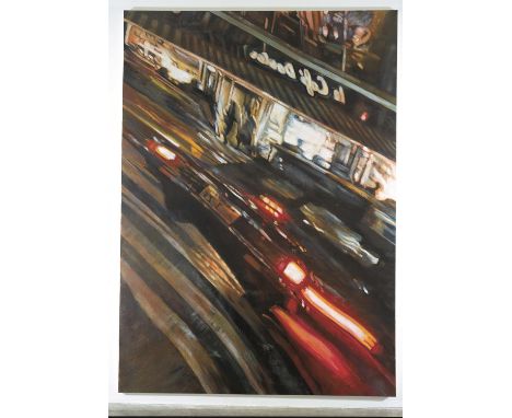
Matthew Carver (Canadian, b.1968). 'Ginza Doutor', 200. Acrylic on canvas, 340 x 244 cm. Provenance: From a reputable private collection. Acquired directly from the artist by the present owner in 2005. Literature: Saatchi Gallery Loan of Art, published by Saatchi Gallery, London, 2006 pp.32. From Saatchi Gallery Loan of Art, pp.32: Carver paints distorted views of city streets at night, based on his own digital photographs taken around the world. As if fleetingly glimpsed in you rear-view mirror or seen as a reflection in a window, his paintings capture the transient nature of city live. Carver employs art historical techniques such as anamorphosis to manipulate his images, and the work often needs external devices such as reflective cylinders to be seen distortion-free.
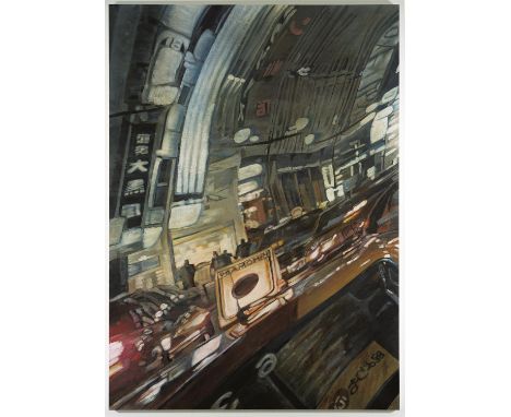
Matthew Carver (Canadian, b.1968). 'Chuo Dori', 2005. Acrylic on canvas, 244 x 340 cm. Provenance: From a reputable private collection. Acquired directly from the artist by the present owner in 2005. Literature: Saatchi Gallery Loan of Art, published by Saatchi Gallery, London, 2006 pp.33. From Saatchi Gallery Loan of Art, pp.32: Carver paints distorted views of city streets at night, based on his own digital photographs taken around the world. As if fleetingly glimpsed in you rear-view mirror or seen as a reflection in a window, his paintings capture the transient nature of city live. Carver employs art historical techniques such as anamorphosis to manipulate his images, and the work often needs external devices such as reflective cylinders to be seen distortion-free.

Rembrandt (1606 - 1669) Drypoint Etching. This is an etching and drypoint by Rembrandt entitled Landscape with Trees, Farm Buildings and a Tower. The etching was done about 1650, and it's unsigned and undated. It is the fourth state of five, and it comes with a digital certificate of authenticity from Stakenborg-Greenberg Fine Art, an art gallery on Main Street in Sarasota, Florida. The etching is listed in Nowell-Ustickes Catalogue as Nr. 223, and described as RRR, extra rare. The piece is a very fine impression of the fourth (final) state, and one of the rarest of Rembrandt's larger landscape etchings, despite the fact that Rembrandt took this plate through four different states. Very few impressions of this print have come up for auction in recent years. The plate actually began as a precise record of an existing building, namely the building with the tower at the right. In the extremely rare first and second states, the tower is taller and topped with a cupola and a short spire, and those characteristics helped scholars identify the building as that of tax collector Jan Uytenbogaert. Presumably for artistic purposes, Rembrandt changed the appearance of the tower in the third state by burnishing out the upper parts of the tower and obliterating what it really looked like. In his landscapes, Rembrandt usually refrained from depicting the sky with etched lines. He preferred plate tone and polishing scratches or sulphur tinting, but here he covered the left side and part of the lower sky with etched lines to indicate dark clouds. The trees on the left are still overcast and dark, while the rest of the buildings are bathed in sunshine. This strong contrast creates the effect of the sun suddenly breaking through receding rain clouds, and the almost blank foreground evokes a sparse and lovely landscape. Image Size: 4.75 x 12 in. Overall Framed Size: 14.25 x 23.25 in. Framed behind glass.
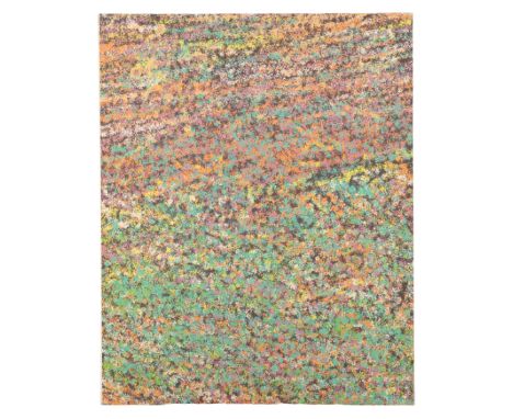
*RICHARD SLADDEN (1933-2020) A pair of Autostereogram type compositions, digital prints on textile, each 90cm x 80cm (on stretcher). RICHARD SLADDEN - Throughout his life Dick was totally committed to art and in his early years as a practising artist came into prominence by exhibiting at the New Vision Centre Gallery in London, the Alwin Gallery, the Arnolfini Gallery in Bristol and in Dusseldorf, Germany, in a joint exhibition with the artist Bruce McLean. He was born in Clevedon, Somerset, on 11 March 1933, and spent his early years growing up by the sea. At the age of 12 he became a boarder at Kings School, Taunton, at the end of the War. He later enrolled at the Royal West of England Academy School of Architecture in Bristol and also did two years National Service in the Lancashire Fusiliers. His working life began in the then Ministry of Works Ancient Monuments branch for six years until he decided that was much too slow for him. His complete change of direction led him into art and design education, becoming a Senior Lecturer at Croydon College of Art. where, among other activities, he founded a well-regarded sculpture department. He moved to Epsom School of Art and Design in 1972 as Vice Principal. He was later instrumental in merging Epsom and Farnham Schools of Art which became the Surrey Institute of which he became the Assistant Director, by which time he was also Principal of Epsom. The Surrey Institute later merged with Rochester, Maidstone and Canterbury Schools of Art to become what is now the University of the Creative Arts. Retiring in 1994, he and Carol moved to Somerset . He participated in the Somerset Open Art Weeks several times having converted the 50ft waggon shed in the garden into an illuminated outdoor art gallery and being open to the public for two weeks in alternate years, occasions which Dick greatly enjoyed. After spells in Storrington for three years and later Milford for nine years, they eventually moved to Caesars Place in Godalming. It was here that Dick died peacefully in his sleep on 14 April 2020. He was a strong, talented and vigorous personality and was much loved and well respected by all his family and friends . He has left a very large gap in all our lives - Carol Miller, March 2021

*LOTTIE DAVIES (B. 1971) 'My mother was born in a bucket, 2014' number one of the edition of 5, Digital c-type, 80cm x 105.5cm. Lottie Davies was born in Guildford, UK, in 1971. She grew up in Surrey and was educated in Alton and Godalming. After a degree in philosophy at St Andrews University in Scotland, she moved back to England to pursue a career in photography. She is currently based in London and Cornwall. Davies’ unique style has been employed in a variety of contexts, including newspapers, glossy magazines, books and advertising. She has won recognition in numerous awards, including the Association of Photographers’ Awards, the International Color Awards, and the Schweppes Photographic Portrait Awards. Her work has garnered international acclaim with the image Quints, which won First Prize at the Taylor Wessing Photographic Portrait Awards 2008 at the National Portrait Gallery in London, with Viola As Twins, which won the Photographic Art Award, Arte Laguna Prize in Venice in 2011, and her collaboration on Dreams of Your Life with Hide & Seek/Film 4.0 which was BAFTA-nominated in 2012. Davies’ work is concerned with stories and personal histories, the tales and myths we use to structure our lives. She takes inspiration from classical and modern painting, cinema and theatre as well as the imaginary worlds of literature. She employs a deliberate reworking of our visual vocabulary, playing on our notions of nostalgia and visual conventions with the intention of evoking a sense of recognition and narrative. Sandy Nairne, former director of the National Portrait Gallery in London, described Davies’ work as “brilliantly imaginative”.
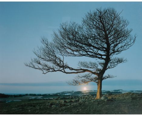
*LOTTIE DAVIES (B. 1971) 'Here: The Last Ghost Tree, 2013' number 1 from the edition of 6, Digital c-type, 76cm x 102cm. Lottie Davies was born in Guildford, UK, in 1971. She grew up in Surrey and was educated in Alton and Godalming. After a degree in philosophy at St Andrews University in Scotland, she moved back to England to pursue a career in photography. She is currently based in London and Cornwall. Davies’ unique style has been employed in a variety of contexts, including newspapers, glossy magazines, books and advertising. She has won recognition in numerous awards, including the Association of Photographers’ Awards, the International Color Awards, and the Schweppes Photographic Portrait Awards. Her work has garnered international acclaim with the image Quints, which won First Prize at the Taylor Wessing Photographic Portrait Awards 2008 at the National Portrait Gallery in London, with Viola As Twins, which won the Photographic Art Award, Arte Laguna Prize in Venice in 2011, and her collaboration on Dreams of Your Life with Hide & Seek/Film 4.0 which was BAFTA-nominated in 2012. Davies’ work is concerned with stories and personal histories, the tales and myths we use to structure our lives. She takes inspiration from classical and modern painting, cinema and theatre as well as the imaginary worlds of literature. She employs a deliberate reworking of our visual vocabulary, playing on our notions of nostalgia and visual conventions with the intention of evoking a sense of recognition and narrative. Sandy Nairne, former director of the National Portrait Gallery in London, described Davies’ work as “brilliantly imaginative”.
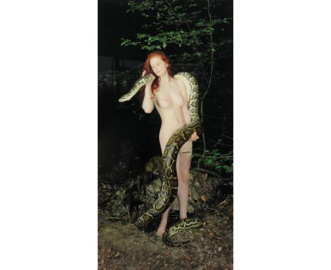
*LOTTIE DAVIES (B. 1971) 'Lilith (After John Collier) 2010' number 1 from the edition of 6, Digital c-type, 100cm x 54cm. Lottie Davies was born in Guildford, UK, in 1971. She grew up in Surrey and was educated in Alton and Godalming. After a degree in philosophy at St Andrews University in Scotland, she moved back to England to pursue a career in photography. She is currently based in London and Cornwall.Davies’ unique style has been employed in a variety of contexts, including newspapers, glossy magazines, books and advertising. She has won recognition in numerous awards, including the Association of Photographers’ Awards, the International Color Awards, and the Schweppes Photographic Portrait Awards. Her work has garnered international acclaim with the image Quints, which won First Prize at the Taylor Wessing Photographic Portrait Awards 2008 at the National Portrait Gallery in London, with Viola As Twins, which won the Photographic Art Award, Arte Laguna Prize in Venice in 2011, and her collaboration on Dreams of Your Life with Hide & Seek/Film 4.0 which was BAFTA-nominated in 2012. Davies’ work is concerned with stories and personal histories, the tales and myths we use to structure our lives. She takes inspiration from classical and modern painting, cinema and theatre as well as the imaginary worlds of literature. She employs a deliberate reworking of our visual vocabulary, playing on our notions of nostalgia and visual conventions with the intention of evoking a sense of recognition and narrative. Sandy Nairne, former director of the National Portrait Gallery in London, described Davies’ work as “brilliantly imaginative”.
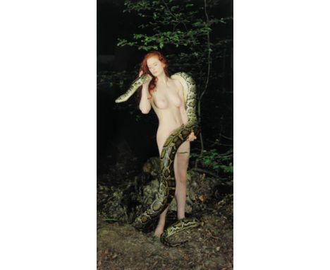
*LOTTIE DAVIES (B. 1971) 'Lilith (After John Collier) 2010' number 2 from the edition of 6, Digital c-type, 100cm x 54cm. Lottie Davies was born in Guildford, UK, in 1971. She grew up in Surrey and was educated in Alton and Godalming. After a degree in philosophy at St Andrews University in Scotland, she moved back to England to pursue a career in photography. She is currently based in London and Cornwall. Davies’ unique style has been employed in a variety of contexts, including newspapers, glossy magazines, books and advertising. She has won recognition in numerous awards, including the Association of Photographers’ Awards, the International Color Awards, and the Schweppes Photographic Portrait Awards. Her work has garnered international acclaim with the image Quints, which won First Prize at the Taylor Wessing Photographic Portrait Awards 2008 at the National Portrait Gallery in London, with Viola As Twins, which won the Photographic Art Award, Arte Laguna Prize in Venice in 2011, and her collaboration on Dreams of Your Life with Hide & Seek/Film 4.0 which was BAFTA-nominated in 2012. Davies’ work is concerned with stories and personal histories, the tales and myths we use to structure our lives. She takes inspiration from classical and modern painting, cinema and theatre as well as the imaginary worlds of literature. She employs a deliberate reworking of our visual vocabulary, playing on our notions of nostalgia and visual conventions with the intention of evoking a sense of recognition and narrative. Sandy Nairne, former director of the National Portrait Gallery in London, described Davies’ work as “brilliantly imaginative”.
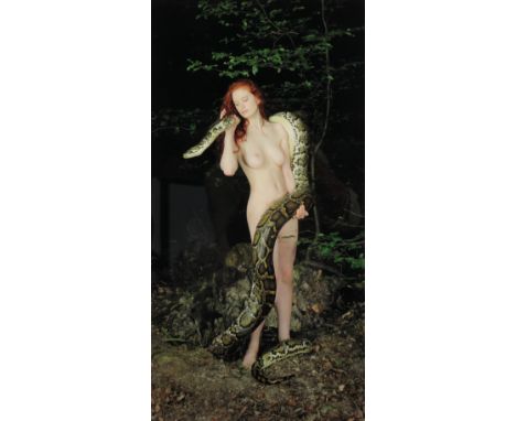
*LOTTIE DAVIES (B. 1971) 'Lilith (After John Collier) 2010' number 3 from the edition of 10, Digital c-type, 66cm x 36cm. Lottie Davies was born in Guildford, UK, in 1971. She grew up in Surrey and was educated in Alton and Godalming. After a degree in philosophy at St Andrews University in Scotland, she moved back to England to pursue a career in photography. She is currently based in London and Cornwall. Davies’ unique style has been employed in a variety of contexts, including newspapers, glossy magazines, books and advertising. She has won recognition in numerous awards, including the Association of Photographers’ Awards, the International Color Awards, and the Schweppes Photographic Portrait Awards. Her work has garnered international acclaim with the image Quints, which won First Prize at the Taylor Wessing Photographic Portrait Awards 2008 at the National Portrait Gallery in London, with Viola As Twins, which won the Photographic Art Award, Arte Laguna Prize in Venice in 2011, and her collaboration on Dreams of Your Life with Hide & Seek/Film 4.0 which was BAFTA-nominated in 2012. Davies’ work is concerned with stories and personal histories, the tales and myths we use to structure our lives. She takes inspiration from classical and modern painting, cinema and theatre as well as the imaginary worlds of literature. She employs a deliberate reworking of our visual vocabulary, playing on our notions of nostalgia and visual conventions with the intention of evoking a sense of recognition and narrative. Sandy Nairne, former director of the National Portrait Gallery in London, described Davies’ work as “brilliantly imaginative”.
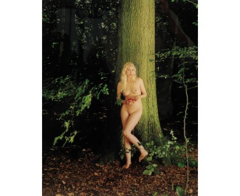
*LOTTIE DAVIES (B. 1971) 'Eve, 2011' number 1 from the edition of 10, Digital c-type, 51cm x 40.5cm. Lottie Davies was born in Guildford, UK, in 1971. She grew up in Surrey and was educated in Alton and Godalming. After a degree in philosophy at St Andrews University in Scotland, she moved back to England to pursue a career in photography. She is currently based in London and Cornwall. Davies’ unique style has been employed in a variety of contexts, including newspapers, glossy magazines, books and advertising. She has won recognition in numerous awards, including the Association of Photographers’ Awards, the International Color Awards, and the Schweppes Photographic Portrait Awards. Her work has garnered international acclaim with the image Quints, which won First Prize at the Taylor Wessing Photographic Portrait Awards 2008 at the National Portrait Gallery in London, with Viola As Twins, which won the Photographic Art Award, Arte Laguna Prize in Venice in 2011, and her collaboration on Dreams of Your Life with Hide & Seek/Film 4.0 which was BAFTA-nominated in 2012. Davies’ work is concerned with stories and personal histories, the tales and myths we use to structure our lives. She takes inspiration from classical and modern painting, cinema and theatre as well as the imaginary worlds of literature. She employs a deliberate reworking of our visual vocabulary, playing on our notions of nostalgia and visual conventions with the intention of evoking a sense of recognition and narrative. Sandy Nairne, former director of the National Portrait Gallery in London, described Davies’ work as “brilliantly imaginative”.

*LOTTIE DAVIES (B. 1971) 'Venus, 2011' number 1 from the edition of 10, Digital c-type, 40.5cm x 51cm. Lottie Davies was born in Guildford, UK, in 1971. She grew up in Surrey and was educated in Alton and Godalming. After a degree in philosophy at St Andrews University in Scotland, she moved back to England to pursue a career in photography. She is currently based in London and Cornwall. Davies’ unique style has been employed in a variety of contexts, including newspapers, glossy magazines, books and advertising. She has won recognition in numerous awards, including the Association of Photographers’ Awards, the International Color Awards, and the Schweppes Photographic Portrait Awards. Her work has garnered international acclaim with the image Quints, which won First Prize at the Taylor Wessing Photographic Portrait Awards 2008 at the National Portrait Gallery in London, with Viola As Twins, which won the Photographic Art Award, Arte Laguna Prize in Venice in 2011, and her collaboration on Dreams of Your Life with Hide & Seek/Film 4.0 which was BAFTA-nominated in 2012. Davies’ work is concerned with stories and personal histories, the tales and myths we use to structure our lives. She takes inspiration from classical and modern painting, cinema and theatre as well as the imaginary worlds of literature. She employs a deliberate reworking of our visual vocabulary, playing on our notions of nostalgia and visual conventions with the intention of evoking a sense of recognition and narrative. Sandy Nairne, former director of the National Portrait Gallery in London, described Davies’ work as “brilliantly imaginative”.
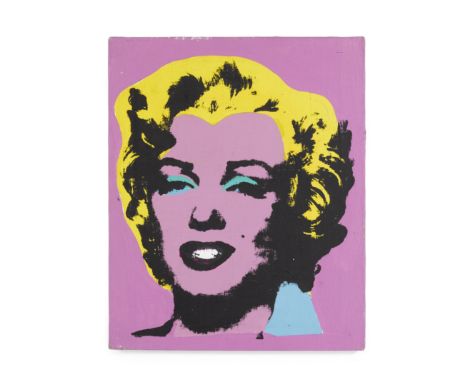
Sturtevant (1924-2014)Study for Warhol's Marilyn 1965 signed, titled, and dated 1965acrylic and silkscreen ink on canvas50.8 by 40.6 cm.20 by 16 in.Footnotes:This work will be included in the forthcoming catalogue raisonné being compiled by the Sturtevant Estate, Paris.ProvenancePrivate Collection, HoustonAcquired directly from the above by the present owner circa 1977Each artistic generation is defined by its novel visionaries and 'enfants terribles'; Marcel Duchamp, Robert Rauschenberg, Maurizio Cattelan, Richard Prince – these are artists whose work shatters the cultural zeitgeist and reshapes the landscape of contemporary art practice in its time. American artist Sturtevant was one of the most prominent and highly regarded conceptual pioneers of the latter half of the Twentieth Century, caricaturing and challenging the entrenched ideas of what constituted the art image and object, inspiring artists, philosophers, and critical theorists for generations. In the painting presented here for sale, there is no finer representation of Sturtevant's lifelong artistic project than this: one of the earliest Study for Warhol's Marilyn works, from 1965, the first year of her 'repetitions,' as she termed them. Executed with all the panache of a consummate master, the underpainting, silkscreen quality, and electrifying colour palette are superbly definitive of the Pop Art canon that she sought to rattle. Her ideas were revolutionary and her artworks supremely astute, engaging in the broader discourse around media and cultural theory that had gained immense traction with artists, writers, and critics in the early 1960s. Her practice went head-to-head with the artist-titans of her time, repeating the paintings of Frank Stella, Jasper Johns, and Anselm Kiefer. Sturtevant's Warhol Marilyn series, however, stands as the most iconic of her career. Superimposing images and techniques, upending the symbolic order of source material and artistic license – using not only the visage of the most recognisable leading lady of the last 70 years, but also the most illustrious portrait of the same era – Sturtevant forced the audience to consider the work of art holistically. Her ideology represented the apex point of Warhol's own practice that conflated ubiquity and fame. Her artworks suspended meaning, and instead engaged the spectator in a hierarchy of images and information, undermining the authorial roots and aura of the work of art. Unlike many whose appropriation has inspired backlash, such as Richard Prince, Jeff Koons, and Sherrie Levine, Sturtevant's Marilyns were painted not only with Warhol's blessing, but with the technicians and materials made available to her at the Factory; the canvases, paints, and screens identical to those that Warhol began producing after the actress's untimely death in 1962. Sturtevant claimed that later, when asked how he made his silkscreened works, Warhol told people to 'ask Elaine [Sturtevant].' Her paintings cannot simply be termed 'copies,' therefore, but are instead something much more complex and subversive, entering the philosophical realm of simulacra – a term the artist consistently nodded to as her holy grail and creative driving force. In an age interwoven with digital and virtual machinations that replicate, reshape, and have largely replaced our engagement with 'the real,' Sturtevant's work has become still more relevant and arresting. Shifting to video and digital art in the latter decades of her practice after moving to Paris in 1990, her earliest paintings retain a mysticism that is reserved for those works of art that are true originals – not simply in appearance, but in substance. In the present work, this sense of presence and significance is palpable and undeniable. As academic Patricia Lee wrote, Sturtevant's 'Warhol Marilyn provocatively embodies a decisive moment in the history of the object in art [...] It is in Sturtevant's work that the issue of the copy and its ramifications in Pop, Minimalism and Conceptual art crystallises' (Patricia Lee, Warhol Marilyn: Sturtevant, London, 2016, p. 17). Not only has Sturtevant's work grown to stand apart from those artists she emulated, but the historical and artistic importance of her practice is assured, with works in global museum collections that include the Musée d'Art Moderne de Paris, the Whitney Museum of American Art, New York, the Museu das Artes de Sintra, Portugal, in addition to her major career retrospective, Double Trouble, that took place at the Museum of Modern Art in New York in 2014. A painting by an artist who emerged to compete at the height of the Pop Art and Minimalist movements, Sturtevant's contribution to and importance as one of the definitive Postmodernists of the Twentieth Century can be held in no doubt, and Study for Warhol's Marilyn from 1965 stands as one of the earliest and most collectible works from her career to come to market.This lot is subject to the following lot symbols: ** VAT on imported items at a preferential rate of 5% on Hammer Price and the prevailing rate on Buyer's Premium.For further information on this lot please visit Bonhams.com
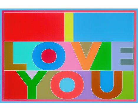

Amanda Denny Untitled from the 'Meanwhile Series' 2020, 2021 Photographic Print on Paper Signed verso 15 x 10cm (5¾ x 3¾ in.) Amanda Denny is a London based visual storyteller and photographic artist working with both analogue and digital image making processes. All of her practice now deals with the interplay of image, literature and archival documentary material in order to create new narratives. That 'fickle friend' memory, the imbrication of time and connections co-joined by chance circumstances tend to be at the start of her projects. Her practice explores issues of our mental spaces, including urban living, solitude versus loneliness, social stigmas and conflicted choice. She is also concerned with the pressures of achievement - 'happiness' too seems to have entered the fray and something to judge by, it misses the point. She believes that stories can help you exist in the world and by producing narrative spaces you can respond to everyday life and the social environment. There is the story and then there is the meaning to be got from it through the gaps, juxtapositions and conversations. The photo book and the development of photo-text are core to her practice as is creating tangible, tactile artwork that is designed to be viewed in person not on screen, and are not quick reads. Amanda's work is held in private collections and she has been exhibited in group shows worldwide. Education Amanda holds a BA (Hons) in Literature and History and graduated from the University of Westminster in 2019 with a BA (Hons) in Photography. 'The Book as Frame' workshop at the ICP in New York, 2020. Exhibitions/Awards She is currently part of the Modern Art Oxford "Activating our Archives: Community Dialogues" group project responding to the COVID-19 lockdown Exhibitor at the Royal Academy Summer Exhibition 2020 (6 October 2020 - 3 January 2021) Featured in the 'Yearbook 2020' online exhibition, organised by Shutter Hub in partnership with BenQ, Exposure Photography Festival, Fujifilm Original Photo Paper and Newspaper Club. Exhibitor in the 'Everyday Delight (Windows) Edition' exhibition running nationwide (from 1 August 2020). Joint recipient of the Dentons Art Prize 2020 and Winner of the Dentons Arts Committee Prize 2020. Exhibition at Dentons Law Firm, London, (December 2019 - December 2020). 'No Place Like Home' 2018 photo book displayed at La Biblioteca Nacional de España during the PHotoESPAÑA Festival 2019 Exhibitor in the 'Time to Think' Shutter Hub exhibition at Festival Pil'Ours, France 4th Edition. 1st July - 30 November 2019 and 2020 Cold Cases, Brighton Fringe, The Old Police Cells, Brighton 29 September 2018 City to Sea Coney Island* 2018 Wall Ortiz Gallery, NY 13th September 2018 to 15th November 2018 Peckham 24 Photography Festival 2018 - featured in the slideshow projection of works at the Overhaul exhibition. Friday 18th May - Sunday 20th May, Safehouse 1, 139 Copeland Road, London, SE15 3SN. 'Intrusion' 2017 group show at Paddington Central, London Crossrail's Street Hoardings Photography Display Dean Street W1 since 2011 Her book 'No Place Like Home' (2018) was shortlisted for the La Fabrica and Photo London Book Dummy Award 2019 and was nominated for the First Book Award 2018. About the postcard artworks The images selected are all part of an ongoing work in progress entitled 'Meanwhile' particularly the 'Down, down, down and still the weeds prevail' series. As Rhiannon Lucy Cosslett says, "so much femininity is unspoken. Moving through the world as a woman - the way you are viewed and treated, your emotions, your approach to your body - involves subtleties and complexities that are often unarticulated, sometimes even between women themselves." All suffering is unique to ourselves and not having the mental resilience, coping mechanisms or support structures to enable a safe space for self validation is detrimental to our wellbeing and sense of place in the world. Often society is too quick and too keen to label and judge. Habitually erroneous assumptions, based on the slightest details and often fleeting physical and environmental associations, lead to abhorrent stigmatisations and instantly deny the recipient any positive audience. Amanda's work continues to deal with the real estate of mental spaces and questions inherited prejudices and biases and memory associations. More than ever this is a time for reflection and reassessment. Her work offers a space for this personal revaluation and a space to create new narratives in. Condition Report: Condition Report Disclaimer
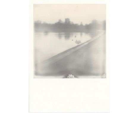
Amanda Denny Untitled from the 'Meanwhile Series' 2020, 2021 Photographic Print on Paper Signed verso 15 x 10cm (5¾ x 3¾ in.) Amanda Denny is a London based visual storyteller and photographic artist working with both analogue and digital image making processes. All of her practice now deals with the interplay of image, literature and archival documentary material in order to create new narratives. That 'fickle friend' memory, the imbrication of time and connections co-joined by chance circumstances tend to be at the start of her projects. Her practice explores issues of our mental spaces, including urban living, solitude versus loneliness, social stigmas and conflicted choice. She is also concerned with the pressures of achievement - 'happiness' too seems to have entered the fray and something to judge by, it misses the point. She believes that stories can help you exist in the world and by producing narrative spaces you can respond to everyday life and the social environment. There is the story and then there is the meaning to be got from it through the gaps, juxtapositions and conversations. The photo book and the development of photo-text are core to her practice as is creating tangible, tactile artwork that is designed to be viewed in person not on screen, and are not quick reads. Amanda's work is held in private collections and she has been exhibited in group shows worldwide. Education Amanda holds a BA (Hons) in Literature and History and graduated from the University of Westminster in 2019 with a BA (Hons) in Photography. 'The Book as Frame' workshop at the ICP in New York, 2020. Exhibitions/Awards She is currently part of the Modern Art Oxford "Activating our Archives: Community Dialogues" group project responding to the COVID-19 lockdown Exhibitor at the Royal Academy Summer Exhibition 2020 (6 October 2020 - 3 January 2021) Featured in the 'Yearbook 2020' online exhibition, organised by Shutter Hub in partnership with BenQ, Exposure Photography Festival, Fujifilm Original Photo Paper and Newspaper Club. Exhibitor in the 'Everyday Delight (Windows) Edition' exhibition running nationwide (from 1 August 2020). Joint recipient of the Dentons Art Prize 2020 and Winner of the Dentons Arts Committee Prize 2020. Exhibition at Dentons Law Firm, London, (December 2019 - December 2020). 'No Place Like Home' 2018 photo book displayed at La Biblioteca Nacional de España during the PHotoESPAÑA Festival 2019 Exhibitor in the 'Time to Think' Shutter Hub exhibition at Festival Pil'Ours, France 4th Edition. 1st July - 30 November 2019 and 2020 Cold Cases, Brighton Fringe, The Old Police Cells, Brighton 29 September 2018 City to Sea Coney Island* 2018 Wall Ortiz Gallery, NY 13th September 2018 to 15th November 2018 Peckham 24 Photography Festival 2018 - featured in the slideshow projection of works at the Overhaul exhibition. Friday 18th May - Sunday 20th May, Safehouse 1, 139 Copeland Road, London, SE15 3SN. 'Intrusion' 2017 group show at Paddington Central, London Crossrail's Street Hoardings Photography Display Dean Street W1 since 2011 Her book 'No Place Like Home' (2018) was shortlisted for the La Fabrica and Photo London Book Dummy Award 2019 and was nominated for the First Book Award 2018. About the postcard artworks The images selected are all part of an ongoing work in progress entitled 'Meanwhile' particularly the 'Down, down, down and still the weeds prevail' series. As Rhiannon Lucy Cosslett says, "so much femininity is unspoken. Moving through the world as a woman - the way you are viewed and treated, your emotions, your approach to your body - involves subtleties and complexities that are often unarticulated, sometimes even between women themselves." All suffering is unique to ourselves and not having the mental resilience, coping mechanisms or support structures to enable a safe space for self validation is detrimental to our wellbeing and sense of place in the world. Often society is too quick and too keen to label and judge. Habitually erroneous assumptions, based on the slightest details and often fleeting physical and environmental associations, lead to abhorrent stigmatisations and instantly deny the recipient any positive audience. Amanda's work continues to deal with the real estate of mental spaces and questions inherited prejudices and biases and memory associations. More than ever this is a time for reflection and reassessment. Her work offers a space for this personal revaluation and a space to create new narratives in.
-
983 item(s)/page